Perceptually uniform color models and their implications
This notebook was created as a learning exercise to teach myself about color theory.
This notebook was created as a learning exercise to teach myself about color theory.
This map shows the countries of the world neatly aligned, rather than randomly spread all over the planet.
Visualizing a dataset of research in visualization sounded a bit meta, but intriguing…
If you’ve ever wondered how frameworks like Observable Plot, ggplot2, or Vega-Lite work, you’ve come to the right place!
Since the start of the year, Wordle has overtaken “crossword” (by 10x), “olympics” (2x) and even “covid” (1.5x) in Google Trends data.
92% of the world’s online population use emoji — but which emoji are we using?
Embarking on this challenge felt like an opportunity to finish a few open projects, to try a few ideas, and to showcase a part of my usual toolbox.
Approaches for working with data that changes over time.
New JavaScript library for visualization of tabular data with a concise and memorable API to foster fluency and help you try out ideas quickly.
In honor of D3 1.0’s tin anniversary, I thought I’d reflect on lessons learned.
Bitemporal data has two dimensions of time, like a table with two columns of dates.
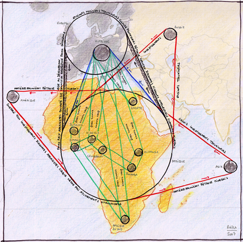
An Observable notebook by Pierre Ripoll.
If you try evenly spacing different colors across a typical linear gradient, you may find it leads to sharp or unusual transitions across the surface.
A handy tool to help make your case when whining about a biannual time change, following earlier explorations of the geography of DST effects
To celebrate the 100th anniversary of the German design school Bauhaus, we published a story at The New York Times.