Mark Twain once wrote, “There are three kinds of lies: lies, damned lies, and statistics.” (He attributed the quip to former British prime minister Benjamin Disraeli, but its true origin is unknown.) Given the foundational importance of statistics in modern science, this quote paints a bleak picture of scientific endeavors. Several generations' worth of scientific progress have proved Twain's sentiment to be an exaggeration. Still, we shouldn't discard the wisdom in those words. Although statistics is an essential tool for understanding the world, employing it responsibly and avoiding its pitfalls require a delicate dance.
One maxim that should be etched into the walls of all scientific institutions is to visualize your data. Statistics specializes in using objective, quantitative measures to understand data, but there is no substitute for graphing something out and getting a look at its shape and structure with one's own eyeballs. In 1973 statistician Francis Anscombe feared that others in his field were losing sight of the value of visualization. “Few of us escape being indoctrinated” with the notion that “numerical calculations are exact, but graphs are rough,” he wrote. To quash this myth, Anscombe devised an ingenious demonstration known as Anscombe's quartet.
Together with its wacky successor, the datasaurus dozen, nothing more dramatically communicates the primacy of visualization in data analysis.
On supporting science journalism
If you're enjoying this article, consider supporting our award-winning journalism by subscribing. By purchasing a subscription you are helping to ensure the future of impactful stories about the discoveries and ideas shaping our world today.
To appreciate Anscombe's quartet, let's slip into the lab coat of a scientist. Suppose you're interested in the relation between how much people exercise and how much they sleep. You survey a random sample of the population about these habits, record the answers in a spreadsheet and run the results through your favorite statistics software. The summary statistics look like the following (this example is not based on real data):
Hours of exercise per week: average, 7.5; standard deviation, 2.03
Hours of sleep per day: average, 9; standard deviation, 3.32
Correlation between the two: 0.816
On average, the people in your sample exercise 7.5 hours per week and sleep nine hours per day. Standard deviation measures how much variation there is in your sample. Here it's moderate for both variables, indicating that most people you surveyed don't veer too much from the averages. The two are highly correlated, which implies that people who exercise more are also likely to sleep more. The software also outputs a line of best fit, which describes the general trend of your data, as shown below.
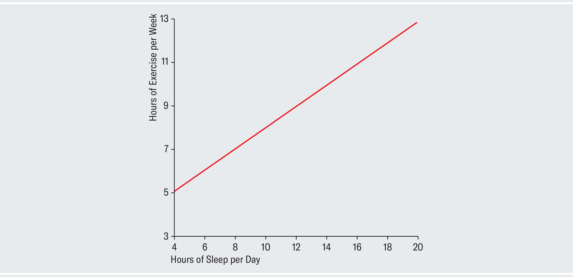
Credit: Amanda Montañez; Source: R: A Language and Environment for Statistical Computing. R Core Team. R Foundation for Statistical Computing, 2023
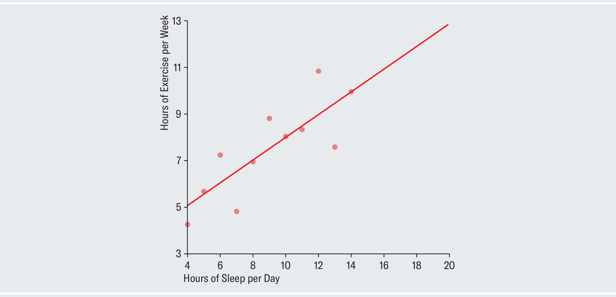
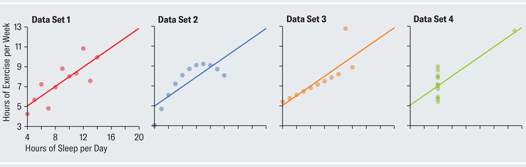
Given this summary, it might be tempting to suppose that the data look something like data set 1 in the plots below. Each dot represents one person in your survey and is positioned according to that person's individual sleep and exercise habits. The chart depicts a strong upward linear trend, which suggests that as people exercise more, they also sleep more (perhaps because both are indicative of a generally healthy lifestyle or because workouts are fatiguing). There is little of the random variation characteristic of the real, messy world. Anscombe showed that, amazingly, all four of the different data sets shown on the opposite page have identical summary statistics.
Credit: Amanda Montañez; Source: R: A Language and Environment for Statistical Computing. R Core Team. R Foundation for Statistical Computing, 2023
Data set 2, despite having the same summary statistics as data set 1, tells a completely different story when plotted point by point. The relation among the actual values is clearly not linear, and for whatever reason, exercise starts to taper off for the people who sleep the most. Data set 3 shows a perfect linear relation except for one outlier who exercises an atypical amount and skews the results. In data set 4, almost everybody sleeps exactly eight hours per day, and their sleep habits have no correlation to how much they exercise, whereas one person in the sample sleeps almost 20 hours a day and presumably spends all their waking time exercising. Notice how the same statistics lead us to very different conclusions once we visualize the data.
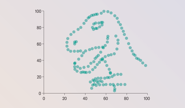
Despite its popularity, nobody knows how Anscombe concocted his quartet. Justin Matejka and George Fitzmaurice of Autodesk Research in Toronto sought to rectify this gap in knowledge and took the concept to its extreme. They demonstrated a general-purpose method for taking any data set and transforming it into any target shape of your choosing while preserving whichever summary statistics you want (up to two decimal places). The results are the datasaurus dozen.
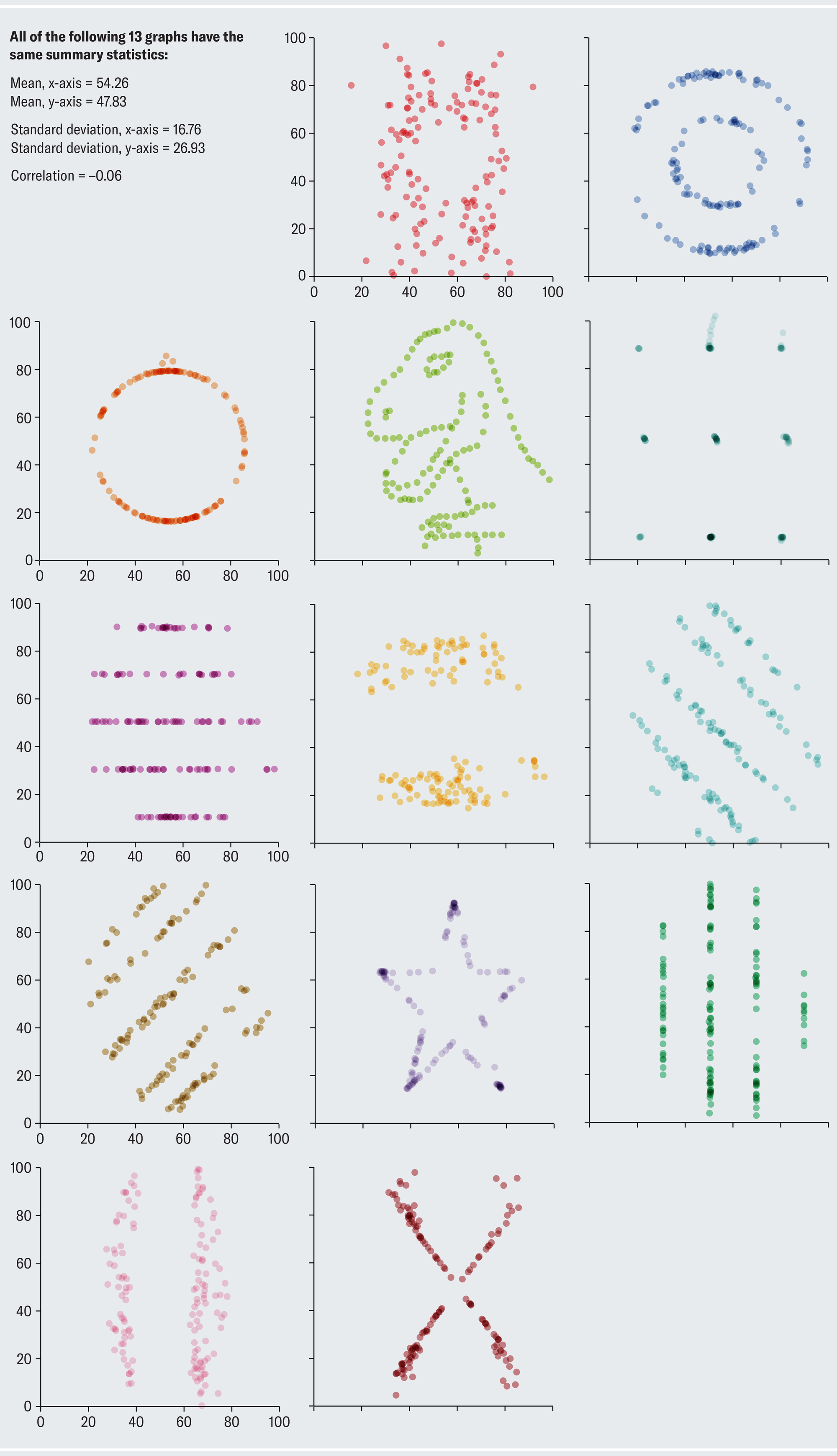
Credit: Amanda Montañez; Sources: Jumping Rivers; “Same Stats, Different Graphs: Generating Datasets with Varied Appearance and Identical Statistics through Simulated Annealing,” by Justin Matejka and George Fitzmaurice, in CHI ’17: Proceedings of the 2017 CHI Conference on Human Factors in Computing Systems; May 2017
All the scatterplots on this page have the same summary statistics! Astute readers might notice that it's a datasaurus baker's dozen. The dinosaur data set was the starting point from which all the others were generated. (It's an homage to data-visualization expert Alberto Cairo's tongue-in-cheek Tyrannosaurus rex data set.) Clearly, summary statistics alone tell an inadequate part of the story.
Anscombe would probably be proud that his quartet lives on as a common pedagogical demonstration in modern statistics classes. As baseball legend Yogi Berra said, “You can observe a lot by watching.”