Autonomy = Choices
Wars have been waged over autonomy. Having the freedom to do things in your own way is considered by some to be one of the three fundamental human needs. The irony is that all too often users are forced to complete tasks in narrowly defined ways that do not reflect their priorities or preferences. This lack of freedom can make users feel a bit like cattle that are forced into cattle chutes, which are used to examine animals or load them onto trucks.

Protecting users’ ability to make choices is so important that in 2020, the California Privacy Rights Act (CPRA) defined a “dark pattern” as “a user interface designed or manipulated with the substantial effect of subverting or impairing user autonomy, decision making, or choice.” While designing workflows without much variation is not inherently a deceptive pattern, this definition highlights the importance of supporting users’ need to make choices by giving them control and flexibility
Definition: Autonomy is the ability to use an interface, product, or service in a way that aligns with personal preferences and priorities.
Giving users autonomy can often conflict with increasing key business metrics. For example, explicitly asking users whether they would like to opt in to receive a newsletter will undoubtedly result in fewer subscriptions than subscribing them by default. However, those users who do make the choice to subscribe will generally be more committed to that choice.
This article provides some examples of how interfaces can give users autonomy. However, it is not a comprehensive list, nor is it a checklist of methods that should be applied to every design. Giving users autonomy is more of a principle than a specific method, and your efforts to do so should be guided by your context, available resources, and research findings.
Customizations
A common way to give users autonomy is through customization (not to be confused with personalization). One benefit of allowing users to make customizations in an interface is the feeling of ownership that tends to follow. However, investing time and resources into developing customizations should be done with caution because many users don’t spend a lot of time customizing.
Customizations that don’t drastically alter workflows or processes are often surface-level, but can bring some users a sense of delight and ownership. For example, Facebook Messenger allows users to pick a custom theme for each conversation. Note, however, that certain design elements, such as font size and color, and the position of messages in the conversation remain consistent with the familiar default design. (Maintaining consistency and standards is critical for preserving usability and brand recognition.)
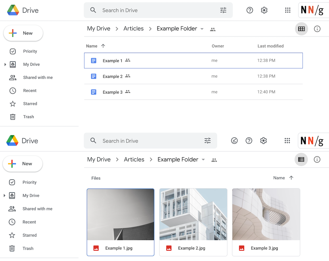
While many users won’t take time to customize the surface-level details of an interface, some task-related customization options can help users adapt UIs to meet their shifting needs. Google Drive allows users to toggle between two file displays — list view and icon view. This customization is especially helpful because each of the two display options is optimal for different types of files (list view for text files, icon view for images), easily discoverable, and can be changed again as needed.
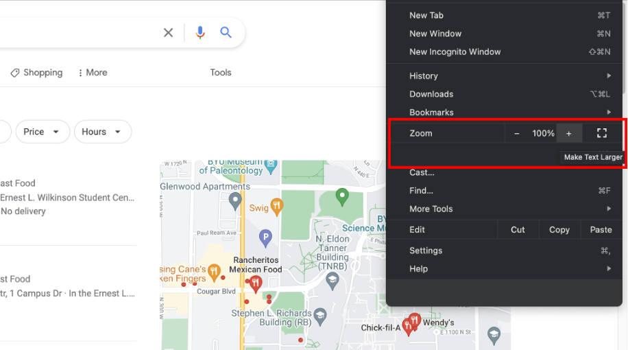
In Google Chrome, users can adjust the magnification of page content by either zooming in or out. This feature gives them the autonomy to adapt the interface to meet their needs — whether they want to see more content on one page or they have poor eyesight and need a bigger font.
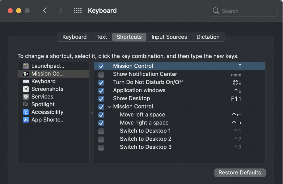
Depending on your context, it can sometimes be beneficial to go beyond these surface-level features and allow users to customize the interaction in a fundamental way — for example, through accelerators, which allow users to customize actions so they can increase their efficiency. These types of choices often fit best in complex interfaces and applications.
Scannability
Users notoriously spend very little time or effort reading content on the web. This is largely because they are trying to move fast and look only for information that is relevant to them. Many eyetracking studies reveal that users follow a variety of patterns for scanning content to decide whether it is worth spending time to read it in detail. Making it difficult for users to scan information limits autonomy because it forces users to interact with the design in a very specific way: they must either read everything to determine whether it is helpful for them or leave.
The good use of headings and subheadings gives users autonomy because it allows them to quickly choose what is relevant to read in more detail. This principle applies to every type of design, including printed materials and emails. Consider the scannability in the two examples below from the Morning Brew, a daily news-briefing email.

Timing and Sequences
It is not enough to make written content scannable. Users also want to choose when and in what order to interact with content. One user might already be familiar with an interface and ready to jump in immediately, while another might appreciate an introduction. One user might be looking for an answer to a specific question, while another might just be browsing.
For example, consider how autonomy is limited if all users must use a chatbot to request help. Offering a variety of methods to contact support is important because one method or sequence will rarely cater to all preferences and priorities.
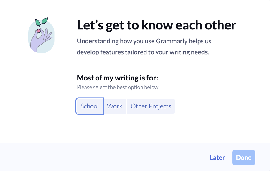
Grammarly.com allows users to postpone initial personalization. Although Grammarly can improve people's experience by finding out certain information about each user, it respects users’ autonomy by not forcing them to complete this step.
Our research shows that forcing users to go through introductory processes, such as tutorials, does not generally make them faster and can even make tasks within the interface seem more difficult.
Khan Academy (a gamified educational app) gives users a great deal of autonomy by allowing them to choose which courses they would like to take and the order of the topics within the course. Autonomy is a fundamental part of Khan Academy’s structure and helps users to develop ownership of their experience. This degree of autonomy is common in gamified environments.
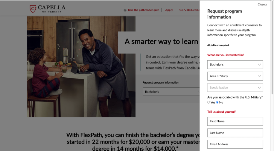
As an example of not giving users autonomy, Cappella University forces all users to enter personal information before they have access to any details about specific academic programs (think: cattle chute).
Try it Yourself
Consider how well the following design gives users autonomy. This design is an interface on a kiosk that customers might use to give a tip at a restaurant as they pay with a credit/debit card.
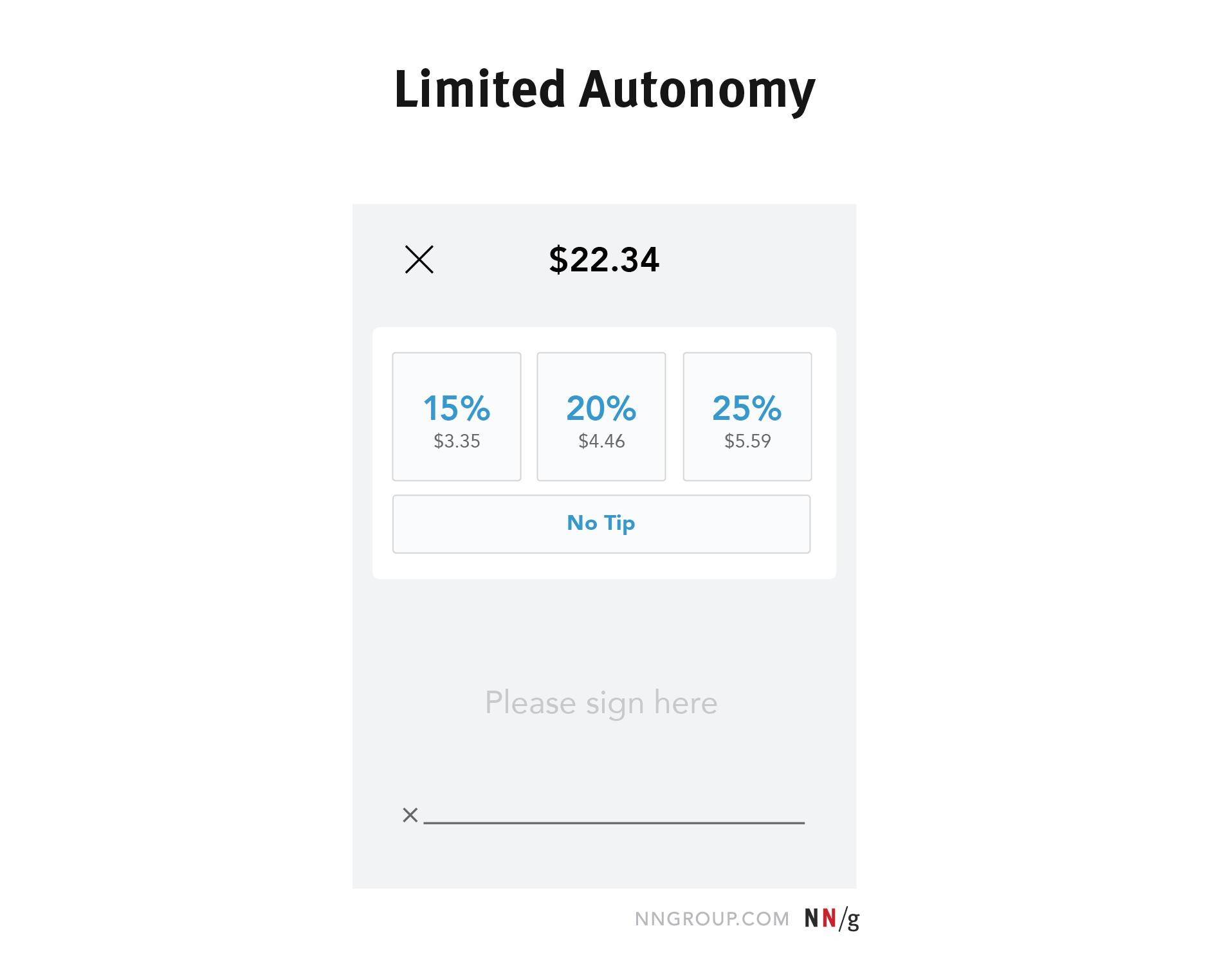
In this case, the commonly used tip amounts (No tip, 15%, 20%, or 25%) are undoubtedly helpful shortcuts for customers who don’t want to do any math. However, what if a customer could only afford a 5% tip? Or would like to pay a tip more generous than 25%? This design restricts those customers’ ability to tip in accordance with their personal preferences.
A simple addition could give customers complete autonomy while still providing helpful suggestions:
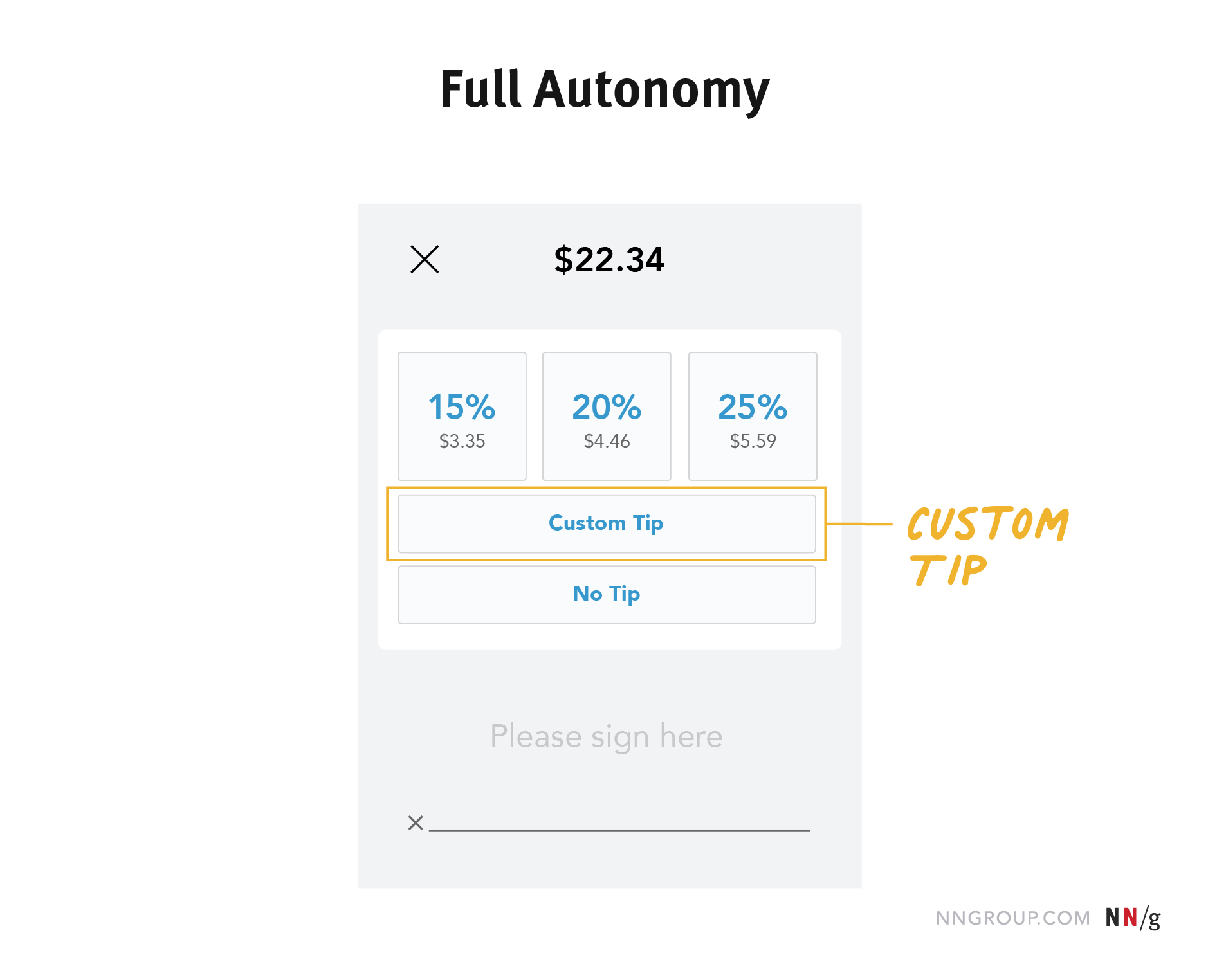
Providing the custom-tip option changes little for the business, but allows customers to have complete autonomy. Increasing autonomy may not necessarily mean increasing the number of choice options, but rather giving users choices where they currently have none. Discovering where users would value more choice or autonomy is best determined by examining various use cases and conducting your own user research. Consider conducting a few exploratory interviews or usability tests to discover opportunities in your designs.
Two Helpful Tips
While it is important to provide choices in places where they add value for users, autonomy can be taken too far if people are overwhelmed by the number of choices or are forced to customize the interface before they begin using it. Here are two suggestions to help you find balance:
Stick to a Few Options
Generally, simplicity is better than more choices because the human mind has its limits. Giving no choices restricts autonomy, giving a few meaningful choices gives users control, but giving too many choices is overwhelming. Consider the limits of human-working memory when deciding how many options to give your users.
Provide Meaningful Defaults
We slow users down if we require them to customize everything before getting started. When a user opens a website or downloads an app, they are not purchasing a piece of IKEA furniture. They do not want to have to put all the pieces together themselves to start using the product. You need to choose basic defaults that benefit important user groups. For example, a weather app that shows your current location by default is useful (if users have the freedom to change it when desired), but a weather app that provides no data until a user manually adds a location is going to slow many people down.
Conclusion
UX design is all about empathizing with user needs and creating designs that meet those needs. We owe it to our users to treat them better than cattle. We will never be able to create one-size-fits-all designs that meet every user's needs without adaptation. Finding opportunities to let users make choices allows them to align our designs with personal preferences and priorities. You can try some of the following actions to increase autonomy for your users:
- Provide a few meaningful customizations.
- Increase scannability of digital copy.
- Allow users to choose when they interact with your content.