
No one wants to commit an error — in life or while using an application or website. Making a mistake — while a natural part of life and often an opportunity for learning — can cause damage, result in tedious extra work, and just make people feel flustered or ashamed for not knowing exactly how to do something.
It makes sense then that not one, but two of Jakob Nielsen’s 10 usability heuristics are devoted to errors:
- Heuristic #5 is error prevention. This guideline states that we should prevent problems from occurring by eliminating error-prone conditions or by providing a confirmation option before users commit to actions with serious consequences.
- Heuristic #9 is help users recognize, diagnose, and recover from errors. Error messages should be expressed in plain language, communicate the problem and a solution, and make use of visual styling that will help users notice them.
When designing digital experiences, prioritizing error prevention and recovery is a commendable and worthwhile strategy. But some well-meaning designs attempting to adhere to these heuristics take it too far, subjecting users to overly aggressive patterns that are frustrating and distracting rather than helpful.
Overly aggressive patterns for error prevention and recovery can be avoided by following these 2 guidelines:
- Avoid premature error messages: Display error messages only after the error has been made.
- Reserve error styling for errors only: Limit use of error-like visual treatments (e.g., red text, caution and warning symbols) for critical system-status messages that are meant to disrupt the users’ workflow.
This article provides examples and guidelines for avoiding these pitfalls.
#1: Avoid Premature Error Messages
Premature error messages are error messages that are presented by the system too early — before the user has reached a fair and reasonable point in the workflow to have truly committed an error or not.
Consider a user filling out a form — a common task on many websites and applications. Ideally, and when technical constraints allow, it’s best to inform users of any form errors in real time, as they are committed. But many form validation triggers are too impulsive, displaying error messages before the user has had a chance to finish filling in the field.
One such case is when a system displays an error message before the user is finished typing a value in a form field with a predetermined, correct format. The error message is displayed as soon as the user begins typing, even when they have not veered off course from the predetermined format. (In other words, typing a “2” in a phone number field should not trigger an error message; whereas displaying an error message as soon as a letter is typed in the phone-number field would be appropriate.)
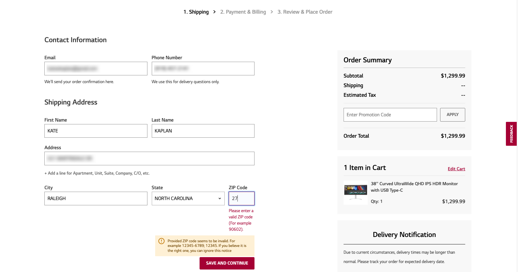
For example, LG’s checkout process displays a premature error message as soon as the user begins typing numbers into the ZIP code field and maintains that error message until the number of characters reaches the predetermined format. While displaying the error message inline (beside the field it is related to) is useful, the error message itself is unwarranted: no mistake has been made. (Adding to the noise, a second, redundant message is also triggered and displayed at the bottom of the form.)
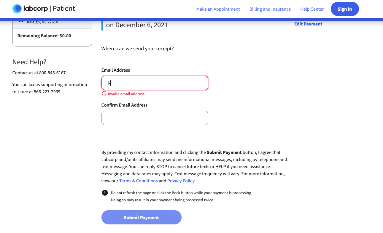
Labcorp (a medical-billing company) uses a similar pattern on its payment portal. As soon as a letter is typed into the email-address field, the error message Invalid email address immediately assaults the user.
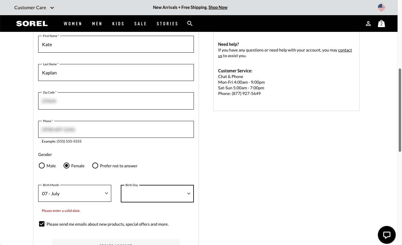
In another example, attempting to fill in birth date information during Sorel’s checkout process triggers the in-line message Please enter a valid date.
As a general rule of thumb, avoid displaying the error until the user has finished with the field and moved to the next field. Displaying error messages while the user types feels like an unwarranted scolding and can be irritating.
An even more frustrating variation of premature inline validation is the error message that appears before the user even begins typing. This type of error message is either triggered as soon as the user clicks into the field or, worse, appears in the default state of the form before any interaction takes place. In these cases, the user isn’t even given the chance to begin filling in the field before being admonished.
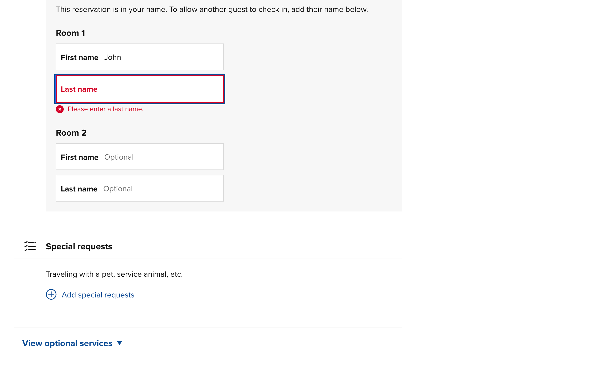
During the reservation process for Hilton’s Conrad New York hotel, clicking into the field for Last name causes the field to be outlined in red and triggers the inline error message Please enter a last name below the field. These error indicators would useful if the user skipped that field and attempted to submit the form, but they should not be triggered by simply clicking into the field. (To make matters worse, all fields contain the word “optional” before the user interacts with them, even the Last name field displaying the inline error message.)
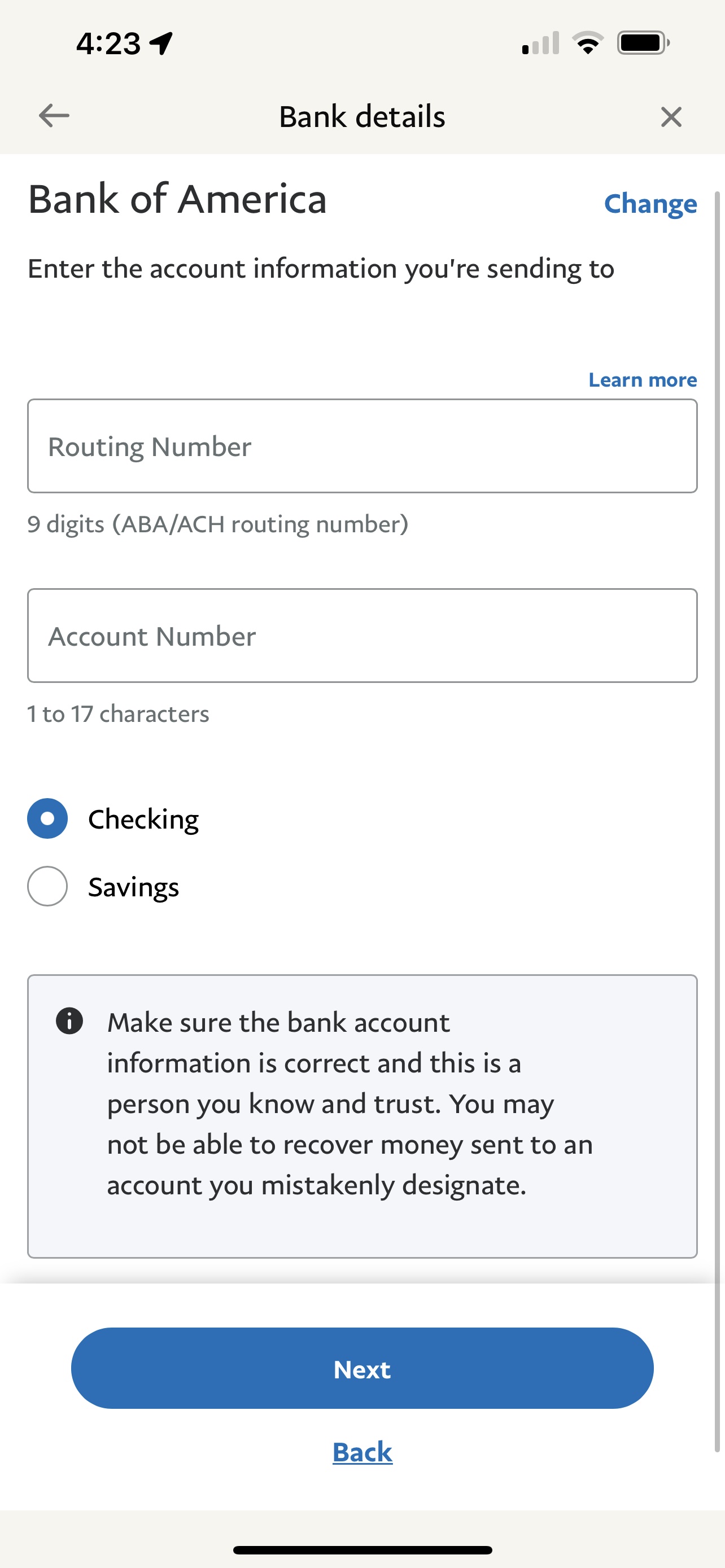
In an even more aggressive approach, the Xpress-pay patient-payment portal below displays the error message Amount cannot be blank before the user even interacts with the field. What’s more, in addition to the error message, there are 3 additional redundant indicators that the Amount field is required: an asterisk by the field label, an icon with an exclamation mark in the far right of the field, and a bold, red outline around the form field itself.
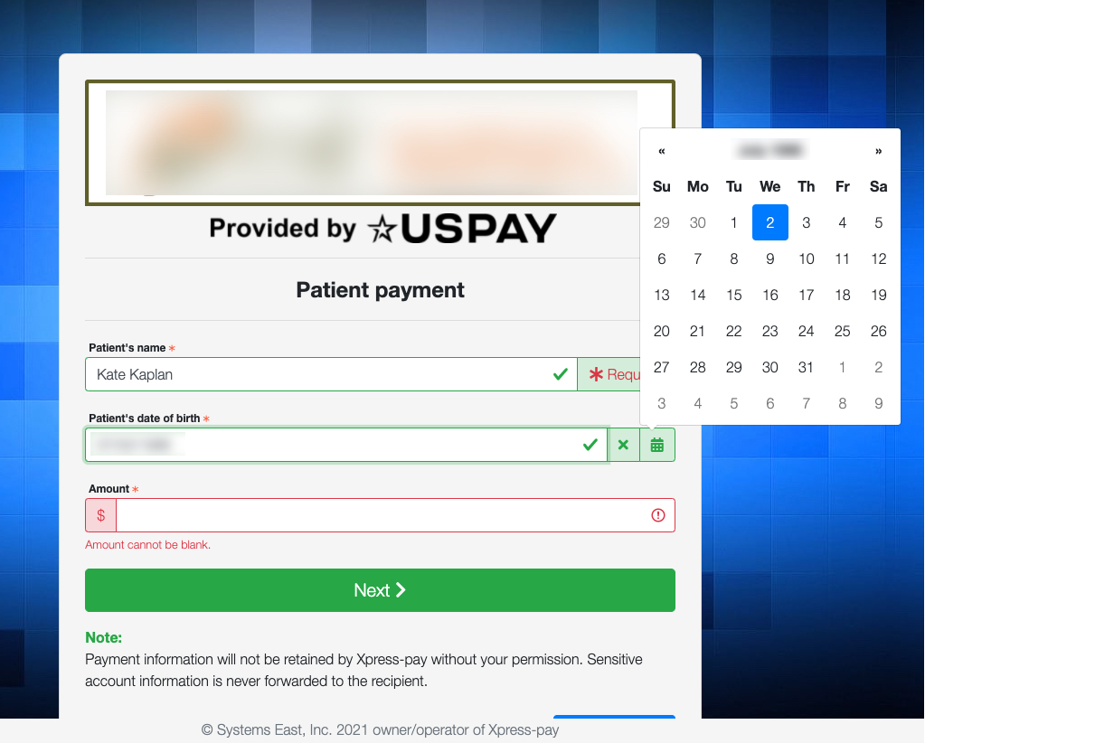
Of course, in any form, we recommend explicitly communicating which fields are required — but an asterisk is generally sufficient. Providing redundant or additional aggressively styled indicators that a field is required serves no end, and it feels combative. The inline, error message Amount cannot be blank would be useful if displayed after a user attempted to submit this form without filling in the required field. Displayed prematurely, it is overkill at best and annoying at worst.
#2: Reserve Error Styling for Errors Only
Another aggressive pattern is using error-like visual treatments in situations where errors have not actually occurred.
One such case is styling noncritical system-status messages with visual treatments better suited for warnings and errors.
Critical error messages and warnings should be intrusive. When errors display, the user is likely paying attention to the task at hand, not thinking about the error, so the error message should disrupt the work enough to gain the user’s attention. Therefore, intrusive styling for errors (e.g., red text or visual treatment, caution symbols, warning signs) makes sense.
But routine system-status messages that communicate noncritical information should not be disruptive. They should be discoverable, but not intrusive.
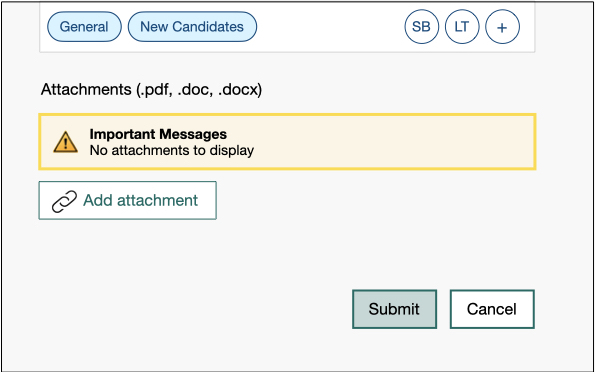
In the HR application below, the message There are no attachments to display is styled like a warning. The information seems more important than it really is, due to the yellow visual treatment and the caution symbol. Users who encounter this message will be disrupted, pausing to consider “Should there be an attachment?” (Because uploading an attachment is optional in this case, the answer is: It doesn’t matter.)
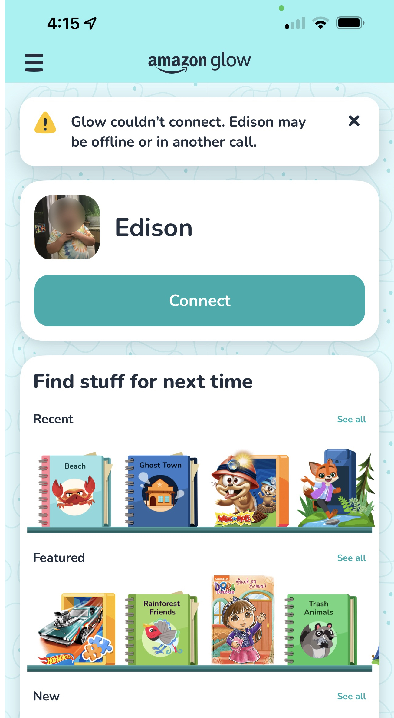
Yellow coloring and caution icons (such as an exclamation mark in a triangle) are best reserved for warnings in situations where failure or significant change has occurred or is likely to occur, but where irrevocable damage has not or will not occur. For example, the Amazon Glow application appropriately uses a yellow caution icon to inform the user that a call has failed.
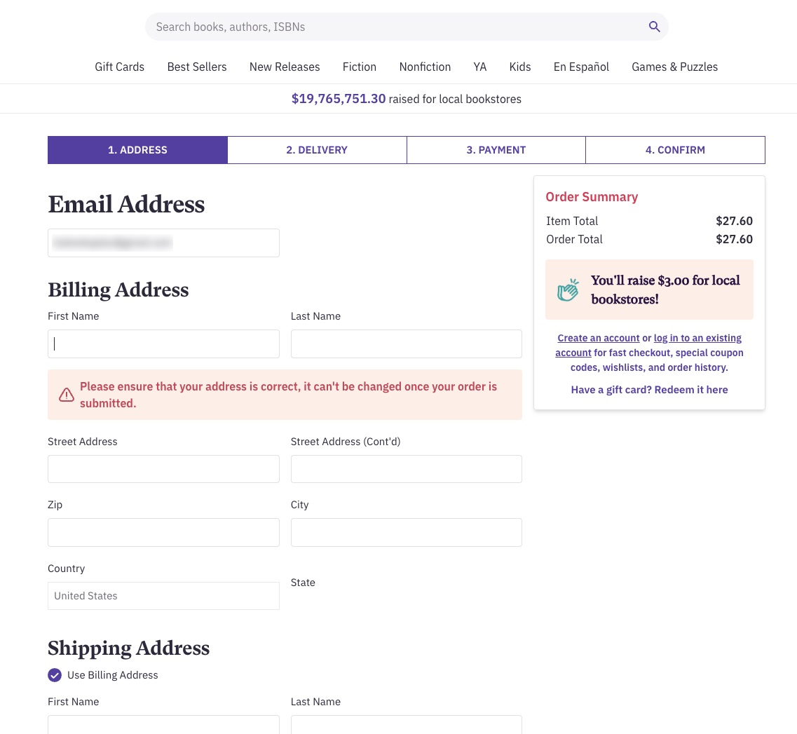
In another example, during a checkout process for the online bookstore Thrift Books, clicking into any form field under Billing Address triggers the message Please ensure that your address is correct, it can’t be changed once your order is submitted. While this information is useful, the red visual treatment and caution symbol make it look like an error message. The user must pause and process the message, doublechecking that an error has not occurred, while there is nothing to fix. Furthermore, the message introduces the question: Why can’t the address be changed? (This violates the heuristic of error recovery.)
Useful information that is not error related, such as this, is better presented without error-like visual treatment. For example, in Paypal’s mobile application, similar information is styled without red font or background coloring and with an information icon in place of the warning icon.
Conclusion
These aggressive strategies for error prevention and recovery are akin to standing over the shoulder of a user and shouting “YOU ARE DOING IT WRONG!” during a workflow. They can be perceived as offensive and cause undo frustration.
Bottom line: Let’s assist users, not admonish them.
Follow these guidelines to effectively support error prevention and recovery without making users feel assaulted or shamed:
- Wait until a user moves on from a field to display an error message related to an appropriate format (e.g., ZIP code, email address).
- Provide any constraints upfront; do not wait until the user begins typing or attempts to submit the entry.
- Use an asterisk to mark required fields or annotate required fields with the word required. Do not overload the user with multiple indicators (e.g., asterisk and red outlined field and inline validation message). Display additional elements if and after the user attempts to submit a form or page without filling in required fields.
- Reserve error-like visual treatments (e.g., red text, caution, and warning symbols) for critical system-status messages that are meant to disrupt the users’ workflow.


