

Dark mode is more popular than ever. You might even think it’s essential — at least if you were to read many of the web-design articles devoted to the topic. However, it takes valuable time and resources to fully support dark mode and “wear it well” because most designs are built in light mode first. To understand how much dark mode impacts users, we recently conducted a survey and some mobile usability-testing sessions in dark mode on mobile.
Why People Say They Use Dark Mode
In a recent survey of 115 mobile users asking what mode they generally have their mobile device in, roughly 1/3 said dark mode, 1/3 said light mode, and 1/3 said a combination of both. The argument that dark mode improves the user experience (and accessibility in some cases) always seems to circle back to the same few reasons, mentioned by users, designers, and developers alike:
- Reduced eye strain
- Battery savings
- Aesthetic appeal
- Improved accessibility for those with visual impairments (e.g., cataracts)
Let’s take a closer look at the commonly cited reasons for supporting and using dark mode.
Reduced Eye Strain
Reducing eye strain is the most common reason users with normal vision mention for using dark mode. As one research participant put it, “My eyes have always been very sensitive to bright lights. So ideally, I use dark mode on everything I can. [...] I don't think I can go back to normal. [I have] a lot less eye strain. I don't think I'm getting headaches as much […]”
While dark mode is not guaranteed to reduce headaches, this belief is widespread and motivates many users to permanently set their devices to dark mode.
Dark mode does slightly reduce the amount of light being taken in by the retina and might feel easier on the eyes during a single session — particularly in dark environments. However, some research has failed to find a significant difference in reported measures of eye strain and headaches when participants complete tasks in both light mode and dark mode.
One study compared participants’ levels of eye fatigue while reading passages in both dark and light modes within an immersive virtual reality (VR) headset. This setup allowed the researchers to control all lighting conditions and isolate the effects of the dark and light modes better than simply having participants look at screens in a brightly lit room. The researchers found that dark mode was best at reducing eye fatigue when the entire virtual environment was dimly lit, yet dark mode's advantage over a dimly lit light mode was still very small. It seems that the brightness level of the screen and surrounding environment make as much of an impact on eye fatigue as the color of the design.
Battery Savings
Another widespread notion is that enabling dark mode in the smartphone’s operating-system settings will automatically save battery across the board (similar to Low-power mode or Battery-saver mode).
When asked why they use dark mode, some survey respondents commented, “[dark mode] uses less battery than light mode” or “to save battery power.” Most users are likely to switch dark mode on in the operating-system settings, assuming they are enjoying the maximum battery-saving benefits dark mode has to offer across the device (whether individual designs support dark mode or not), and do not think about it again. This is because most users do not fully understand how the process works.
The truth is that dark mode can save battery only on devices with OLED (Organic Light-Emitting Diode) displays. As of 2023, roughly half of smartphones being produced use an OLED display. For reference, the first iPhone to use an OLED display was the iPhone X, which was released in 2017. OLED displays control each pixel individually and send only as much power to each one as needed at any given time. This means that, when portions of a design use dark colors, those pixels can use less power than those displaying brighter colors. Pixels displaying pure black (#000000) can be turned off completely and save the most power.
A study at Purdue University found an average of 67% reduction in power consumption by using dark mode when the screen brightness was at 100%. However, at only 30% screen brightness, the average power savings from using dark mode dropped to only 14%. In other words, screen brightness is as important as the display mode when it comes to battery consumption.
Designs using many images, videos, graphics, or other content that are the same in dark and light modes have the least capacity to save battery life.

Aesthetic Appeal
Many people simply like the way dark mode looks. Some survey respondents made comments such as, "it’s more visually appealing to me,” “I like the look of the dark screen,” and “dark mode is way cooler.”
Some designs are even built in dark mode and do not allow users to transition to light mode. In most of these cases, building in dark mode first is an aesthetic choice; it does not improve usability. For example, Spotify opted for permanent dark mode after users seemed to prefer it over a light-mode aesthetic. Those overseeing this design choice at Spotify compared the app’s experience to a movie theater. They emphasized that the less important UI elements can fade into the dark background to prioritize the colorful imagery and album art — just as a dark theater does not detract from the movie on the screen. Similar logic seems to guide the designs of many video-streaming applications such as Netflix, Hulu, Disney+, Peacock, Kanopy, Max, and Amazon Prime Video — none of which can be switched into light mode.
The aesthetic-usability effect predicts that, when designs are seen as attractive, people will assume that they are easier to use. One participant commented, “I also like the aesthetic of the dark mode. It makes everything seem more modern and easier to use.” However, such comments are not reason enough to build all designs in dark mode first. Aesthetically pleasing visual design cannot make up for poor usability. The fundamentals of usability have very little to do with light mode and dark mode. If you are skeptical, try conducting a few usability testing sessions using the same tasks in light mode and dark mode on your own or a competitor’s application. It’s unlikely that the color scheme will be the source of the biggest usability problems.
Improved Accessibility for Those with Visual Impairments
Over time, various research studies have shown that dark mode can benefit individuals with cloudy-ocular-media conditions, such as cataracts. In such disorders, the various transparent media in the eye (e.g., lens) reflect light in a fuzzier manner and, when there is a lot of light, it is harder for the eye to focus.
The bottom line is: for people with visual impairments, it’s best not to enforce either display mode and, instead, respect their system-wide choice.
So, Should We Support Dark Mode?
It’s debatable how much a design team who is trying to prioritize time and stretch a budget should worry about arguably reduced eye strain or minimal battery savings for users.
However, it is not debatable that many users like the dark mode aesthetic, which might be reason enough to support it. (Just not at the expense of fixing real usability issues!) Additionally, the benefits for those with visual impairments are also important and should be discussed as part of larger accessibility considerations within the organization. Aesthetic appeal and improved accessibility are the strongest arguments for supporting dark mode.
What Users Expect Regarding Dark Mode
Users think about dark mode at the operating-system level, not at the individual application level. Once they’ve set their device to dark mode in the system settings, they generally assume that all applications and websites will automatically display in dark mode — that is, they basically expect to see a lot more black than white. They do not expect to have to enable dark mode within individual applications.
In users’ minds, dark mode seems to be a bit like screen brightness: dimming the phone’s screen brightness affects all applications and websites in the same way. Many users don’t realize that the system does not automatically override application-level settings and force dark mode everywhere.
Dark-mode fans in our study barely seemed to notice when designs did not support dark mode. They did not generally comment about the fact that some designs were bright white while their phone was in dark mode and certainly didn’t show signs of abandoning these websites or applications. Also, interestingly, at the end of our study sessions, participants struggled to recall whether they had encountered any designs which did not support dark mode.
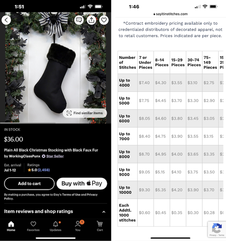
For example, one usability-testing participant spent a few minutes looking for Christmas stockings on Etsy in full dark mode (see image below). Once he found a stocking he liked, he visited a separate website — which did not support dark mode — to estimate the cost of having the stockings embroidered. When he opened the embroidery website, he did not comment about the fact that the website was not in dark mode, nor did he hesitate in any way before using it. Roughly 10 minutes later, when asked whether any of the websites or applications he had used during the session had not supported dark mode, he responded, “I don’t think any of them [didn’t], I think all of them were dark mode.” When we reminded him of the embroidery website, he commented, “I feel as though there are certain things that I would put more urgency of having dark mode on … I feel as though [this] random, offhanded website, I really don’t care about.”
Unfortunately, we weren't able to observe participants in their natural environments using designs for long periods, such as reading at night in a dark room. We also acknowledge that a user-testing environment sometimes leads people to deviate from their normal behaviors and priorities. However, we would be very surprised to see users avoid or abandon a design because it does not support dark mode.
Dark Mode Issues to Avoid
It can be fairly simple to render a design in dark mode — for example, by using a plugin in your favorite design tool. However, while a tool might do most of the heavy lifting, it will never be as thorough as a real designer. You must check for common issues. The following examples highlight small ways in which dark mode can be problematic or simply tacky when done carelessly.
Graphics
Graphics need to look equally good in dark mode and light mode. It’s problematic if portions of the graphic become invisible against a dark background, or if nontransparent backgrounds are revealed. It’s better to use an SVG, WEBP, or a PNG than a JPG to support transparency.
Overlays (Creating Depth)
The most common method for creating the illusion that one UI element is layered over another is to use shadows that signal depth. This includes the darkened, translucent scrims (or “grayed-out” sections) used to signal the difference between a modal and a nonmodal overlay.
A white page element on a white background can be okay in light mode because the use of darker shadows can create the necessary depth to understand the interface. However, placing a black element on a black background can be problematic because a lighter “shadow” does not create the same layered effect — it makes the top element look like it’s glowing.
The best way to create depth with layered dark elements is to use the darkest colors for the page elements on the bottom, and the lightest colors for the elements on top (or “closest” to the user). For example, placing a gray page element on a black background is visually interpreted the same way a drop shadow is with white on white.
Legibility
Three main issues make it difficult to read in dark mode:
- Overly thin fonts
- Overly thick fonts
- Poor color contrast
Thin fonts can be easily “swallowed up” by a dark background — particularly for individuals with poor eyesight. This is true even of pure white fonts on pure black backgrounds.
Thick (or bolded) fonts can seem to “bleed” into the background as the user tries to read. Generally, light fonts on dark backgrounds tend to appear bolder than dark fonts with the same font weight on light backgrounds.
Fonts without sufficient color contrast with the background are obviously difficult to see and read in both dark and light modes.
To maintain the legibility of text in logos, consider adding strokes, glows, shadows, or gradients that will be visible in dark mode but invisible in light mode. This strategy can be especially helpful in email communications, because email clients may display your messages in both light and dark modes. Even though you may be able to request that the email client use two different logo versions for dark and light mode, there is no guarantee that all email clients will comply.
When choosing the color of fonts in dark mode, use one color with different levels of opacity. This allows you to accommodate different background colors throughout the interface. Using one color consistently at 100% opacity (such as a light gray) will look good on some backgrounds, and poor on others.
Color Contrast
Highly saturated colors on dark backgrounds have poor visibility and do not comply with accessibility guidelines, such as the WCAG 2 requirement of a minimum contrast ratio of 4.5:1 for normal text and 3:1 for large text.
Channel Inconsistency
It is common for native mobile applications to provide links to web pages. These pages are sometimes displayed in in-app browsers or in the phone’s browser application. In many cases, the native application supports dark mode, yet the website is shown in light mode. It is ironic when product teams go to great lengths to support dark mode throughout the application, only to shove users “into the light.”
Page Structure
Dividers or visual section markers, such as cards, should be seen equally well in dark and light modes. Thin, gray dividers are easily swallowed up on very dark backgrounds. Missing dividers and invisible cards undermine the Gestalt principle of common regions, making it more difficult to understand how a page is organized.
While outlining elements on the page to visually separate them is often sufficient in light mode, in dark mode, it can be helpful to use slight color differentiation to distinguish a card from the background.
Floating Components
When a page element is meant to stand out from the background and “float,” it should be equally distinctive in light mode and dark mode.

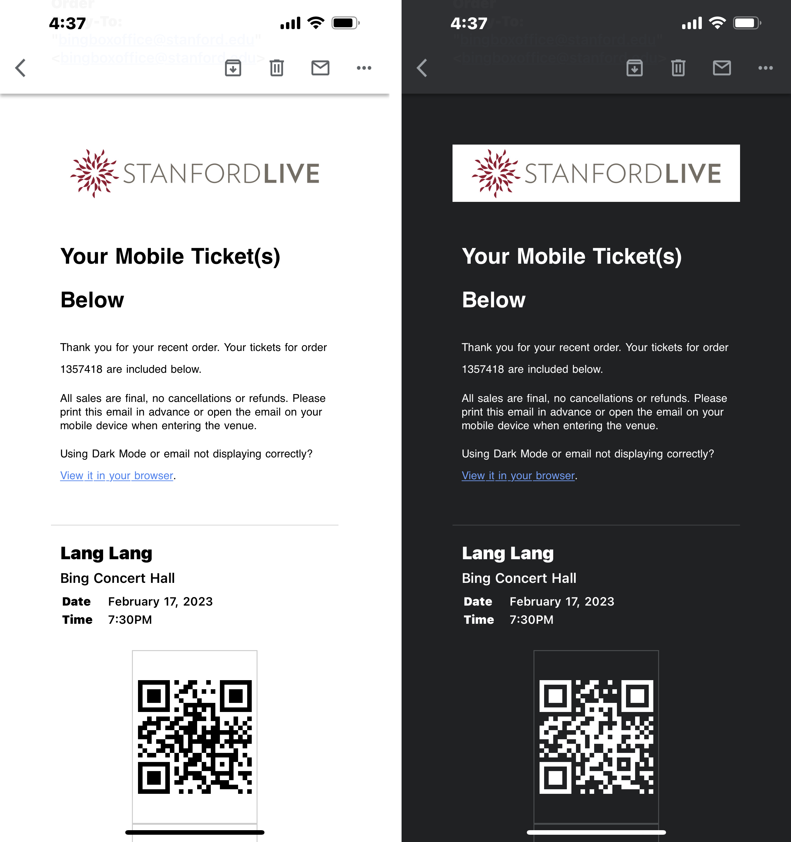
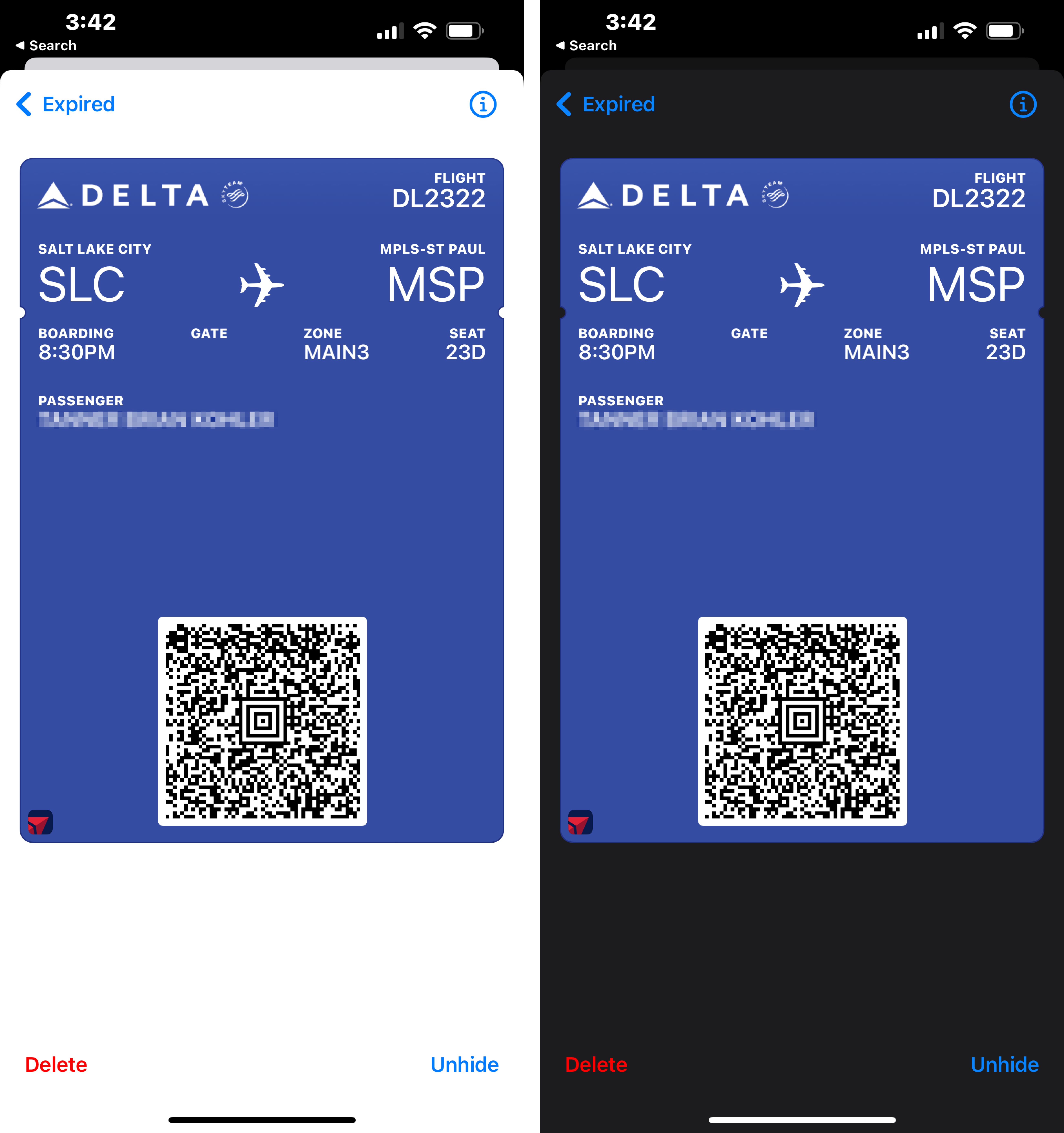
Scannable Codes
Not all scanning devices are as sophisticated as phone cameras, and many cannot process scannable codes (such as QR codes or barcodes) when they are inverted in dark mode. Many scanning devices expect a dark foreground on a light background. It's best to present scannable codes in formats that will not render differently in light mode and dark mode (such as a PNG).
Dark Mode: Best Practices
Dark mode is a nice-to-have, not necessarily a need-to-have in most cases. There will always be users who are grateful when dark mode is supported — particularly when they use a design frequently, for long periods, and in dark conditions. However, dark mode should not take priority over ensuring basic usability just because it is popular and preferred by many users and designers.
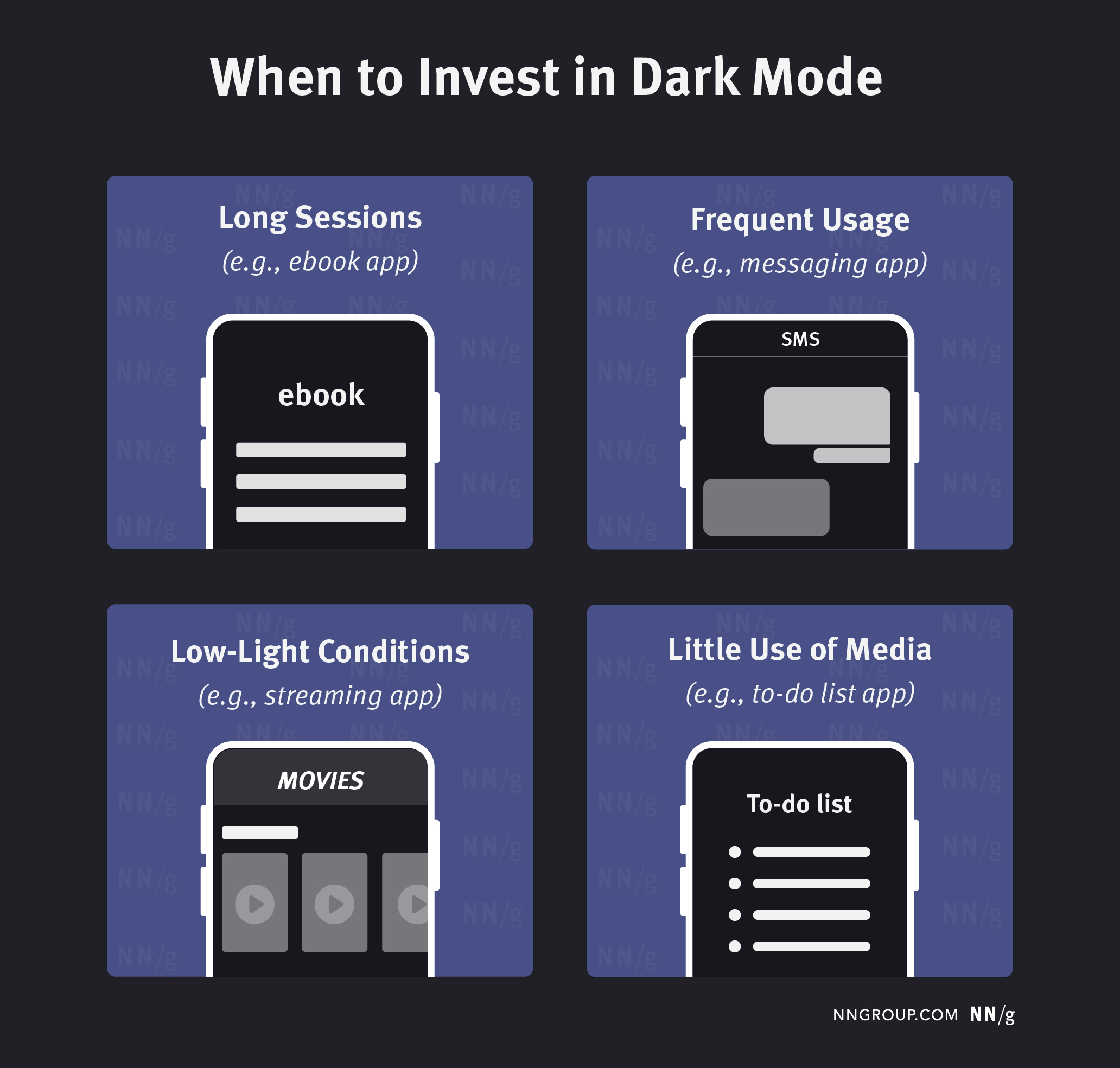
Investing in dark mode is most important in the following circumstances:
- Long sessions (e.g., news application, ebook reader): The longer users typically spend looking at your design in one sitting, the greater the chance of eye strain and excessive battery consumption.
- Frequent usage (e.g., messaging app): The more frequently users engage with the design, the more time they will spend looking at it and the more likely it is that they will use it in dark conditions.
- Low-light conditions (e.g., movie-streaming app, white-noise app): The more users are likely to use the design in the dark, the more bothersome it will be if they are subjected to the blast of white screens while the pupils are dilated.
- Little use of media (e.g., not social-media apps): Media such as photos and videos look identical in light and dark modes. The more such media you have, the less difference dark mode makes.
If you decide to support dark mode, here are a few recommendations:
- Mirror the device’s operating system dark mode settings by default. If designs require users to manually enable dark mode at the application level, many users will not realize that dark mode is available, or they will feel annoyed that they must enable dark mode twice (once on the device, and once in the application). Providing a display mode switch within the application is fine, but know that users will not look for it in most applications (except, perhaps, those like book readers or video-streaming platforms, which are frequently used in the dark).
- Test your design in dark mode to make sure that all design elements and illustrations are clearly visible. Use transparency for your image backgrounds and pay particular attention to floating elements and overlays. Do not trust a plugin to do everything perfectly.
- Check your email communications. While you might have control of your own website and application, you do not always have full control over how your emails are displayed within an email client. We saw many instances when an application did dark mode well, but fonts, logos, and images did not display well in emails. Even if you do not currently support dark mode, check how these elements will display if users use dark mode in their email.
References
Dash, P., & Hu, Y. C. (2021, June). How much battery does dark mode save? An accurate OLED display power profiler for modern smartphones. In Proceedings of the 19th Annual International Conference on Mobile Systems, Applications, and Services (pp. 323-335).
Eisfeld, H., & Kristallovich, F. (2020). The rise of dark mode: A qualitative study of an emerging user interface design trend.
Erickson, A., Kim, K., Bruder, G., & Welch, G. F. (2020, March). Effects of dark mode graphics on visual acuity and fatigue with virtual reality head-mounted displays. In 2020 IEEE Conference on virtual reality and 3D user interfaces (VR) (pp. 434-442). IEEE.


