


Layout Grids in Figma

As an aspiring designer, one of the first proper books I purchased was Josef Müller-Brockmann's Grid Systems in Graphic Design. The book was fascinating to me because it helped codify the many ways a grid could provide structure and consistency, improve readability, and create emphasis and hierarchy in design. It's the first text to formalize many of these concepts into such concise words, and it's probably one of the most important tomes on the topic. In the design world, there's a common joke that you can tell how long someone has been a designer by the color of the spine of their Müller-Brockmann copy.
By carefully constructing a grid that's suitable to your content, you can define structure, hierarchy, and rhythm in your design. When done right, the scaffolding of grids can remove the guess work from many aspects of your process. Different types of grids can also help you establish a rational approach to type scales, positioning, sizing and spacing.
Although these principles originated in the relatively "rigid" medium of print, I remain convinced now more than ever of their importance. In the era of screen design, grids can be instrumental in establishing consistency across a wide variety of device and viewport sizes, especially for teams that need to create a cohesive design experience for multiple products and platforms.
Despite all the benefits of grid systems, for a long time I struggled to configure grids effectively in my own design process—they often didn't provide me with the flexibility I wanted (in other design tools). So you can imagine my happiness when I discovered how layout grids worked in Figma. Figma offered added functionality like styles that removed much of the friction I had previously experienced.
In Figma, you can apply more than one grid as a property to any frame (and independently toggle its visibility). That was a game changer, and quickly became an essential part of my workflow. In speaking with other Figma users, I learned that many still hadn't had the lightbulb moment I did in uncovering the useful capabilities of this feature. So, I thought I'd share a few ways that I use layout grids to speed up my design process, from resizing frames to visualizing spacing and padding.
Layout grid basics
Before I dive into the more advanced use cases, let's cover the basics of where and how you apply grids. If you're a grid pro, skip ahead to the next section.
Apply a layout grid to any frame - Layout grids can only be applied to frames; this means you can apply them to any top level frames sized for a device (desktop, mobile, tablet), frames nested within your design, or even frames inside your components.
Multiple grids on a frame - You can add as many different layout grids to a frame. This means you could stack different types of grids on a single frame. Each of those grids can also be selected and pasted onto other frames since they are applied like other properties in the right hand sidebar.
Grid appearance - You can control the appearance (color and opacity) of each grid so they are easily differentiated.
Types of grids
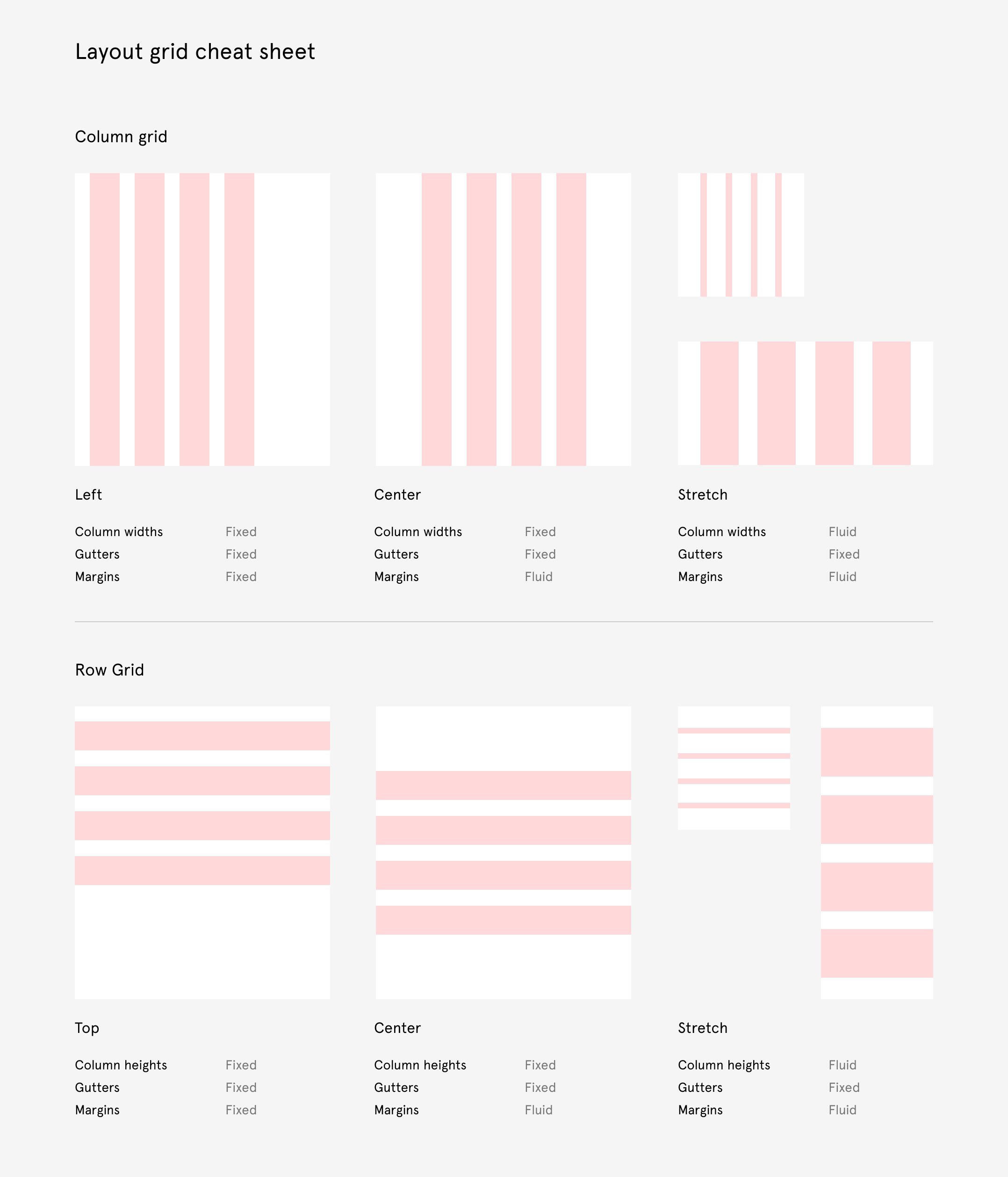
There are three different forms of grids to choose from: grid (uniform grid), column, and row. Uniform grids create a series of uniformly spaced fields across your frame (imagine a sheet grid paper) at whatever size you specify. The others have a few more options to create columns and rows. Within column and row grids you can also control their position and scaling behavior. We cover most of this in our help center article, so we won't go into all the details, but here is quick cheatsheet to highlight some of the key differences.

Baseline grids
A baseline grid is one that's established from the baselines your typography sits on. These appear as visual aids in your design spanning the width of your design and repeating vertically at an even internal. What that interval is, is largely dependent on your typography scales and line-heights. In many 8pt grid systems, a 4pt baseline is used. This basic unit makes the math easy and scalable as you start to setup different type sizes and line-height combinations.
Using one can help you align one piece of type to another while giving you a unit of measure to help establish the sizing and spacing of other elements. In many design systems, such as Google's Material Design, the baseline grid is a foundational part of defining type size and line-height parings, as well as spacing for margins and padding.
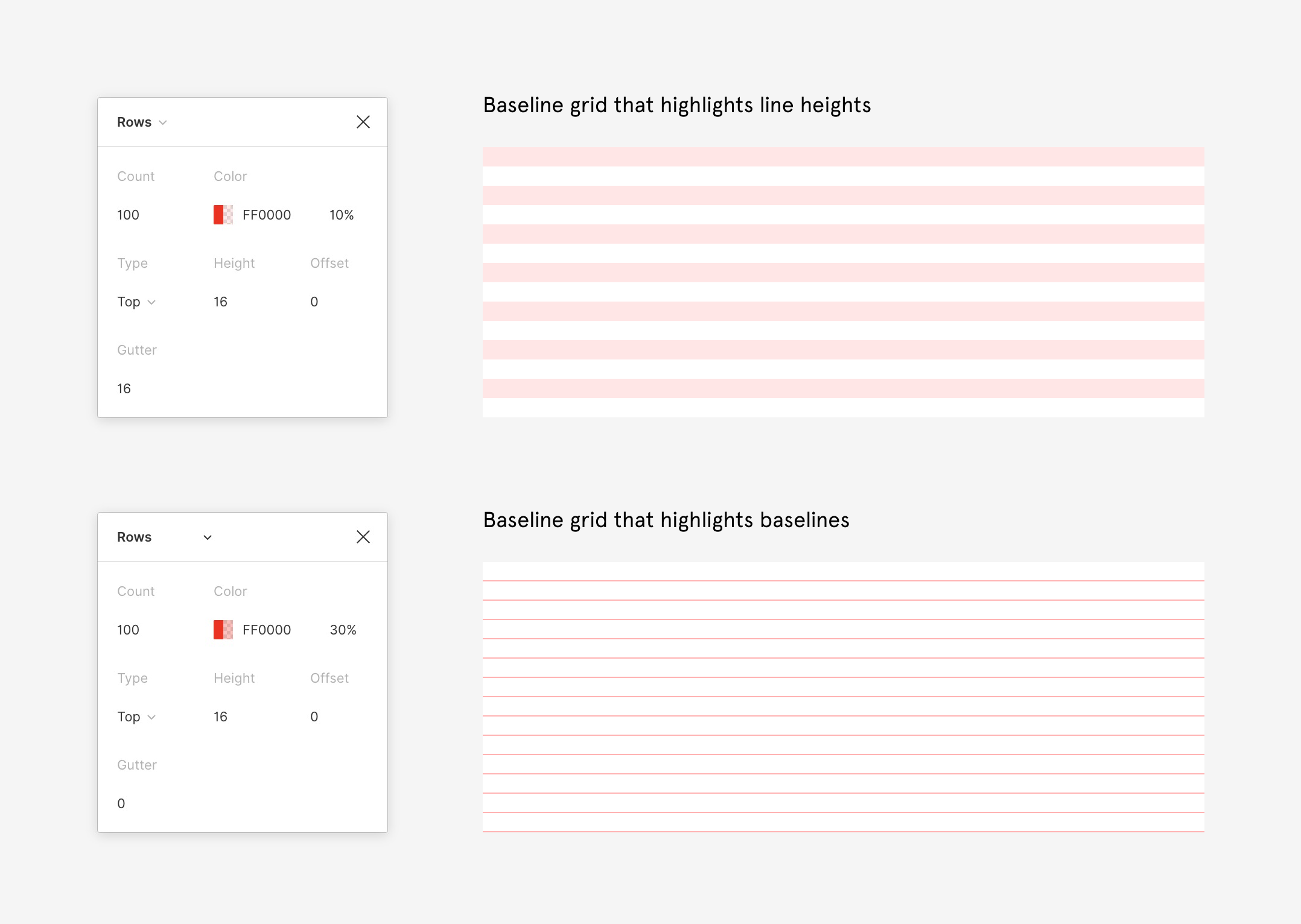
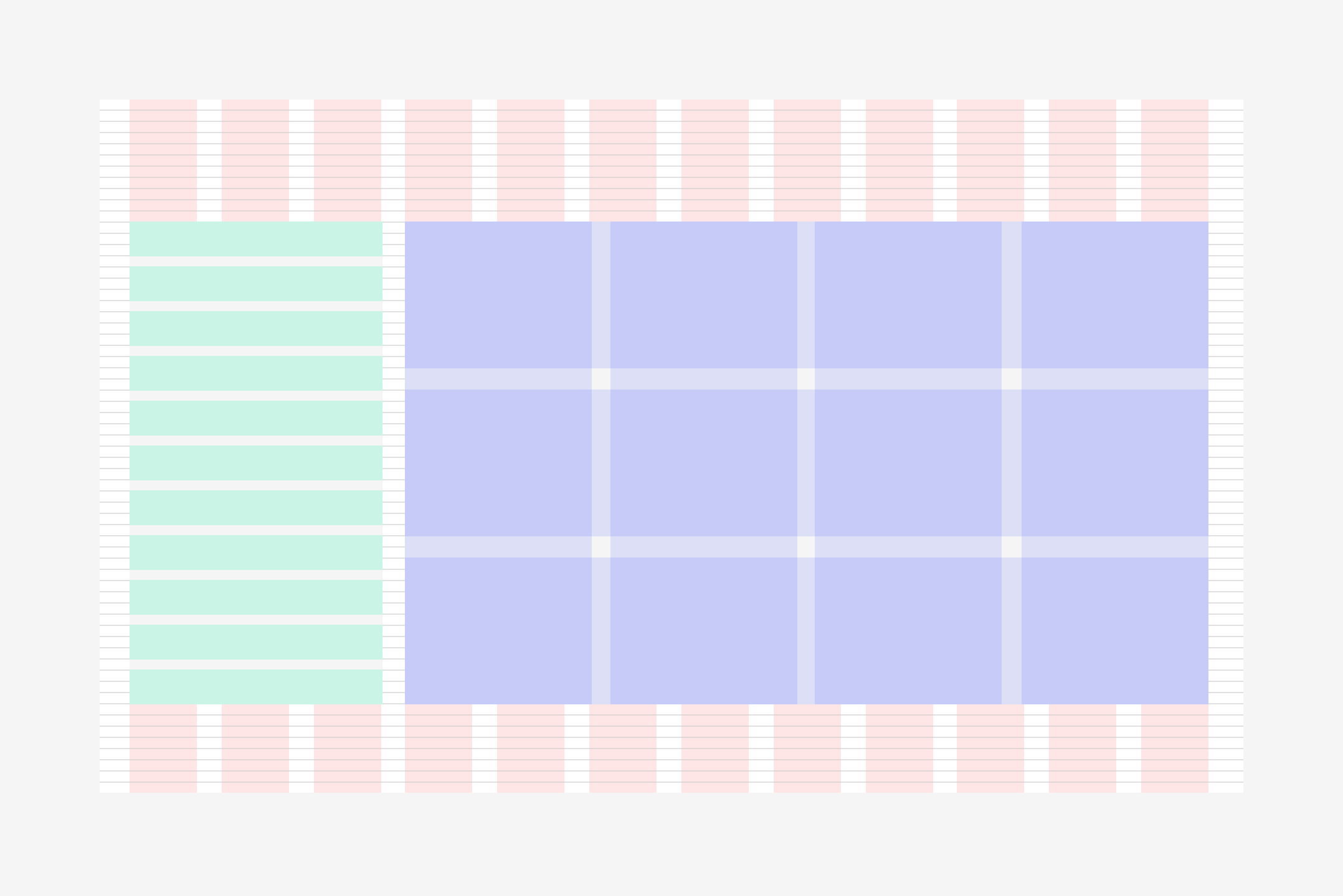
If you've ever wanted to create a baseline grid in Figma, there are a couple of different ways to do so using a row grid.
- A grid that is built around line-heights
- A grid that is built around the actual baseline that text sits on
Since you have some control over the appearance of your grids, you can create the right kind of grid for either approach. By using a row grid, with the type set to "Top", we can create the foundation for a baseline grid. Usually it's a good idea to set the row count to a high number that will allow you to accommodate longer scrolling frames. From there you can choose to highlight alternating rows, or thin lines using a combination of the height, gutter, and color properties as illustrated below.

Nested grids
Unlike other tools, with Figma you won't be limited to a single grid at the "artboard" level. Since you can apply a grid to any frame, this means you can apply them to frames that are nested within your design. So feel free to get all Matryoshka on your design and create grids within grids within grids to your hearts content.
Once you begin to leverage this, there are infinite ways to use grids as visual aids within particular areas of your design. You can help differentiate among them by specifying the color and opacity of each grid.

Additional tips on layout grids
Using constraints with layout grids
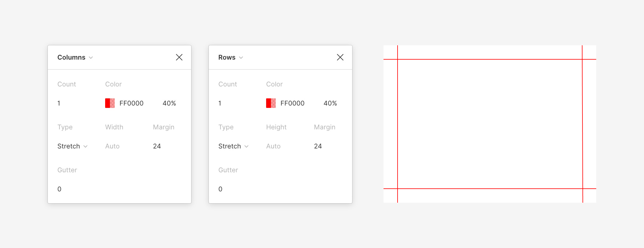
When you apply constraints in Figma, they help you define the resizing behavior of elements in relationship to their parent frame. So if you wanted an element to stay pinned to the top right of a frame (like a close button), applying constraints will ensure that the element maintains its distance from the top and right without changing its size as the frame grows or contracts.
In contrast, when you apply constraints to an element inside a frame that has a layout grid, your constraints will be relative to their nearest column (instead of the boundaries of the parent frame). When used with stretch grids, this will allow your elements to stay fixed to columns or rows and maintain a fixed space (gutter) between them. It results in much more realistic scaling behavior, as you can see in the gif below.
By setting constraints appropriately, you can resize items relative to the layout grid, which helps you maintain fixed column gutters and margins.
Using the same method, we can add constraints to our previous example that highlighting nested frames (each with their own grids). This allows you to independently define the resizing behavior of specific areas within your design.
Once the grids and frames are set up, we can add elements to our design that can also resize relative to the grids on the parent frames.
Using grids to visualize padding
Sometimes you need to visualize padding to ensure content stays equidistant from the boundaries of an element. You can create grids to help with that by styling a column and a row grid with a single row/column, setting the gutters to 0 and the margin to your preferred spacing. If your design system has standardized spacing values for padding, you can quickly add these and apply them to frames or components within your design.

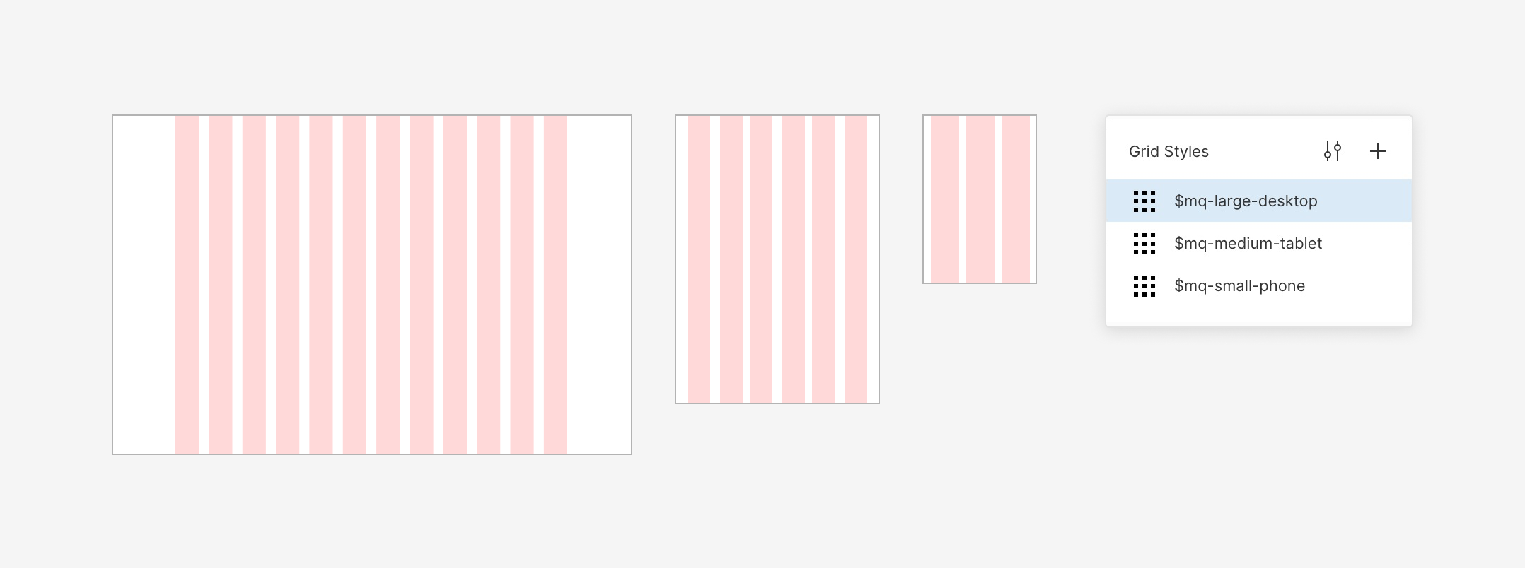
Sharing grids with styles
As you're creating grids, you might want to make different variations for layouts on different device sizes or other common use cases. To make it easier to apply those grids across frames, files and projects, you can combine several of them into a single grid style. That style, like other styles and components, can then be shared from a team library. Easy peasy.

That's all for today's quick hit on grids. I hope these tips uncover some of the lesser known ways to leverage layout grids in Figma, and we would love to see how you're using them. Time to channel your inner Müller-Brockmann and be sure to share your experiences with the Figma community on Spectrum.