

Creating coherence: How Spotify’s design system goes beyond platforms


Design Manager Juli Sombat sheds light on how a need for more cohesion led Spotify’s design systems team to take a cross-platform approach to components.
Illustrations by Andreas Samuelsson.
In 2019, when our leadership at Spotify unveiled their ambition to make audio content available and consistent to anyone on any device, our design team faced a significant challenge: Spotify would now be available across 45 unique platforms, and over 2,000 types of devices spread across 200 brands. This meant that someone could be jamming to their favorite tunes from their living room TV, continue the party in their car, and carry that into the work week with a “focus” playlist on their computer.
Our design approach wasn't just about ubiquitous coverage, it was about consistency. Wherever people tuned in, we wanted that experience to be as seamless and cohesive as possible. (And our customers noticed, too.) Ensuring that Spotify felt inherently “Spotify,” regardless of the medium, became our core focus. In my role as the design lead on our design systems team, Encore, I’ve had a front-row seat as our teams tackle the daunting task of keeping the experience unified. Components have been core to our strategy—rethinking how we approach them, all the way from scoping to execution.

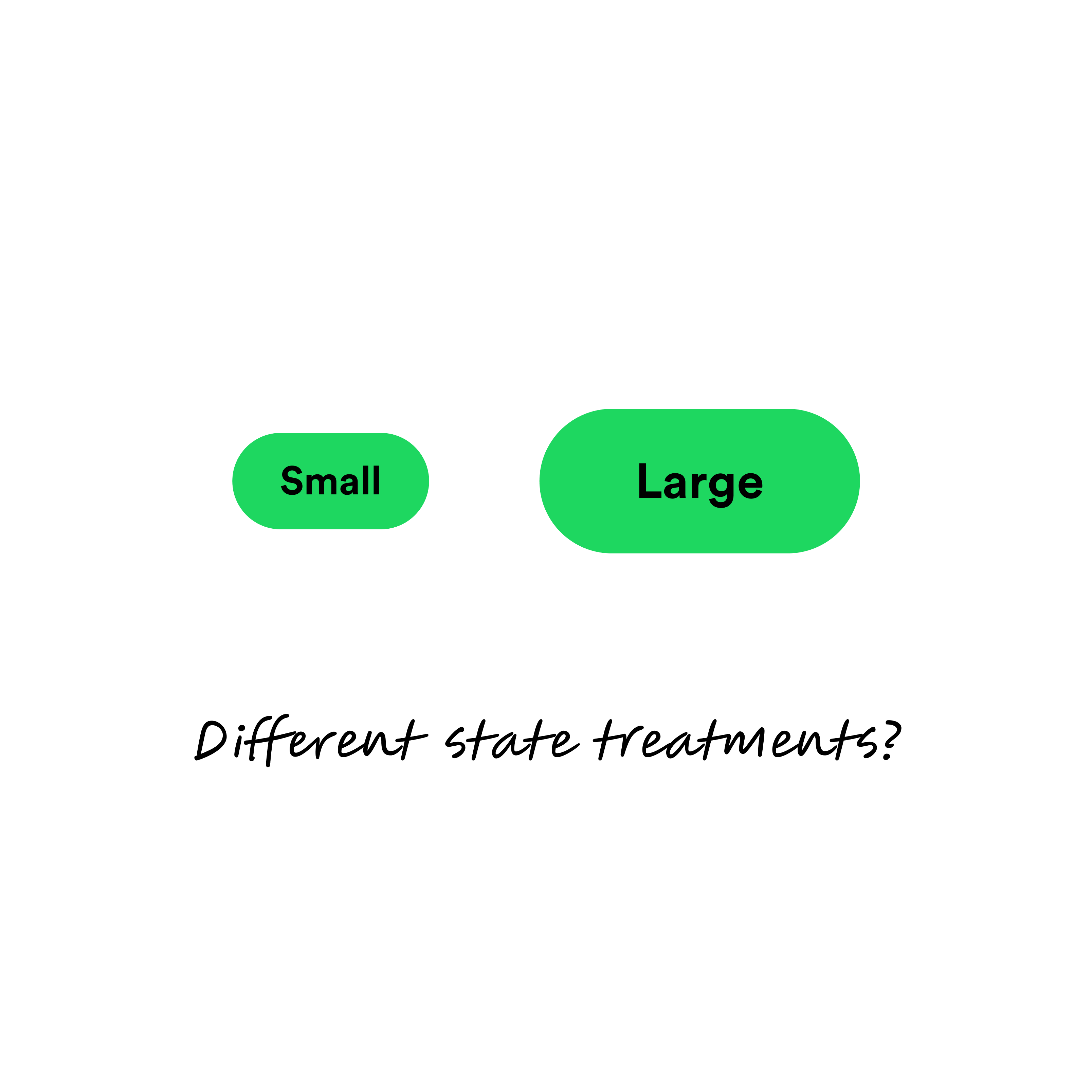
Before: Button components for Encore's Consumer Mobile system
Spotting the discrepancies: the birth of Encore
When we introduced our design system, Encore, in 2019, we broke it out into two key segments. Encore Consumer Mobile was incredibly flexible, designed for mobile-centric Spotify experiences. In essence, it acted as a vast catalog of ever-growing and evolving UI components. Meanwhile, Encore Web catered to a broader spectrum of web products. We adopted design tokens for foundational design decisions, such as color schemes and type styles. But, as our journey progressed, we recognized the need for more commonality between our subsystems.

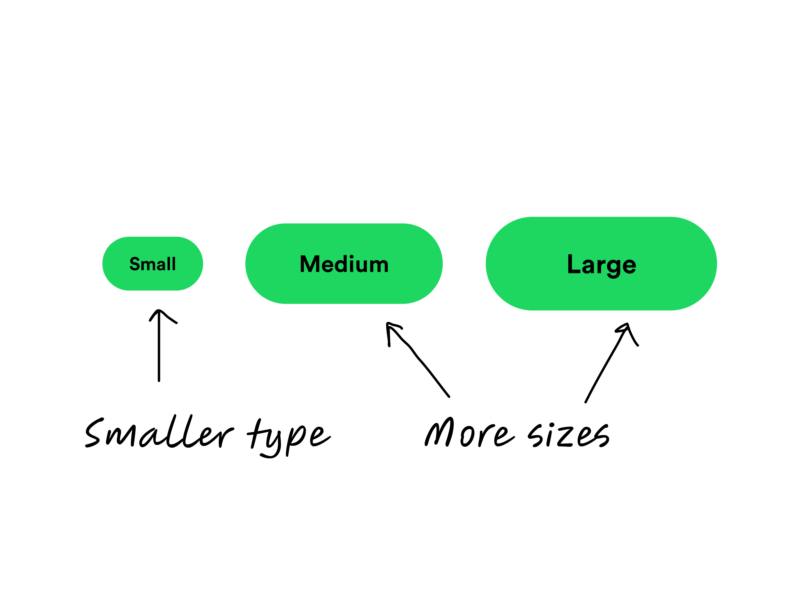
Before: Button components for Encore's Web system

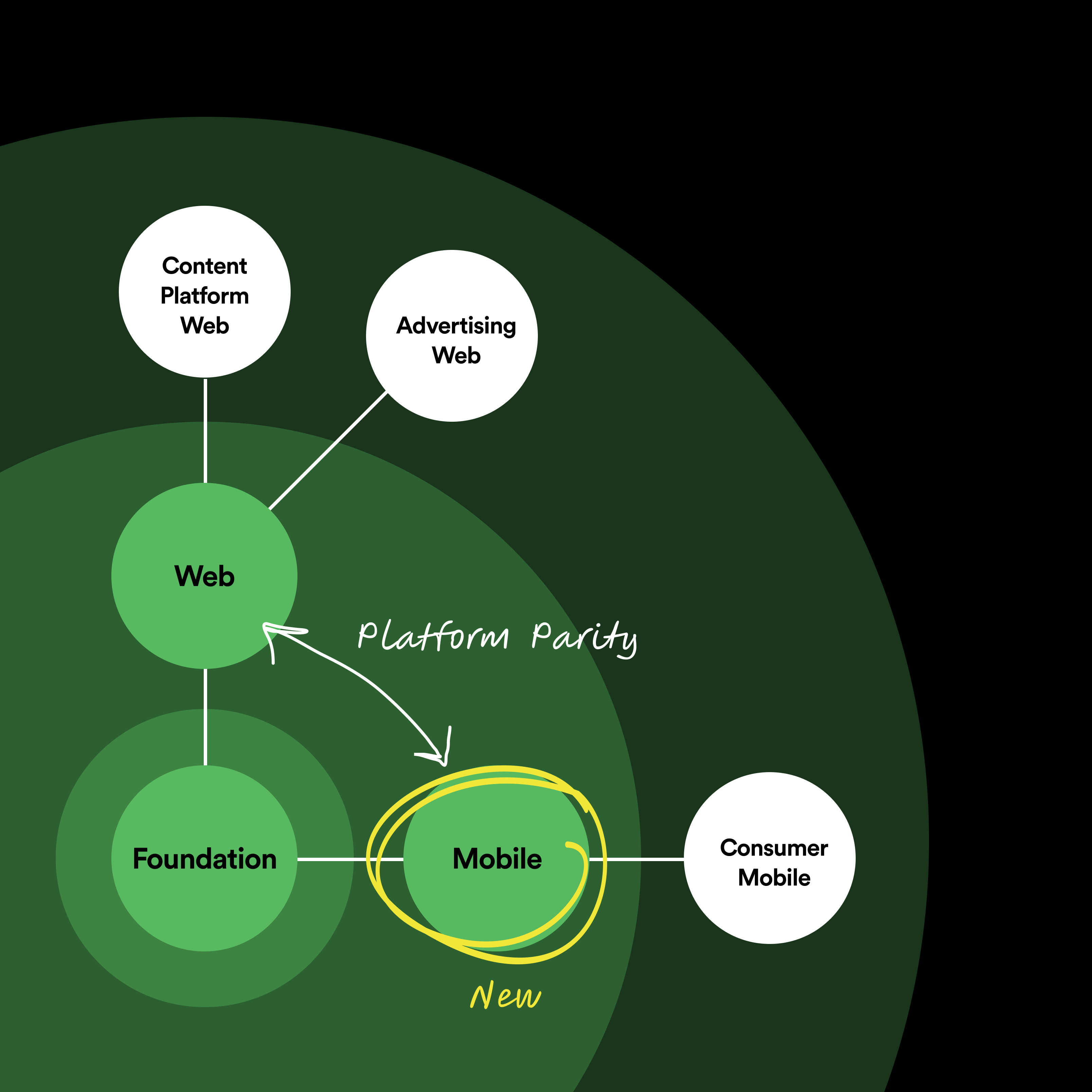
Encore is made up of two subsystems (Mobile and Web), which share a foundation of design decisions in order to build coherence across our platforms and products.
As Spotify grew, so too did our product teams’ appetite for more refined components. By 2022, it was evident that the pendulum had swung too far towards flexibility, and a recalibration was necessary. We assembled a specialized team with a sole purpose: creating reusable components for Encore Mobile. If we think of our various subsystems as radiating from our core foundational system, each increasingly specialized and divergent from that center, this new subsystem exists between Encore Consumer Mobile and that foundational system. In doing so, it creates something of a first line of defense, reducing the demand on Encore Consumer Mobile to provide every component themselves, while creating greater platform parity across the rest of our system. In collaboration with Encore Web, we began developing cross-platform components at the outset, as opposed to an afterthought.
The mechanics of cross-platform design
The art of crafting cross-platform components wasn’t entirely new ground. The traditional processes were still in place: design, based on research, followed by development. The major shift, however, was in the design phase. In this new way of working, we didn’t want to just design for one platform; we wanted to synchronize our designs across platforms to maintain cohesion.

At the same time, each platform has unique characteristics that we want to design for. So, how do you build a website that looks and feels the same as your mobile products or your TV experience, without losing those qualities? Generally, there are experts at designing for web and experts at mobile—and it’s very rare to find someone who’s an expert on both. Each person brings a knowledge set tailored to their respective domain.
So, how do you build a website that looks and feels the same as your mobile products or your TV experience, without losing their unique characteristics?
We start by getting everyone in the same room, and then our journey begins with thorough research. Teams from each platform—iOS, Android, and Web—delve deep into the intricacies of each component. Each representative is conducts an audit and diagrams out what’s unique to their surface. Desktop has more real estate; TV’s different because of the viewing distance; Watch requires all the information to be condensed.


From here, we come together and share context about naming conventions, platform specifications, and accessibility requirements so that we can align on what we should build. By pooling our findings, we craft what we call the component’s outline, which captures these decisions and lays the foundation for a more detailed design phase. The outline might include a glossary of terms, the anatomy of the component, or any variants we need to support.
The Encore team has been using variables in combination with the REST API to generate and update values when changes are made to their code source of truth.
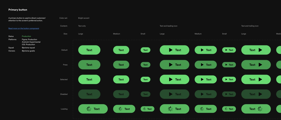
Take, for instance, our button component. When Encore was in its infancy, buttons varied widely across platforms. They had different size frameworks, interactions, padding, and used different increments in our type scale. But through rigorous collaboration, we developed a unified hierarchy: primary, secondary, and tertiary. We also defined a size framework and naming structure that we’ve used again and again—one that we were able to implement with variables. Today, Encore’s unified buttons boast a range of sizes, custom focus states (platform-dependent), and even usage guidelines.

Our research showed that many design systems are platform-agnostic, using a single design across all. In other cases, a system optimizes for a primary platform (like IBM’s Carbon for web). Other platforms aren’t as critical, if they’re supported at all. There are great examples too, like Lyft, whose article on building for parity was an inspiration to us.
Why cross-platform?
Danny Banks, a designer and front-end developer, spoke at the design systems conference Clarity in 2020 about the environments, ergonomics, and economics of building cross-platform design systems.
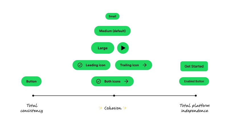
We see the pursuit of cohesion being the middle path between perfect consistency and total platform independence. We’ve also found a few key benefits to making design system decisions from a cross-platform perspective:
Cohesion
Adhering to this approach ensures a shared Spotify essence across platforms. While nuances do exist, the core experience remains undiluted.
Efficiency
Starting from a common foundation saves time. Instead of reinventing the wheel, platform teams can customize based on their unique requirements. Plus, we’ve made strides in building reusable frameworks. For instance, our cross-platform naming system is now a staple in our design approach.
Scalability
With such a system in place, it’s significantly easier to adapt to growing needs, be it a brand evolution or a new partner integration, as updates can happen at the cross-platform level and then flow outward to our subsystems.
Emerging challenges
Of course, the journey isn’t without its hurdles. The complexity of managing multiple platforms while keeping multiple teams on the same page poses a few challenges:
Increased project complexity
It’s certainly simpler to focus on one platform at a time. With multiple platforms, we have to keep track of many requirements and limitations, which can get tricky. Encore’s role is to absorb this pain, rather than creating complexity for product teams or our customers. We make this simpler for ourselves by choosing a project lead per component, and that individual gets input from design and engineering partners with platform expertise as needed.
More dependencies
When coordinating design and build phases across several teams, the variations in release schedules, roadmaps, and timing can make things harder. We’ve improved this for ourselves by limiting our number of active projects, and being very proactive with our internal communication.
Yet, these teething troubles were but a small price to pay for the cohesion and clarity it brought to our users.


A note on collaboration
In the intricate orchestration of creating a design system as expansive and immersive as Spotify’s, cross-platform is just one facet of the larger gem. Cross-functionality is equally important. You might even say that our systems are as much about breadth (across platforms) as they are about depth (across functions).
At Spotify, this cross-functional synergy is not just a byproduct; it’s intentional. Every step in the creation of Encore was a testament to the power of collective endeavor. For any team aspiring to create a cohesive, integrated user experience, cross-functional collaboration isn’t just preferable—it’s essential.
For any team aspiring to create a cohesive, integrated user experience, cross-functional collaboration isn’t just preferable—it’s essential.
In our pursuit of consistency, our mantra was clear: Unity in design, diversity in thought. This meant regular sync-ups, brainstorming sessions, and feedback loops. It also meant shedding individual silos and embracing a collective mindset. From sharing context about naming conventions to debating over the anatomy of a component, these discussions became a melting pot for great ideas and solutions.
In the end, the seamless Spotify experience—from TV screens to mobile devices—is not just the product of consistent design. It’s the result of countless hours of cross-functional teamwork, where each discipline respected the other and truly believed that the whole was greater than the sum of its parts.
Unity is invaluable
I will be speaking at DSW Day 2023, happening September 20, 2023. It’s free to sign up, and everyone is welcome to attend. Hope to see you there!
Designing from a more cross-platform perspective has helped Encore make Spotify’s experiences feel both coherent and familiar, while preserving platform-specific interactions and details. Spotify designers can optimize for their unique platform, such as considering different screen sizes or input types, while still aligning with Encore.
For teams navigating design systems across platforms, I’ll emphasize this: Unity is invaluable. By defining what’s non-negotiable in your design, you not only elevate its consistency but also spark the creativity within your team to think beyond boundaries.
Our Encore work is far from over. With our foundations firmly in place, we’re continuing to roll out new cross-platform components and, in doing so, expand the system’s coverage. Next on our list? Building up our contribution process so everyone can start to benefit more from what we’ve learned, including showcasing some of our best examples of cross-functional components. Questions or curious about where we’re headed next? Reach out and follow along on Twitter and Instagram.

Related articles