
Surf the web like it’s 1999 with these old-school cursors


404 isn’t just an error code—this year it’s our annual April Fun Day. We’re throwing it back to our favorite digital design eras, from the days of DOS to Y2K, and from skeuomorphism to Windows Vista.
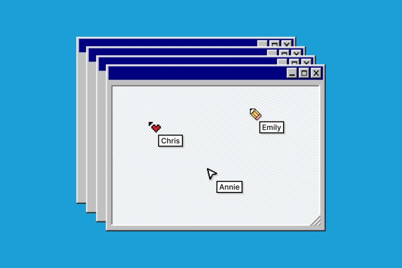
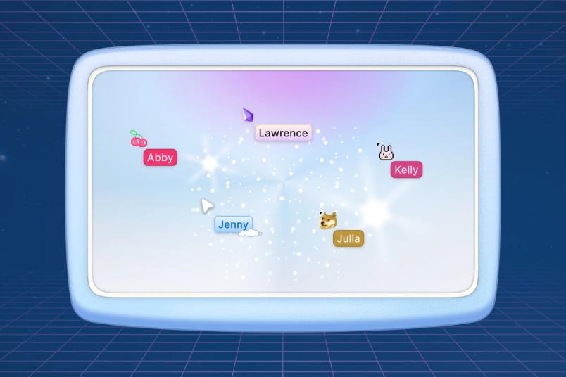
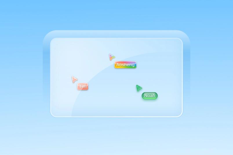
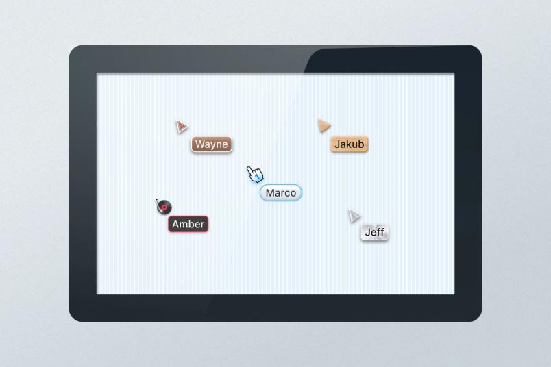
There’s no visual metaphor for personal expression quite like a cursor blinking in a brave new document, or zooming around a shared canvas. In Figma and FigJam, cursors signify multiplayer collaboration. These avatars don’t just design and build, but also chat, emote, and high five. They’re how we see and relate to each other thanks to—not in spite of—our screens.
What better way to celebrate this icon of interaction than with a look back at digital eras through the decades? For one week starting this April Fun Day, you’ll be able to choose throwback cursors inspired by four aesthetics from internet history: We’re calling them 8-bit, Y2K, Skeuomorphic, and Aero. Here, we reminisce about bygone trends and reveal how we brought these vintages back to life. If you’re eager to try them out, open any Figma or FigJam file and click on the cursor icon in the top right corner.
8-bit: Pretty in pixels

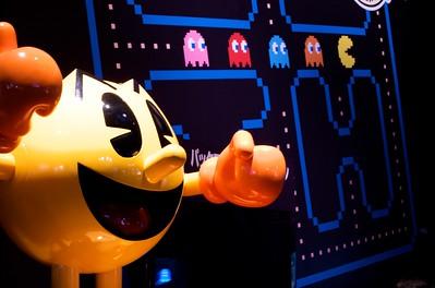
Originally called Puck Man in Japan, Pac-Man was first released for arcades in 1980. (Image source: Rob Fahey via Flickr, CC BY-SA 2.0)
The 8-bit style spans the early days of the World Wide Web, from the time of text-based terminals to the dawn of Windows 2000. Bask in the nostalgic glow of low-resolution screens and heavy pixels, when classic arcade games like Pac-Man and Space Invaders inspired hours of button mashing.


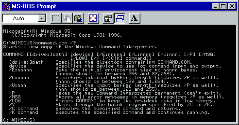
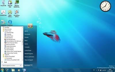
A DOS, or Disk Operating System, allows users to type commands directly into a text-based interface instead of a GUI, or Graphical User Interface. A GUI uses icons, windows, menus, and buttons to represent information instead of lines of text. (Image source: Public domain, via Wikimedia Commons)
“I got my start with computers in the days of DOS [Disk Operating System], so all of these retro cursors bring me back to that prototypical idea of what a computer is like,” says Chris Brainerd, Software Engineer. Product Designer Kelly Li also remembers learning how to type on her school’s DOS computer: “I grew up in China, and for some reason our school’s operating system was super behind. There was no GUI [Graphical User Interface] at all. It was just letters on a screen, so this aesthetic is super nostalgic to me.” When she finally got her hands on Windows 2000, Kelly was obsessed with the three-dimensional quality of its icons, from the raised start button, to the sunken timestamp, to the suggestion of a light source. “I remember seeing this and thinking, ‘It feels so tactile.’ You could change the toolbar color at one point, and that blew my mind as a kid.”
Finding visual inspiration for a mood board was like “digging through the drawer of memory,” says Aosheng Ran, Product Designer. “I was personally so obsessed with all these eras.” Translating the 8-bit style into a set of cursors meant dialing back the resolution to accentuate the pixel grid, and leaning into the friendly, elementary nature of old-school icons like a pointing hand or a No.2 pencil. “There’s real nostalgia in the expressiveness of these designs,” says Kelly.

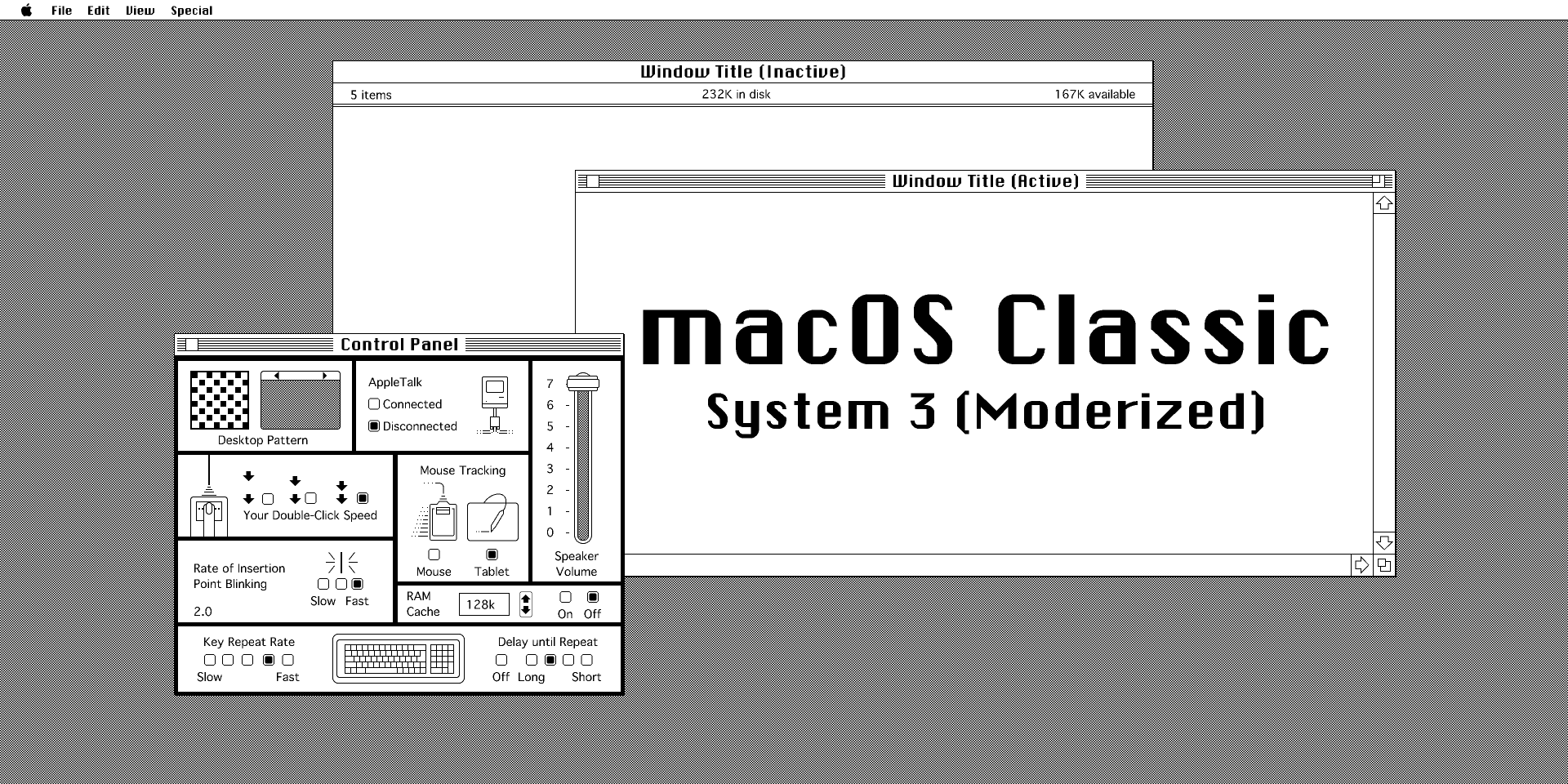
Indulge your nostalgia with this macOS UI kit.
Y2K: Xpress urself

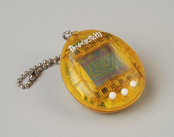
Raise your hand if you had a Tamagotchi. (Image source: Museum Rotterdam via Wikimedia Commons, CC BY-SA 3.0)
It’s the year 2000. Cargo pants and baby tees are all the rage, the Backstreet Boys have just released Millennium, and the discordant beeps and boops of dial-up internet connection are music to the ears. If the Y2K era seems oddly familiar despite being nearly a quarter century ago, that’s because iT’s BaCk, BaBy.


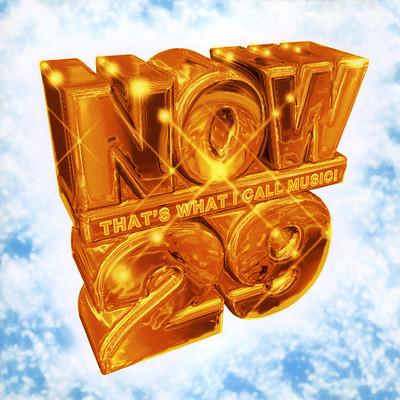
“Now That’s What I Call Music! 29” included hits like P!nk’s “So What,” T.I.’s “Whatever You Like,” and Rihanna’s “Disturbia.” (Image source: Brett Jordan via Flickr, CC BY 2.0)
“There are so many renditions and reinterpretations of this style, and it’s so joyful to see,” says Aosheng. The Y2K mood board features holographic details, neon colors, Bedazzling, and other examples of unabashed maximalism. “There’s a sense of customizability and self-expression that I miss about this era,” says Kelly. “My first interaction with HTML was actually for my MySpace. My mom taught it to me because I wanted to put glittery GIFs on my profile.”
The team didn’t want to just unleash the unadulterated energy of the early aughts onto the canvas, however. Says Kelly, “We tried to represent the ‘anything goes’ spirit of the time but bring the designs up in terms of of sophistication and polish.” There are gestures toward pop iconography, including gem and cherry cursors, as well as the strategic import of memes. “The doge is a transplant from another time,” says Aosheng, “but it’s true to the spirit of the era, and because it’s meant to evoke a time before we had retina display, it’s a bit blurry.”
We tried to represent the ‘anything goes’ spirit of the time but bring the designs up in terms of sophistication and polish.

Learn how to create a Y2K-inspired chrome effect.
Aero: Lens flair

Windows Vista featured a default Aurora wallpaper. (Image source: ropiku2003 via Flickr, CC BY-NC 2.0)
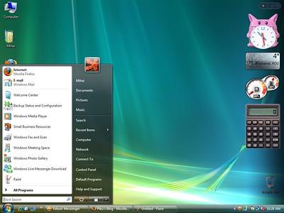
In 2007 and 2009, respectively, Windows Vista and Windows 7 elevated the operating system to glossy new heights. The interface felt sleek and ultramodern with references to water, nature, glass, and transparency. The techno-optimistic design language was called Windows Aero, and it was what everyone wanted on their home computer. At the same time, the Frutiger family of fonts was rising in the ranks, leading the design world to dub the aesthetic Frutiger Aero.


A Windows 7 screen illustrates the era’s obsession with nature and aquatic imagery. (Image source: okubax via Flickr, CC BY 2.0)
“I was really obsessed with Windows 7 when it came out,” says Aosheng. “I remember visiting my classmate’s house and seeing it. I was like, ‘What is this? It looks like it’s from outer space.’ It feels so futuristic and delightful.” The moodboard is an homage to Aero’s high-gloss polish, and its nature-inspired palette of blues and greens. “I didn’t want to break my parents’ machine, so I spent so much time installing those theme packs for Windows XP,” remembers Aosheng. “This era reminds me of playing MapleStory on a really slow computer,” says Susan Su, Software Engineer.
The designers took the time to give each cursor an appropriate glaze. “It took a lot of effort and attention to render a single pill,” says Kelly. “In our day to day, we do a lot of visual design and sweat the details, but it was fun to use that muscle in a different way.”
I remember visiting my classmate’s house and seeing [Windows 7]. I was like, ‘What is this? It looks like it’s from outer space.’

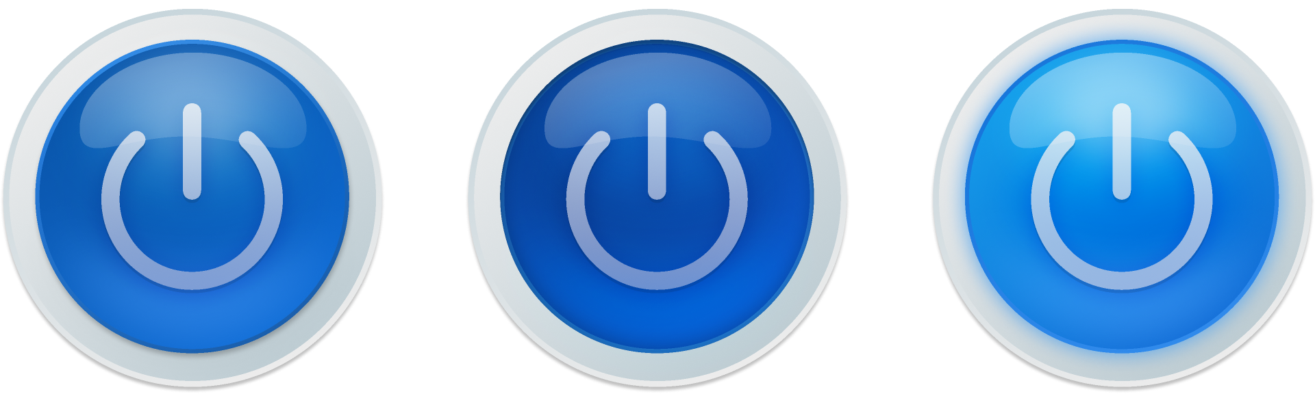
Add some shine to your canvas with these Aero-appropriate power buttons.
Skeuomorphic: Please do touch

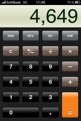
The UI of Apple’s calculator app echoed the real thing. (Image source: Tatsuo Yamashita via Flickr, CC BY 2.0)
When the first iPhone hit the scene in 2007, it brought new energy around skeuomorphism, a type of visual design that borrows from the physical world—like when you discard a file by dragging it to a recycling bin icon. The iPhone gave us the Notes app (a yellow legal pad), Newsstand (a wooden magazine rack), and Calculator (er, a calculator). The representational designs cued users on how to interact with them, lowering the learning curve for those new to the tech.

“This reminds me of when I got my first iPhone, and the excitement I felt at the time,” says Aosheng. “The visual design felt so considered and handmade.” For inspiration, the designers pulled examples that illustrated the era’s use of texture and three-dimensionality to reference an object's materiality and presence in the real world. Kelly notes that skeuomorphism is having another moment today: “Less in the sense of physical metaphor, but more in the sense of reintroducing textures to our UIs. I think we’re so inundated with screens that people just want to ‘touch grass.’”

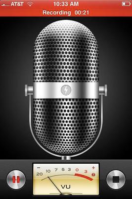
The iPhone’s voice memo app mimicked analog recording equipment. (Image source: Rosenfeld Media via Flickr, CC BY 2.0)
The cursors inspired from this period have a corresponding emphasis on texture and shading. “We pulled the metallic glow effect from iconic iOS dials and switches,” says Aosheng. There are nods to the fine-grained pattern of leather, as well as the glassy forms characterizing text bubbles of yore. Certain colors, like aqua, help recreate the feel of classic interfaces.

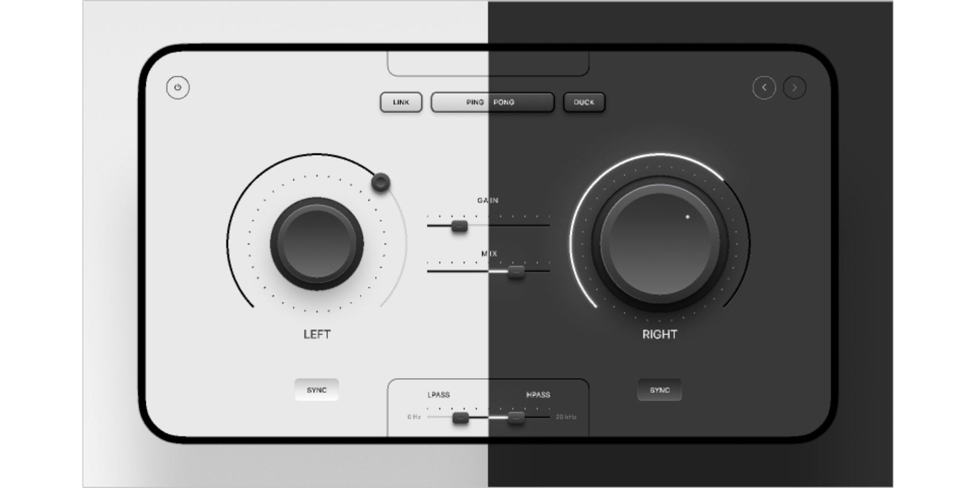
Here’s a skeuomorphic synth that was designed in Figma.
Speaking of classic interfaces—the team took an old-school tack to create the name tags for all the cursors, which needed to stretch horizontally to accommodate different name lengths. Figma renders cursors and name tags on a per-pixel level, which means that they feel nimble and native; the downside is that they’re a pain to scale. As a solution, the team broke down each name tag into a 9-patch image, allowing the corner radii to stay the same while the length could accordion as needed. It’s a technique borrowed from the more rudimentary days of CSS, and makes each name tag simpler to code. “The real generational divide is engineers who know how to do 9-patch, and those who don’t,” jokes Kelly.
“The designers have been stretching their wings with this project,” says Chris, “and as a result, the problems that Annie [Wang], Susan, and I are getting to solve are very fun. We don’t normally get to make cool radial gradients in CSS because nobody uses them anymore.”
Each April Fun Day cursor is a chance to take on the ‘tude of the time, whether it’s the brashness of the Y2K years or the friendly optimism of skeuomorphism. The handcrafted character of each one is also a reminder of what the internet was built to be—a place for self-discovery and self-determination. “The internet somehow felt more accessible,” says Aosheng. “The sense of ownership that you had with MySpace, for example, gave you creative control over how it looked and reflected your identity.” We say, it’s high time we revived that frontier spirit. So dial up, log in, and choose your fighter.