
Dealing with the occasional 100-year storm or drought are problems farmers have had to deal with for centuries, but what happens when those weather events become the norm? Climate change will test agriculture practices across the globe in ways humans can’t fully predict. Many country’s harvests are already feeling these effects and will continue to see problems with increases in temperature and shifts in rainfall patterns from elevated human-caused greenhouse gas emissions. “We did not expect to see such a fundamental shift… A 20% decrease from current [maize] production levels could have severe implications worldwide,” according to Jonas Jägermeyr, a crop modeler and climate scientist at NASA’s Goddard Institute for Space Studies (GISS) and The Earth Institute at Columbia University. It’s crucial that countries start to prepare for the inevitable now while we still have the resources, and it’s necessary that we skip as much of the trial and error process that defined the first big boom of farming as possible.

Setting the stage
At the United Nations Climate Change Conference (COP28) last November, U.S. Secretary of State Antony Blinken announced the commitment of $150 million to develop food crops well-suited to the changing climate in Africa. This announcement was made in support of the State Department’s Vision for Adapted Crops and Soils (VACS), a program that addresses food security in Africa by developing and mobilizing investment in resilient, nutritious indigenous crops suited to the changing climate. VACS is a multi-phase initiative launched by the U.S. Department of State, in collaboration with the African Union and the Food and Agriculture Organization. Cameron Kruse and Mikel Maron at Earth Genome, who specializes in creating technical solutions to help solve issues related to climate change, approached Stamen to help support this initiative by creating a tool that could be used to inform strategy and decisions around food security.
Fortunately, organizations like the Agricultural Model Intercomparison and Improvement Project (AgMIP) are already thinking about how we can model crop yields in different climate change scenarios. They’ve created a model for a set of crops in Africa to predict how yield will change depending on two different emissions scenarios. Earth Genome specifically wanted help envisioning and implementing a storytelling experience driven by AgMIP’s model that could influence decision-makers and spread light on the subject for the general public.
Defining our audience and narrative
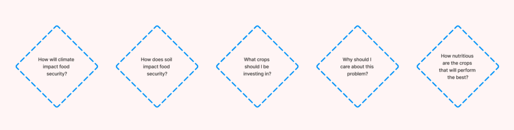
The application we built is meant for a range of audiences. We wanted to ensure that it could be useful at conferences like COP28 and for politicians thinking about food security in a changing climate. That said, we also wanted to make sure it was accessible to the general public as an educational tool regarding agriculture and climate change. This meant that the tool could not be too technical or unapproachable in addressing key user questions like, “what crops should I be investing in?”. There needed to be something for everyone, as these issues are relevant to all audiences. One design decision we at Stamen agreed on from the start was that we did not want the product to feel too “dashboard-y.” It needed it to be eye-catching to look at and delightful to interact with.
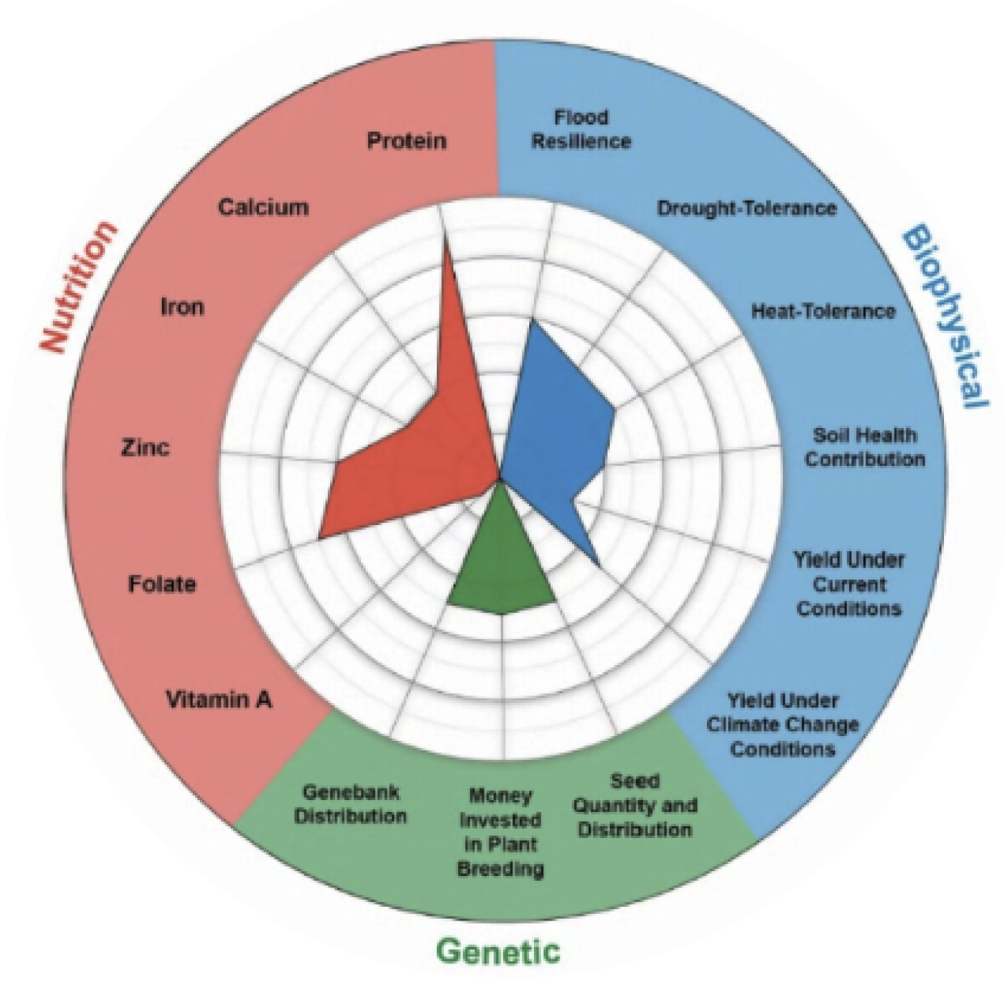
Our goal was twofold: 1) to recognize that despite the unfortunate reality of climate change, it’s possible to optimize yields by selecting for crops that are better suited for different climate conditions, and 2) to show how mitigating the effects of climate change can make a real difference on crop yields. Our first data source was AgMIP’s crop model, which showed the projected yield changes depending on the climate change scenario. We also had a series of crop “scorecards” that ranked each crop’s performance in nutritional, biophysical, and genetic categories (i.e. Sesame is 5/10 on zinc content and 10/10 on heat resistance). Synthesizing these two data sets would be the key to creating a rich data-storytelling experience.
Turning data into a search and selection feature
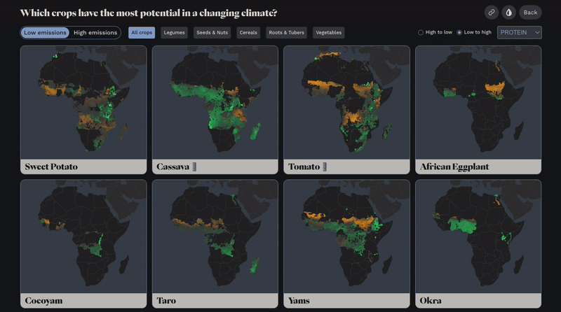
Apart from how a crop performs in a changing climate, how should one determine which crop to plant? The crop characteristics data, which assigned values for each crop from 0–10 across 3 categories with several subindices, was originally presented in the form of a radar chart. While we wanted to include the radar charts in the final crop profiles as a kind of “crop footprint,” we wanted users to have a way of exploring how all the crops we had data for compared to each other. For certain data integrity reasons, we could not map every single crop we had access to on one map without misleading the reader. It’s important to note that the crops represented in the tool are a subset – as in, there are more crops that are grown in Africa than the dataset reflects. But, we were keen on including an “all crops” view in the narrative as a way of showing the breadth of data and providing a way for single crop selection.
In order to make sure each crop was given equal weight when determining which to investigate first, we used single crop map cards tiled on one page (which we refer to as “small multiples” in the data viz and cartography world). This proved to be a powerful way of presenting the breadth of data in the product. Small multiples for 25 maps organized alphabetically felt like a miss, however, as many crops would get lost beyond the scroll of the page. So, we added the ability to view the data by low or high emissions scenario, select by food group, sort by nutritional characteristic, and order ascending or descending. For example, a user could choose to look at only cereals and sort by highest to lowest iron value. Each crop tile features a description on hover and high, medium, or low rank depending on what the user is sorting by. Once a crop catches their eye, they can select the crop to investigate further.
Diving deeper into a crop
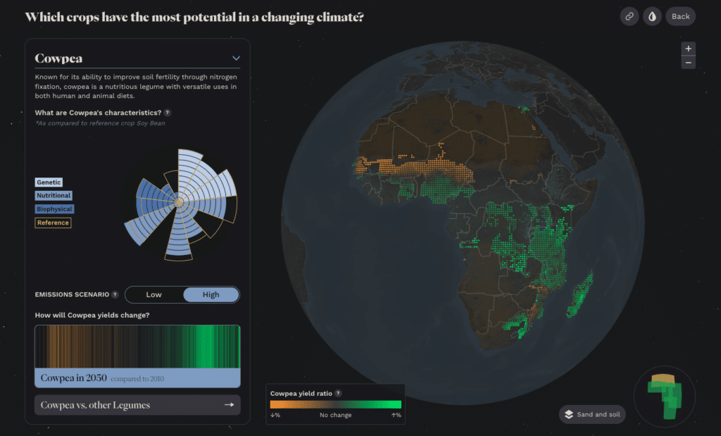
When a user selects a crop that piques their interest, they get an expanded view of the map in the previous page accompanied by a side panel with supporting visualizations. The side panel is meant to add more depth to the highlighted crop, so we included a brief description about the crop as well as a radar chart of its crop characteristics. We redesigned the original radar chart to add more visual attention to particularly high or low characteristics by increasing the curve of each bar in the chart as the score gets higher. We also added the ability to toggle the climate change scenario and even change the crop you have highlighted in the dropdown header.
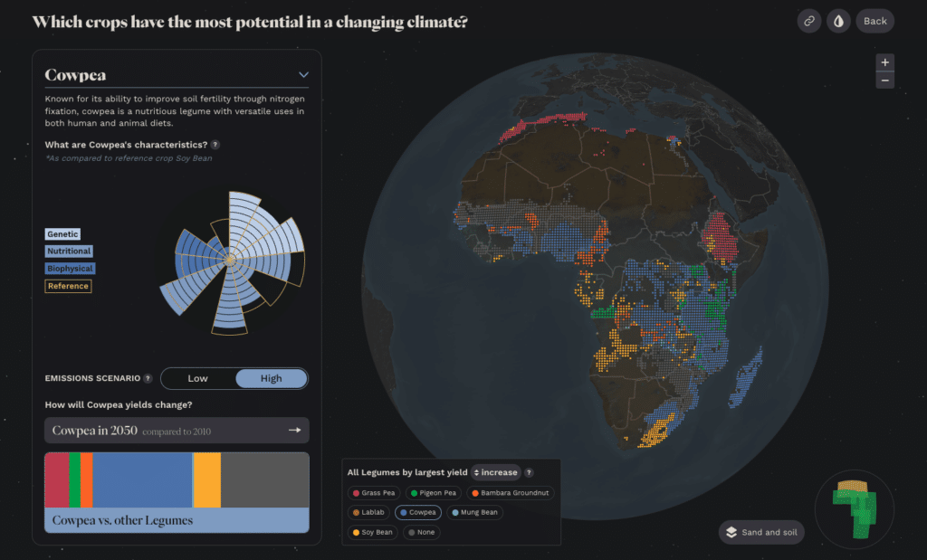
There are two different modes for looking at one crop. The default mode is the same as the map from the all crops page, which shows the yield ratio of that crop depending on the location grid dot in Africa. Each dot is the centerpoint of a 10km2 area on the map. A user can also choose to compare their selected crop to all crops in that same food group. This updates the map to show the crop that will increase (or decrease) the most by grid dot depending on the emissions scenario. Keeping this modeasis the default establishes continuity between the all crops and single crop page. The second mode compares the highlighted crop to its crop group. This is meant to let the user take a step back after investigating a crop and find similar crops for comparison. From here the user can interact with the visualizations in tandem and even select another crop in the same group to view on the map.
Filling in the gaps with sand and soil mode
If you look closely at the map we built there is a noticeable hole in the data: the Sahara Desert. More technical users could identify that land mass as the Sahara and piece together why there would not be data available for such a barren part of Africa. With that in mind, we wondered if there was a supporting story we could tell about the Sahara Desert. Earth Genome sourced sand and soil raster data to see how we might support the individual crop’s story with additional data. Given climate change will likely bring extreme droughts and amplify temperatures, we wanted to hint at the current arability of the land to give the user more context.
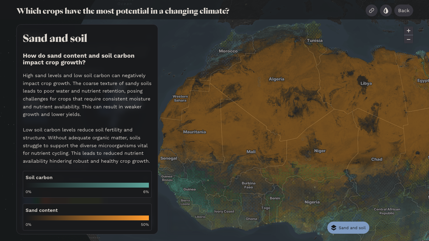
The sand and soil data was compelling enough that we wanted it to always be present on the map in some way. Ideally, the data suggests to the user there is more investigation to be done and adds geological context to help explain why conditions might be better or worse in a given area. We knocked back the opacity of the sand and soil data and chose a color palette that felt more in line with the existing color palette of the map so it didn’t draw too much attention when displayed with the yield ratio data. When a user selects the “Sand and soil” layer button, the rest of the data and information is blurred, and the sand and soil data becomes saturated and easier to read. This brings the user into a geological snapshot so they can understand what sand and soil content generally means for agriculture purposes. We also added faint hollow circles that replace the crop data previously on the map so as to provide a bit of context of what the user was just looking at. This lets them see how generally high sand and low soil levels lead to decreased crop productivity.
Adding final touches for that certain je ne sais quoi
Given the wide range of audiences this tool is intended for, we dedicated time to not just polish the experience, but also add additional mini-features that round out the product. We added a colorblind accessibility mode, the ability to copy and share a stateful link to the product, a minimap for zooming into African regions, info icons for users who want to dive deeper into the math and terminology in the experience, and more. We also worked to create a visual design that was delightful and engaging to look at. It was important to us to find the right balance between giving the agricultural model and topic the gravity it deserves, while also creating something visually appealing and exciting to interact with. We employed design techniques like a dark color palette, full bleed single crop maps, heavy topography, and a video on the landing page to create this immersive experience.
There is a tremendous amount of work that needs to be done to ensure food security in the face of climate change. Earth Genome and Stamen hope that our product is both helpful and insightful for decision-makers, politicians, and the general public to shed a bit of light on the subject. Check out the full live experience yourself at vacs.theplotline.org, and if we can help you with visualizing your own mission-critical data, please get in touch!