Introducing Mono Icons
For the past years here at Mono we’ve tried all sorts of icons sets available online for our projects, but every time we encountered some recurring issues:
- It’s very hard to find an icon set that fulfils all your project needs, most of them feel incomplete
- It is a lot of work to make consistent project icon sets on the fly
- Using icon sets designed by tech giants (Material Icons, SF Symbols, etc.) can result in generic-looking designs or designs that look too close to those companies’ brands
In some instances we ended up expanding on existing open-source icon sets ourselves based on the project needs, but that too could prove a bit tricky since some of those sets didn’t really include the specifications used to design the icons.
Designing our own icon set is an idea that’s been going through our minds for a while, so we’ve finally taken the leap and decided to come up with our own open-source, extendable icon set. We introduce you to Mono Icons!
Design system
To make sure all our icons feel consistent and follow a unified style and approach we’ve introduced a basic set of rules and design principles which we’ve used as the foundation to design the whole set. This includes decisions concerning grid, padding, keylines, strokes and even the treatment of corner radiuses.
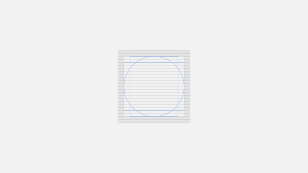
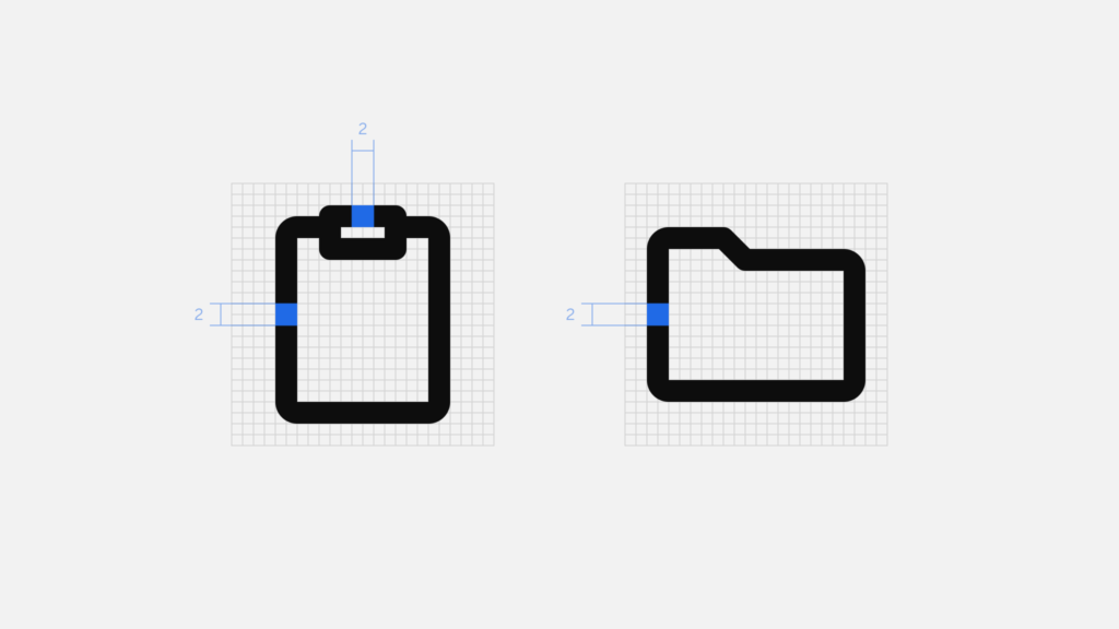
Grid
Mono Icons are designed on a pixel-based grid of 24px × 24px, which is used as a base to determine shape, positioning and proportion across the entire set of icons. Throughout the process, having a grid in place has proven essential to make design decisions and keep overall consistency.
Padding
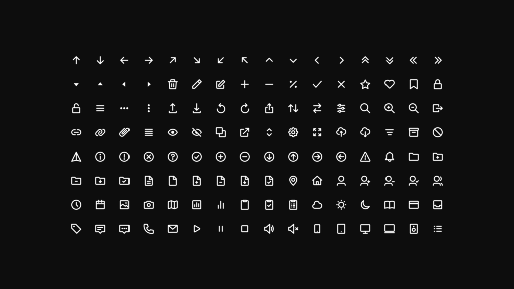
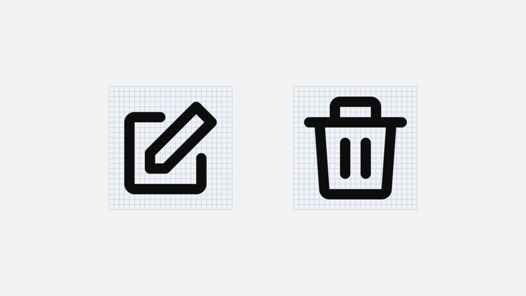
The icon’s boundary box also contains a 2px padding. This gives all icons a similar white space around them, which also makes the set look more visually balanced. Overall we try to keep the icons always within the area defined by the padding, but we might extend some shapes into the padding area in some (few) cases where the icon requires some extra visual weight.
Keylines
Besides the grid and the padding, keyline shapes are the third big foundation of our icons’ design. They’re basically a group of simple, core shapes that help maintaining consistent visual proportions across icons. If some of your icons have a similar proportion or shape you can use keyshapes to ensure that all icons that share those visual characteristics are aligned.
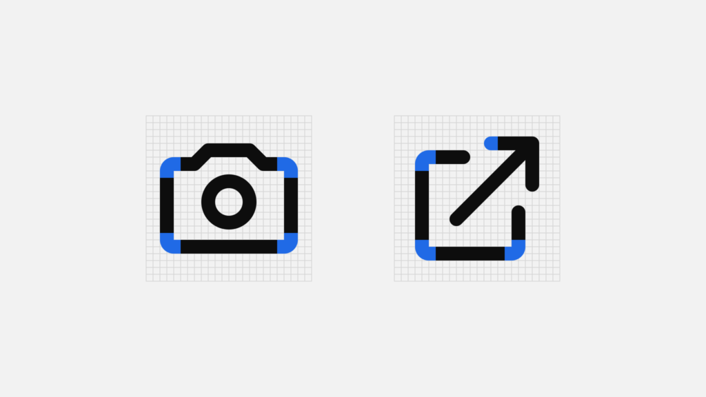
Strokes
To keep overall consistency and a balanced visual weight across the set, we’ve chosen to use a 2px stroke for all icons. There could be, of course, some exceptions to this rule, for example in those cases where an icon is too complex for the default 2px stroke thickness.
Corners
Mono Icons also use a (somewhat) consistent corner radius of 1px, with the exception of interior corners, which are square. Why is it “somewhat” consistent? Because the roundness of some corners or shapes may depend on the object the icon is representing. We try to avoid forcing rounded corners on some objects or shapes that might make them unrecognisable. We’ve also chosen to round all terminals and joints of every shape.
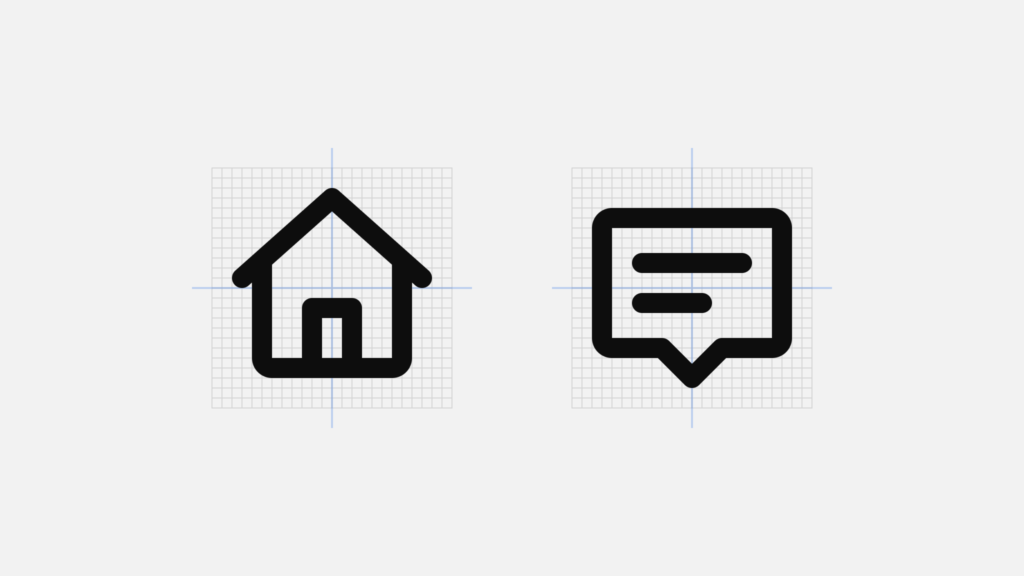
Alignment
In icon design (and in design in general really), sometimes aligning shapes metrically won’t cut it, that’s why all our icons are optically aligned within the boundary box. This ensures that all icons look properly aligned when used side by side and overall just makes the whole set look visually balanced.
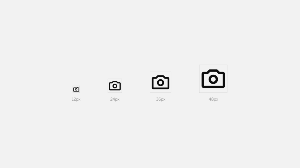
Size
Like we’ve mentioned before, Mono Icons have been designed in a 24px × 24px grid, so we recommend using them at a 100% scale for pixel-perfect accuracy. Another option is to use them at a multiple size of 12 to ensure that the icons are displayed sharply.
What’s next?
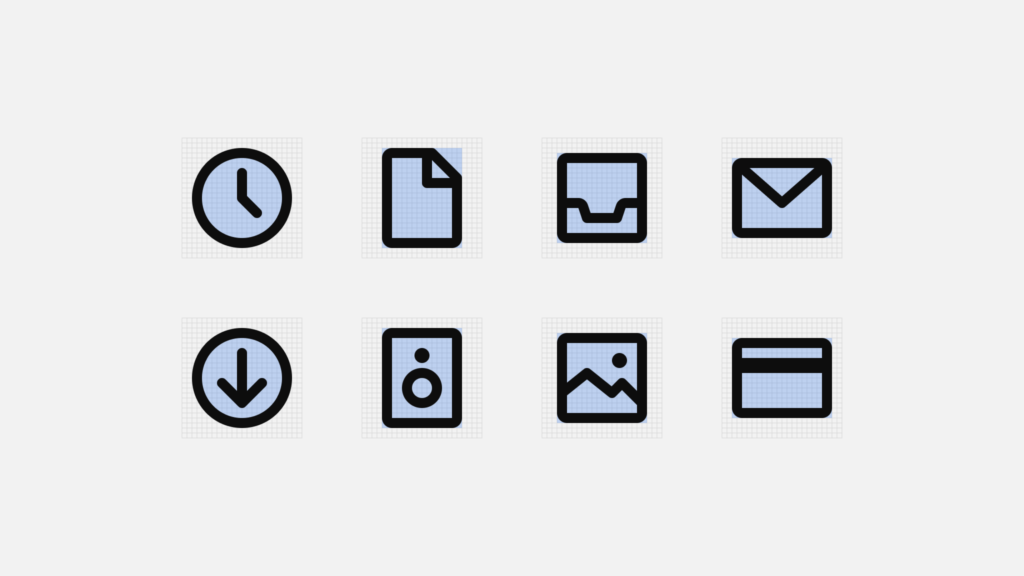
The current Mono Icons set includes 136 base icons that cover what we consider to be the most essential icons needed for interface design. Our idea is to keep expanding the set as we encounter new projects with different use cases (e.g. medical sector, education, transportation, etc.). So keep an eye out for upcoming releases!
Mono Icons can be used and downloaded in a wide variety of ways:
- Download or copy each icon as an SVG individually
- Download the whole set as SVG
- Use the Figma file we’ve created for those who want to start using the whole set in Figma right away (available on our Figma Community page)
- Copy the CDN link directly to your clipboard
- View on Github
Head to Mono Icons to check them out, we hope you enjoy them! ?
Subscribe to our newsletter
Receive blog highlights and fresh insights into UX/UI and front-end development.
Leave a comment
Your email address will not be published. Required fields are marked *