Generative logo design
Development and redesign of our dynamic logomark
When we first set out to design a logo for Components AI, we naturally gravitated towards generative concepts. The idea of a static mark didn’t seem to make sense for our visual brand. As people interact with Components AI, the product is constantly altered. The logo is an opportunity to play with this concept in our visual language.
There are impressive examples of dynamic and generative branding projects. As this is just the beginning of our project, something too impressive and complex wouldn’t feel authentic to us. Our instincts were to start with a simple form that could become more complex and technical over time as the project matures and grows. Eventually, the logo design could be informed or driven by data we’ve collected.
Our first chats and sketches were centered around dots of random colors on a grid. Even when constraining the colors to a harmonious scale, it was quickly apparent that it wasn't working. Often, the visual contrast between logos was jarring enough to be distracting.
Initial sketches on paper were of a 4x4 grid, as we’re partial to powers of 2. In practice, it wasn’t as aesthetically pleasing as 9 dots. 16 dots was too dense. We compromised on the purity of input values for visual aesthetics.
After initial sketches and an evening of light exploration, we gathered a bit of informed direction. We wanted our logo to:
- Have enough variance to be different, but recognizable
- Be neutral - not intrusive visually to the canvas
- Be modest/simple in form, with room to evolve and grow over time
Randomly varying the opacity of each dot on a defined scale was more lackluster than anticipated. The subtle changes in opacity weren’t very perceptible, especially in the corner of the eye. The composition of the form as a whole didn’t feel balanced. Even with light constraints, allowing for the full range of opacity values didn’t seem to work. We shifted to toggling between two values - one dark, one light. We wrote a few different sets of weights that apply to each dot, which are randomly selected before logo generation.
Eventually we landed on something that generated the visual states below:

Since we launched in 2019, it’s served us well. At this stage of the product, logo design is not high on the priority list. While it’s been a short period of time since our launch, some of our technology has evolved past a few milestones. Behind the scenes we’re starting to wire independent systems together. In a manner, dots are beginning to connect.
While building the Delaunay triangulation pattern generator, we became interested in the forms generated when there was a small count of coordinates. Using Delaunay to connect a small series of dots seemed like a small and appropriate evolution, both in concept and execution.
To visually assess various iterations, the natural first step was to build an interface that could control a generative logo component similar to the other components we have available. To accomplish this, we boiled it down to this four step process:
- Define a set of parameters you want to manipulate and see variants of
- Define lists or sets of input ranges for each input
- Expose these controls to the GUI
- Experiment - adjust in code if necessary
Often, users want to expand or constrain the inputs into a parameter. For our purposes, we have a few things to generate that we might want to control:
- Size of the SVG
- How many points (coordinates)
- Border width of outer border (convex hull)
- Stroke (thickness) of the lines connecting dots (which if could be 0 simulating no line at all)
- Border width of the points (coordinates)
- Colors, of course
- SVG stroke styles, like dash array and dash offset
After the initial grunt work of defining and wiring up the controls, our patience was rewarded with an endless array of options at the click of a mouse.
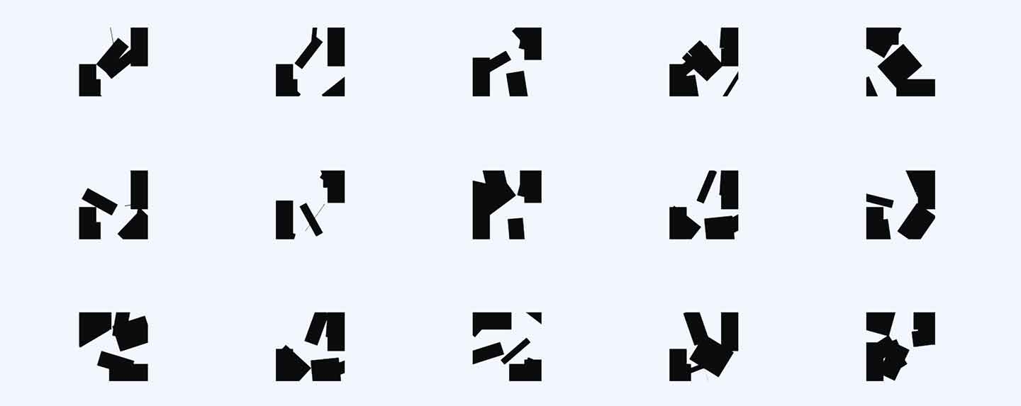
The starting out point proved to have a lot of visual contrast.
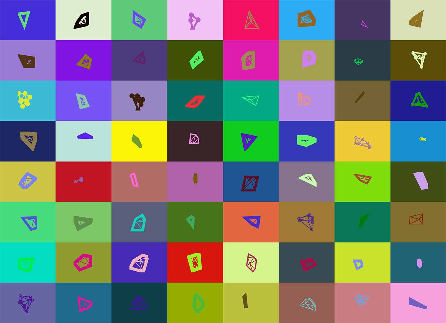
We knew we wanted our logo to be more neutral, so we constrained it to something close to black and white. We quickly noticed, though, that our lower bounds for points count resulted in triangles. We worried they weren't similar enough to the other marks to be recognized as part of the same visual identity.
Moreover, the variance in shape made the transition between logo updates jarring, and we didn’t find most of the forms to be aesthetically pleasing.

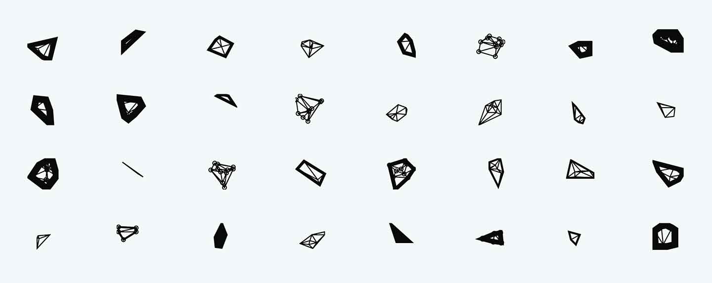
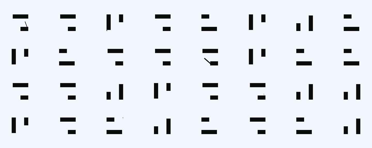
Constraining the width of the border to 1 or 2 pixels and removing the stroke around points created some visual consistency, but still didn't feel close to what we wanted.

Here, the variance in form was too much. While not noticeable on a static grid, viewing the logo update inline was continuing to be a subpar experience. To create some consistency in the overall shape and form, we set the initial coordinates of a square. Then we generated additional points inside this boundary, which resulted in the forms below.

The lower boundary we had set for point count resulted in triangles rendering, but some aesthetically pleasing forms emerged. The balance and slight contrast between the outside border and the line weight, for example, was something we wanted to explore further.
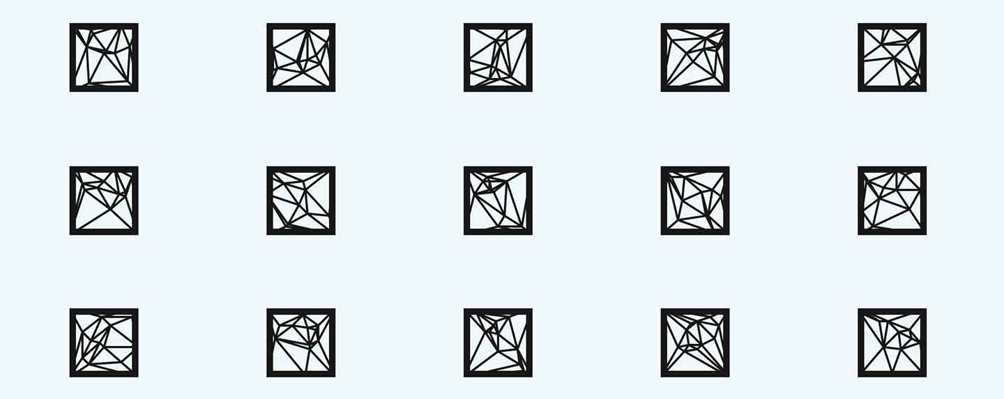
With more than 10 points, though, the density and detail became lost at smaller sizes, almost appearing to emulate stained glass.

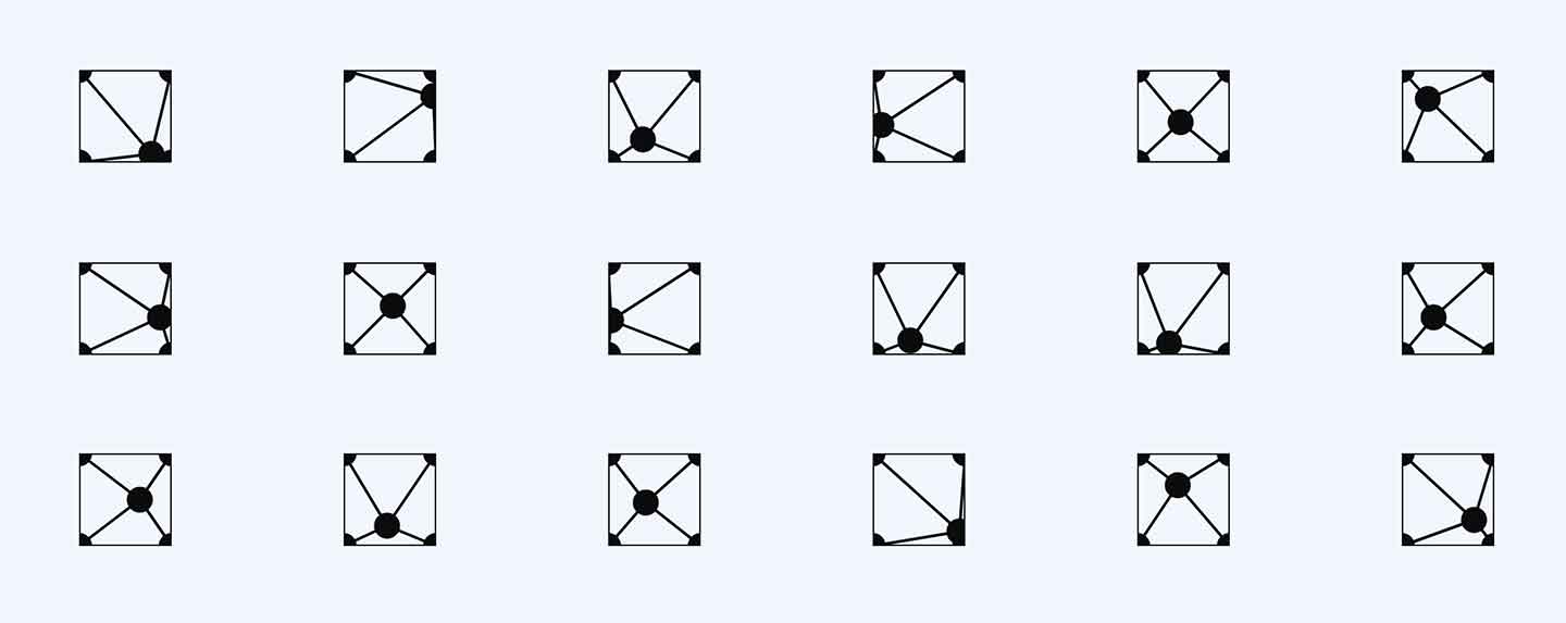
We cranked up the outer border width and removed lines altogether, just leaving dots for each point. Many of the generated forms felt unintentional, but in some cases were aesthetically pleasing. Reducing the border and adding the lines back in produced a drastically different look.
For fun, we explored manipulating the lines with dash array. Varying the line width to extremes on both ends led to some visually appealing output that resembled paper folding instructions.

Increasing line width and moving dash array sliders around resulted in some bold marks.

After this iteration, we decided to take it in a more minimalist direction. Again, some of the errant lines led to the marks feeling a bit unintentional.
A lot of the above explorations were not within the bounds of our imaginations when we first conceived of our logo concept. Even at the point of defining parameters and input values, much of the output is far removed from the original sketches and visual concepts we set out to explore. Some of these iterations helped us define in more specific terms what we didn’t want or like.
Settling on a range of points between 5-7 with an outer border width of 4 and a line width of 1, we started to generate the forms you see below. These immediately felt "right."
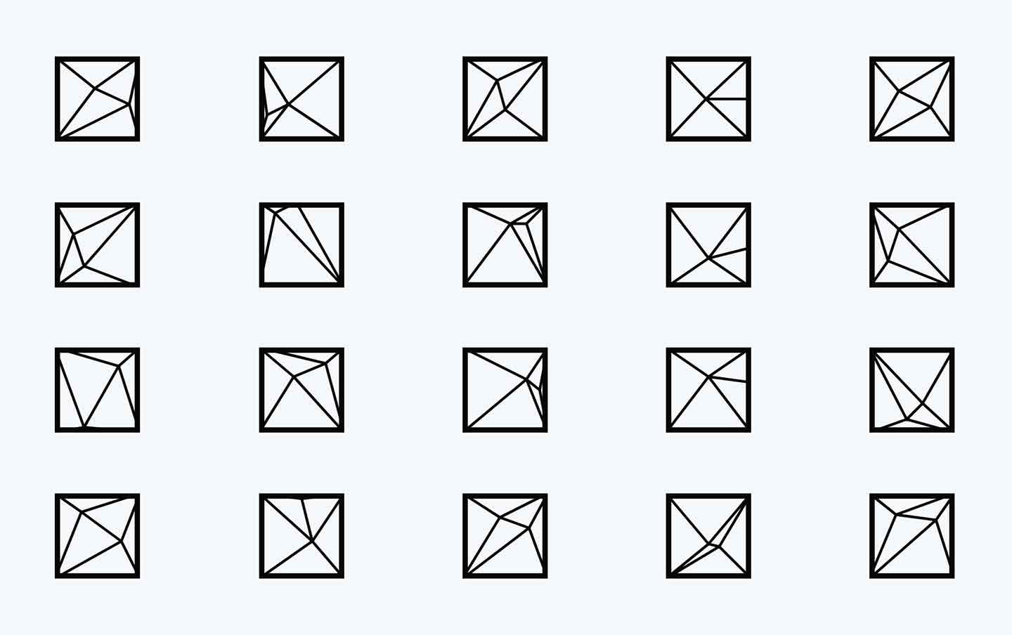
After looking at thousands of options, this output felt balanced and in line with what we wanted. It’s got enough variance to feel alive and dynamic, and it's only 1 degree removed from a random grid of dots. While simple, we feel it’s a step forward aesthetically, and a bit more recognizable as a mark. If you'd like to play around with the generator we used to design our current logo:
Check it out hereIf you're interested in reading more about generative branding, below are some more complex explorations and executions: