
Dynamic Pictograms For Design Systems
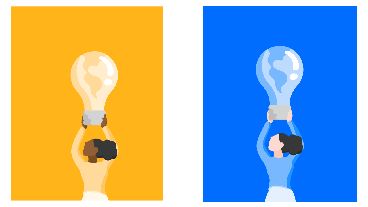
Pictograms are vector graphics illustrations that are more complex than icons. They can include multiple color variations, different background colors, accent colors, and various skin colors. These illustrations usually include multiple different shades of brand colors as well.
We want to include pictograms in our design system package to make it easy for other engineers to use throughout the product, but there are some problems. To include every option, we'd have to store a different SVG file for each color combination, which means a 1kb SVG file will now require (number of combinations) * 1kb of package space. If we add a new brand color or skin color, that number grows immensely. So we need to make this dynamic. But how?
For icons, I automatically handle the colors by extracting the values into CSS variables. This is usually simple, because icons are often monochrome, or have a single color. The various color changes across pictograms will make automatic variable extraction difficult. However, I designed a solution that allows us to manually "clean and prep" the SVGs beforehand, making the whole process easier.
Before diving into the color processing, let's look over some other fundamentals to make sure we cover our bases when implementing pictograms in our design system.
Formatting
The pictograms will go through our SVGR build process to make consumption of our pictograms easier. To oversimplify, SVGR allows us to save .svg files, then does a transform so that we can use SVG files like React components. We'll move icons into a new /assets/icons folder, and create a new folder /assets/pictograms. We’ll export everything from a /assets/index.ts to make it easily usable, so we can import { PictogramName } from "assets";.
Naming
We don’t have to do anything crazy. Similar to how we suffix icons with SVG, I think we can suffix with "Picto" to differentiate the assets. So for example, a name may be WomanHoldingLightbulbPicto. By dynamically handling different color profiles, we also simplify the naming process. PaleWomanHoldingLightbulbOnBluePicto doesn't have the same ring to it, does it?
Accessibility
Since pictograms are almost always used as images, we should include an accessible description for each one. This will be done by using an Icon wrapper component, adding role="img" and aria-hidden="false" to the SVG, and adding a descriptive <title> as a direct child of the <svg>. These props will let browsers and screen readers know that this <svg> should be treated as an image. You can configure your wrapper component or SVGR build to do some of this for you. This is not comprehensive; I suggest reading a more detailed guide for handling accessibility.
Colors & Control
Now let's dig into color processing.
So let’s say each pictogram has 4 brand colors and 5 skin tones, that means each pictogram will have 20 variations. That’s too much to add and manage by hand within the design system. The trick here is to break everything into a variable. What that variable will be, and its defaults, are a little more tricky to determine.
First, let's break our colors down in to three categories: brand colors, skin colors, and constant colors. We'll handle each of these a little differently.

Using HSL
Since there are so many different shades of brand colors, we can't really determine a constant color value for each occurrence. Instead, we'll generate these dynamically.
Before moving forward, let me explain how a color is codified in CSS. There's a few different ways to codify a color: HEX, HSL (Hue, Saturation, Lightness), and RGB are the common methods. As an example, here are the different ways we can write the color red:
| Format | CSS Value |
|---|---|
| By Name | red |
| RGB | rgb(255, 0, 0) |
| HEX | #ff0000 |
| HSL | hsl(0, 100%, 50%) |
We'll be utilizing HSL because it gives us a way to control the part of the color we need: lightness.
For brand colors, we can calculate each path’s color lightness compared to the darkest color. This will give us a percentage value to use for lightness, while hue and saturation will be a constant derived from the brand color we choose.
I think it’s easier to visualize this as a black and white image:

Isolate Skin Tones
First step would be to isolate our color palette of skin tones. Those should be “pulled out” so we know not to touch them. It could be possible to do this automatically, but the sure-fire way is to allow the user to “paint” out the colors, AKA click the paths in the SVG that are skin. We also have to differentiate between the primary skin tone and any shadows or highlights.

After painting out the skin tones, we end up with something like this:

Isolate Constant Colors
Sometimes our pictogram will include colors that should be ignored. Perhaps the hair should always be black, or a logo should always be blue. We’ll want to allow users to paint out colors that will remain constant between brand color changes. After these paths are selected, we can remove them from any further processing.
Calculate Palette Lightness Across Paths
Now that we isolated our brand and skin colors, we can figure out the lightness percentage for all remaining paths:
More specifically, these percentages are derived from selecting the existing fill or stroke color from the path, converting the HEX value to HSL, and pulling out the third value for lightness. In our replacement, the other two values will be discarded and replaced by our static brand color constant Hue and Saturation values.
Below is a table showing the hue and saturation values for each of our darkest brand colors. You can get this value by loading the HEX into a color picker and pulling out the H and S values from HSL.
| Color | Hue Degrees | Saturation Percentage |
|---|---|---|
| Blue | 215 | 100 |
| Green | 173 | 68 |
| Yellow | 36 | 78 |
| Red | 5 | 82 |
Knowing all of this, we can then loop through each path and replace the fill and/or stroke value with a CSS variable. So a fill will become hsl(var(--active-h), var(--active-s), ${hsl[2]}%);
--active-h: the active brand color hue value
--active-s: the active brand color saturation value
hsl[2]: the lightness percentage value of the original color (exemplified by the graphic above)
Together, this will reproduce the graphic in any color we want, just by changing the --active-s and --active-h variables.

Handling Skin Tones
Changing skin tones works similarly. Since we isolated the paths beforehand and identified them as primary and shadow skin tones, we can use more CSS variable constants to save our different skin tones.
| Skin Tone | Primary Variable | Secondary Variable | Primary | Shadow |
|---|---|---|---|---|
| Fair | --skin-tone-fair-primary | --skin-tone-fair-shadow | #ffc6b4 | #ffab90 |
| Midtone | --skin-tone-midtone-primary | --skin-tone-midtone-shadow | #ecc19c | #dfb38b |
| Dark | --skin-tone-dark-primary | --skin-tone-dark-shadow | #8a613e | #764f2a |
And now we can replace those static fills and strokes with a CSS variable: --active-skin-tone-primary and --active-skin-tone-shadow. Then we can specify which skin tone is active, and voila!

CSS Variable Architecture
When designing this, I wanted to prioritize two things:
- Completely customizable by consumers
- Usable by designers via copy/paste
The best way to approach this is to use CSS variables. We can even tier our CSS variables to allow internal and external control. What does this mean?
Internal Control
After processing, we want the SVG to work right out of the box. We don’t want to require that consumers configure a variable architecture. We do this by appending CSS variable rules to the root <svg> element. These variables are referenced throughout the internal paths of the SVG. So let’s say our root will have variables active-h, active-s, active-skin-tone-primary, and active-skin-tone-shadow. Our paths inside the SVG only reference these top-level variables. By setting these variables to values, we’ll always have a functioning SVG even if the consumer doesn’t customize the colors.
External Control
However, we want to follow our two parameters and allow customization. So what we can do is set the SVG’s properties to consumer an external variable if it exists, and set a fallback variable if it doesn’t. So inside our SVG tag’s properties, we set it like this:
--active-skin-tone-primary: var(--active-skin-tone-primary, #8A613E);
With this approach, consumers can externally set the variable --active-skin-tone-primary to be whatever they want, and the SVG will know to use that. If it isn’t present however, we can use the fallback HEX code provided.
Within the app I made (link below), we update that fallback HEX color to be whichever value is currently selected. So if the dropdowns specify blue brand color with dark skin tone, we update the fallback variables to be just that, and the outputted code is updated. This allows designers to copy/paste the SVG markup and paste it into Figma, or engineers to copy/paste one-time-needed code, allowing for easily customizable SVGs.
Implementation Into Workflow
Luckily, implementation into our design sytem won’t be too difficult. Work is already underway to update our processing of SVG files to handle pictograms. The only question is preparation.
Here is how I think it should happen:
1. (One time) Designers outline skin-tone constants:
--skin-tone-fair-primary: #ffc6b4;
--skin-tone-fair-shadow: #ffab90;
--skin-tone-midtone-primary: #ecc19c;
--skin-tone-midtone-shadow: #dfb38b;
--skin-tone-dark-primary: #8a613e;
--skin-tone-dark-shadow: #764f2a;
2. Designers process the pictograms in the program before handing off to engineers
3. Engineers save the processed pictogram as an SVG in design system (different colors are painted and variables are settled automatically beforehand)
4. (One time) Engineers create pattern for consumers to override skin & brand colors
Conclusion
Now we can output this SVG, use it in our build, and can alter any skin tones / backgrounds without hosting multiple versions of the same graphic.
To make everything easier, I created a tool that does all of this for you. Here is the live URL: https://mikecarbone.github.io/picto-painter.
and here is a video of it in action: