
Website content creators are responsible for the web pages, blog posts, videos, and documents that make up the Web. We make strategic decisions so our users can easily read, navigate, and enjoy our content.
As content creators, we also have a lot of power to either make content accessible for our users with disabilities or (often unknowingly) create barriers that make it difficult or impossible for them to access content.
The good news is you can start making your content more accessible today simply by reading the rest of this article.
We’ll go over everything you need starting with a free tool to use in your content publishing process. This tool is called WAVE and acts as your accessibility checklist detecting common accessibility issues.
Next, we’ll cover the accessibility basics content creators need to know to make accessible content.
Lastly, we’ll go through an example of how to use the WAVE tool with basic accessibility knowledge to review a page with accessibility issues.
- Check your content with WAVE (a free accessibility tool)
- Learn accessibility basics
- Alternative text on images
- Contrast for images or text
- Heading structure
- Tables
- Links
- Text writing and formatting
- Videos
- Using WAVE as part of the content creation process example
Check your content with WAVE (a free accessibility tool)
What the WAVE tool is
Even before you fully understand accessibility basics, you can use the WAVE extension as your accessibility checklist every time you create/edit a webpage.
This is an easy way to start embedding accessibility into your content creation process. It takes you from wanting to create more accessible content to actually creating more accessible content.
The WAVE tool is an extension you can install on Chrome, Firefox, or Edge. It’s an automated accessibility testing tool, which means it runs several accessibility tests and then gives you the results.
Install and activate WAVE
To install the extension, visit WebAIM’s WAVE browser extension webpage and choose the browser you’ll be using. From there, install the extension.
To activate the WAVE extension, follow these steps:
- Navigate to the page you want to test.
- Select the WAVE extension icon in the top right of your browser.
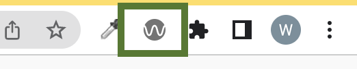
- If you don’t see the extension, try opening your browser’s extension menu and pinning the WAVE extension to your browser bar.
WAVE extension tabs and WAVE results
In the example at the end, we’ll go over exactly how to use WAVE to check your accessibility results. For now, here’s what you need to know:
- The WAVE tool has six tabs. Each of these tabs has information about accessibility results.
- There are six accessibility result types. These result types help you focus on what’s an issue and what’s something you just need to quickly review.
The six WAVE tabs you’ll navigate through are:
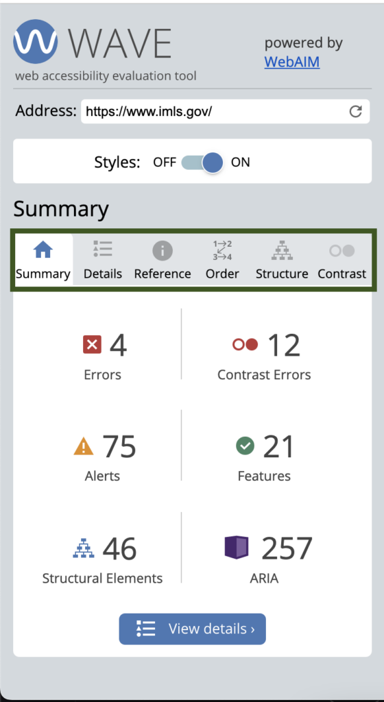
- Summary: An overview of your accessibility results.
- Details: Lists all the accessibility errors, concerns, and results. This is the checklist you’ll review as part of your publishing process.
- Reference: Has additional information about the accessibility results.
- Order: Shows the tab order of the page and all the accessible names of interactive components.
- Structure: Lists all the HTML landmarks and headings on the page.
- Contrast: A contrast tool to test colors plus it lists any contrast errors on the page.
The six types of accessibility results are:
 Errors – Accessibility issues that need to be fixed.
 Contrast – Specific types of accessibility errors related to color contrast. These should be fixed.
 Alerts – These could be accessibility issues. They should be checked to see if they are or not.
 Structure – Identifies structural elements like headings and lists.
  Features – Elements of your website that probably improve accessibility. They should still be checked to make sure they’re done correctly.
 ARIA – ARIA, or Accessible Rich Internet Applications, refers to ARIA HTML that is used to make the page structure more accessible.
Results to focus on
The WAVE extension finds several types of accessibility results. Some of these aren’t relevant to content creators because they’re part of the webpage’s template. The template stays the same on every page – for example, the header, footer, design elements, navigation, etc.
Oftentimes, content creators aren’t responsible for the template, and fixing issues related to it is done by a developer who has access to that code.
All of that to say, there are specific accessibility results in your Details tab that make sense for content creators to focus on.
PRO TIP: A good rule to follow is results you have control to edit (it’s in the content you’re creating), you should fix. If the result is in the website’s template, ignore it and focus on the results you can control.
We list the specific accessibility results that could relate to a content creator’s role in the accessibility topics below.
Learn accessibility basics
You can make a lot of improvements to web accessibility just by knowing the basics.
Once you know what to do, it’s easy to apply it as you create content. It’s also easier to fix issues you find with the WAVE extension.
There are seven accessibility strategies content creators should use to keep their content accessible for all their users. Each strategy has the related WAVE accessibility results to help connect the tool you can use in your process to these accessibility topics.
Alternative text on images
What alternative text is
Alternative text is used to describe an image to users with visual disabilities. It can be in the content near the image or added to the image as alt text.
For most Content Management Systems (CMS’s), you apply alternative text by selecting the image in the editor and adding it to an alt text field.
There are three types of images:
- Decorative: These images don’t convey any content. They’re “eye candy” and don’t need alternative text.
- Informative: These images convey content and need alternative text.
- Functional: These are linked images and need alternative text describing where the link goes.
PRO TIP: Ask yourself these questions when deciding if an image is decorative or informative:
- Do these images add needed content?
- Would any information be lost if these images were deleted?
- Would alternative text on these images give meaningful information to a screen reader?
If the answer is yes to any of these questions, it is not a decorative image, and it should have alternative text in the content or in the image’s alt text field.
How to write great alternative text
Here are tips for writing great alternative text:
- Don’t use “image of” or “link to” language
- Capitalize the first word, and end full sentences with periods.
- Keep it succinct – try to use a few words or only a sentence or two.
- The purpose of the image can change what the alternative text is. That means the same image used in different contexts, or for a different purpose, could have different alternative text.
Alternative text resources and examples
- What alternative text is, when to use it, and how to write great alt text
- Alternative text in the wild: 5 alternative text examples
- Alternative text YouTube playlist
Alternative text results in WAVE
These are the results in WAVE that relate to alternative text. Each should be reviewed (even the features) to make sure the alternative text is correct.
Contrast for images and text
What contrast is
Contrast is the difference between two colors. All users benefit from enough contrast, but low-vision users might not properly see an image or text without proper contrast.
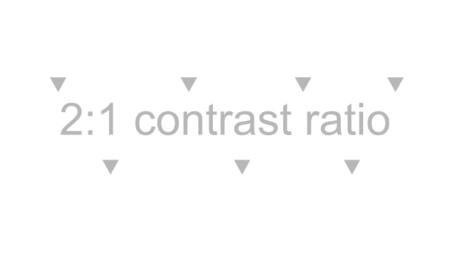
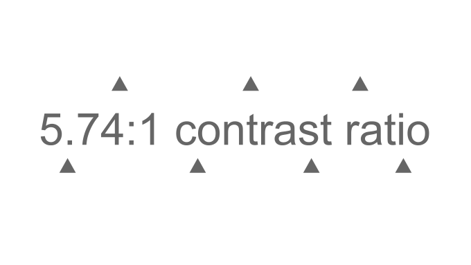
The contrast ratio is how the difference between two colors is measured.
The ratio can range from 1:1, which would be the same color for the foreground and background, to 21:1, which would be black and white for either the foreground or background.
For example, the contrast ratio for the light grey foreground and white background below would be 2:1, and the contrast ratio for the dark grey foreground and white background would be 5.74:1.
PRO TIP: When creating images to support your content, it’s nice to have a tool to check color contrast while designing. Use WebAIM’s Contrast Checker to find the contrast ratio between two colors.
Text contrast ratio requirements
There are specific contrast ratio requirements for text. This means if you change the text color when editing content, make sure it meets these requirements.
The text contrast ratio requirements are:
- Text smaller than 18 point or 14 point bold has a contrast ratio of at least 4.5:1 with the background color.
- Text 18 point or 14 point bold or larger has a contrast ratio of at least 3:1 with the background color.
- This includes text on images used to navigate or understand the content.
- Logos or brand-name text has no contrast requirement.
The text you’re reading right now is 15 pt, so it needs a contrast ratio of at least 4.5:1. The contrast ratio this text has with its background is 14.72:1, so it meets the requirements.
Non-text color contrast requirements
“Non-text” refers to visual presentations, which includes buttons, icons, graphics, charts, images with text overlays, or other images conveying content.
The requirement for non-text is there needs to be a contrast ratio of 3:1 against adjacent colors. This makes sense because if we want all visual users to be able to distinguish between the colors of graphics, there needs to be a high enough contrast between the colors.
Color contrast examples and resources
- Color contrast accessibility requirements explained
- Color contrast accessibility tools with examples
- Accessible color contrast requirements with examples (YouTube video)
Contrast results in WAVE
There is only one contrast related WAVE result, and it’s an error. If you see it and it’s for something in your content, it should be fixed. Images and graphics would need to be manually checked using the WebAIM Contrast Checker tool.
Heading structure
What a heading structure is
Web content uses headings to organize the content on the page. There are six heading levels – H1-H6. For example, some of this page’s heading structure is:
- H1: A complete guide for content creators to start making accessible content
- H2: Check your content with WAVE (a free accessibility tool)
- H3: What the WAVE tool is
- H3: Install and activate WAVE
- …
- H2: Learn accessibility basics
- H3: Alternative text on images
- H4: What alternative text is
- H4: How to write great alternative text
- H4: Alternative text resources and examples
- H3: Alternative text on images
- H2: Check your content with WAVE (a free accessibility tool)
Heading structures are important because screen reader users use headings to navigate and understand the page’s content. Below is a screenshot of a heading list on Mac’s VoiceOver screen reader.
PRO TIP: Headings improve the readability of a page because they chunk the content. This can make reading your content easier for visual and non-visual users.
Common heading issues to avoid
An accessible heading structure is logical, so it makes sense when a user navigates the page by headings. To keep your heading structure logical, avoid these issues:
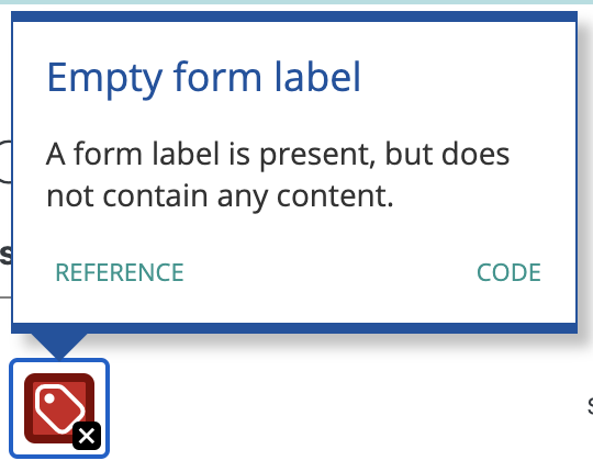
- Empty headings: This is a heading block without any content. Sometimes, these are used to add spacing to a page. But, these blank headings end up in the screen reader user’s heading list, which is confusing.
- No headings: This is when no headings are used on the page. This could be okay for content pages with little content. But, if there are multiple ideas, use headings to organize them and chunk up the content.
- Skipping a heading level: This is when a heading level is skipped when descending headings. An example of a skipped heading would be going from h2 to h4 without having an h3 between them. An h4 back to an h2 is not a skipped heading. Visually, these don’t look like an issue, but skipped headings are confusing for screen reader users because they rely on hearing a heading structure to help them understand and navigate the page.
- Possible heading: This is when paragraph text is large. So, paragraph text could be acting as a heading. If the text is a heading, use your CMS’s heading styling. This applies the correct HTML code so users can navigate using the heading.
PRO TIP: Use CSS styling to make text larger – don’t apply heading styling because it could cause a skipped heading level. But, even if it doesn’t, this is confusing because paragraph text is now part of an assistive technology user’s heading list, which they use to navigate.
How to create a logical heading structure
To create a logical heading structure, start by outlining your content. Some questions to help you know when to make a new subheading are:
- Is this a new idea/topic within the heading level above it?
- Is there enough content (1-3 paragraphs) to support a new heading?
- Does my previous heading have too much content? Should it be broken up into subheadings?
- Should this idea/topic stand out in the content?
Heading structure examples and resources
Headings structure results in WAVE
These are the results in WAVE that relate to headings. Each should be reviewed (even the structure callouts) to make sure the headings are correct.
 Missing first level heading
- Identified headings in the Structure tab are only used to describe content below them and not as text –


 Possible heading
Tables
What makes tables accessible
For assistive technology users, accessible data tables make understanding and navigating the table easier by:
- Letting them skip the table instead of going through each cell.
- Announcing how many columns or rows are in the table before navigating the table.
- Announcing the table headings before reading the information in the cell. This tells them the header the data relates to giving more context to each individual data point in the table.
Here is HTML code tables need for screen readers to correctly announce the table’s data.
- The table header
<th>tag. Table headers can be assigned to the first row, column, or both. And, when the table has headers, the screen reader announces the header before the data in the cell, so the screen reader user knows what heading the data is associated with. - The scope attribute
<scope>added to the table header<th>tag. Scope tells the screen reader if the header is a column or row header. - We suggest adding a caption with a
<caption>tag. A caption is like a heading for the table, so it should describe what the table is about. The screen reader announces the caption before reading the data in the cells. - Complex data tables should use a summary. A summary describes the layout of a table and is only needed for complex tables with unusual structures. It can help users understand how to navigate the table.
How to make an accessible table
Some CMS’s can’t add a table caption or make the first column or row table headers. Most editors do have the option to switch to an HTML view though.
Once you switch to HTML, you can add a caption, headers, and the scope attribute to your table using HTML. Here are the steps:
- Switch to your content editor’s HTML view.
- Use command or control + F to pull up your browser’s find tool. You can use this to easily find the table in the HTML. Search for text in the table or the word “table”.
- Change the
<td>cells that should be headers to<th>. - Add the scope attribute to your headers.
- The column headers with the scope attribute will look like this:
<th scope="col">Header text</th>. - The row headers with the scope attribute will look like this:
<th scope="row">Header text</th>
- The column headers with the scope attribute will look like this:
- Right after the
<table>tag, add your table caption with this HTML:<caption>Put brief description here</caption>
Your HTML will look something like this if you only have header cells in the top row:
<table>
<caption>Fruit and the month they are ripe.</caption>
  <tr>
    <th scope="col">Fruit type</th>
    <th scope="col">Month it's ripe</th>
  </tr>
  <tr>
    <td>Apple</td>
    <td>September</td>
  </tr>
  <tr>
    <td>Strawberry</td>
    <td>May-July</td>
  </tr>
</table>| Fruit type | Month it’s ripe |
|---|---|
| Apple | September |
| Strawberry | May-July |
Table examples, HTML code, and resources
- Beginner’s guide to accessible tables
- Introduction to accessible tables and a screen reader demo (YouTube)
Table results in WAVE
These are the results in WAVE related to tables. Each should be reviewed (even the structure callouts) to make sure the table is accessible.
 Column header cell
 Row header cell
Links
How to make links accessible
Links are how a keyboard user navigates a web page. When keyboard users press the tab key, they go from link to link down the page. When a screen reader user tabs down the page, the screen reader announces the links aloud.
To make links accessible, follow these three strategies:
- Write descriptive links. Write links that describe where the link goes. Links that say, “read more” or “click here” don’t give any information to a screen reader user.
- Links should typically open in the same tab. Often, external links open in a new tab so users stay on the website. But, this isn’t the best user experience. Links that open in a new tab take away the user’s choice to open it in a new tab or the same tab.
- Use same-page links for long content. Same-page links, or anchor links, link to another part on the same page. For example, the links at the top of this article are same-page links. These are helpful for keyboard users because they can jump down a long page instead of tabbing all the way down. Adding “Back to top” helps keyboard users navigate back to the top of the page.
Link resources
- A beginner’s guide to link accessibility
- How to make external links accessible
- Accessible links and text YouTube playlist
Link results in WAVE
These are the results in WAVE related to links. Each should be reviewed to make sure your links are accessible.
 Broken same-page link
Text writing and formatting
How to format and write more accessible and readable text
Improving your text’s writing and formatting makes it easier for all users to read and understand. Here are five strategies to make your text better for everyone:
- Use paragraph breaks. This adds white space making it easier for users to read or skim the content.
- Use plain words and avoid jargon. For example, instead of saying “utilize” just say “use.” Or, instead of saying “inquire” use the word “ask.”
- Use short sentences. Write sentences with simple structures instead of adding subordinate clauses and conjunctions.
- Write in active voice. Active voice sentences are when the subject performs the verb versus passive voice where the grammatical subject receives the verb. For example, “Sasha catches the ball” is active. “The ball was caught by Sasha” is passive.
- Write at an 8th-grade reading level for a general audience. You can check your own writing using this Flesch Kincaid Calculator.
Text issues to avoid
These are three text issues to avoid. Each of these can cause accessibility issues for users with low vision or cognitive disabilities.
- Very small text is difficult to read. To fix it, either increase the size in your content editor or adjust the font size in the CSS.
- Justified text is difficult to read because of the varying size of spaces between words. To fix it, remove the justified text styling.
- Underlined text can be mistaken for links. To fix it, remove the underline and choose another way to emphasize the text like bolding.
Accessible text examples and resources
- A beginner’s guide to accessible text
- Five tips for formatting more readable and accessible text (YouTube)
- Five tips for writing more readable and accessible text (YouTube)
Text results in WAVE
These are the results in WAVE related to text. Each should be reviewed to make sure text is accessible.
 Very small text alert for text that you changed the size
 Justified text alert for text that you changed the alignment
 Underlined text alert for text you underlined
Videos
What videos need to be accessible
Videos with audio need specific components to be considered accessible:
- Captions: Captions are the text of the audio in a video. It includes what’s spoken, who’s speaking if it isn’t obvious, music, or noises. Captions are synchronized with the visual content.
- Audio descriptions: Audio descriptions tell users with visual disabilities what’s happening on-screen. They have the original voice-over plus any voice-over needed to describe what’s happening on-screen.
- Transcripts: Transcripts are the text of the audio, which includes what’s spoken, who’s speaking, music, and noises. They are NOT synchronized with the video or audio. The transcript or link to the transcript can go directly below the video or audio file.
PRO TIP: Whenever possible, integrate the audio description into the existing script. You won’t need any additional files. And, it counts as your audio description because you’re saying the important information on-screen. This is the easiest option and should work for most videos.
Quicker way to make accessible videos
Here are the steps we suggest if you’re starting a new video:
- Create a script with the audio description part of it. If you start with a script, you don’t have to spend as much time typing captions and can make sure your audio description is incorporated.
- Upload the video to your media player.
- Add your script as the captions – make sure it’s still accurate. If you’re using YouTube, use Auto-Sync and just paste your captions in. YouTube will automatically create the time stamps.
- Turn your script into a transcript by adding any formatting like paragraphs. YouTube videos automatically generate a transcript using your captions.
- Link or add the transcript below your video.
Now, your video has captions, an audio description, and a transcript.
Accessible video resources
- How to make videos and audio accessible
- How to create audio descriptions for accessible YouTube videos
- Easy way to create accessible videos with audio
Video WAVE results
These are the results in WAVE related to videos. Each should be reviewed to make sure the video is accessible.
 YouTube video
 YouTube video
Monthly focus topics
Each month we send out an email covering these topics. It’s a great way to keep accessibility top of mind with beginner-friendly resources.
Using WAVE as part of the content creation process example
Now that you know about WAVE and the web accessibility basics, it’s time to put them together. I’m using our Content Creator WAVE Example Page as an example. You can open this page, activate the WAVE extension, and follow along with the example.
Results in the Details tab
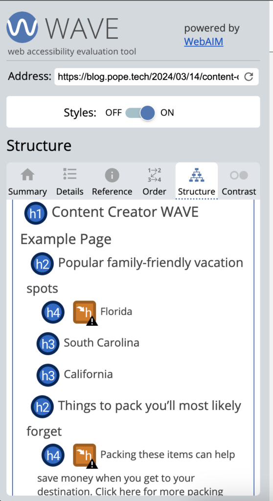
After activating the WAVE extension, go to the Details tab. This tab lists all the accessibility results including any errors or alerts you should focus on.
You can click on the result and it’ll take you to where it is on the page. You can also click on the result on the page, and then select Reference to learn more about that result.
The example page has several errors and alerts that need to be checked. They are:
- Missing alternative text
- Very low contrast
- Suspicious alternative text
- Skipped heading level
- Suspicious link text
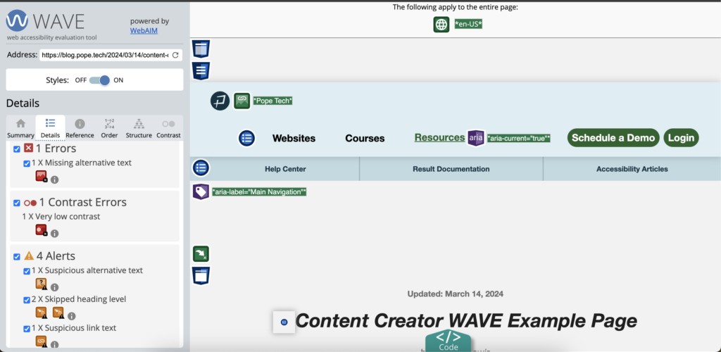
Four alternative text features should also be checked.
I can ignore the rest of the results because they’re not part of my content – they’re part of the website’s template.
PRO TIP: As you review your content more, you’ll get more familiar with the results that you ignore because they’re part of your website’s template.
Now, I’ll go through and fix each issue.
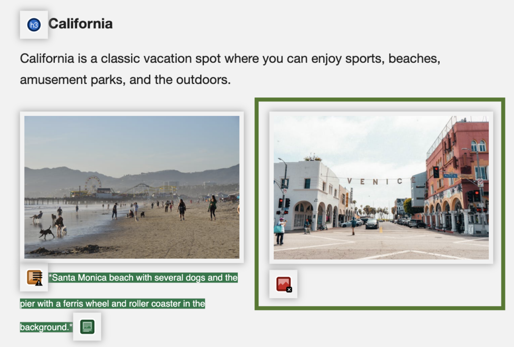
Missing alternative text
The missing alternative text error is on an image of California’s Venice neighborhood. This image supports the content, which is California as a vacation. It needs alternative text so all users get its content.
The alternative text could be “Street view of California’s Venice neighborhood.”
Suspicious alternative text
Suspicious alternative text is on the Jurassic Park image. You can read the alternative text WAVE found under the image. The alternative text is “universal.png,” which is the image’s filename. This isn’t helpful to a screen reader user.
The alternative text should be changed to “Jurassic Park entrance at amusement park.”
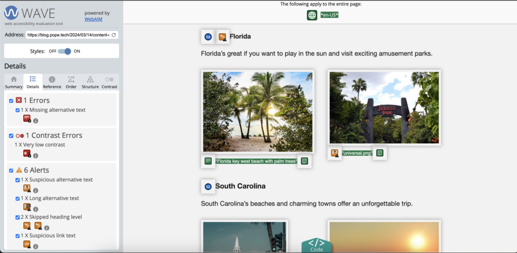
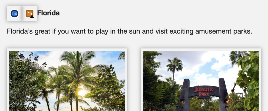
Skipped heading level
There are two skipped heading levels. The first is the heading “Florida” that goes from H2 to H4. The second is text that uses a heading styling to make it stand out.
The “Florida” heading needs to be an H3, and the text needs the heading styling removed. Instead, it could be bolded.
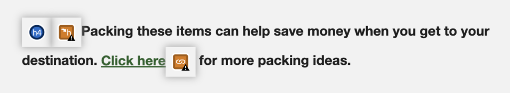
Suspicious link text
The suspicious link text is “Click here.” This text doesn’t describe the link. To fix it, I can change it to, “Visit Packing for a trip to the tropics for more information.” Now, the link describes where it’s going.
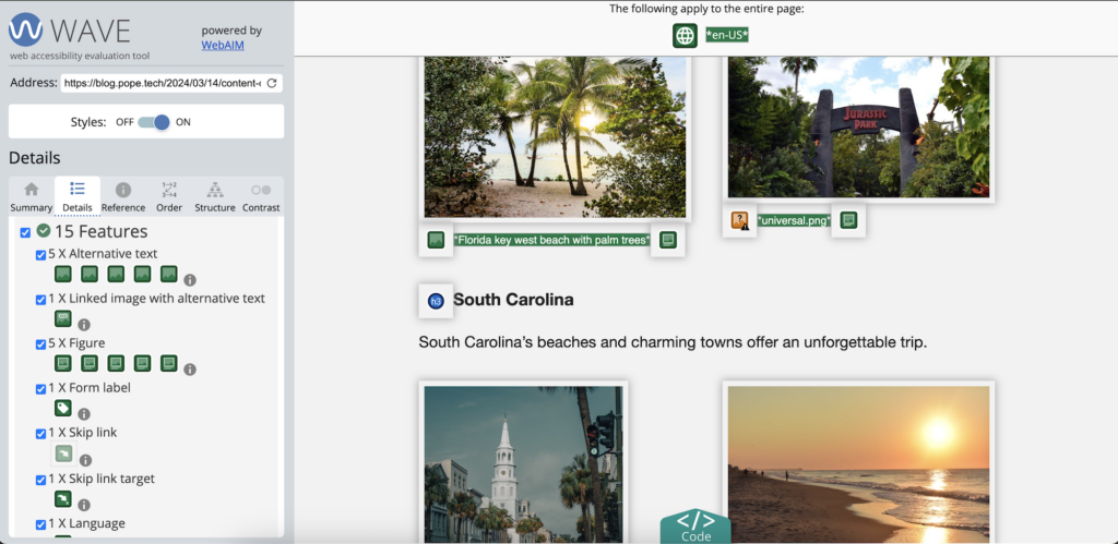
Alternative text feature
Several of the images have alternative text. Their result is in the Features part of the Details tab. I need to check each image to make sure the alternative text is correct. I’ll click the image, jump to where it is on the page, then review the alternative text.
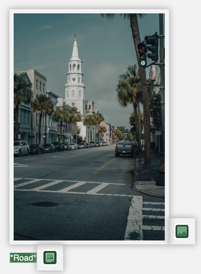
All the images have good alternative text except for one. The image for Charleston, South Carolina has alternative text that is “road.” While there is a road in the image, this doesn’t explain the content of the image. Instead, the alternative text should be, “Charleston, South Carolina street view with historic buildings.”
Review the Structure tab
The structure tab is an easy way to review your heading structure. It also shows the heading-related errors and alerts. I’ll review this to make sure my heading structure is right. Remember, this is the outline screen reader users will hear as they navigate by headings.
Use the Contrast tab
The very low contrast error is yellow text at the bottom of the page. I’m going to use the Contrast tab to review it.
Select the very low contrast errors at the bottom of the tab. This fills the colors in the contrast checker tool. Then, use the sliders to find a color that would work.
You’re ready to embed WAVE into your content process and use it and the accessibility basics to start making your content more accessible.
WAVE resources
- Use the WAVE extension to start accessibility audits and embed accessibility into processes
- How to use the WAVE extension as a content writer
- Check heading accessibility using the WAVE tool
- Find and fix contrast issues with the WAVE extension
Try automated testing for free
Try out Pope Tech with our Free Plan – no credit card required.
Monthly accessibility insights
Sign up to get monthly accessibility content similar to this article. Unsubscribe at any time.