
SVG can be a tricky subject. If you're a developer, you might need to have an interest in design to really dive into SVGs. And if you're a designer, you'll need to know a bit about coding to do more than just export files from design tools like Figma. This might be why we rarely see custom-made responsive SVGs, even though they are incredibly useful and versatile. In this post, I’ll guide you through the basics of creating a responsive SVG.
I was reminded of the potential of responsive SVGs when I looked at the Threads App. In the app, there's an interesting design element where a little swirl line connects the avatar of a reply to the original message's avatar.
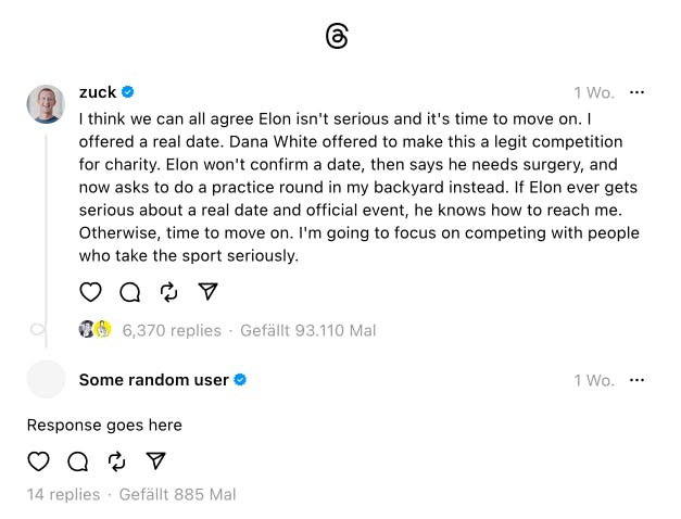
This design is achieved using three separate SVGs, with the length of the longest part calculated by JavaScript that is triggered on page load and every time the window is resized. While this is an effective approach, it relies heavily on JavaScript. In contrast, I want to show you how you can achieve a similar result using a responsive SVG and no JS at all.
To build the desired image, there are three basic things we need to understand: the viewBox attribute, the preserveAspectRatio attribute, and SVG symbols.
ViewBox Basics
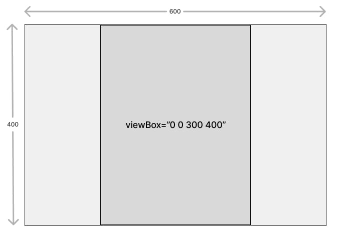
#<svg viewBox="0 0 300 400" xmlns="http://www.w3.org/2000/svg">
...
</svg>Think of the viewBox in SVGs like an artboard in a design tool. For example, when you see viewBox="0 0 300 400", it's similar to saying, "Create an artboard that is 300 units wide and 400 units tall."
Remember, we're working with vector graphics, so it's best not to think in terms of pixels, as these graphics can be scaled to any size.
SVGs also have width and height attributes, just like any other image. However, there's a key difference: by default, SVGs behave as if object-fit: contain is applied. This means if the aspect ratio set by width and height is different from the one defined by viewBox, your "artboard" will always remain fully visible and maintain its proportions without distortion.
To add a bit more complexity, you can actually choose not to define a viewBox at all. When this happens, the actual width and height of the SVG itself become the dimensions of our "artboard." This might sound a bit confusing now, but don't worry; we'll explore this in more detail later on.
PreserveAspectRatio ↔ Object-fit
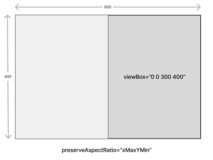
#<svg viewBox="0 0 300 400" preserveAspectRatio="xMaxYMin" xmlns="http://www.w3.org/2000/svg">
...
</svg>As I mentioned earlier, SVGs naturally act like they have object-fit: contain. There's also an attribute that functions similarly to object-position: the preserveAspectRatio property.
By default, it's set to preserveAspectRatio="xMidYMid", which centers the artboard. But you can change this setting to mimic other object-fit behaviors. For example, to replicate 'object-fit: right top', you would use preserveAspectRatio="xMaxYMin". Remember, only one of these positioning rules will be applied due to the 'contain' behavior.
SVG Symbols
#When we think of the viewBox in SVGs as an artboard, SVG symbols are quite similar to components in design tools like Figma. Essentially, a symbol is like a small artboard within itself, which can be inserted (multiple times) within another SVG. Each symbol comes with its own viewBox and preserveAspectRatio attributes, defining the space and boundaries of this mini artboard.
To use an SVG symbol, you first define it with a <symbol> element, giving it a unique id. This symbol acts as a template. You can then place this template anywhere in your SVG with the <use> element, which references the symbol's id.
<svg viewBox="0 0 300 400" xmlns="http://www.w3.org/2000/svg">
	<defs>
		<symbol id="symbol" width="20" height="30" viewBox="0 0 20 30" >
		...
		</symbol>
	</defs>
        <!-- `href` equivalent to the `id` on the symbol -->
	<use href="#symbol" x="0" y="0" width="20" height="30" />
</svg>
Building a Responsive SVG
#Before we put together our final SVG, let's start with the swirl element, which we'll later use as a symbol.
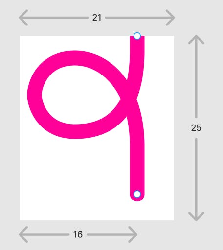
I began by creating an artboard with a width of 21 and a height of 25, where I drew the swirl as a path. I set the path width to 2 and chose to have round start and end points for a smooth appearance. To ensure symmetry, I positioned the start and end points of the curve such that their x-coordinates are both at 16.
The SVG code you get after exporting your design can vary depending on the graphic tool you use. Here's what the code looked like when I exported my swirl design from Figma:
<svg width="21" height="25" viewBox="0 0 21 25" fill="none" xmlns="http://www.w3.org/2000/svg">
	<g clip-path="url(#clip0_34_935)">
		<path d="M16 21.5C16 19.25 16 18.6 16 15C16 7 11.75 3 7.5 3C3.2503 3 2 6.5 2 8C2 9.5 3.2503 13 7.5 13C10.5 13 16 12 16 2V0" stroke="#FF0099" stroke-width="2" stroke-linecap="round"/>
	</g>
	<defs>
		<clipPath id="clip0_34_935">
			<rect width="21" height="25" fill="white"/>
		</clipPath>
	</defs>
</svg>
There’s a lot of unnecessary stuff in there. Ultimately, we only need the path that defines the swirl.
I frequently rely on SVG OMG by Jake Archibald to optimize my SVGs. However, Figma often includes a clipPath, which, for our little demo at least, is not needed. Unfortunately, SVG OMG doesn't remove it, so in the end, I manually removed everything except the path tag.
<svg width="21" height="25" viewBox="0 0 21 25" fill="none" xmlns="http://www.w3.org/2000/svg">
	<path d="..." stroke="#FF0099" stroke-width="2" stroke-linecap="round"/>
</svg><svg width="21" height="25" viewBox="0 0 21 25" fill="none" xmlns="http://www.w3.org/2000/svg">
<path d="M16 21.5C16 19.25 16 18.6 16 15C16 7 11.75 3 7.5 3C3.2503 3 2 6.5 2 8C2 9.5 3.2503 13 7.5 13C10.5 13 16 12 16 2V0" stroke="#FF0099" stroke-width="2" stroke-linecap="round"/>
</svg>With our swirl asset prepared, we're ready to construct the actual SVG. Let's set a width of 21 (the same width that is used for the swirl) and initially a height of 80 for this SVG. As we discussed earlier, we'll omit the viewBox attribute.
In our SVG, we'll define the swirl as a symbol within a <defs> tag. To create this symbol, we can use most of the code from the swirl SVG we created.
The main changes involve replacing the <svg> tag with a <symbol> tag and removing the xmlns attribute, as it's not necessary for symbols. What we do need is an id so it can be referenced within a use tag.
Moving it into <defs> as a <symbol> will prevent the path from being visible in the content.
<svg width="21" height="80" fill="none" xmlns="http://www.w3.org/2000/svg">
	<defs>
		<symbol id="swirl" width="21" height="25" viewBox="0 0 21 25" fill="none">
			<path d="..." stroke="#FF0099" stroke-width="2" stroke-linecap="round"/>
		</symbol>
	</defs>
</svg>
To make the swirl path visible, we must insert a <use> tag that references this symbol. This is where the preserveAspectRatio attribute comes into play. We want our swirl to always align at the bottom of the SVG, so we'll apply preserveAspectRatio="xMidYMax" to the symbol. This ensures that the swirl is anchored to the middle bottom of the SVG.
Additionally, by setting the symbol's height to 100% via the reference within <use>, we ensure that it always matches the height of the SVG, adapting fluidly to any changes in the SVG's size.
<svg width="21" height="80" fill="none" xmlns="http://www.w3.org/2000/svg">
	<defs>
		<symbol id="swirl-1" width="21" height="25" viewBox="0 0 21 25" preserveAspectRatio="xMidYMax" fill="none">
			<path d="M16 21.5C16 19.25 16 18.6 16 15C16 7 11.75 3 7.5 3C3.2503 3 2 6.5 2 8C2 9.5 3.2503 13 7.5 13C10.5 13 16 12 16 2V0" stroke="#FF0099" stroke-width="2" stroke-linecap="round"/>
		</symbol>
	</defs>
	<use href="#swirl-1" x="0" y="0" width="21" height="100%" />
</svg>
Now we have an SVG where the swirl is always positioned at the bottom, regardless of any height changes made through CSS.
Next, let's add the long vertical line, which in the Threads App is the part with a dynamically calculated height. To do this, we'll insert a rectangle that extends from the top to the bottom of the SVG. This is easily achieved by setting the rectangle's height to 100%.
<svg width="21" height="80" fill="none" xmlns="http://www.w3.org/2000/svg">
	<defs>
		<symbol id="swirl-2" width="21" height="25" viewBox="0 0 21 25" preserveAspectRatio="xMidYMax" fill="none">
			<path d="M16 21.5C16 19.25 16 18.6 16 15C16 7 11.75 3 7.5 3C3.2503 3 2 6.5 2 8C2 9.5 3.2503 13 7.5 13C10.5 13 16 12 16 2V0" stroke="#FF0099" stroke-width="2" stroke-linecap="round"/>
		</symbol>
	</defs>
	<use href="#swirl-2" x="0" y="0" width="21" height="100%" />
	<rect x="15" y="0" width="2" height="100%" rx="1" fill="#f09" />
</svg>
However, we don't actually want our rectangle to extend the full 100% height of the SVG. Ideally, it should stop just where the swirl begins.
In SVG, you cannot define coordinates starting from the bottom, but we can cleverly use CSS to achieve the desired effect. By setting the rectangle's height to 100% - 24px, we ensure that it reaches just above the swirl. This adjustment can be made directly within the SVG's code.
<svg width="21" height="80" fill="none" xmlns="http://www.w3.org/2000/svg">
	<style>
		#swirl-4-rect {
			height: calc(100% - 24px);
		}
	</style>
	<defs>
		<symbol id="swirl-4" width="21" height="25" viewBox="0 0 21 25" preserveAspectRatio="xMidYMax" fill="none">
			<path d="M16 21.5C16 19.25 16 18.6 16 15C16 7 11.75 3 7.5 3C3.2503 3 2 6.5 2 8C2 9.5 3.2503 13 7.5 13C10.5 13 16 12 16 2V0" stroke="#FF0099" stroke-width="2" stroke-linecap="round"/>
		</symbol>
	</defs>
	<use href="#swirl-4" x="0" y="0" width="21" height="100%" />
	<rect id="swirl-4-rect" x="15" y="0" width="2" height="100%" rx="1" fill="#f09" />
</svg>
And there you have it! We've successfully created a responsive SVG that adjusts its size while always keeping the swirl loop at the bottom, ensuring it doesn't get distorted.
Using responsive SVGs
#Now, you might wonder, how do we actually use the swirl-line in our code? You have a few options.
Inline SVG
#One of the simplest methods is to use it as an inline SVG. This approach allows you to define the symbol just once at the beginning of your document, rather than repeating it multiple times. Additionally, the style definition for the SVG can be included in your regular CSS stylesheet. It's probably best to apply these styles using a specific class, to avoid affecting all rectangle elements globally.
Using an image tag
#You can also save the code as an SVG file and then use an image tag. Please note that for this approach, you have to delete the width and height attributes from the SVG and instead apply them to the <img> Tag.
CSS in SVG in CSS 🤯
#Perhaps the most thrilling option available is embedding the SVG directly in our CSS as a data URI background-image.
For this, I recommend a fantastic tool by @yoksel, which you can find at https://yoksel.github.io/url-encoder/. This tool allows you to simply copy and paste any SVG and generates a ready-to-use code snippet for your stylesheet. You can then, for example, use a pseudo-element and apply the background image.
This process essentially embeds CSS within an SVG, which is then itself embedded within your CSS file. Isn't that mind-blowing?
Putting it all together
#Check out this CodePen, where you'll find all three examples demonstrated. While I don't have a strong preference for any particular solution, I'm somewhat partial to the last option. The reason is, that it allows for the creation of the swirl without the need for an additional DOM element, which I find quite efficient and elegant.
Related reading:
#- Understanding SVG Coordinate Systems and Transformations by Sara Soueidan
- Understand the SVG Viewbox by Paul Ryan
- viewBox on mdn web docs
- <symbol> on mdn web docs
Nils selected Queermentor for an honorary donation of $50
Queermentor is committed to promoting equity by providing free mentoring, training, and networking opportunities for queer individuals. They also serve as a resource for companies looking to make a positive impact on the LGBTQIA+ community through their work.