Wait, what? Can a design trend really influence the way we use text in an interface?
Yes, it can. We saw last week that design and content influence each other, and that includes pure design trends like the flat UI look that’s all the rage right now (including right here on sitepoint.com).
So if you’re applying the flat UI aesthetic to your website, here are a few easy ways to make sure your text best supports user interactions to within that visual context.
What’s the problem?
Hey, no one said “problem”! But, if there’s one thing you can say about flat UI designs, it’s that they’re two-dimensional. Shadows and gradients are so 2011. And sure, there are plenty of other visual cues you can use to indicate clickable zones on a page in the world of flat UI.
But from the user’s perspective, this new trend is just that: new. While those in industry might be familiar with it, flat UI isn’t exactly everywhere just yet. So users who are used to seeing interactive elements that look tactile can find two-dimensional design a bit of a surprise.
Which areas are clickable? Which areas aren’t? Where and how can they interact with the page?
One way you can help them work that out is through text. Let’s look at a few examples.
2D Calls to action
Calls to action can be a great place to communicate your brand – where better to “resonantly connect” than in the actual moment when your user’s physically engaging with your website?
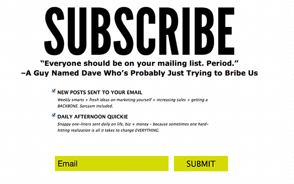
One of my favorite branded CTAs used to be on Ashely Ambirge’s The Middle Finger Project website: her email signup button read “Bombs away!” it reflected her attitude, and, I’ll wager, brought smiles to the lips of new subscribers.
But the flat, minimal style of 2D design doesn’t immediately lend itself to that kind of flourish. In an interface where a button is simply a differently colored rectangle, that rectangle better make its intentions known. How? Through text. It’s no surprise that the signup CTA on Ambirge’s new, flat-UI interface is “Subscribe”, and the button text alongside the email field simply reads “Submit.”
So in the flat-UI universe, don’t go crazy with CTA or button text – at least, not until the style has evolved a bit more and your users are comfortable with it. In the meantime, make sure your CTAs really do demand the right kind of attention:
- Use a verb at the start of your CTAs: get, join, sign, subscribe, and contact, for example.
- Make use of CTA conventions where it’s appropriate. “Sign up,” “Log in”, “Subscribe” – all these are established CTAs, and users already know what they mean.
- Keep CTAs consistent where they serve the same purpose. So if you used “Sign up” at the top of your home page, don’t switch to “Join” further down. Similarly, keep fonts and colours consistent so users know a button on your site when they see it – and have some idea of what it does.
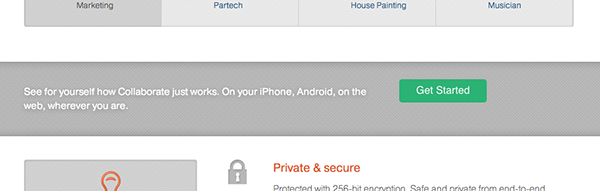
- Also, look at text casing. In the image below, collaboration tool Collaborate.com uses a fairly flat design, and presents all its Get Started CTAs in title case. Have a look at the site and you’ll see that this is a different treatment from, for example, subheading text. That helps differentiate these interactive elements from simple text.
2D Navigation
What about navigation? You may think this is a bit of a no-brainer, but with growing complexity of nav presentations, being careful with text can help to communicate what’s interactive, and what’s not.
Take a look at this image of the RMIT university homepage.

This content was viewable in my browser on pageload. It includes four nav areas.
How are they differentiated? Through:
- text and background colour
- text casing
- positioning on the page
- the use of visual cues like arrows and vertical dividers.
If we look at the two top navigation sections – the one that reads “Students, Alumni, Staff” and the global nav, which contains options like “About, News, Events” and so on, we can see that their text is minimal, and consistently so.
There’s congruence between the items in each navigation area – each group makes sense within itself. They’re also built using common terms, which users will have seen in other sites’ navigation. That helps to reinforce the idea that users can select those items, as they can on other sites.
And these nav items all have single-word labels, which helps to support the idea that they’re parallel parts of a group, and makes them easily scannable and comprehensible.
So these navigation areas have a very minimal look, but the consistencies between them – including the labels that are used – helps to give users a clear indication that these items are clickable.
Minimal link styles
Fewer and fewer sites seem to underline links, and I’ve found this to be especially the case among sites that have a flat UI. That presents a challenge to designers to identify links in the page, but you can help by looking at the linked text itself.
That RMIT site has a number of subheads further down its home page: News Events, Explore, and Interact. They all look the same, but while some are clickable, some are not.
This is far less than ideal. Firstly, the designer is expecting users to rollover the headers to find out if they’re clickable, since they don’t appear so. But if you roll over the wrong one, you’ll think they’re all just headers, when in fact, most aren’t – they’re links to more information.
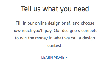
Adding small, subtle cues like “More” links (if you’re really opposed to underlines) could be one way to avoid missing that opportunity to communicate. “Learn More” links are used on the 99designs homepage, for example, to help interested users access more detailed information on how the service works.
If you want users to click on a link, tell or show them they can.
Working with design
As you can see, your text doesn’t need to do all the heavy lifting in a flat UI design, but it can work within that style to help make sure users know where they can access what they need to.
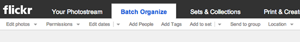
Things like shaded nav bars and arrow cues for drop-downs, as in the flickr editing page below, are a big help in a flat UI design. But, for example, they can affect how much room you have to play with for text – you may need to shorten CTAs to accommodate other visual devices in this style.
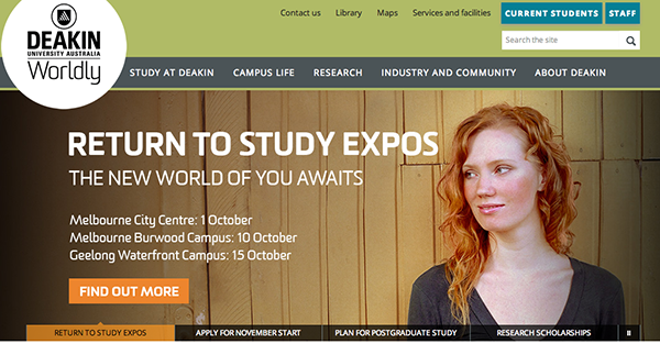
Also, you might need to allow extra space within the design to create consistently constructed, super-clear on-page CTAs, as in the carousel on the Deakin university homepage shown below.
And if you adhere to the consistent-text-for-consistent-interactions mantra, make sure that the phrase you choose for a particular interaction (like “Learn more”, discussed above) is versatile and clear enough to be applied in all the circumstances in which you need to use it.
Are you using the flat-UI design style on your site? Has it affected the interactive text you use, or the way you present it? Tell us in the comments.
 Georgina Laidlaw
Georgina has more than fifteen years' experience writing and editing for web, print and voice. With a background in marketing and a passion for words, the time Georgina spent with companies like Sausage Software and sitepoint.com cemented her lasting interest in the media, persuasion, and communications culture.