is a blog about design, technology and culture written by Khoi Vinh, and has been more or less continuously published since December 2000 in New York City. Khoi is currently Principal Designer at Adobe. Previously, Khoi was co-founder and CEO of Mixel (acquired in 2013), Design Director of The New York Times Online, and co-founder of the design studio Behavior, LLC. He is the author of “How They Got There: Interviews with Digital Designers About Their Careers”and “Ordering Disorder: Grid Principles for Web Design,” and was named one of Fast Company’s “fifty most influential designers in America.” Khoi lives in Crown Heights, Brooklyn with his wife and three children.
Free Fonts Are Getting Better, But What Does That Mean?
I’m continually astonished by the downward trend in the value of design paraphernalia. We’ve seen massive shifts in the stock photo business where those assets now cost little or nothing—and companies like Unsplash can raise millions of dollars in venture capital to give away stock images for free.
Perhaps less pronounced, for now, but still worth watching is the trend towards free in the marketplace for type. Every month I get an email update to Typewolf’s Definitive Guide to Free Fonts, an excellent, comprehensive handbook of the best offerings in the market. Each new edition adds more free fonts, and watching this activity month to month is fascinating. Jeremiah Shoaf, the designer behind Typewolf, surfaces the best of recent releases, but even amongst these the quality can be varied. Some are quite well executed while others are merely passable.
Once thought of as amateurish by professional designers, free and open-source fonts have gone through something of a renaissance in just the last few years. The quality of available free fonts has increased dramatically.
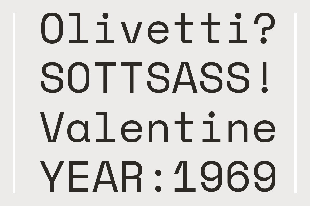
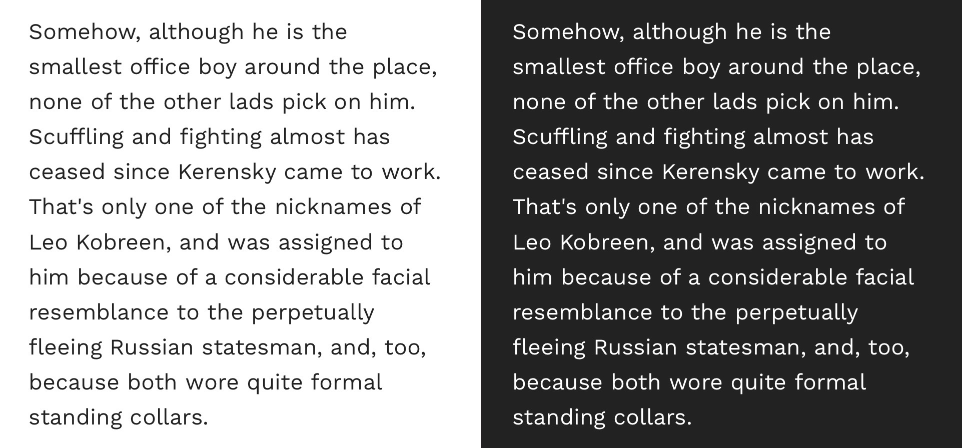
When I emailed him to ask about his feelings now, three years later, he stood by those comments. “We are seeing more and more free font releases that are suitable for professional design,” he said. Shoaf pointed to several examples of high quality releases from just the past year or two, all of which are superb, admittedly:
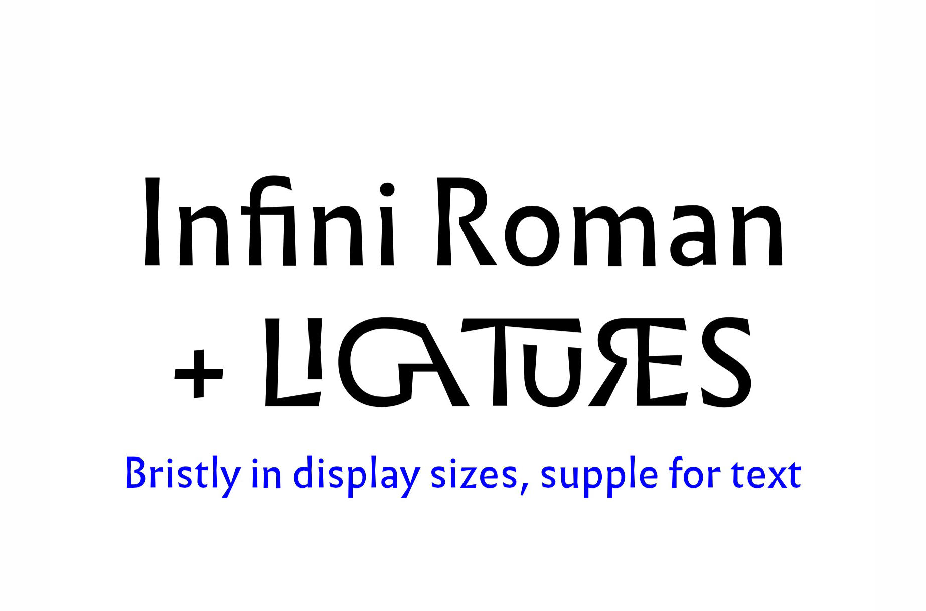
Work Sans. A sans from Wei Huang inspired by early grotesques.
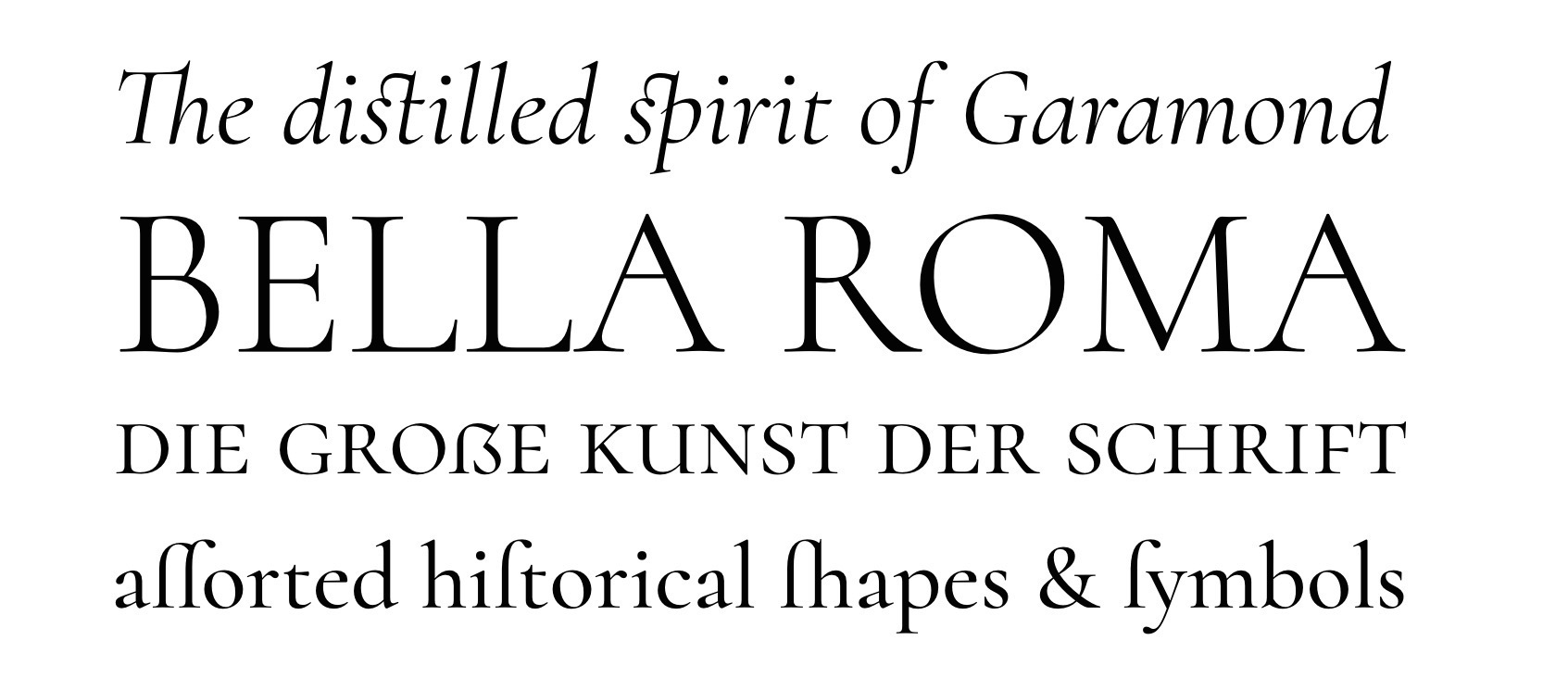
Cormorant. A refined Garamond created for display use rather than text like traditional Garamonds.
Given the quality of these examples, the question inevitably arises whether their kind will diminish the market for paid typefaces. In Shoaf’s estimation, the opposite is in fact happening: free fonts are effectively raising the bar for typography in general, at least on the web, and stoking demand for more distinctive, paid fonts. “I think free fonts and commercial fonts can co-exist peacefully,” he says.
Whether that is true or not is hard to verify, but it seems clear that the labor and expertise that goes into producing the very best typefaces will never be compatible with a market that assigns a value of zero to fonts in general. We’re not at a disruptive juncture yet, but I hope that as this evolves, we find a way to square the introductory value of free fonts with the richer quality of premium fonts.