
Typographic Classifications
There is a whole wide world of typefaces out there and finding the right one(s) for your specific scenario can be overwhelming. A typeface, also known as a font family, can set the overall tone and personality of your site or application, as well as increase (or decrease) readability.
Let’s first start by defining some common characteristics across typefaces:
- Baseline: An imaginary line where letters sit
- X-height: The height of the typeface’s lowercase letters, not including ascenders or descenders
- Foot: the part of the letter that rests on the baseline (often seen in serif fonts)
- Stroke: A single line, straight or curved, that makes up a part of a letter

These definitions will be useful when describing typeface classifications. When looking for typefaces to use in projects, decide which classification of typeface will look best.
There are several classifications of typefaces, but what you often see in websites and applications fall into the following categories:
- Serif: Typefaces that use feet at the end of character strokes and often use varying letter-stroke widths
- Sans-serif (French for “without serif”): Typefaces without feet, which often have thinner letter strokes and larger x-heights
- Slab-serif: Typefaces that look sans-serif, but possess thick, block-like serifs that match the overall letter stroke
- Script: Typefaces that are decorated with flourishes meant to resemble handwriting
- Display: Typefaces that stand out with decorative features and are meant to be used at large sizes
- Monospaced: Typefaces with all or most characters taking up the same horizontal space (whereas in most typefaces, letters like W are much wider than letters like J)

With these classifications in mind, you can begin to narrow down your options when searching for typefaces that will best suit your website or application. But, even so, choosing typefaces often feels like a guessing game: you pick a typeface, apply it to your design, decide it’s not what you wanted or that it clashes with other aspects of the design, then go back to choose another typeface. Rinse and repeat.
You can make this process easier by starting with the guidelines described below.
Look for Typefaces that Support Multiple Languages
A quick way to narrow down your list is to focus on typefaces that support multiple languages. This is especially important if you serve international users. However, even if your site supports a single language, users may translate it using third-party software, so it’s a good practice to select a typeface supporting multiple languages anyway.
Test how your content will look in different languages by translating the page or application. Notice how your typeface looks in different characters and how the layout changes.
Knowing how your typeface appears in different languages can influence how you design the page and how your users perceive your product or service.
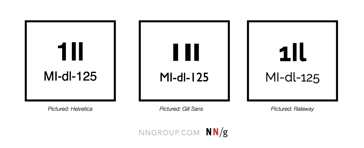
Assess the Similarities Between Characters
Some typefaces, especially sans-serifs, are minimalistic and have unclear distinctions between characters. Check how well your candidate typeface differentiates between the number 1, the uppercase I, and the lowercase L.
It’s true that users often can get what a character means depending on context, so, in many situations, lack of clear distinctions between characters may not impact the legibility of your typeface. However, if your typeface will be used to display alphanumerical data (e.g., verification codes), similarity between different characters could cause issues. This is especially true if you’re serving users in the financial, government, or healthcare industries, where account numbers are prevalent.
Mix Decorative Fonts with Neutrals
Script and display typefaces bring brand personality into your site or application and set you apart from competitors. However, do not go overboard with decoration. In this case, less is more.
Reserve decorative typefaces that have a lot of personality for less-utilized elements, such as headers or illustrations. Decorative typefaces are difficult to read at small sizes and should never be used for body copy.
Pair a decorative typeface with a neutral serif or sans-serif typeface. If your decorative typeface has intense flourishes, it will look best when paired with a sans-serif typeface. If you’d rather pair it with a serif or slab-serif, make sure its serifs aren’t so pronounced that they compete with the decorative typeface.

Use Contrasting Font Weights to Distinguish Components
Pairing multiple typefaces in a single design isn’t always necessary. A design that uses a single typeface with multiple weights can look professional and well-balanced. Using multiple font weights, styles, and sizes will help define the page’s visual hierarchy, which will guide the users’ eyes around the screen.
The more options the typeface provides, the more flexibility you’ll have in the design. When using a single typeface in your design, consider looking for font families that include the following options:
- Light
- Regular
- Bold
- Light italic
- Italic
- Bold italic

Assign Distinct Roles when Pairing Typefaces
Regardless of which typeface or combination of typefaces you choose, do not use them haphazardly in designs. Each typeface or style should have a clear role and purpose.
Like in the decorative typeface examples above, you can assign one typeface to headers and another to body copy. Using two typefaces for body copy makes a design look inconsistent and unrefined and could diminish trust in your brand or company.
Utilize a design system or front-end style guide to define patterns across your entire site or application to maintain consistency and satisfy user expectations.
Conclusion
Choosing typography for designs can feel overwhelming due to choice overload. With so many options to choose from, you may find yourself picking whatever is most comfortable or readily available in the moment. These typography guidelines will build your confidence in creating designs that maximize usability without sacrificing aesthetics.
Learn more about using typography in designs in our training course Visual Design Fundamentals.


