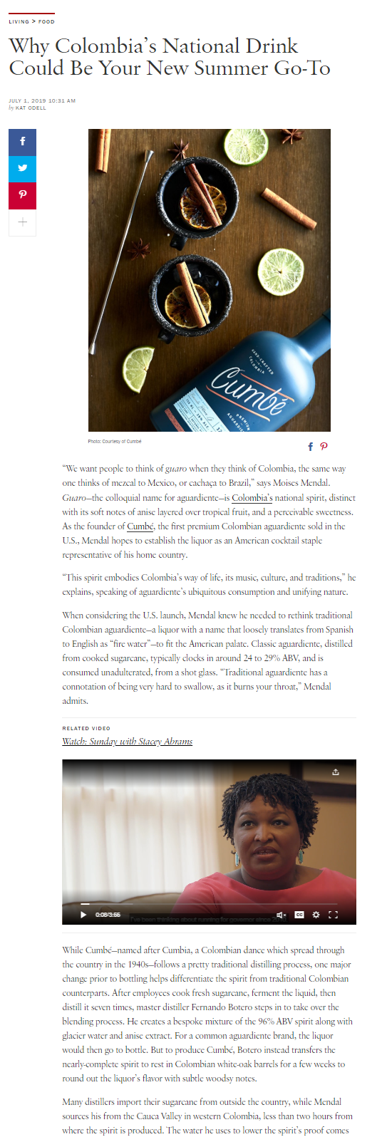
People don’t usually read every word on a webpage, in an app, or even in an article or text passage. Instead, they often scan — because their experience with many websites has taught them that scanning can deliver almost the same value (that is, amount of information) with significant less time and effort. (Recall that people are naturally efficient and attempt to put in the least possible work for achieving their goal.)
The way in which the page is organized visually plays a big role in how people scan its content. If the page layout allows users to quickly identify the essential information that is relevant to their needs, users will save a lot of effort and will be able to accomplish their goals fast. But, if, on the other hand, the layout does not emphasize the important information, people may miss it and they may end up leaving the site.
This article focuses on a scanning pattern that occurs when the information on the page is split in clear headings and subheadings.
Definition: The layer-cake scanning pattern consists of fixations made mostly on the page’s headings and subheadings, with deliberate occasional fixations on the (body) text in between. In an eyetracking heatmap or gaze plot, this pattern looks roughly like a set of horizontal stripes and blank spaces between them, resembling a layer cake (with cake on a level, then frosting, then cake, and so on).
Aside from reading every (or almost every) word, the layer-cake pattern is by far the most effective way to scan pages: most of the time, it ensures that users will find the information they are looking for (if it is present on the page).
How to Create Subheadings that Promote Effective Scanning
We said that the layer cake is one of the most effective and efficient scanning patterns. But people can only engage in this pattern if (1) they can identify the subheadings easily and (2) the subheadings correctly summarize the sections of text associated with them. Let’s examine how designers can create subheadings that support users on both accounts.
Visual Guidelines for Effective Subheadings
There are two elements that are important in the visual design of subheadings:
- Marking subheadings so they visually stand out relative to the rest of the text in a consistent, predictable manner
- Clearly indicating which body of text goes with which subheading
Many visual text effects can be used to make a subheading stand out. For example:
- Different color
- Larger size
- Different typeface
- Effects such as bolding, shadowing, or underlining (but use underlining only if the subheading is also a hyperlink)
- Combination of effects: a mixture of the above visual treatments
Be careful to not make the subheadings so absurdly brighter or larger than the body text that they look like promotions or ads instead of page content and cause users to ignore them.
Work with visual designers and conduct usability testing to iterate ideas and derive a good way to present subheadings. And then create a visual-design style guide for all the text on your side, addressing especially how body text, subheadings, page titles, and links should be styled.
Content Guidelines for Effective Subheadings
Just like the IA reflects the information structure of a website, the mini-IA, which is made up of all the page headings and subheadings, reflects the information structure of a page. Subheadings make it easy to browse a page in the same way in which the global navigation makes it easy to browse a site. Good subheadings help users determine if a section is worth reading, and good category names help people understand where they should navigate to complete their task.
Content writers and editors need to provide a clear content hierarchy to users by:
- Prioritizing and ordering the content on the page: Organize text so it makes sense to readers.
- Being concise: Remove superfluous content.
- Chunking: Break content into chunks, like paragraphs or lists. Put related content together.
Once these things are done, refine the words used in subheadings, so they are most informative when scanned. Make your subheadings:
- Descriptive of all topics in the section, and only topics in the section: Use words that encompass all the body text associated with the subheading so users have an idea of everything available in the section.
- Descriptive of only those topics in the section: Be succinct and describe only concepts and words that appear in the body text associated with the subheading. Don’t make the subheading so broad that it seems to include more than what is in the body text
- Lead with some of the most important words: Information-bearing words give people the main point of the subheading right away.
- Understandable: Use clear language so when users scan a heading, they can quickly understand its meaning.
Chunk and Label All Pages, Not Just Text: Derivatives of the Layer-Cake Pattern
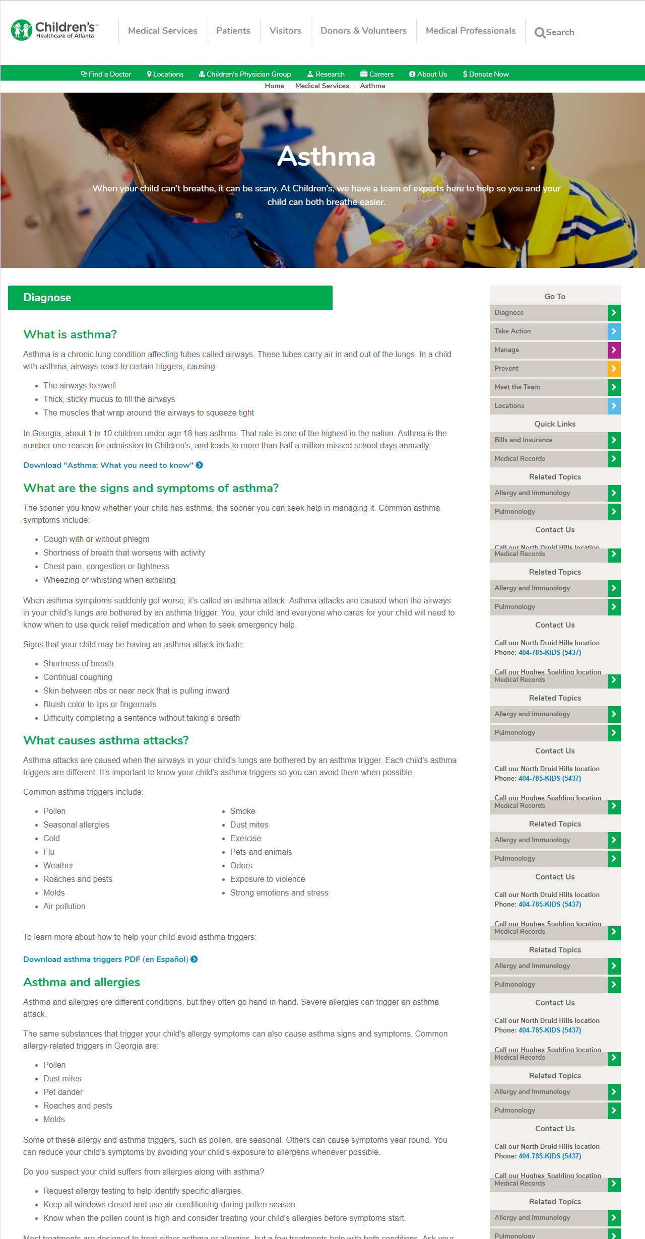
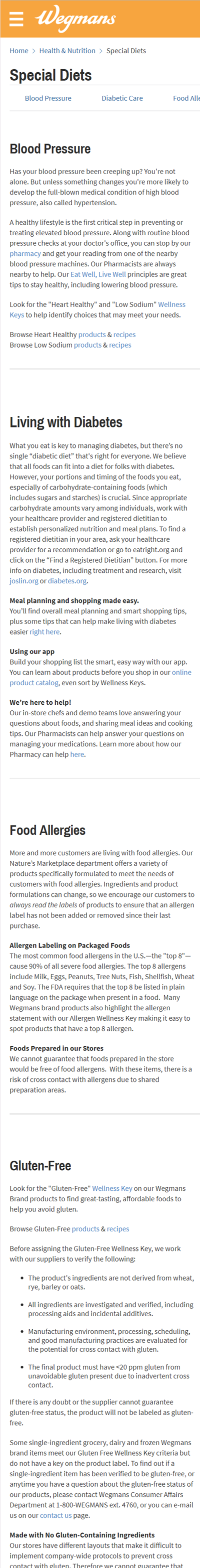
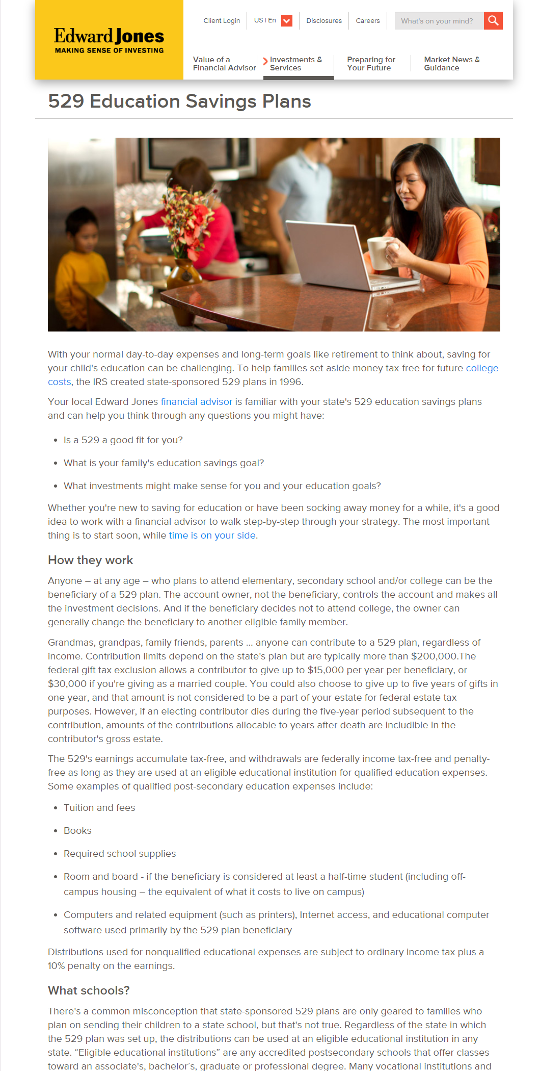
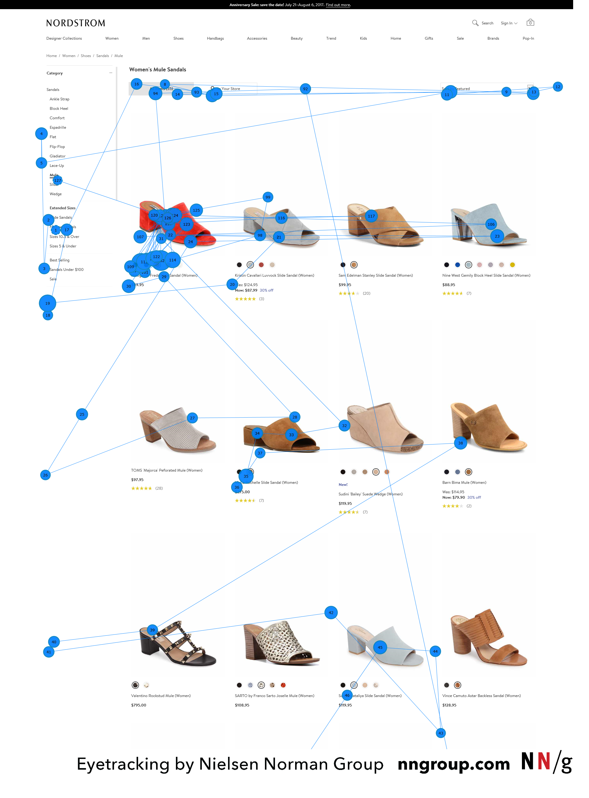
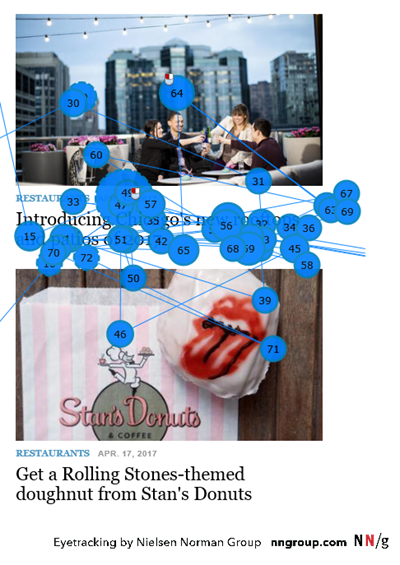
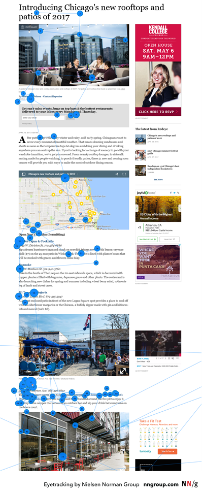
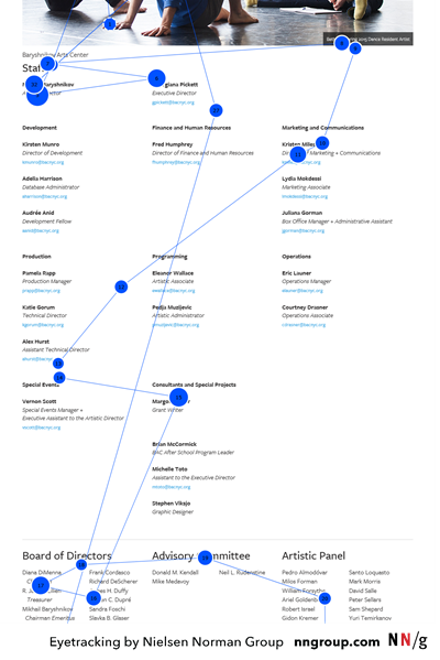
Pages with a systematic layout are easy to scan; disorderly and unpredictable pages are not. When the layout consists of one or more text columns (like in the Edward Jones example above), subheadings allow users to quickly determine which text goes with which subheading. However, when the page uses cards or some other irregular format, it’s important to use the Gestalt proximity principle to signal what subheading or label goes with what body text or section.
Pages with mixed content can still be made scannable by following the same principles as those for text layouts Specifically:
- Determine like content and place it together.
- Visually distinguish content chunks. Do this with:
- a grid or other graphic system that includes borders or colored backgrounds around each chunk (e.g., cards, banners)
- a suitable amount of space between chunks
- When appropriate, label each content chunk with a clear subheading.
When pages are designed in this way, users often scan in series of mini layer-cake patterns, looking for text that indicates what the section of content is about.
Layer-Cake Pattern Versus F-Pattern
While we discovered the F-pattern and the layer-cake pattern at the same time, the F-pattern is undeservedly the more notorious of the two. Unlike the F-pattern, which is usually not very effective at extracting the right information from text, the layer-cake pattern can guide users to the right place on a page (provided that the headings are meaningful and representative for the content underneath). Once people have identified a section of interest, they can read it carefully.
|
|
F-Pattern |
Layer-Cake Pattern |
|
Page characteristics |
Columns of text with little text that stands out (e.g. subtitles, chunks of content, bullets, bold, underline) |
Pages with well-signaled headings and subheadings |
|
Efficiency |
Low |
High |
|
User behavior |
The eyes skip sections of text based completely on how the text flows in a column. |
The eyes scan directly to headings and may read the related body of text if interesting or relevant to their goal. |
|
Effects |
People inadvertently miss meaningful information and have no knowledge they did so. |
People save time by directing their attention to the relevant page sections and skipping the irrelevant ones. |
Summary
Chunking content and assigning clear, descriptive subheadings that stand out from the other text and content on the page increase content usability exponentially because they support the layer-cake scanning pattern, which, unlike its relative, the F-pattern, increases users’ efficiency by allowing them to quickly identify the content that is most relevant to their task.
For more information about reading and scanning, see our full research report, “How People Read on the Web: The Eyetracking Evidence”.