
Ten years ago, the first iPhone started the mobile revolution. In 2009, when we released the first edition of our mobile-usability report, we still had to convince companies that they need a mobile presence. As we release the fourth edition of the same report, the mobile landscape has changed significantly: today it offers not only more diversity but also, not surprisingly, better, more consistently good user experience.
One of the biggest hurdles in mobile design is the small screen: because only so much can fit in, essential information gets hidden under the fold, navigation elements are crowded under hamburger menus, and users struggle to find what they need fast. Every extra bit of screen real estate can make a difference on mobile.
Over the years, mobile designers have flirted with the idea of using gestures in order to amass more functionality without sacrificing screen space. Unlike graphical UI elements, gestures don’t need a visual representation and, thus, leave more room for content. But gestures are hard to remember and use. iOS apps such as the todo-list manager Clear Todos and the now defunct Mailbox app implemented all or most of their functionality through gestures, with almost no graphical UI elements. These kinds of apps have been received with enthusiasm by the design community, but have never been successful with the general mobile user because remembering gestures (and especially a lot of gestures) is hard. And if you don’t get a chance (read: you’re not forced) to use these gestures every day, chances are that you won’t learn them. Or you may give up learning them.
The iPhone X represents one large-scale attempt to use gestures to maximize content space on the mobile screen. With this new device, Apple removed the defining characteristic of the iPhone, the Home button, in favor of a larger screen. To access the phone’s home screen, users have to swipe up on the bottom edge of the screen.
What are the implications of this change?
Swipe Ambiguity on Steroids
With the Home button removed, its functionality — in particular, accessing the home screen and the list of recent apps — needed to be relegated elsewhere. The swipe gesture, with its many varieties, has been the solution chosen by Apple.
The swipe gesture started playing a big role in the iPhone’s operating system starting with iOS 7: it was used to navigate back to the previous page in apps like Safari or Mail or for invoking the notification and the control centers. With iPhone X, Apple changed the meaning of some of the existing iOS swipe gestures and created new ones. Swiping on the left, bottom, and top edges can have different outcomes depending on three attributes of the swipe:
- the location where the gesture is initiated
- the length of the swipe
- the direction of the swipe
It’s always bad to change a design element that users have grown used to. Not only are UI changes always unpopular with existing users, but the risk of user errors grows as people sometimes use the old interaction by mistake. These usability problems will eventually go away if the new design is better than the old design, because the users will gradually adapt to the new design. However, in the case of Apple’s new gestures the error-proneness of the design change is magnified by the number of invisible criteria that determine the meaning of the many gestures. Thus, users may adapt slower than usual.
The table below provides an inventory of the meanings of swipe on iPhone X compared with the previous iPhones.
|
|
iPhone X |
iPhone 8 and older |
|---|---|---|
|
Swipe up |
||
|
Close to bottom screen edge |
Scroll the page down |
Scroll the page down |
|
On the bottom edge |
Go to the phone’s home screen |
Open up the control center |
|
On the bottom edge, up to the middle of the screen |
Go to the list of recent apps |
N/A |
|
On the bottom edge, up at 45-degree angle |
Go to a different view of the recent apps |
N/A |
|
Swipe down |
||
|
Close to screen edge |
Scroll the page up |
Scroll the page up |
|
Top right corner |
Invoke the control center |
Show notifications |
|
Elsewhere on the top edge |
Show notifications |
Show notifications |
|
Left horizontal swipe |
||
|
On the bottom edge |
Switch to previous app |
Back to previous page ((in Safari, Mail, and other apps that support swipe for Back) |
|
Close to the bottom edge |
Back to previous page (in Safari, Mail, and other apps that support swipe for Back) |
Back to previous page (in Safari, Mail, and other apps that support swipe for Back) |


Are the many swipes problematic? We documented swipe ambiguity when we analyzed the usability of the first iPad apps. (There, a horizontal swipe could turn the page or move the carousel depending on where the user swiped.) Swipe ambiguity means that users have to learn multiple meanings associated with essentially the same action (swipe) — which makes the memory retrieval of that gesture more effortful and slower.
Swipe ambiguity was present in all iOS versions since iOS 7. It was perhaps the most irritating on web pages that contained embedded carousels, where a horizontal swipe could mean Back or could move the carousel.
Is swipe ambiguity likely to be a deal breaker on the iPhone X? Although it will cause annoyance, the new types of swipe ambiguity are unlikely to be as problematic as the already existent Safari ambiguity mentioned above. On a random website that they have not seen before, in order to avoid swipe ambiguity users have to realize the potential problem and plan their movement accordingly. (Sadly, most users are not UX experts and don’t have a firm understanding of these design concepts or the ability to analyze their experience and deduce what might be going wrong. Now that you know about it, you may suffer less than normal users when encountering swipe ambiguity.)
On the iPhone X, most of the new swipe ambiguities involve basic functionalities of the phone. Users will have countless opportunities to discover swipe ambiguity, practice avoiding it, and learn how to execute the different swipes correctly eventually. Users may suffer under Apple’s new design, but at least they’re suffering in a good cause and might eventually reach a stage of less suffering. (In contrast, on your website, due to Jakob’s Law of the Internet user experience, users will spend relatively little time and usually not get a chance to learn any weird gestures you employ. On individual sites, user suffering is just misery that reduces mastery without redeeming goodness.)
The new meanings associated with some of the swipes will also cause some difficulty. Using the same gesture in different ways on different iPhones means that, if you upgraded your older iPhone to an iPhone X, you will have to unlearn the behaviors you were used to and create new associations. Again, this is likely to cause problems in the beginning, as people will be transitioning to the new device, but is not a fatal flaw. Ultimately, the number of repetitions will be high enough that people will overcome the initial difficulty and learn the new meanings for swipe. (However, I pity those owning both an iPad and an iPhone X — they will have to put up with the different meanings of the gestures on the different iOS devices.)
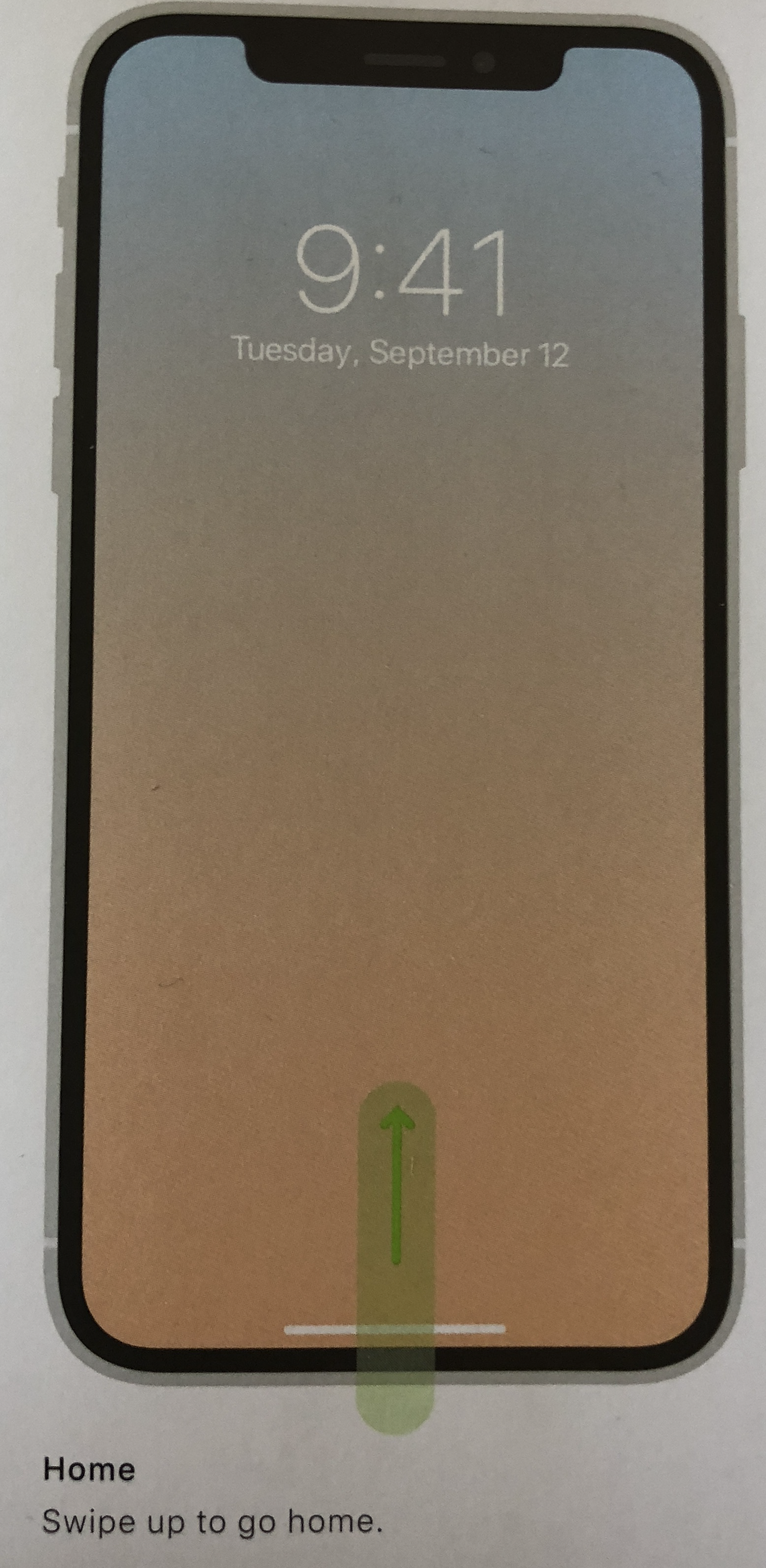
The Home Line: A Visual Signifier Saves the Day
One of the big problems with using gestures for interface actions is that they are invisible and people have trouble remembering them and remembering to use them. The old saying “Out of sight is out of mind” applies too well to hidden UI elements — whether gestural or not. When Windows 8 first came out, it relied heavily on gestures to enable access to interface functionalities. We tested it and it was a huge usability failure. (Microsoft made changes that resulted in more usable subsequent versions.)
Is Apple simply stepping into Microsoft’s shoes and repeating the same errors? I feared so, but one simple design element saves the day: a visual signifier for the Home button. The `home line’ that appears at the bottom of the screen, where the Home button used to be, serves as a reminder for users to perform the swipe up — the one gesture that they really need to remember. Yes, in fact, people don’t need to remember most of the actions available to them through the many variants of swipe. These actions are enhancements or accelerators — nice for power users, but regular users can survive quite well without them. They can access the control center using the phone’s Settings, they can get to the list of recent apps by swiping up or in the worst case by navigating back home. But in Microsoft’s case, they could not do much if they did not remember how to navigate back to the start screen or how to expose the so-called “charms” — essential interface controls.

The home line is sometimes hard to see because it blends in with screen content. It is also not always present — for example, it is not displayed on the home screen. Logically, it makes sense to not show it there: if you’re already home, you don’t need to get home. Except that the home line is a reminder not only of how to get home, but also of how to access the list of recent apps. Plus, going home can serve as an escape hatch: in many user studies we’ve noticed people pressing the Home button when they felt lost and wanted to start with a clean slate. When nothing else worked, pressing the Home button offered a concrete, physical way out.
For example, if you long press an app on the iPhone X, you’ll enter the home-screen–edit mode: the apps will start `shaking’ and you could move them around. But how do you get out of this mode once you’re done? Normally, pressing the Home button will exit it. Without a Home button, people could still do the equivalent “press the Home button” action — swiping up on the bottom edge of the screen. But the home line is not there to remind them of that option. Instead, Apple added a different visible UI element — a small Done button in the top left corner or the screen. Users of older iPhone models will be confused at first, likely not noticing the Done button and getting no clue as to how to dismiss the view. The little bar could have served as a reminder that, in the absence of a Home button, you are supposed to swipe.

FaceID: Login with Zero Interaction Cost
For previous iPhone versions, the Home button doubled as a fingerprint-authentication sensor. It worked quite well and saved people from the misery of typing passwords on a small soft keyboard. To my surprise, FaceID works comparably well. It does encounter some difficulties when the user is grabbing the phone and not directly looking at it, in the dark, or when the face is covered by goggles or a face mask, but seems to work quite well in most practical situations. In fact, FaceID is a little closer to that holy grail of usability — zero interaction cost. It’s a little ironic that what arguably used to be the hardest task in a system (logging in) is now perhaps the easiest — users do not have to do anything to authenticate or unlock the phone. (Well, technically, they should swipe up to get to the application view.)
Heterogeneous iOS Experience
In the early years, one of the iPhone’s strengths was the consistency of the experience across all devices: unlike the many Android phones produced by various manufacturers, each with their agendas and ideas about design, all iPhone users had the same screen size, the same physical buttons (the one and only Home button), and ran pretty much the same version of the iOS operating system.
But things changed with the iPhone 5, when a new screen size was introduced. After that, it became common for different iPhones to have different screen dimensions. Later, with the iPhone 6S another difference came around: the 3D Touch — a gesture not available on the older devices.
The newest iPhone, the iPhone X, makes the iPhone ecosystem even more heterogeneous. Now, there are multiple types of iPhones — some with Home buttons, some without (somewhat like selling some Macs with a one-button mouse and others with a two-button mouse). The same page will look quite different on these devices. The iPhone X’s status bar is divided by the now famous notch into two different sections. And the aspect ratio of the screen is different for the iPhone X compared with the other iPhones.

Costs vs. Benefits
The lack of a Home button does incur usability costs, as we’ve hinted above. First, existing iPhone users will have to unlearn all the habits they’ve formed on previous devices. Second, they will have to remember more gestures and their corresponding outcomes. They will make mistakes in the very beginning, but after enough experience, they will eventually become as proficient as they were with their old devices. Last but not least, designers have to worry about this new form factor and about how their app will look on this device.
However, the question is not so much whether there are any costs, but whether the costs of this design are outweighed by the benefits. In this case, there is one potentially huge usability benefit: more screen space. Screen real estate is very expensive on mobile, so every additional millimeter has a positive impact on the user experience. That extra space might mean less scrolling and higher chances of actually seeing relevant content. (Also: how often do users use the Home button? Very often. But less often than reading content in an app or on the web. )
Right now, the extra space may not seem that generous — if you compare the visible area on an iPhone 8 Plus and on an iPhone X, you can see at best one extra line of text. Yet using a gesture instead of a visible button has the potential to open up more user-experience improvements in the designs to come — from Apple and from others.

Apple is in a unique position to push this kind of gesture-based innovation and could even go beyond that to create a standard vocabulary of gestures that can be used by other apps or phone manufacturers, because the Apple brand is so strong that people will put up with the hurdles of learning a new system and unlearning what they know for the sake of using its products.
In general, any innovation (and the replacement of the status quo) has a cost. Users are change-averse, and rightly so — they have to spend the time and effort to learn to use the new UI and give up on an old UI in which they were proficient and effective. Most companies have a hard time pushing innovative UIs. (Many desktop apps will keep two versions of the interface available at the same time —the new and the old — to prevent complaints and allow people to be as productive as they need to be.) But companies with strong brands and with many users can actually push design or technology advances more easily — because the perceived value of using the brand is so high, it can compensate for the initial usability hurdles. Once users of that brand adopt the innovation, chances are that it will become mainstream and that products from other brands could benefit from it too. (WeChat’s use of QR codes in China is an example of technology that spread from one brand and became ubiquitous in that part of the world.)
With this power to innovate comes great responsibility — that of ensuring that the innovation is moving the world in the right direction rather than closing promising design avenues for the sake of making one brand’s product more unique.
When it comes to the removal of the Home button, I think we’re safe.
Learn more about swipe ambiguity, gesture use, and designing for mobile in the fourth edition of our mobile usability report.


