
How to Animate Borders in CSS
Different approaches for animating CSS borders in 2024.
Animating borders in CSS can be surprisingly difficult. Aside from simple transitions like width or color, more complicated animations often require other alternatives, usually not even using the actual border property at all.
In this article, you'll see five examples of animations done without real CSS borders, instead using "fake" borders, outlines and even SVG.
The HTML for all of these examples is an outer
carddiv with aninnerdiv. Please reference the demo for more info.
Fake Borders
We’ll start with three examples that simply use padding or margin to simulate a border.
All of the examples in this article use the following CSS.
.card {
  max-width: 400px;
  width: 100%;
  margin: 50px auto;
  border-radius: var(--border-radius);
}

.card .inner {
  padding: 25px;
  background: #222;
  color: #fff;
  border-radius: var(--border-radius);
}

.card h3 {
  margin-bottom: 15px;
}
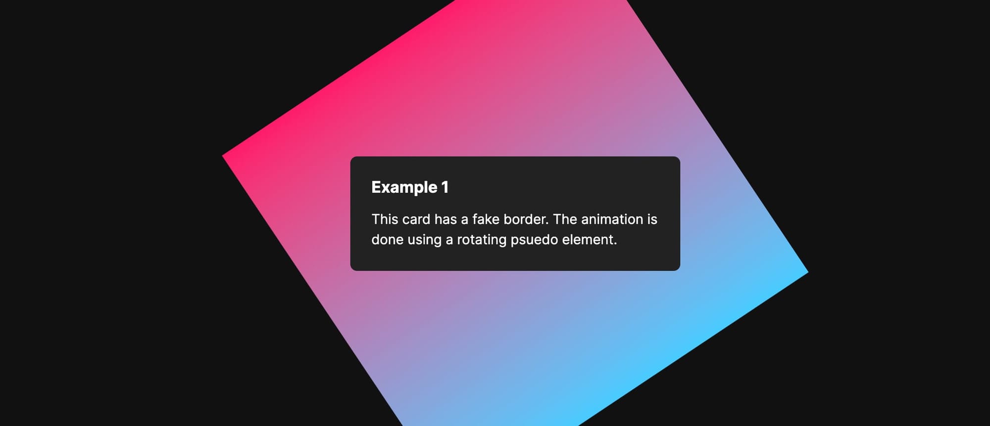
Example 1
Let’s begin with a subtle gradient animation with a fake border.
This effect is done using a pseudo element that rotates around a central point on the card.
First, some basic positioning styles.
.example-1 {
  position: relative;
  display: flex;
  align-items: center;
  justify-content: center;
}

.example-1 .inner {
  position: relative;
  z-index: 1;
  width: 100%;
  margin: 5px;
}
Now we'll add styles for a ::before pseudo element. This is the key part of the animation.
.example-1::before {
  content: "";
  display: block;
  background: linear-gradient(
    90deg,
    hsla(197, 100%, 64%, 1) 0%,
    hsla(339, 100%, 55%, 1) 100%
  );
  height: 500px;
  width: 500px;
  position: absolute;
  animation: rotate 8s linear infinite;
  z-index: 0;
}
The pseudo element is kept in place with the flexbox properties defined on the .example-1 class.
Finally, add a basic animation keyframe to rotate 360 degrees.
@keyframes rotate {
  from {
    transform: rotate(0);
  }

  to {
    transform: rotate(360deg);
  }
}
Now that you see how this is working, go back to the .example-1 div and add overflow: hidden to clip the edges that overflow outside of the card.
.example-1 {
  ...
  ...
  overflow: hidden;
}
This is all you need to create an animated gradient border in CSS!
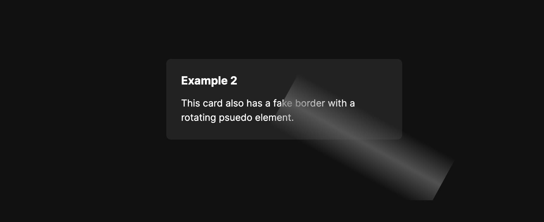
Example 2
This time we'll have a subtle glimmer around the edge of the card.
Similar to the previous example, this one also involves a rotating psuedo element. Some of the same CSS can even be reused.
.example-1,
.example-2 {
  position: relative;
  overflow: hidden;
  display: flex;
  align-items: center;
  justify-content: center;
}

.example-1 .inner,
.example-2 .inner {
  position: relative;
  z-index: 1;
  width: 100%;
}
The only difference we'll add so far is the border width, which we’ve been using an inner margin to fake. This one is thinner than the first example.
.example-2 .inner {
  margin: 2px;
}
The styles for the ::before pseudo element should also look familiar.
.example-2::before {
  content: "";
  display: block;
  background: linear-gradient(
    90deg,
    rgba(255, 255, 255, 0) 0%,
    rgba(102, 102, 102, 0.75) 50%,
    rgba(255, 255, 255, 0) 100%
  );
  height: 300px;
  width: 100px;
  transform: translate(0);
  position: absolute;
  animation: rotate 5s linear forwards infinite;
  z-index: 0;
  top: 50%;
  transform-origin: top center;
}
Instead of a square, it's a thin gradient line. This is what gives us a partial border instead of a full one.
Another difference from the first example is the use of transform-origin: top center. This sets one end of the gradient line to be centered over the card and keeps it positioned during each rotation.
This effect also uses the same animation keyframe from the first example because all we need is a 360 degree rotation.
@keyframes rotate {
  from {
    transform: rotate(0);
  }

  to {
    transform: rotate(360deg);
  }
}
Example 3
Inspired by this Codepen, we have one last type of fake border animation. This one is again similar to the first two examples but it uses background-position with a glowing effect spilling outside of the card.
We’ll apply the same positioning and border radius as the previous examples, but specifically omit overflow: hidden so that content can be shown outside of the card.
.example-3 {
  position: relative;
  border-radius: var(--border-radius);
  padding: 4px;
}

.example-3 .inner {
  border-radius: 4px;
}
Next we have ::before and ::after pseudo elements positioned behind the inner content of the card.
The hex values chosen for the gradient are somewhat arbitrary and could be replaced with other colors. You can also add additional values for a wider range in the gradient.
.example-3::before,
.example-3::after {
  content: "";
  position: absolute;
  top: 0;
  left: 0;
  bottom: 0;
  right: 0;
  background: linear-gradient(
    45deg,
    #ff595e,
    #ffca3a,
    #8ac926,
    #1982c4,
    #6a4c93,
    #ff6700
  );
  background-size: 400%;
  z-index: -1;
  animation: glow 20s linear infinite;
  width: 100%;
  border-radius: var(--border-radius);
}
The glowing background is done with the filter CSS property by blurring the ::after pseudo element. Blurring it by a large enough pixel value creates sort of a drop shadow effect, and since it'll be animated using the same properties as the ::before element, it'll follow that animation seamlessly.
.example-3::after {
  filter: blur(25px);
  transform: translate3d(0, 0, 0); /* For Safari */
}
Safari seems to struggle with this effect sometimes, especially when switching between examples in the demo. The
transformproperty above helps mitigate the issue.
Finally, the background-position of the gradient is animated from 0 0 to 100% 0 and back again.
@keyframes glow {
  0% {
    background-position: 0 0;
  }

  50% {
    background-position: 100% 0;
  }

  100% {
    background-position: 0 0;
  }
}
Using an Outline
So far all of the examples have used fake borders. Let’s change the approach a bit and use an outline instead.
The next animation is a blue pulse with a delay between each interval.
First, apply the styles for the outline itself.
.example-4 {
  outline-width: 1px;
  outline-offset: 0;
  outline-color: rgba(0, 130, 206, 0.75);
  outline-style: solid;
  animation: animateOutline 4s ease infinite;
}
Then all that’s needed is the animation keyframe.
@keyframes animateOutline {
  0% {
    outline-width: 1px;
    outline-offset: 0;
    outline-color: rgba(0, 130, 206, 0);
  }

  10% {
    outline-color: rgba(0, 130, 206, 0.75);
  }

  /* The animation finishes at 50% */
  50% {
    outline-width: 7px;
    outline-offset: 4px;
    outline-color: rgba(0, 130, 206, 0);
  }

  100% {
    outline-width: 7px;
    outline-offset: 4px;
    outline-color: rgba(102, 102, 102, 0);
  }
}
When using an infinitely run animation with a keyframe, trying to set a delay between intervals can be tricky. Adding the usual
animation-delayproperty will only set a delay before the first animation iteration and not subsequent ones.
To get around this, we need to create an artificial delay by being more precise with the keyframe values. The animation above will technically end at 50% because the same properties are repeated at 100%. By setting the duration to4s, we have2sof time between each interval. It’s not ideal, but this is one way to fake an animation delay in this situation.
Animated Borders with SVG
For the last example, let’s change the approach again and see how to use an SVG for a border animation. This effect has two thin stroke lines rotating around the card opposite of each other.
We need a bit more HTML this time to define the SVG itself.
<div className="card example-5">
  <svg height="100%" width="100%" xmlns="http://www.w3.org/2000/svg">
    <rect
      rx="8"
      ry="8"
      class="line"
      height="100%"
      width="100%"
      stroke-linejoin="round"
    />
  </svg>
  <div className="inner">
    <h3>Example 5</h3>
    <p>This card uses SVG for the animation effect.</p>
  </div>
</div>
Notice the
rxandryproperties. These allow us to match the border radius we’re using in CSS.
Next we'll absolutely position the SVG relative to the card.
.example-5 {
  position: relative;
}

.example-5 svg {
  position: absolute;
}
Since we’re using SVG, the border will actually be a stroke and since we're using a dasharray, we're splitting that stroke up into pieces.
.example-5 .line {
  stroke-dasharray: 260;
  stroke-width: 1px;
  fill: transparent;
  stroke: rgba(78, 255, 13, 0.3);
  animation: svgAnimation 2.5s linear infinite;
}
The
fillproperty above is important. Without it, the content of the card won’t be visible.
Finally we have the animation. What we’re doing here is moving the stroke-dashoffset from 0 to 1000 which moves the SVG stroke pieces counter clockwise.
@keyframes svgAnimation {
  from {
    stroke-dashoffset: 0;
  }
  to {
    stroke-dashoffset: 1000;
  }
}
Summary
In this article, you learned some alternative ways to create borders in CSS, as well as animate them.
While using the actual CSS border property would be ideal, some designs call for more complicated animations that just can't be done without techniques like this.