

Meet the maker: Marcin Wichary


We talk with people about what makes them a maker. Here, a design manager tells us about his latest project, a book covering 150 years of keyboard design.
We have a ritual at Figma where new hires are asked: “What makes you a maker?” For our new series, Meet the Maker, we’re digging into the details, kicking off with Marcin Wichary, a design manager from the Editor team. If a T-shaped person has a breadth of knowledge and one deep specialization, we’d liken Marcin to a comb—he taps into deep knowledge across a broad range of niche interests, such as looping videos and San Francisco’s ghost stations. We talked to him about his latest project: a book on the history of the keyboards.
What makes you a maker?
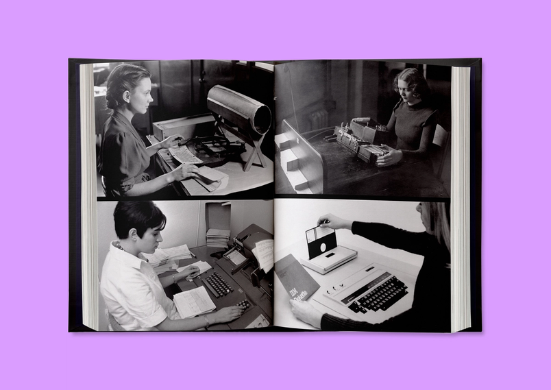
Well, I’ve been working on a book for a while. It’s called Shift Happens, which was a temporary title, but I never came up with anything better. It’s about the history of keyboards and typing, and the 150 years of QWERTY (shorthand for the standard English keyboard layout, named for the order of the first six letters listed on its upper row). It sounds really boring, right? In a way, the QWERTY keyboard is boring because it has to be boring. It’s a functional tool to get you somewhere. But if you look at it throughout ages—how it evolved, how it connected to typewriters, to big computers, small computers, teletypes—it becomes a lot more interesting.

For example, today we use keyboards mostly for talking, chatting, and texting people. That’s not how they were used just 20 or 30 years ago, let alone 150. So there’s this whole evolution of how we look at keyboards, how we use them, how we think of technology, of computers and the time before the typewriters. Who designed the keyboard? The answer is everybody and no one, which is true of a lot of everyday objects.
What’s your approach to making?
There are many different ways to design and build software, but I always take the approach of a prototyper: I think about something, then I build a bit of it, then I look at it again, and use it, or give it to somebody else to use. I design this way. I make prototypes this way. I prepare for my talks this way.
This project was no different. I hadn’t finished writing before I started flowing in photos, which is not typical when it comes to creating a book. So, I had to write plugins and software that would keep flowing the text and photos into the print program. It added some time, and I went down a few blind alleys, but I learned so much along the way. I ordered a print-on-demand prototype the moment I had the first manuscript ready, before even checking typos, and so on.

Even now, the book is on Kickstarter, but I’ve already asked a printer to print one chapter on the paper I want, in the correct size and everything. Like with software, I even chose edge cases. For one prototype, I chose a spread that was printed on black, one with vivid colors, one photo with a lot of fine details, and so on. (And even sent a prototype to fellow designer to review.) There will be, of course, surprises still, but hopefully I’ve eliminated a lot of them.
This approach is hard sometimes because very quickly you end up in a situation where you think you are almost done. Everything feels almost there—the words, the photos, the typesetting. But then you iterate. You go back to the beginning. It’s going to feel messy. It’s going to feel all over the place. But if you embrace this feeling, and you get used to it, I think you learn how to negotiate it, at least to some extent.
What was most challenging?
I’ve never written a book before (especially not one that’s so dense and long), but I’ve done smaller creative projects that felt somewhat similar. I knew that I needed to find ways to keep it interesting or fun because if I’m staring at the blank page or rewriting, or if I’m trying to find this one photo that’s on the internet, but I don’t know who owns it, and it takes days—which is a true story—it can get overwhelming. So throughout the process, I created little toys—some that were useful for research, some that were semi-related to the book, but others less so.
For example, I reverse engineered some vintage keyboards and connected them to modern computers. I typed on really bad keyboards and really good keyboards. I turned my piano into a typing keyboard. I built some very strange keyboards. I also wrote a bunch of mini-games and a typewriter simulator. It was about giving myself an idea or two to keep having fun [with the project]. There were always some reasons for an experiment, but in a way, I didn’t always care what happened. I wanted to remember why I love this.
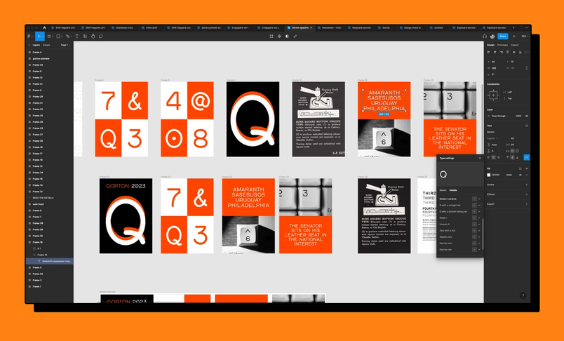
I also designed—well technically I revived—a font for the book. It’s a very specific strange-looking font that was popular on keyboards in the eighties called Gorton. It’s a very technical font that comes from CNC machinery. It never existed as a TTF (TrueType Font), so I drew it in Figma, and then I moved it to the proper type design software, Glyphs. It was really fun because I got to use the type details font UI that was actually my first project at Figma, and now I got to use it as a real type designer. So that was a really great moment. I immediately found bugs, of course. (A curse of knowing something really well.)

How else did you use Figma for this project?
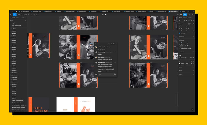
I used Figma for a bunch of different things: I created moodboards for how the book should feel, how the renders should feel. That was really, really fun. I also used it for selection colors and document colors. My Figma files are messy because some of them are for print, some for the website, some for the Kickstarter campaign, some for the newsletter. So having features that helped me feel like I have a design system without actually having one was crucial. I used auto layout and, like mentioned earlier, wrote plugins for some of the more complex designs, particularly as I kept laying out the book over and over.
I spent a lot of time in the file with a friend trying to figure out small details like section breaks over Zoom. It was really cool to be able to quickly share a URL and have someone—someone who might have never even heard of Figma—open it up. I could be like, “Here’s a few ideas that I made for a cover. What do you think? Here’s the link.” And many people jumped in and gave their feedback. It was so easy that I accidentally sent a link to the wrong person, without any context, as he had the same first name as another friend, and they just jumped in and did it anyway. We used comments and voting for that. The ability to scribble on the canvas is another simple, but maybe underappreciated thing. I’ve collaborated with some 3D renderers on the other side of the world and we’d just type or draw all over the renders to figure stuff out together.

You mentioned that feedback was really important. How did feedback play a role in this project?
I’ve always been interested in feedback With all the ways we communicate in our hybrid work world, it can feel hard to turn conversations and ideas into action, and feedback is a huge part of that. We’ve pulled together this handy guide to help you get better at giving and receiving it.
Feedback is a gift: Introducing Figma’s feedback gift guide
I wanted to have a bit of fun—and make the process fun for others, too. For the book, I actually wrote an app to help people give me feedback. I could pick one chapter and put it behind a secret URL. Then people could select emoji or quickly type some reactions. I used it with dozens of friends, and I got some really useful feedback. But it was also entertaining for me to build a little app that does a very specific thing. It was a nice break from writing and from other parts of my brain. And it was a very different way to consume feedback compared to working with my editor in Microsoft Word which can feel very serious.
What’s your favorite detail?
This is hard because there are many details.
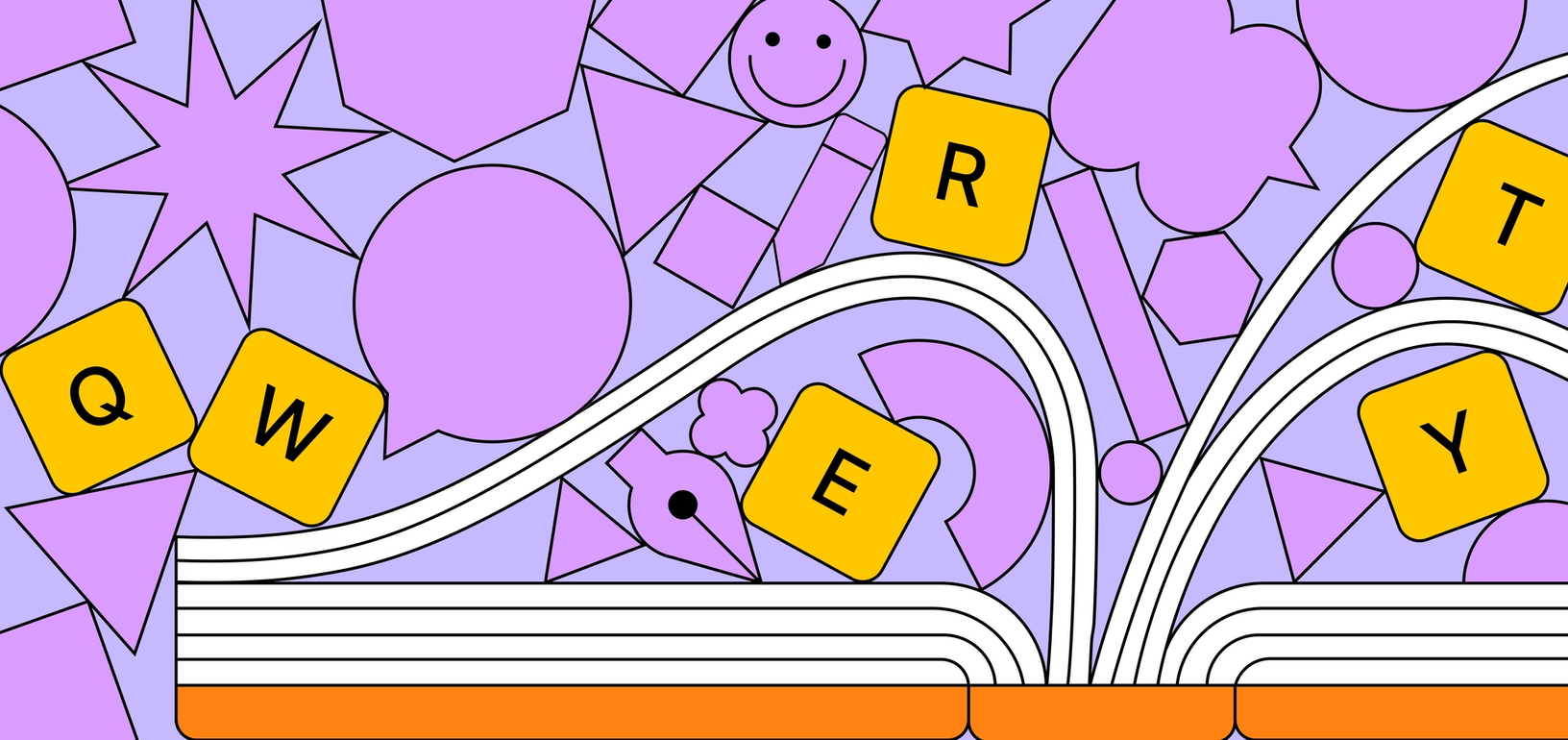
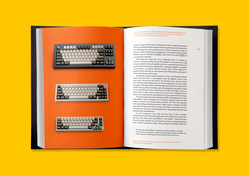
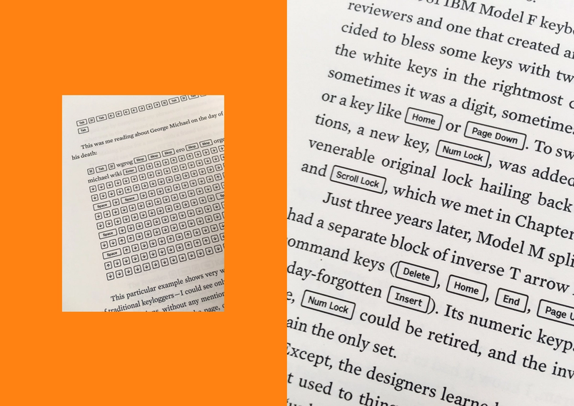
I talk about keys a lot in the book and it was important to me for those keys to look nice; I didn’t want to italicize the word Shift and put it in a book like this, or use color. I wanted to have a visual treatment that looks like a key with a little border. That’s trivial on the web. In CSS, that’s like three lines of code. You do a little border, you do inline block, little padding, round your corners—looks great. But in print, this is hardly possible, which I found really interesting. There was this idea in my head that the web took a lot of typography away. We spent hundreds of years perfecting typesetting and then we threw it all away because of pixels, which is true to some extent, although some of it can also be gatekeeping. But! The web also sometimes gives us tools that are much better, which we often forget about.

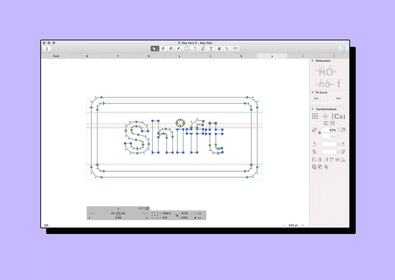
So it was a Rube Goldberg puzzle to achieve this simple thing. I thought it was going to take an evening and it ended up being weeks. I had to make a special font that was like a meta version of an existing font, Output Sans. In that font, each letter would be a keycap, and inside it would be the original font. I collaborated with the designer of this font to create it. I had to make a special plugin for the font-making software that typeset the keys, including kerning, which I don’t think you usually do inside font-making software. I had to write in Python, which I don’t normally do.
And nobody will know. This looks the most obvious thing to do, but I wonder if any other book has it because it is so hard to do. So I’m really proud of it. I learned a lot doing it. I think it elevates the writing and a lot of people won’t ever notice. The important details are like that. You will never notice if it looks good or serves its function or works well. But, it’s there.

You can follow Marcin and his multifarious endeavors on Twitter and learn more about his forthcoming book, Shift Happens, on his Kickstarter.