


Components, styles, and shared library best practices


Two of Figma's most powerful features are components and styles. They let you reuse UI objects and attributes so you can maintain designs systematically at scale. When you need to change something, like your brand’s link color or home icon, you can make the change once — in the original main component or style — and watch it update across all your designs.
You can use components and styles:
- Within one individual file in Figma's free tier
- Across different files and projects in the Figma Professional tier
- Across teams in the Figma Organization tier
There’s an endless number of things to consider when creating, naming and managing your components and styles, so we put together a best practice guide to help you out. Grab a cup of coffee and get settled for the 101 masterclass.
A quick note: Before making components in Figma, we recommend figuring out which Figma plan makes the most sense for you. If you're signed up for Figma Organization, read this best practice article on setting up your teams in Figma, because that structure will form the foundation of your component organization.
What are components and styles?
If you already know all the basics of components, styles and libraries, jump to to the next section.

Components: These are reusable objects in your design. They can be as simple as an individual button, or as complex as an entire navigation header (comprised of instances of other components like logos, avatars, buttons and menu items). You'll discover that components work similarly to "symbols" in Sketch or other design tools, but with a few unique differences. More on that in a bit.
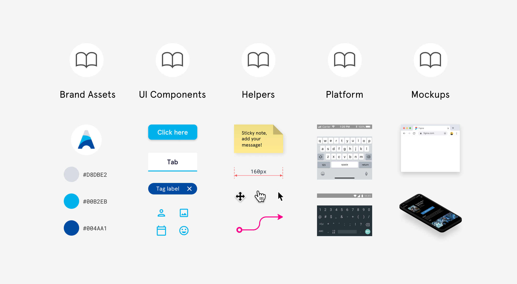
Here is a list of common things people turn into components:
- UI components
- Company logos and brand assets
- Icons
- Device mockups
- Platform OS components (Android, iOS, Linux, OSX, etc)
- Cursors
- Redlining and annotation components
- Post-it notes and voting "stickers" for running collaborative design sprints
- Diagramming "helpers" like flow arrows and flowchart shapes
Component Instances: Once you make something a component, you can create instances of it, which are essentially connected copies of that component—so if you update the design of the original component, the instances will reflect that change. For example, if you change the color of a button component to red, and then publish those changes, any file that used instances of that button will get a notification. They can then choose whether to update their instances to red.
Styles: These are reusable collections of properties which you can easily apply to elements in your design. In Figma, you can create styles for text, colors, grids and effects like shadows and blurs. If components are reusable objects, think of styles as the attributes you might apply to those objects.
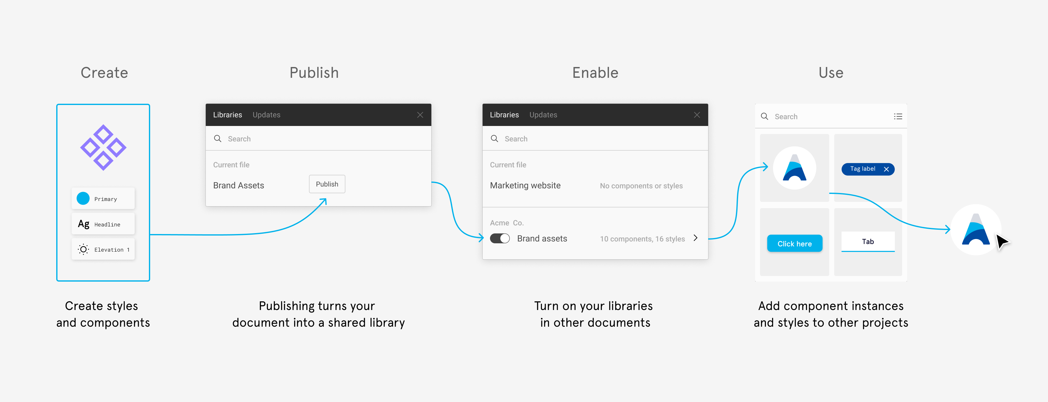
Libraries: In Figma, you can share components and styles by publishing them. This turns your file into a library, so you can use instances of those components in other files. Updates to the design of your components can be published and pushed out to other documents where instances of your components live. Users have the choice to accept those updates or continue working with an old version (if required).

When to start creating components for design systems
This question comes up often and the answer varies greatly based on individual designers' workflow preferences. That said, we generally recommend turning things into components fairly early in the design process. Once you have elements repeated across multiple screens, it's a good time to start thinking about components (even if you at fairly low-fidelity stages of your project). The design may change and go through many refinements, but creating components at this stage means you can save time later by making those changes once (with the original component), and having them update across all of your screens (with the instances).
Main components live wherever you create them, usually in context within your design, which makes them easy to tweak as your design progresses (except for bigger companies which house their main components in a separate design system file). If you feel like you're getting hung up on components too early at an exploratory stage of your project, worry about them later—don't let it hinder the fluidity of your design process.
As your team decides to adopt these patterns to reuse them in other products as part of your design system, then you can consider consolidating them from individual project files into a more formal document dedicated to serving as shared library. During that process you may choose to refine their structure/naming/properties so that they are easier to use and consistent with other components. How might you design better components? Let's unpack some considerations and best practices!
Structuring your components atomically
When you begin creating high-quality components, especially with the intention of sharing them, consider starting with smaller atomic components that can be used as building blocks. You'll notice patterns in your design that you want to be consistent. For example, the shape of a card, or the shape of a button.
A good strategy is to turn these repeated elements into a component that you can reuse by nesting instances of them inside other components. Imagine turning a simple button shape into a component (to be used as an atom), and nesting it within every button component that you create. The result: all buttons use the exact same starting point; if that shape were to change, it can be updated by changing that single atomic component.
Continuing with the button example, let's assume you also have primary and secondary variants, desktop and mobile versions, each with 4 states (normal, disabled, pressed, and focused). You would potentially have 16 different button components that you would otherwise have to edit if you didn't build this in an atomic fashion. Structuring components in this way will make your system much more maintainable.
Quick tip: By prefixing component names with a '_' or a '.', they will be excluded from publishing. Consider which components designers will need to use; they may not need to access all of the smaller atomic components. By excluding these from the publishing process, you can improve the experience for the users of the libraries since you will eliminate these from showing up in the components panel.
Structuring components to handle states, themes, and variations
As you're thinking of UI components, you're most likely also considering how to handle related components—these could be additional states, themes like light or dark, or other variations. What's the best way to handle them? How will designers interact with them?
Nesting states and variations in a single component
When you place an instance of a component into your design, Figma gives you access to its layers in the layers panel. This enables you to view and expand each instance in the layers panel. You may consider nesting elements in your component which users can turn on (by toggling the layer visibility) when needed; you could even nest every state within a single component. This method does have some benefits, but also a few drawbacks.

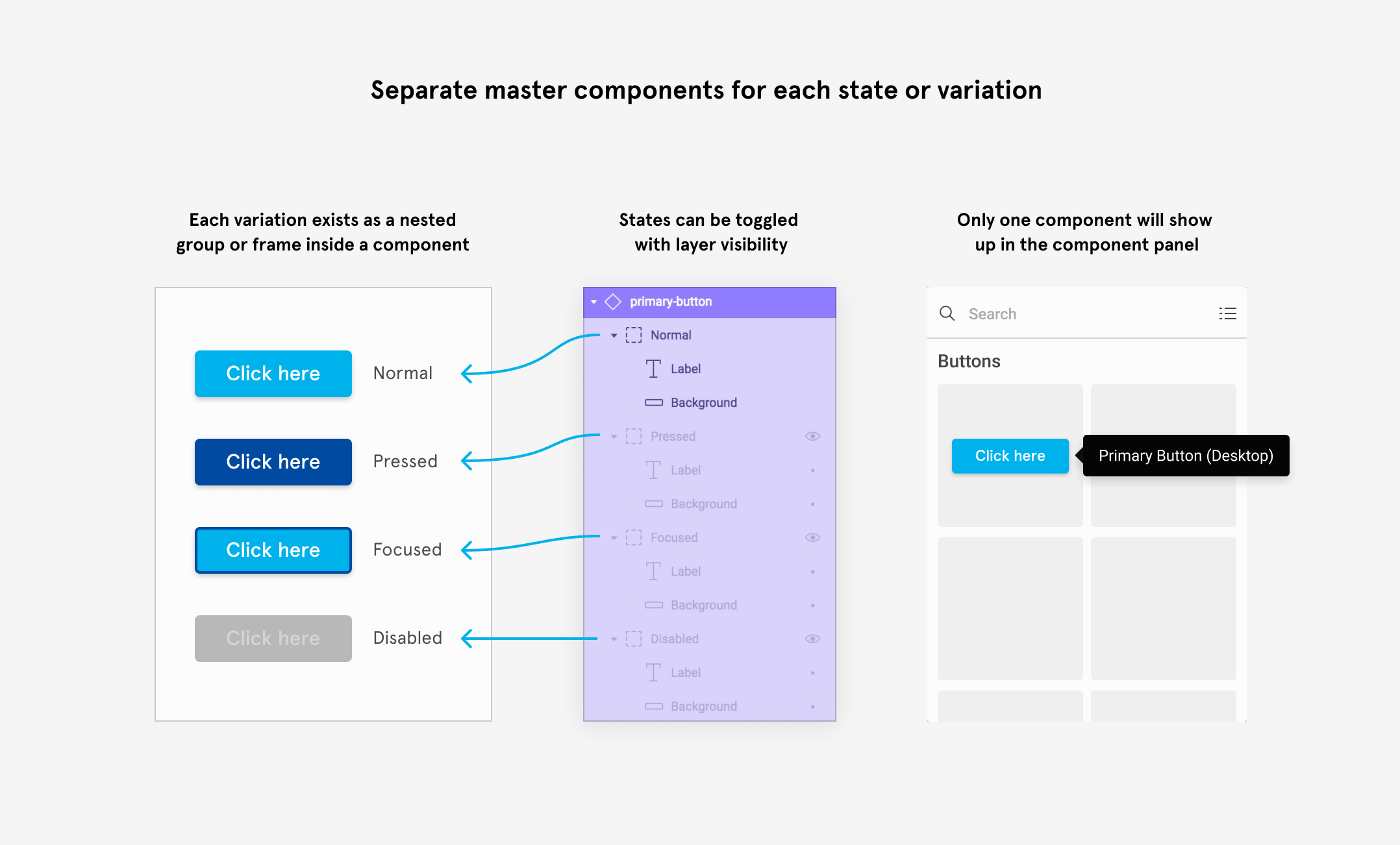
Benefits: There is a single Figma component to share with users. This means one component to maintain, one component for designers to use, and only one to find in the components panel and instance menus.
Drawbacks: This method can make it more difficult for designers for discover the different states within the layer stack of each component. Switching between them can be more cumbersome since designers must know to toggle the appropriate layers within the component. These states are not always immediately apparent unless designers expand the component in the layers panel. This method can also result in a lot of repeated layers within your component. For example, a button comprised of a text box and a rectangle may need to repeat those layers for every state—when users override the text, and later want to show a different variation/state, the designer will need to re-input the override. This use case is handled much smoother with the following approach.
Separate components for states and variations
Another approach, and one that we typically recommend, is to create separate components for each variation or state.

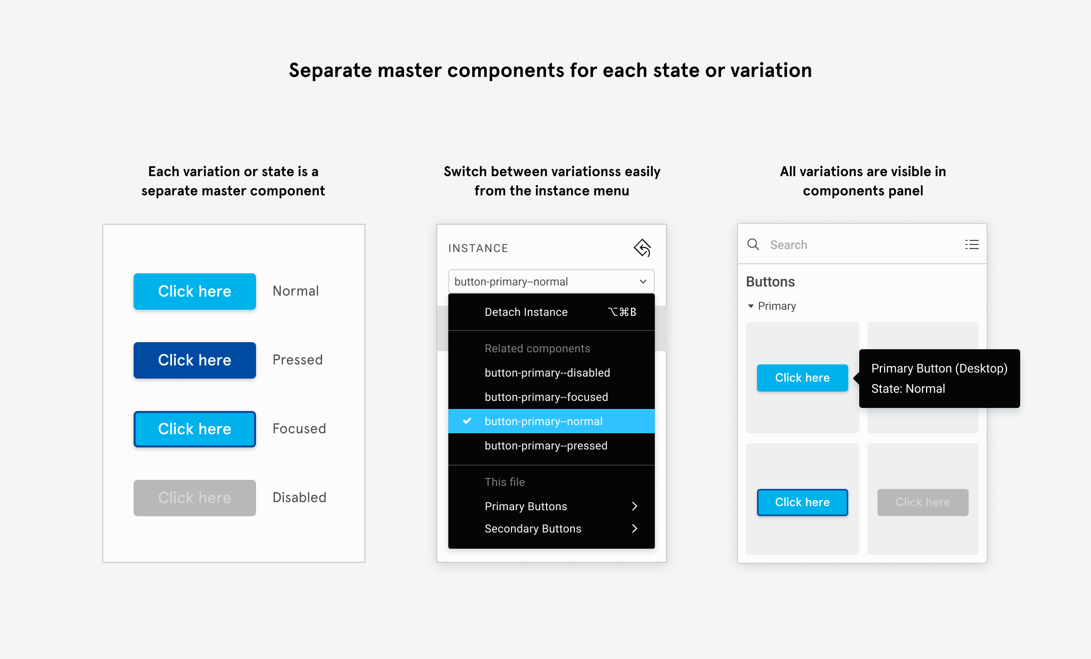
Benefits: With this method, all variations are easily accessible from the components panel and the instance menus; making it easier to find and switch between them. Instead of toggling the right combination of nested layers, designers can simply choose a different related component from the instance menu to switch to. This method can preserve your text overrides when switching instances if the text layers are named the same in both components. This method also tends to be more performant; we've seen some examples of very complex components with hundreds of hidden layers (using the nested approach), that could be greatly simplified using this approach.
Drawbacks: With this method you will ultimately end up with more components to share and maintain. However, if you couple this method with the atomic structure described above, you can build your components in a way that makes them easier to maintain. Lastly, since many visual variations may be very subtle and difficult to discern in a thumbnail preview, consider adding useful descriptions to your components (they will surface as tool tips on hover in the components panel).
Handling theming with components
There may also be times when you wish you create variants of components with different visual properties—for example: for themes, for light and dark modes, or for different brands. One technique you can use to achieve this is to select an existing component instance, override the visual properties you want to change, and then create a component from it. This will nest an instance of the original component inside a new component. This will preserve the newly applied overrides, but will still maintain a connection with the original component—this makes the design easier to maintain since you only have to adjust the design in one place. The image below highlights a couple potential use cases.
Component best practices
Now that you're familiar with a couple of baseline approaches, let's discuss a few best practices for making these components easier to use and maintain.
Preserve text overrides
When creating your component variations/states as separate components, you'll want to preserve your text overrides if you plan on swapping between them—this way you don't have to re-input the text. To ensure that your text is maintained during this swap, make sure the text layers within each component are renamed to be the same as each other (since by default, the layer name will inherit whatever you initially type into the text box).
Descriptions
You can add a description to each main component in the properties sidebar. These descriptions show up as tool tips on hover in the components panel. This is also a good place to include info about their intended usage to help users pick the right components.

Constraints and layout grids
Take the time to setup proper constraints to ensure predictable and intended behavior when components are resized. Since components function the same way as frames, you can add layout grids within your components and even apply constraints to elements that are relative to the grid. They can also be used to help visualize margins or padding within your component.
Clip content
You can toggle the clip content checkbox in the properties panel to define whether or not elements which extend outside the bounds of the frame are cropped/hidden. This feature can be really useful if you have components with repeated elements that you may want to reveal when resized. For example, the number of rows in a table might vary from use case to use case—with this method you can simply resize the component to reveal the number of rows you need. Make sure you setup constraints for all of the elements within your component first!
Styles and style tips
Styles in shared libraries
You can also include styles like colors and text styles in your shared libraries—they are much simpler to create, but there are still some best practices that will make using them easier.


Text styles: Figma has decoupled properties like alignment and color from being included in the style, so you won't need to create a separate unconnected text style for every color or justification. This results in fewer styles, making them easier to manage. Many users will have two sets of type styles which include a type ramp for mobile and another for desktop.
Color styles: Make sure you have styles created for all of your documented colors in your design system, and name them appropriately so they are easy to identity, use and implement.
Effect styles: Effect styles allow you to consistently reuse effects like layer blurs, background blurs, drop shadows, and inner shadows. For example: the Material design system includes an entire set of drop shadows to coincide with different layers that are stacked in the UI—shadows are repeatedly used used to create the effect of different "elevations" tied to certain elements like modals and buttons.
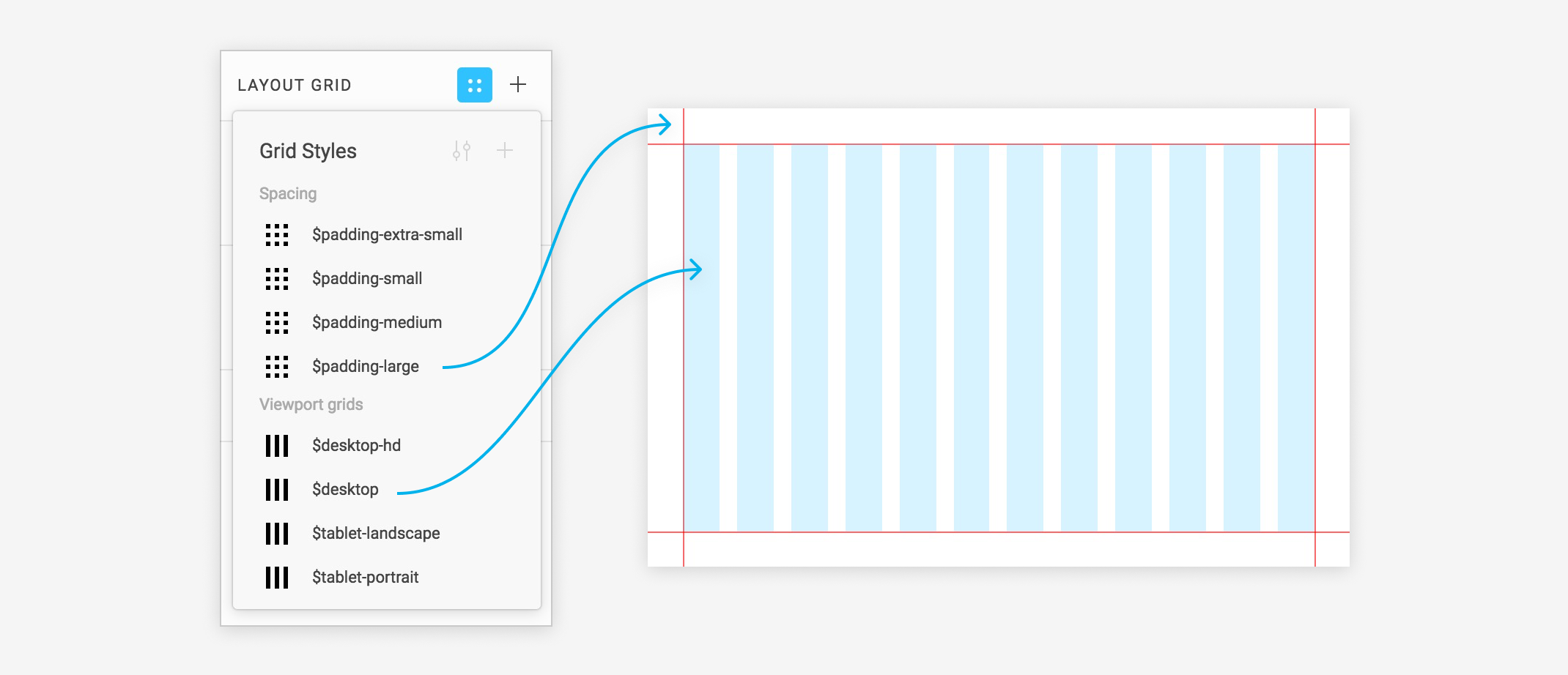
Grid styles: Often overlooked, grid styles can help standardize layout grids across multiple projects and viewports. If you have specific grids you use from desktop down to mobile phones, consider defining grid styles so they can be easily shared.
Style tips
Style names: Style names are critical for alignment with predefined properties in your design system. You can also use prefixes separated by a forward slash in the names to group styles in the style picker (note: you can only add one level of hierarchy). For example, if you add "Alerts/" before several styles, they will all appear together under the subheading "Alerts". You might use these prefixes to:
- group colors by hue
- group colors by theme or type
- group accessible colors together
- group type styles by font family or size
- group grid styles by viewport size
Style descriptions: Add descriptions to your styles—these will appear in tooltips in much the same way they do for components. The descriptions can help clarify their intended usage by surfacing additional information to help designers select the right style.

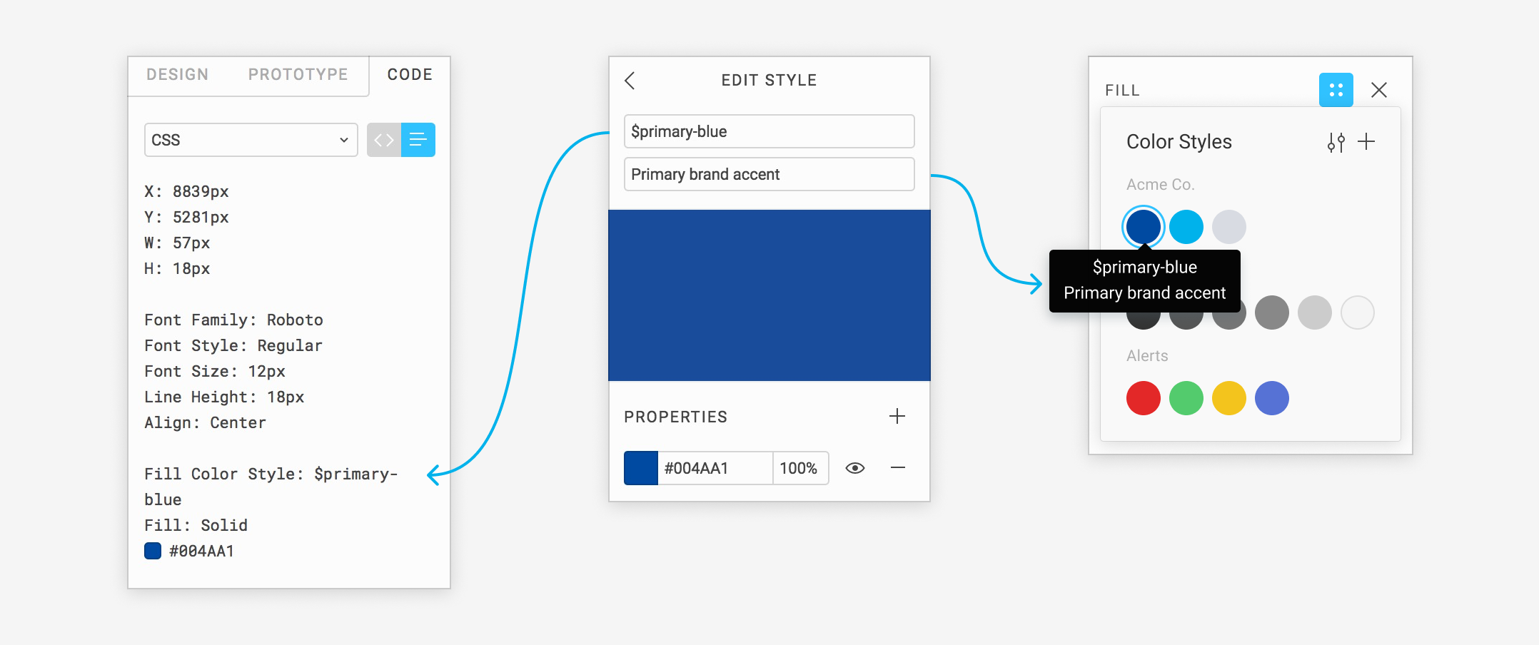
Note: when developers are inspecting your designs, in the code panel, style names will show up as comments in CSS mode and as a line item in table view. The names of color, type, and effect styles will be displayed in addition to their attributes.
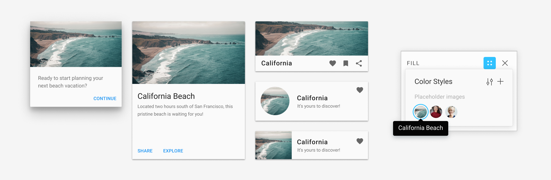
Image fills for Placeholder images: You can create styles for image fills. Lets say you have some user avatars, or placeholder photos you commonly use. You may not know what shape, aspect ratio, or size they will need to be applied to. By creating image fills, you can easily apply them to any shape.

Layout grids for visualizing spacing: You can create grid styles which are comprised of multiple layout grids. For example, a column and a row grid can be applied to a frame or component to help visualize margins or padding. These can be very useful for teams that have defined standardized spacing as part of their system.

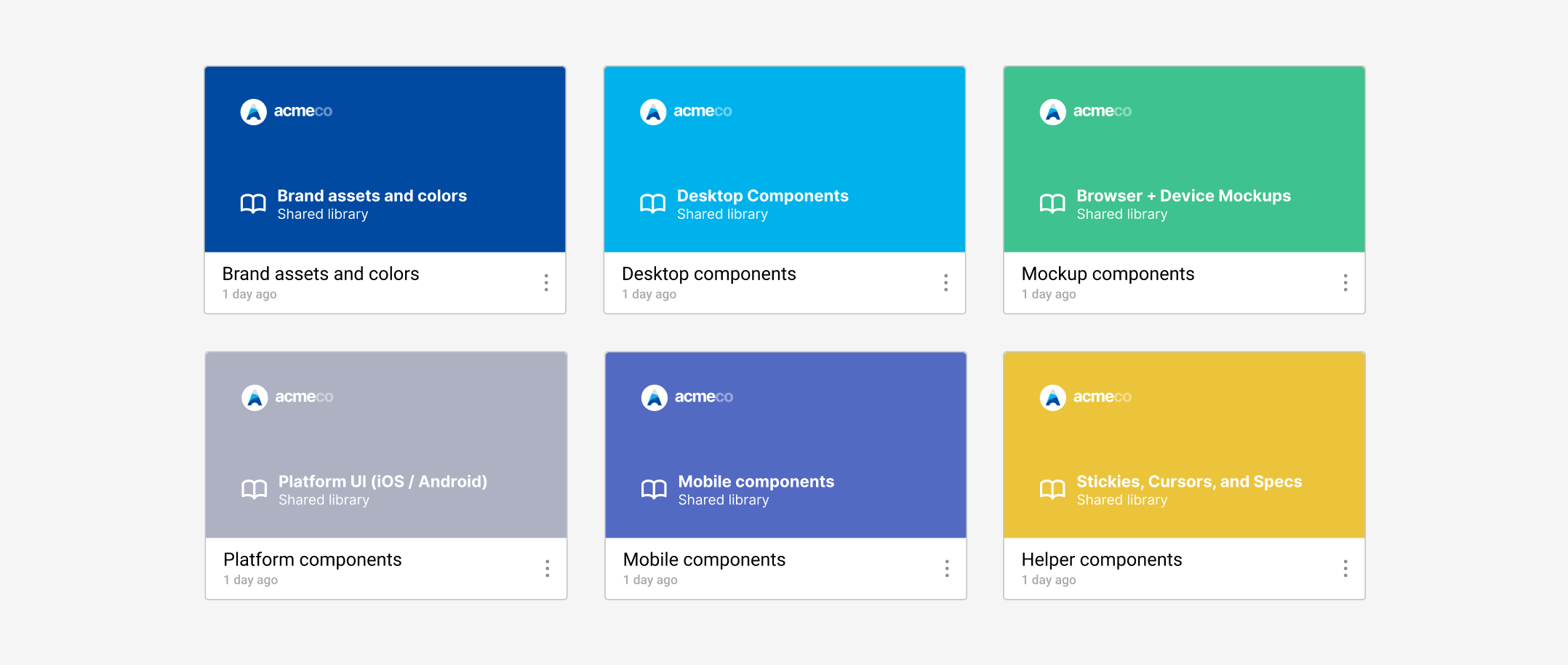
Organizing and creating libraries
To create your first library, publish any Figma document from the Team Library modal. All of the main components and styles in this document will then become available to use in other documents. As you scale design across products or teams, especially in larger organizations, you'll want to figure out the best way to organize and distribute them for everyone to use. How many libraries should you create? How do I organize my components? Remember, the designers consuming these libraries are your end users.
We often get asked if teams should share everything from a single library or use multiple libraries. Of course the answer is, it depends! Let's look at some of the factors to consider.
Everything in one big library
Some teams, particularly smaller ones, will often create a single library to house all of their components and styles for the sake of simplicity. This approach has some benefits but a few big drawbacks as you scale.

Benefits: There is only one library for users to enable that has everything they need. There is never any confusion as to where particular components live. This also means there is only one library to maintain.
Drawbacks: For larger organizations with a lot of components and styles required to support many different platforms and products, this library can grow very quickly. If users only need a small selection of those components, they'll still have to sift through a lot of similar components they never need to use.
Separate libraries
Many teams, especially medium-large teams, often decide the best approach is to break up their components into multiple libraries. This tends to scale much better.

Benefits: By separating components/styles into different documents/libraries, only the required libraries can be enabled for the right subset of users or teams. For example, let's say you have dedicated teams working on only mobile products. Those working on mobile may never have to consume assets designed for desktop. By splitting these into separate documents, you can publish them to separate libraries. Then, designers will only need to enable the applicable library for them, which saves them from having to sift through components they don't need to use.
Drawbacks: For those responsible for maintaining and publishing the libraries, there will be more of them to manage.
Optimizing for success: Libraries can be enabled by default for Pro teams, or across all teams in the entire company in Figma Organization. To learn more about how you might approach this, be sure to read our post on structuring teams.
Organizing components in a library
The next level of library organization takes place inside each library itself. Within a document you have the ability to organize the master components in a number of ways, from naming schemes to pages and frames. You can even combine these methods in conjunction with one another.
Forward slash naming
The first and most common way to group components is with forward slash component names to organize them into a hierarchy. If you're coming from Sketch, you may already be familiar with this method. Let's say you had primary and secondary buttons with variations of each. You may choose to name them as such:
- buttons/primary/default
- buttons/primary/hover
- buttons/secondary/hover
- buttons/secondary/active
Benefits: This method is the fastest way to organize your components. Simply rename the components, and they will get organized into a hierarchy in your instance menus.
Drawbacks: While this method is a quick way to organize your components, it can result in long component names for larger systems. It is not uncommon for component names to exceed the width of your layers panel, making it more cumbersome to scan and parse the layers panel. If you are migrating from Sketch, there is nothing wrong with this method, and it will help you get up and running faster; however, if you intend to spend a bit more time laying out master components and want to include some additional information alongside them, the next method may be a better approach.
Pages and frames
Our recommended method to organize components, is to use pages and frames as organizing containers.

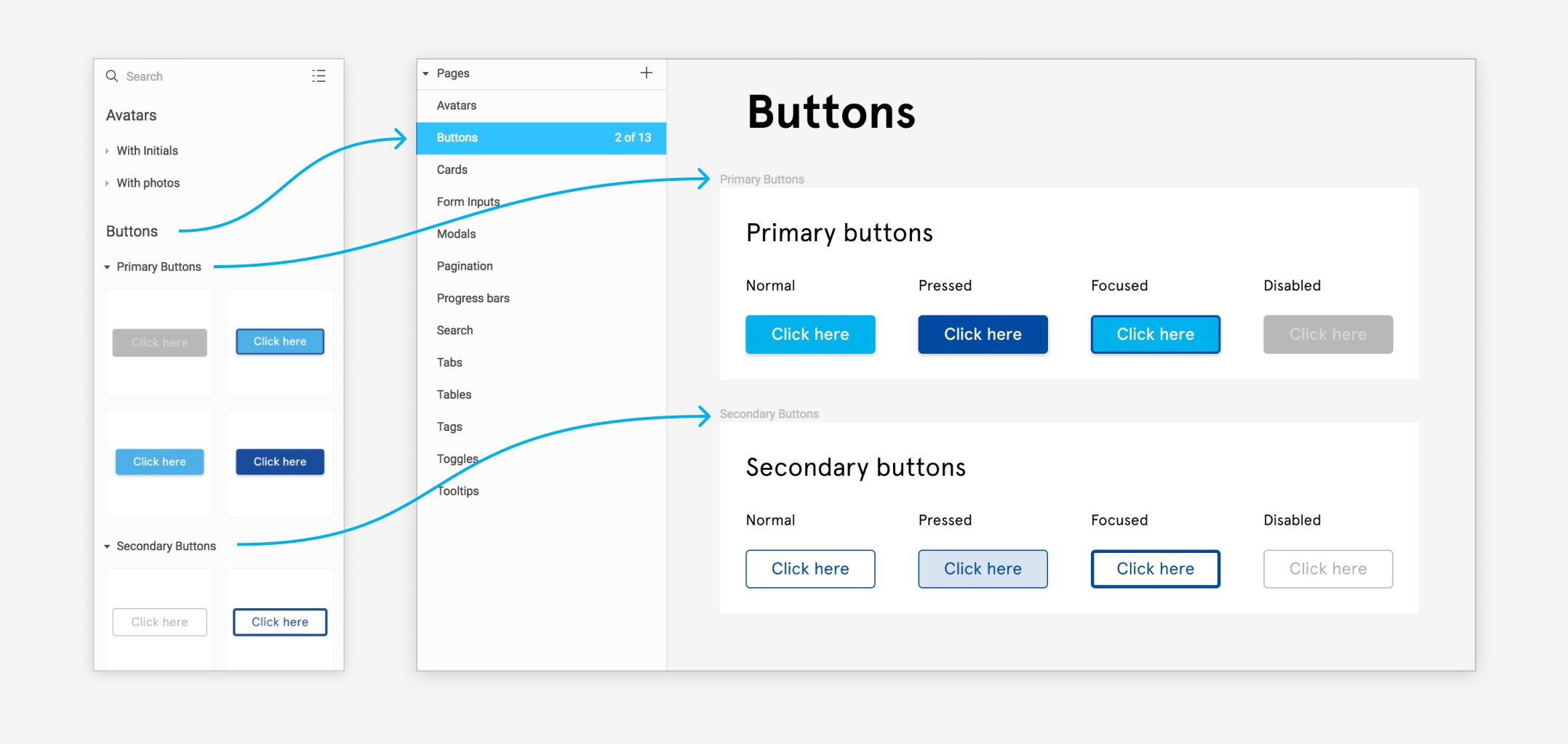
Benefits: This method allows you to decouple organization from the your component naming scheme. This results in shorter component names that are easier to scan in the layers panel, and i will allow you to use a naming scheme which is closer to your system's code base.
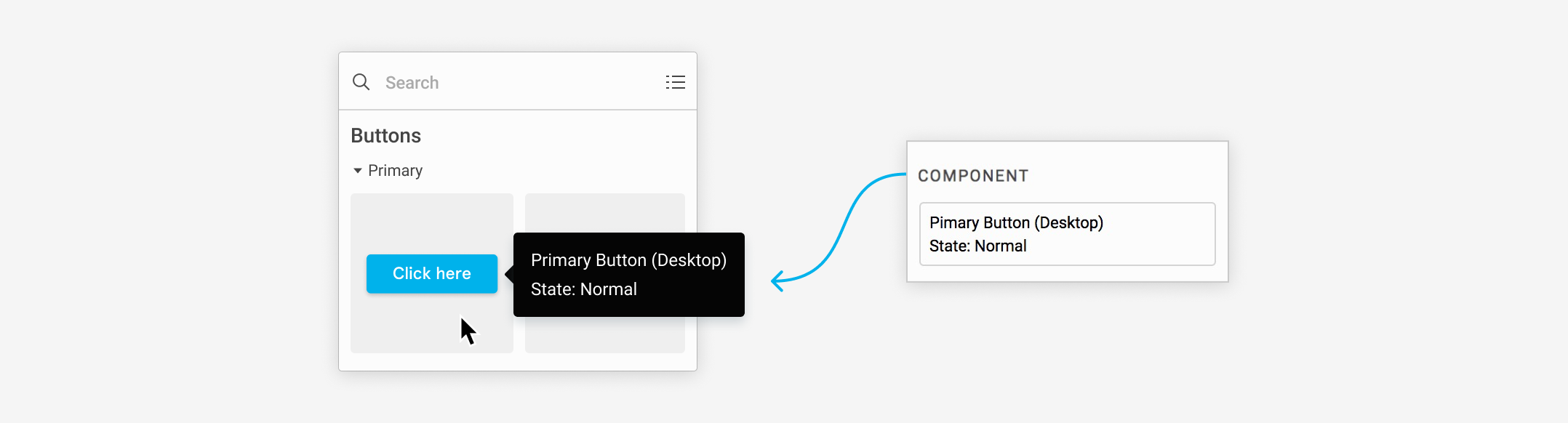
For example, you might have a page called "Buttons", and on it a dedicated frame for each type of button ("Primary" and "Secondary") where those master components reside. This will improve the experience when navigating the thumbnails in the components panel. Page names will appear as top level headings, and frame names will appear as collapsible subheads with all the components that reside within that frame below.
This feature compliments the way many users were already starting to visually organize their library by laying out accompanying notes, annotations, proper and improper usage examples and other usage documentation alongside the master components. This way users have the ability to right click on any component instance in their document and choose "Go to Master Component", which will open the library document. Here they can view this additional information which may help them use the components in the way they were intended.
In addition, components which reside in the same containing frame are treated as related components. When you click on an instance of one of these components, the list of related ones will surface to the top level of the instance menu to make swapping between them easier. This means you don't have to hunt through the full instance menu to choose the right component.
If you require additional levels to your component hierarchy, you can still use this method and combine it with the forward slashes. If you add forward slashes, Figma will revert back to your naming scheme to determine the list of related components for subsequent levels.
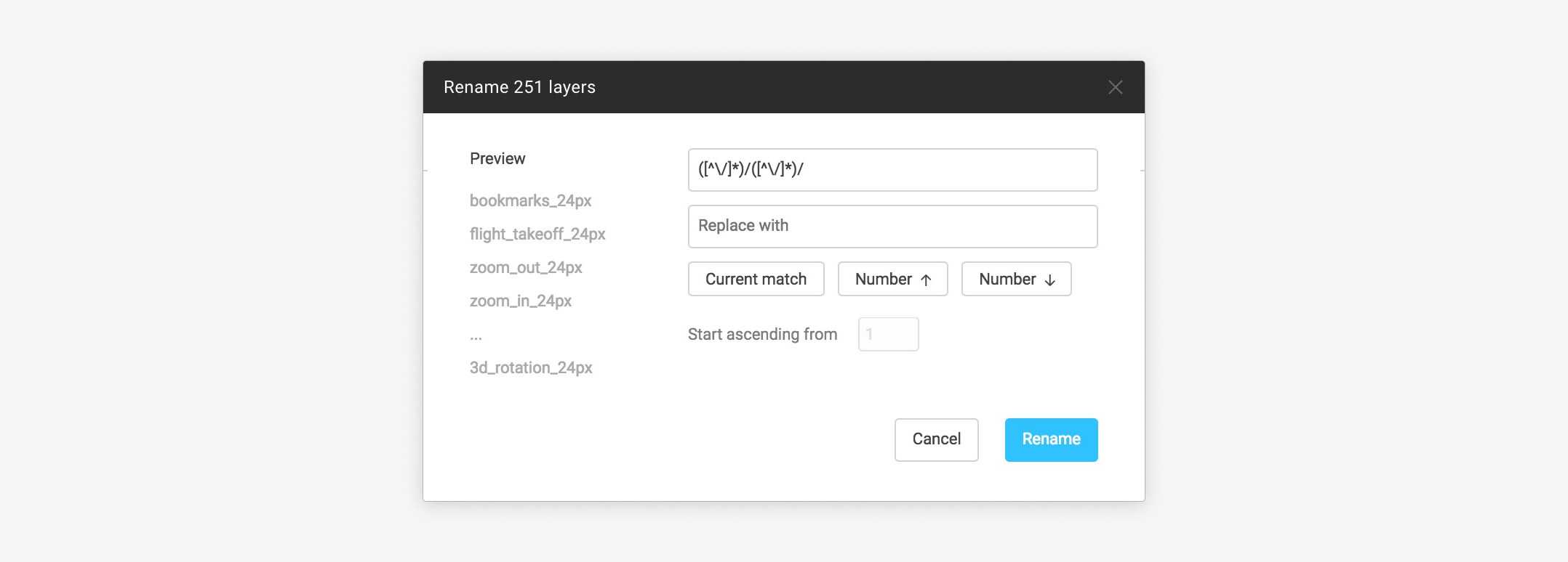
Quick tip: If you are moving from an existing or imported Sketch library that is using the forward slash method of organization, and want to switch to the pages and frames approach, you can use Figma's batch renaming feature to speed up this transition. To do this, simply select the components you wish to rename, and choose Rename from the context menu, or press cmd + R (Mac), ctrl + R (Win). Within this renaming dialog, you can even use Javascript regular expressions to remove any prefixing and forward slashes.

Final thoughts
While there are many ways to build and organize your shared libraries, we hope this guide gave you some ideas on how to accomplish this in the way that's most appropriate for your team or organization. If we've learned one thing from our users who build design systems, it's this: Never lose sight of the end user who ultimately consumes the system you create. Make sure the right libraries are enabled for them, and that components are easy to use, find, and understand. Accomplish that, and you'll make huge strides towards achieving greater consistency across your organization's design work.