Redesigning Chrome: An interview with Chrome’s lead designer

If you use Google Chrome, you may have noticed some changes that started rolling out last week. Yes, indeed, Chrome got a fresh look for its 10th birthday, and today we sat down with Alex Ainslie, Chrome’s lead designer, to go behind the scenes of the biggest redesign since Chrome launched 10 years ago.
So first, what changed in Chrome? Why and why now?
Alex: We’re introducing a major refresh on Chrome across all platforms, which aligns with Google’s new Material Theme. This update involved changing our approaches to shape, color, iconography, and typography. And why right now? You only turn 10 once, so we thought it would be the ideal moment.
For most people (who are non-designers), the modern browser is a simple window to the internet. Is it really that simple?
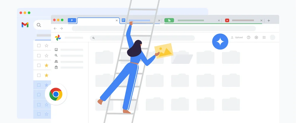
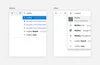
Alex: A major focus of our work is about finding ways to simplify web browsing. And we think about simplification not so much as a goal, but instead as a strategy for making Chrome more usable. The new, simplified tab strip, for example, makes it faster to find a specific tab when you have many open.
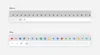
Goodbye "tablerone." Hello user-friendly icons.
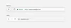
We’ve learned from user research around the world it can be hard to decipher URLs with too many words and characters. So we simplified the text you see in the address bar to make it easier to understand where a URL is taking you.
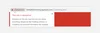
A simple user interface also makes it possible for us to create bold warnings when things aren’t safe: for example, when you visit a dangerous or deceptive site. This is an example of Chrome's values of simplicity and security reinforcing each other.
Your team spent the last year working on the new design. What challenges did you face?
Alex: One of our key design challenges is to be a good citizen of all platforms. That means we work hard to ensure Chrome both looks comfortable and behaves in familiar ways on Windows, Mac, Linux, Chrome OS, Android, Daydream and iOS. For example, we respect platform conventions for window controls, button ordering, typography, and more. And we also take care to negotiate the relationship between these platform-specific elements and Google's new Material Theme because we want Chrome to feel at home on all of your devices and to feel recognizably Googley.
The design team is spread across several offices - Mountain View, San Francisco, Los Angeles, London, Munich, and Paris. So in addition to thinking about how to improve Chrome’s UI we also think about how to maintain a healthy design culture across offices and timezones.
Have your team’s design principles changed since Chrome launched 10 years ago?
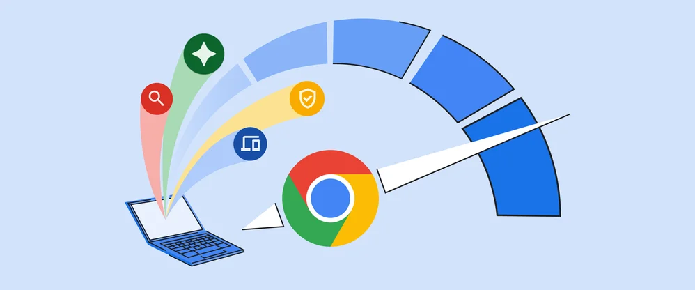
Alex: We still rely on the early Chrome team mantra, “Content, not chrome,” which is based on the idea of designing the browser UI to make the web content stand out. And our core values remain the same, though they’ve expanded. For example, in the case of speed, we think both about performance improvements to make pages load faster and about how Chrome can help people get things done more quickly. The improved Omnibox—which merges the search and address bar into one—is a great illustration of this.
What’s your proudest moment from the 8 years you’ve been on the team?
Alex: I appreciate that the Chrome team takes on difficult, long-term projects. For example, helping to move the web to HTTPS has been a multi-year effort. From improving our connection security indicators to marking HTTP sites as “Not secure,” we have plenty of examples of how design can help keep people safe and contribute to change throughout the ecosystem. So it’s not any specific element in Chrome’s UI that I am most proud of, but instead the broader outcomes that impact people out in the world.