


Why We Need to Change
For over 10 years, our organization had been called Adobe Experience Design (not to be confused with the Adobe product offering by the same name). While we loved our original identity, we believed it was time to streamline our name and align with industry standards. After consulting with stakeholders across the board, we decided to rebrand ourselves as Adobe Design. We believe that this new name will resonate more with our external audience and better present what we do as an organization to prospective hires.
Adobe Design is a worldwide organization of over 160 designers, engineers, researchers, program managers, writers, and makers. We create smart, sophisticated applications for a wide variety of devices, and our expertise ranges from interaction and visual design to research, information architecture, and programming.

The Challenge
The initial challenge in the design process was figuring out how to strike a balance between the old and new identity. There were many elements about the old identity system that we loved and wanted to somehow carry over in the rebranding. Our initial sketches reflected this desire to hold onto the old system.

Ideation & Sketching
We soon realized that in order for us to successfully rebrand ourselves we needed to start with a blank slate. We also decided to drop the "A" from our acronym and focus on the letter "D" as the basis of our logo. We explored new ways to express the letterform visually, and landed on three different concepts after a series of explorations. Here are some proposals for each concept extracted from our sketches and studies:
Concept 1: Negative Space
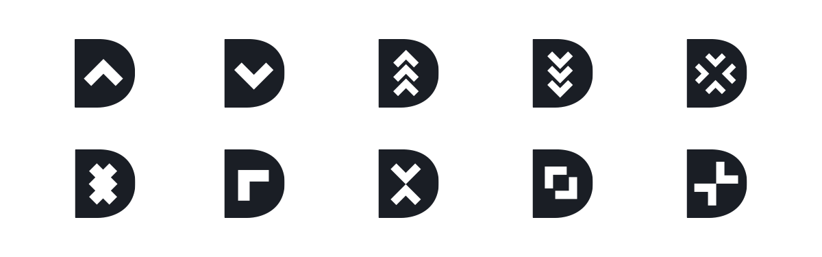
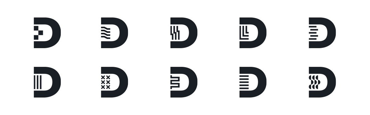
Concept 2: Dynamic Spine
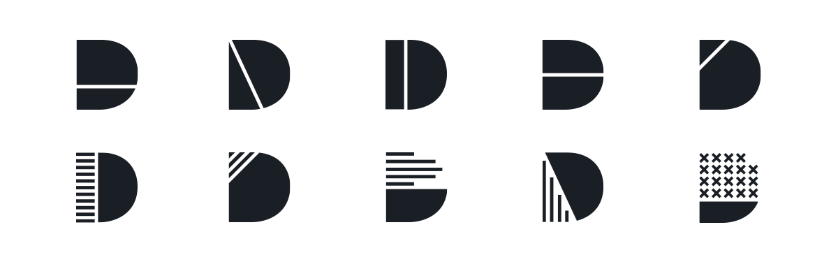
Concept 3: Sliced Form
Choosing a Direction & Refining
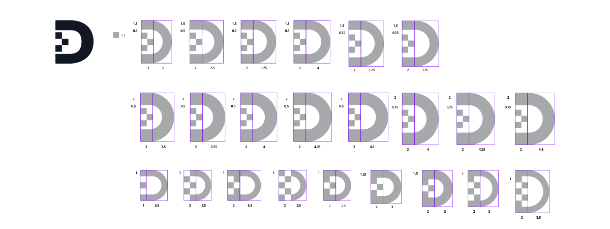
We decided to move forward with the following iteration of Concept 2, which played with the idea of pixels as the building blocks of the spine of the D. Once we had chosen a direction, we began a series of studies to find the best proportion between the spine and the bowl of the letterform.
Final Solution
The final Adobe Design logo embodies the visual impact of a simple and elegant solution. The logo is created with a single design move, by taking a section of the spine of the "D" and shifting it one pixel to the right. With this one design move, the logo tells a clear story through the visual metaphor of the pixel, which represents us as a design organization committed to creating innovative digital experiences.

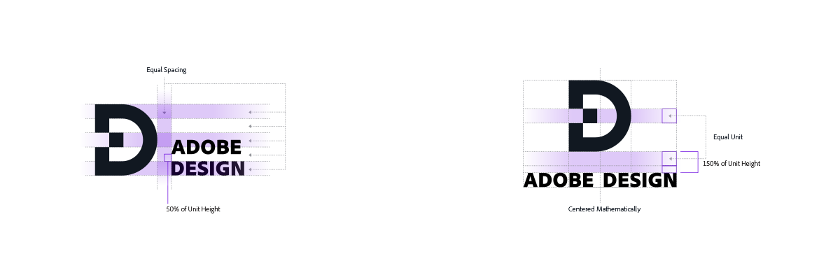
Building an Identity System
Once we finalized our new logo, the next step was to create an identity system. We deconstructed the logo mark into its core shapes: the square pixel and the circle. From these two shapes we derived a series of units that would serve as the building blocks of our visual language.

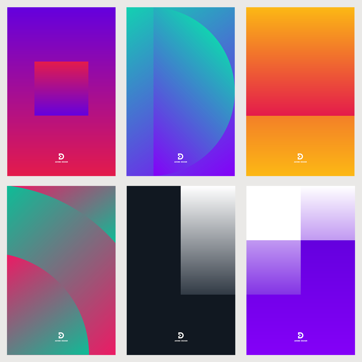
Posters
We created a series of posters to help further define our new visual identity. In the first series of posters, we continued with the idea of "one design move," by limiting ourselves to a single object in the composition and one gradient in each poster. We kept the same color palette and gradients from our old identity system.
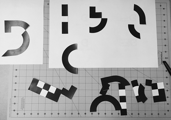
During the design process, we stepped away from the computer and experimented with cutting up our logo with scissors and then rearranging the shapes by hand on paper to explore new compositional ideas.
The second series of posters started to play with scale and movement, and how the basic units of our new visual identity system could interact with one another in a composition.

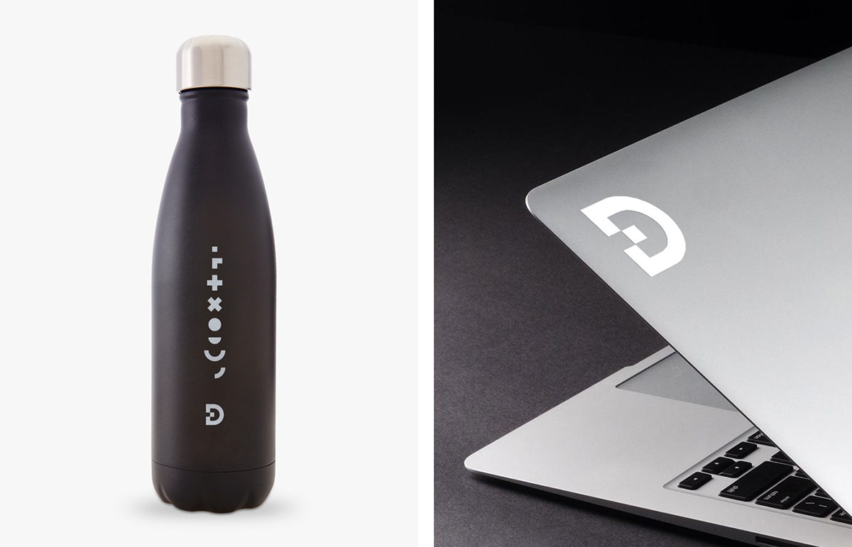
Branding Applications
Custom Water Bottle / Vinyl Die-Cut Sticker
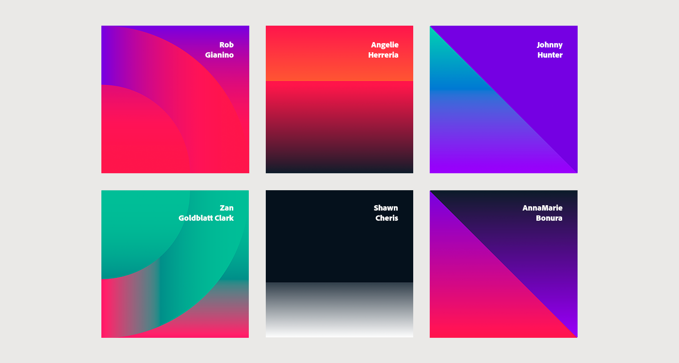
Nameplates
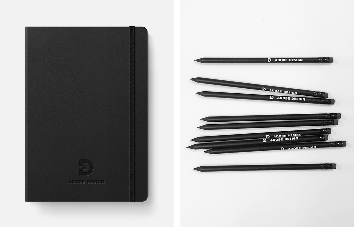
Notebook / Pencils
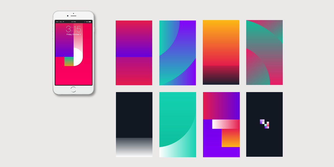
Mobile Wallpapers
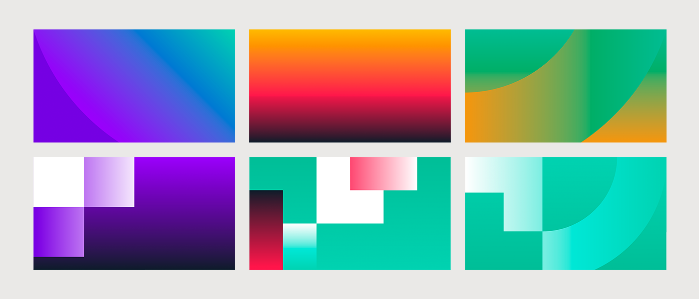
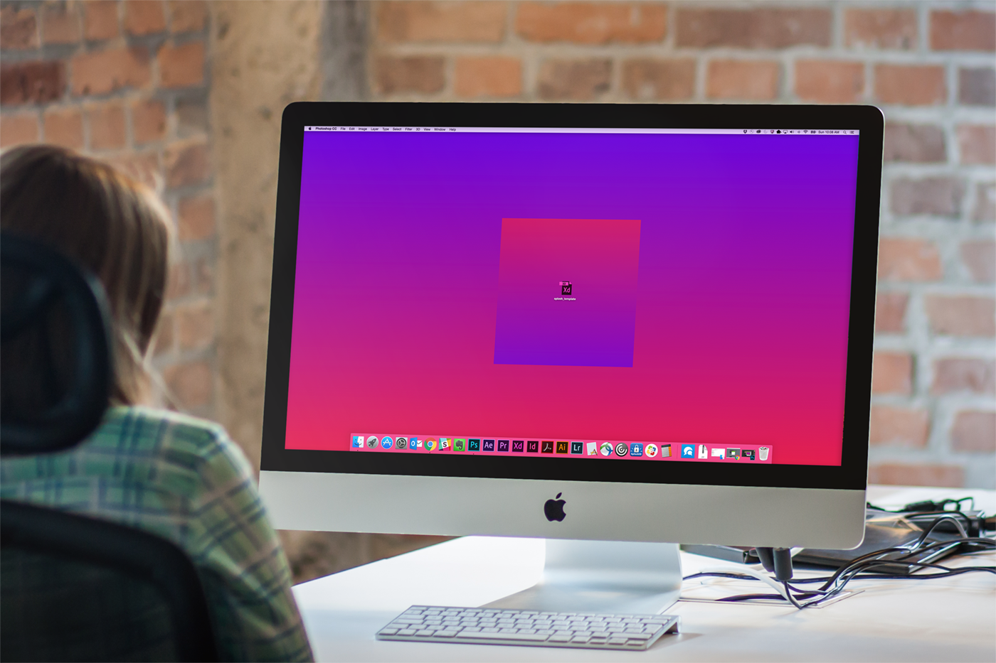
Desktop Wallpapers
Adobe Design Brand Team
Special Thanks


