There’s a past version of me who probably wouldn’t have believed that the devices Google announced at its fall event were actually designed by Google. The old me might have thought: The company that had the generic rainbow serif logo for 17 years made this?
The stuff Google showed off on October 4 was brazenly designed and strangely, invitingly touchable. These gadgets were soft, colorful… delightful? They looked human, but like something future humans had made; people who'd gotten righteously drunk with aliens. You could imagine them in your living room, your den, your bedroom. Your teleportation chamber. A fuzzy little donut you can have a conversation with. A VR headset in stunning pink. A phone with playful pops of color and an interface that seems to presage what you want, when you want it. It’s weird. It’s subtle. It’s… good. It’s Google?
It’s Google.
It was only a few years ago that Google was actually something of a laughing stock when it came to design. As an aggressively engineer-led company, the Mountain View behemoth’s early efforts, particularly with its mobile software and devices, focused not on beauty, elegance, or simplicity, but rather concentrated on flexibility, iteration, and scale. These are useful priorities for a utilitarian search engine, but didn’t translate well to many of the company’s other products. Design — the mysterious intersection of art and communication — was a second-class citizen at Google, subordinate to The Data. That much was clear from the top down.
“When a company is filled with engineers, it turns to engineering to solve problems.”
Marissa Mayer — as Google’s head of search and user experience — famously had her design team test 41 different shades of blue for a toolbar to see which hue drove the most clicks. As the New York Times wrote in 2009: “More often than not … Ms. Mayer says she relies on charts, graphs and quantitative analysis as a foundation for a decision.” In other words, a patently uncreative approach to solving creative dilemmas. Compared with Steve Jobs’ obsessive study of typography and calligraphy, or Jony Ive’s wild reimaginings of Dieter Rams’ finest lines, Google’s engineering-based solutions seemed to always come up short.

Visual design lead Douglas Bowman penned a blistering memo upon departing the company in that same year detailing the Google’s widespread lack of focus, and reliance on data, not design instinct, to solve problems:
Without a person at (or near) the helm who thoroughly understands the principles and elements of Design, a company eventually runs out of reasons for design decisions. With every new design decision, critics cry foul. Without conviction, doubt creeps in. Instincts fail. “Is this the right move?” When a company is filled with engineers, it turns to engineering to solve problems. Reduce each decision to a simple logic problem. Remove all subjectivity and just look at the data. Data in your favor? Ok, launch it. Data shows negative effects? Back to the drawing board. And that data eventually becomes a crutch for every decision, paralyzing the company and preventing it from making any daring design decisions.
That was definitely Google. Was.
Enter Matias Duarte, the design impresario who was responsible for the Sidekick’s UI (a wacky, yet strangely prescient mobile-everything concept) and later, the revolutionary (though ill-fated) webOS — the striking mobile operating system and design language that would be Palm’s final, valiant attempt at reclaiming the mobile market. Duarte was hired by Google in 2013 (initially as Android’s User Experience Director, though he is now VP of design at the company), and spearheaded a complete reset of the company’s visual and functional instincts. But even Duarte was aware of the design challenges his new role presented. “I never thought I’d work for Google,” he told Surface Magazine in August. “I had zero ambition to work for Google. Everybody knew Google was a terrible place for design.”

Duarte went to work on a system that would ultimately be dubbed Material Design — a set of principles that not only began to dictate how Android should look and work as a mobile operating system, but also triggered the march toward a unified system of design that slowly but surely pulled Google’s disparate network of services into something that much more closely resembled a singular vision. A school of thought. A family.
The concepts inherent in Material Design — a system of literal layers that evoke the tactility of a stack of paper, but offers the flexibility of digital spaces; a responsive layout concept that assumes no two devices may be exactly the same size or shape; a bold use of typography, motion, and color — showcase a decidedly different approach than Apple has taken. Where Jony Ive and company have produced a scattered, visually unmoored solution that seems to be solving small problems bite-by-bite, Google essentially blew up what had come before and reset. This radical rethink has spread into Google's deep web pockets, meaning that a logical system of navigation and connectivity not only informs what you see on your phone when you interact with apps and services, but what you get on the web, on a laptop, or on a TV. Gmail is Gmail is Gmail, responding to whatever screen it’s on. And sometimes, thanks to Google’s deep machine learning and natural language chops, Gmail is also the disembodied voice you talk to while you’re driving. In Google’s universe, its voice-activated Assistant isn���t middleware — it’s everyware, tapping deeply and natively into all of the company’s nodes.
The walls between an app, a service, and a predictive AI have started to come crashing down. And a cohesive system of design has made it accessible to users.
Google’s voice-activated Assistant isn’t middleware. It’s everyware.
And this is perhaps Google's biggest achievement yet. That it's been able to pull together all of these disparate elements into something that is so vast yet so knowable. Something that feels familiar whether you're speaking to its assistant, triaging your inbox, finding something on the web, or collaborating in real-time in Google Docs. And more and more it's that underlying, evocative design sensibility — the human approach to complex systems — that makes its innovations so much more effective.
While Apple is concerning itself with new ways to unlock your phone and doubling down on its chip-making business, Google is figuring out ways to connect the where, how, when, and why of your life. It's not just making wireless earbuds — it's making wireless earbuds that can translate Swedish to English (and back again) in real time. And all of this is possible because the company has — since day one — understood that the internet is the ultimate gadget. That the connection between things and the way those connections work for humans is the system that is going to power much of the innovation we see in the 21st century.
And that brings us, finally, back to hardware. When you think about smartphones for most users, it’s the first and likely best place they interact with their digital world. And Apple elevated the smartphone to something beyond a tool for connecting — it made the phone an object of desire, sophistication, and status. This is something Google never quite seemed to grasp. Even the first Pixel phone — while technically a dramatic improvement over previous attempts — felt stale and safe from a design perspective. Good on the inside, forgettable everywhere else.
For years the company struggled to produce hardware that was competitive with Apple and Samsung. Beginning with its Nexus line of phones in 2010, through the ill-fated acquisition of Motorola in 2011, Google stumbled time and again with half-steps, disappointments, and amateur passes at hardware. Remember the Nexus Q, Google’s aborted attempt at a media streaming box?
Since day one the company has understood that the internet is the ultimate gadget.
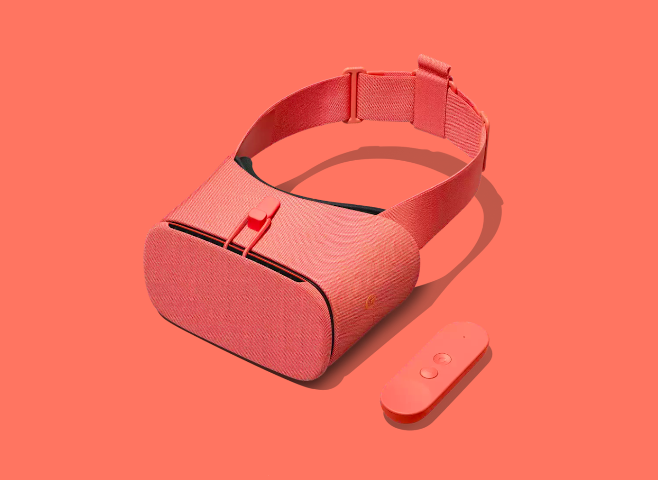
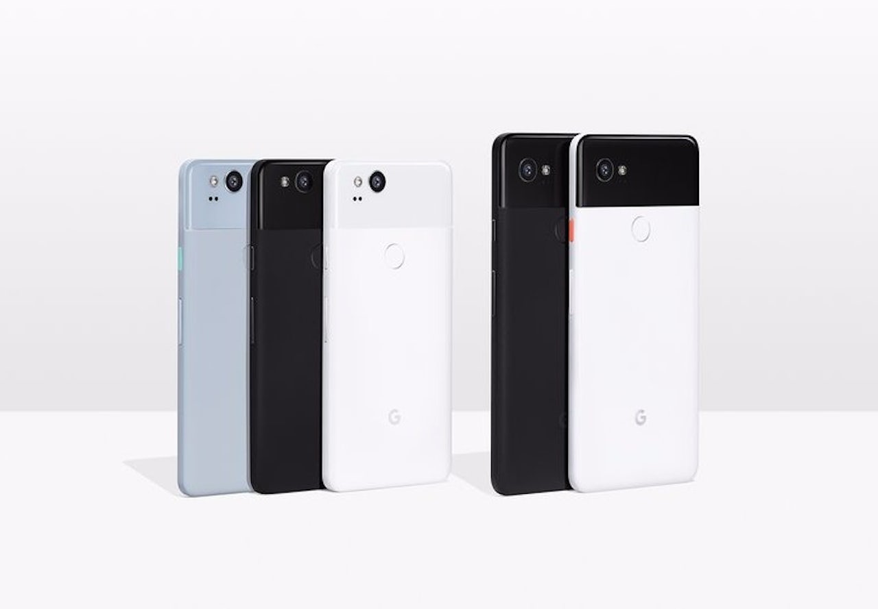
But that’s changed. This latest lineup of devices manage to capture something that has been a long time coming for Google: I actually want them. I think the new Pixel phones look legitimately cool (please, please make the Pixel XL in that blue color). I started evaluating whether or not the Google audio devices (the Home, Home Max, and Home Mini) could replace my Sonos system. I considered buying the pink VR headset just because I like it. They are magnetizing designs, modern, sophisticated, and unlike anything else on the market. They feel purely Google and at the same time unlike anything that Google has ever done. Something audacious. Fashionable even! This is new mix for the company, and I think it’s a pretty big deal.


I know from having used last year’s Pixel that the company is capable of making a phone that works really well (yes, a phone that feels complete the way an iPhone feels complete). I know that its software ties together tons of services I actually use in a seamless way. Now it’s clear that Google is building something more meaningful — more beautiful — around all of its assets, and it’s building that structure by finally unifying devices and software through design.
As Ivy Ross, the head of user experience for Google’s hardware products, put it earlier this year, “In the last year we’ve had the opportunity to marry software and industrial design, to have my team and [Matias’s] team together. He and I really talk about the future and how these two things need to dance.”
The way I see it, they’re definitely dancing. Now the real question is: what’s the next song?