
Storybook addons for CSS
Better workflows for styling components

CSS can be frustrating, even for experienced developers. You have to orchestrate dozens of properties—accounting for aesthetics, layout, color, alignment, responsive behaviour and languages. On top of that, deal with browser quirks and inherited styles. And visual inspection is the only way to confirm that everything works as expected.
Each aspect needs to be verified manually. Resize the browser to check all breakpoints. Test each pseudo-state, locale, browser and so on. That's a lot of time spent clicking around to get the UI in the correct state. ⏱️
This article showcases Storybook addons for CSS that speed up your workflow and make debugging easier.
Device and user preferences
Modern interfaces respond to user context and preference by rendering differently. They morph based on the device size. Support multiple colour modes (light and dark). And respond to interactions such as hover and focus. Storybook addons make it easy to visualize these states. You can focus on verifying your work instead of replicating each state manually.
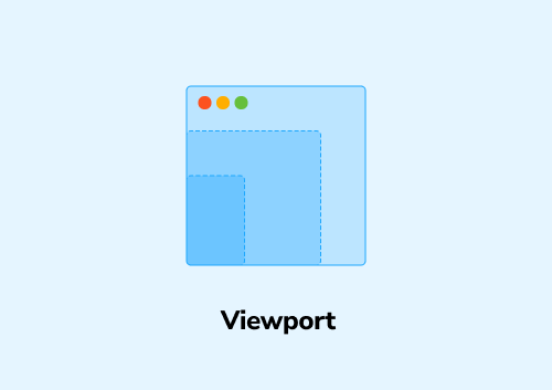
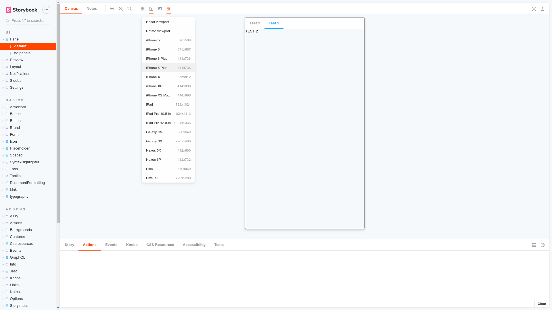
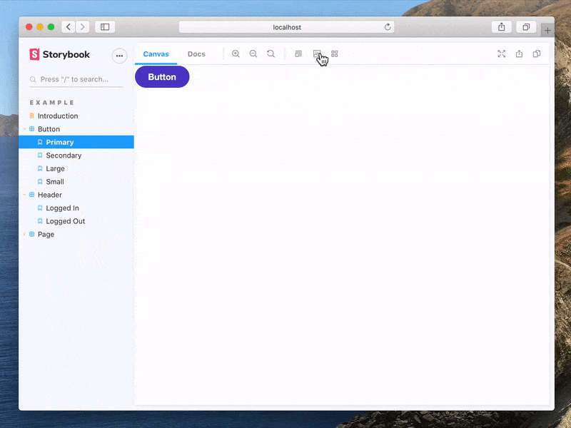
Control the viewport size and orientation using the Viewport addon. You can pick one of the standard sizes or configure your own specific dimensions.
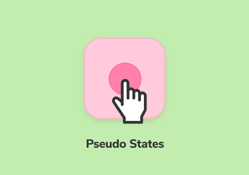
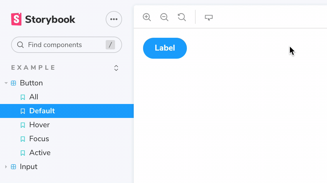
The Pseudo States addon allows you to render the various CSS pseudo-states of your component side-by-side—hover, focus, active, etc. Which then enables you to run visual regression tests on them too.
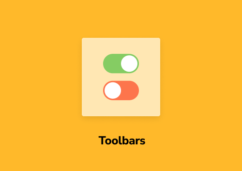
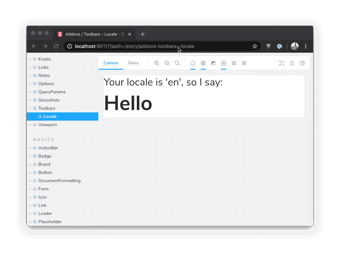
The user's language preference can dramatically impact the UI. For example, German words are 20-25% longer than their English counterparts. Arabic is written right to left. Testing UI by adjusting browser preferences in every combination of locale and language is a headache. With Toolbars addon toggle global variables like locales in one click.
Themes
Themes control UI characteristics like colour palette, typography, and white space. Increasingly developers have to build components that support multiple themes:
- Colour modes such as light, dark and high contrast
- Different visual branding. Components, especially those in a design system, are used to build numerous products with differing aesthetics.
You need a way to switch themes or display the same component with different themes side-by-side. How that happens depends on what tools you use. Storybook has you covered.
Vanilla CSS
Do you prefer regular ol’ CSS files? Use the CSS Resources Addon. You can configure all the CSS files for your project then toggle them on or off from the addons panel. Making it easy to load and switch between different themes.
CSS-in-JS
Emotion and styled-components allow you to write CSS in JavaScript. They require your app to be wrapped by a Provider which then provides the theme object to components down the tree.
The styled-components addon and emotion addon instruct Storybook to wrap all stories with this Provider. And adds a theme picker to Storybook’s UI, so you can swap between the themes your company supports.

The Theme switcher addon is a more generic option. It can be configured to work with any library of your choice.
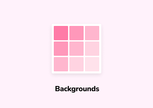
You might have noticed that the background for each story is white by default. You’ll want to change that when testing dark mode or to better match your colour palette. Backgrounds addon does exactly that. It adds a dropdown to the Storybook toolbar, allowing you to alter background colors.
Documenting themes
While you are building UIs, having easy access to the theme makes for a good developer experience. Instead of switching between multiple tools, you can reference the theme right inside Storybook.
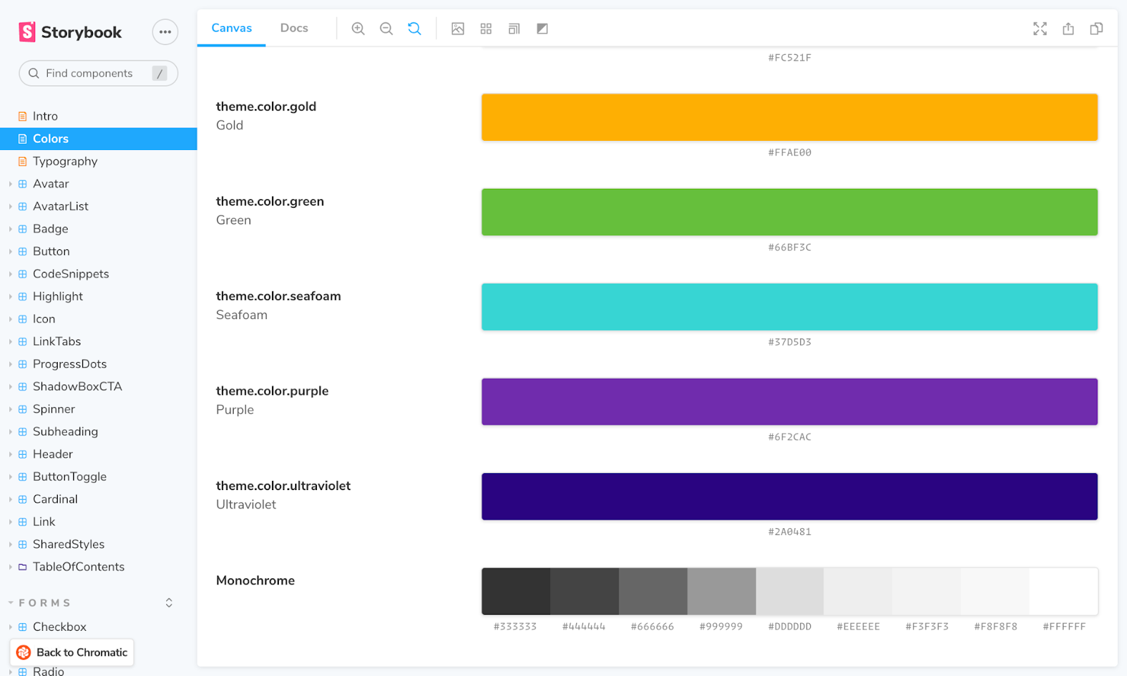
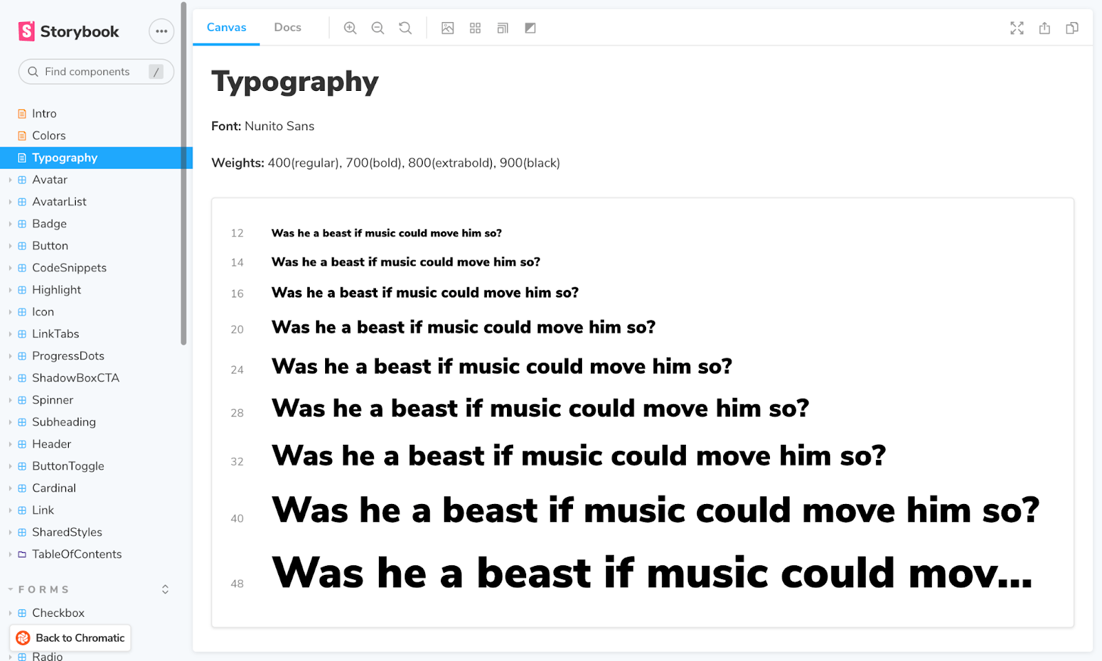
Addon Docs is a fantastic tool for documenting component usage and properties. It also allows you to create free-form pages using MDX, which can be used for visualizing and documenting themes. The addon offers a collection of Doc Blocks components, which include utilities for colour palettes and typography styles.
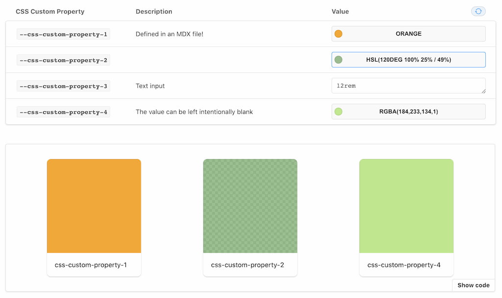
The current best practice is to use CSS Custom Properties to define theme variables. Addon CSS Props makes it easy to document and interact with these variables. You can access them via the addons panel or even add them to a Docs page.
Layout
It's tough to tell if your CSS layout matches the design. Eyeballing alignment is tricky when DOM elements are far apart or have odd shapes.
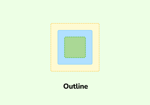
The Outline addon adds a toolbar button to toggle outlines on all UI elements. That makes it easy to verify positioning and placement at a glance.
Backgrounds addon also offers the option to display a grid. This is particularly handy if your designs are based on a consistent baseline grid. You can configure the size of the grid using parameters.
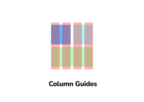
Speaking of grids, CSS Grid is becoming the tool of choice for page layouts. You can use it to create complex layout systems with gutters and template areas. The Column Guides addon allows you to visualize your grid by displaying column guides. Again, you can use parameters to configure it.
Accessibility
Choices you make in CSS can have negative implications for the accessibility of your app. Poor contrast between foreground and background colours, missing focus styles or locking device orientation using media queries.
Such best-practice heuristics can be run against your UI using a machine to catch accessibility violations. The Accessibility addon helps you QA your component’s compliance by running such automated checks. It then highlights areas of improvement as you develop.
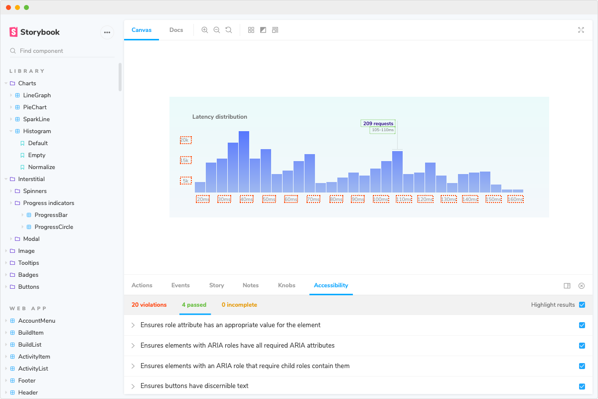
The addon also allows you to simulate vision deficiencies, which helps you make more informed choices. For example, is the text legible for someone with blurred vision? Or how does the page appear to someone with colour blindness?
Conclusion
It takes time, effort and care to style UIs. You have to anticipate countless conditions to ensure the layout and aesthetics work. It’s tricky to account for every combination of browsers, devices and user preference the first time around. Storybook addons make your life easier by giving you better debugging tools during the development workflow.
Check out the addon catalog to discover more addons for styling and CSS. Learn how to build an addon using our tutorial and docs. And join the discussion on Twitter below.
CSS can be frustrating.
— Storybook (@storybookjs) April 15, 2021
Minor changes can have unintended consequences—no warnings or feedback.
Storybook addons give you a better workflow:
🐛 Focused UI debugging tools
🕹 Simulate device settings
🎨 Document & switch themes
♿ Accessibility checkshttps://t.co/slSJNeMQx8 pic.twitter.com/tyeKFnWMHR