Enhancing User Experience With CSS Animations
With CSS and JS progress, implementing animations on websites has never been easier. But how do we make sure that our CSS animations and transitions will be meaningful to our users? That they will not be just some annoying “in-your-face” eye candy? How can CSS animations enhance your user experience?
In the talk, I give a quick reminder of CSS syntax to build transitions and animations. With practical examples, I show why certain animations work better than others and how to find the best timing and duration to build UI animations that “feel right”. I explain how our brain works, why and how animations contribute to improving user experience. And what you need to be careful about to build inclusive and accessible motion and avoid making some people sick.
I published the PDF version of the slides, but a PDF of a talk on animations is boring. So you will also find here a transcript with CSS codepen and video examples and LOT of resources to dig further in specific topics and the replay of the talk at the end of the article.
** Last Update: November 26, 2020 **
UX ❤ Animations – How and where animations can help users
So big warning: this talk and those slides contain a LOT of animations.
Most of the time when we say “animation”, people think about cartoons. Those are Disney’s 12 animation principles illustrated. But animations are not limited to cartoons.
Operating systems, videos games, and more recently apps and websites also started using animations in the last years to build better product and make the user experience better. Today, the power of CSS brings a lot of animation options and possibilities directly in the browser.
Animations decrease cognitive load
No change in nature is instant. Think about a sunset for example. So, animations decrease cognitive load, by making state changes more natural.
Change of states without animation is disruptive to human mental models and are hard to process. When abrupt change happen, the brain is trying to figure what happened between the states. And it’s a cognitive effort for our users.
It’s a little bit like the flip books. You know, when we were drawing stick humans in different positions in the right corner of a note book. Then we flipped the notebook, creating a moving character animation? When change happened without transition, the brain tries to detail all the steps to understand the “what just happened between those two states?” The brain does the flipbook drawing. And this drains resources from the brain, aka cognitive load.
So, animation explicitly show users the in-betweens. This helps decreases the cognitive load for the brain. The brain doesn’t have to interpolate the stares, so the interface feels less disruptive.
In this example, the animation shows how the menu opens and how the elements appear. User can concentrate on the task (of finding an element).
If you want to learn more on that topic, Scott E. Hudson and John T. Stasko published a paper called “Animation support in a user interface toolkit: flexible, robust, and reusable abstractions” . In the paper they explain how animations even allow users to continue thinking about the main task because they don’t need to think about the context shift of the interface.
Animations create feedback
If you ask someone a question and they don’t replay, stay silent for a moment, you might wonder if something actually happen. If they heard the question, understood it. If they wrinkles their forehead, you know they heard it and are thinking about an answer. It’s the same for interfaces. You can use animations and transitions to build micro-interactions. They give feedback to the users: “the action worked you can expect a response soon”. They make the experience feel fluid, generating the illusion of continuity. They bring a degree of “responsiveness” to the interface. Responsiveness, as in “the interfaces responds to user input”, not as responsive web design.
Note: if you are also interested in responsive web design and building robust systems of components, check out my other talk “Designing Adaptive Components, Beyond Responsive Breakpoint“
For small wait time that are above 1 second, you need to “tell the user” that the system is still working, nothing froze. This is where those kind of spinner animations become handy.
Another note: if you are interested in spinner, loaders, performance and user experience, make sure to check my talks on perceived performance. I show a few techniques to help you bring your products and services to the next levels by building not only interfaces that load fast, but that also feel fast.
Predicting the outcome of an action
Animations can also be used to show and to tell the future state of the element. If you are building a drag and drop feature, you can animate the “future place of the element” to show to the user where this element will be if the user drops it. Here the animation is used to show the user the possible outcome of the action.
Animations grab user’s attention
The human eye is attracted to moving things. Our brain is wired to notice and react to motion. It’s encoded in our DNA, it’s an evolutionary advantage. It helps humans discern danger and protect themselves. So, things moving around attract user’s attention. And you can use this at your advantage in interfaces for a few things.
Making signifier more obvious
Animations can make a subtle signifier more obvious. Like the little red button on this website. The pulsing animation gives a subtle nudge to invite to discovery.
People are prone to change blindness. If something changes in an area far away from their focus, they might not see that change.
Avoiding change blindness
Animations can help with that, by again, grabbing user’s attention so that they see those changes. For example: on archiduchesse, when users adds something to the basket, the only think that changes is the number in the top right. When users hit the “add to card” button, it triggers this cute little flying sock. This attracts user’s attention to the card number that changed. This gives user a visual confirmation that their action worked. Users might have missed it because the number change is so subtle without animation.
You could also use animations to distract user from slow loading for example on some websites (again, more about that on my talk on perceived performance).
Don’t be evil, don’t hijack user’s attention with deceptive design patterns!
But, this is a double edge sword. Animations can also become annoying for your users quite quickly. Let’s learn from the horrible time of flashing blinking banners on websites and never NEVER go back to that again.
So please, don’t hijack user’s attention with deceptive design patterns! Avoid using animations to create FOMO (fear of missing out) and other deceptive design patterns like that horrible counter to trick them into buying things. Don’t get me wrong: it’s really cool that we can build this in CSS. It doesn’t mean you SHOULD. Don’t.
Animations provide spacial orientation
If something disappears from the screen the user might ask “where did this go?” and be lost. Animations help establish the “physical space” in interfaces and keep user oriented.
Think about the menu on my blog for example: thanks to the animation you understand where the menu comes from when it opens and where it goes when you close it. Think about a list where you add elements: where do the elements come from when you create them? Where do they go if you delete them?
Helping move towards different steps
Animations also helps users move towards different special steps. They can also help establish that a user is moving forward or backward in different steps. Think about a carousel for example.
In the little quiz, each time I fill a question, the animation brings me to the next question. So I don’t have to think about the steps, the interface does the job for me.
Preventing disorientation
Animations can prevent disorientation, especially on context change.
In this example, when users click on the form elements, they enter in this “full screen modal” on mobile. This content change can be disorienting for some users. They might not get that this is an overlay and think it’s a new page. Then, they hit the back button to come back to the previous state. But the back button here will bring them back to the previous page: the search results. I have seen this happen in user testing: users not understanding the “full screen modal change” and hitting back button. Baymard wrote an article called “4 Design Patterns That Violate “Back” Button Expectations – 59% of Sites Get It Wrong” a few years ago on that specific problem.
How to fix? You could use a transition when the full screen pop-up opens to help user understand that they are on a layer on top of the page.
Animations craft a unique experience
Last but not least, animations help crafting a unique and memorable experience. Animations and motion can create pleasure and delight.
Show don’t tell: interactive data-viz and infographics
You know the show, don’t tell motto? Why explain something complex when you can actually show how it works? Animations are a good candidate for storytelling and interactive data-vizualisation and infographics.
The Washington Post animates the globe when you scroll in their interactive article about the global spreading of the COVID-19.
Capturing emotions, bringing delight
Animations can also help you capture mood and emotion. Mailchimp for example has a cool little “high five” animation when you send the newsletter. What more perfect way to celebrate sending you newsletter to all those ?
A well crafted animation can bring delight and a little touch of whimsical on a super clean website. Take a look at Josh Comeau’s website, in the article sections. There’s nothing super fancy, the layout is super clean, great content. And suddenly in the sidebar you see this cute little heart. The heart is playful, follows your mouse and can be clicked multiple times to say that you like the article. Filling the heart until it’s totally red is actually really satisfying. This is a great example of a small little “cherry of the top” detail that makes the experience memorable. Be sure to check the rest of his site, he has some little interaction gems there.
Reinforcing a brand identity
Animations also serve and reinforce the brand identity. Just like colors, voice and tone, etc. For example, the animations on the game dots match perfectly the whole personality and visual identity of the game.
On illustrating a message without overwhelming users
Be careful though, Animations should fit and illustrate the message without overwhelming users. This is where we enter more and more the realm of pure “illustrative” animations that are supporting messages, not just UI transitions.
For example, on the homepage, I have a “growing plant animation”. This animation is triggered when the user arrives in the blog section. The plant grows, supporting the message that I help other people grow by giving talks, writing articles, etc. You notice here that the animation only plays once then the plant stays grown even if you keep scrolling back and forth. Someone asked me why that plant didn’t “ungrow” when they scrolled outside of the area and regrow again. And the answer is simple: I wanted that animation to support the message, not overwhelm users. So playing it once it sufficient. Because, animations like that can actually be pretty annoying, even damaging for some users when you do it wrong.
CSS Transition and Animation Syntax
Now that we’ve seen how and where to use motion, let’s see how we can actually build those animations in the browser.
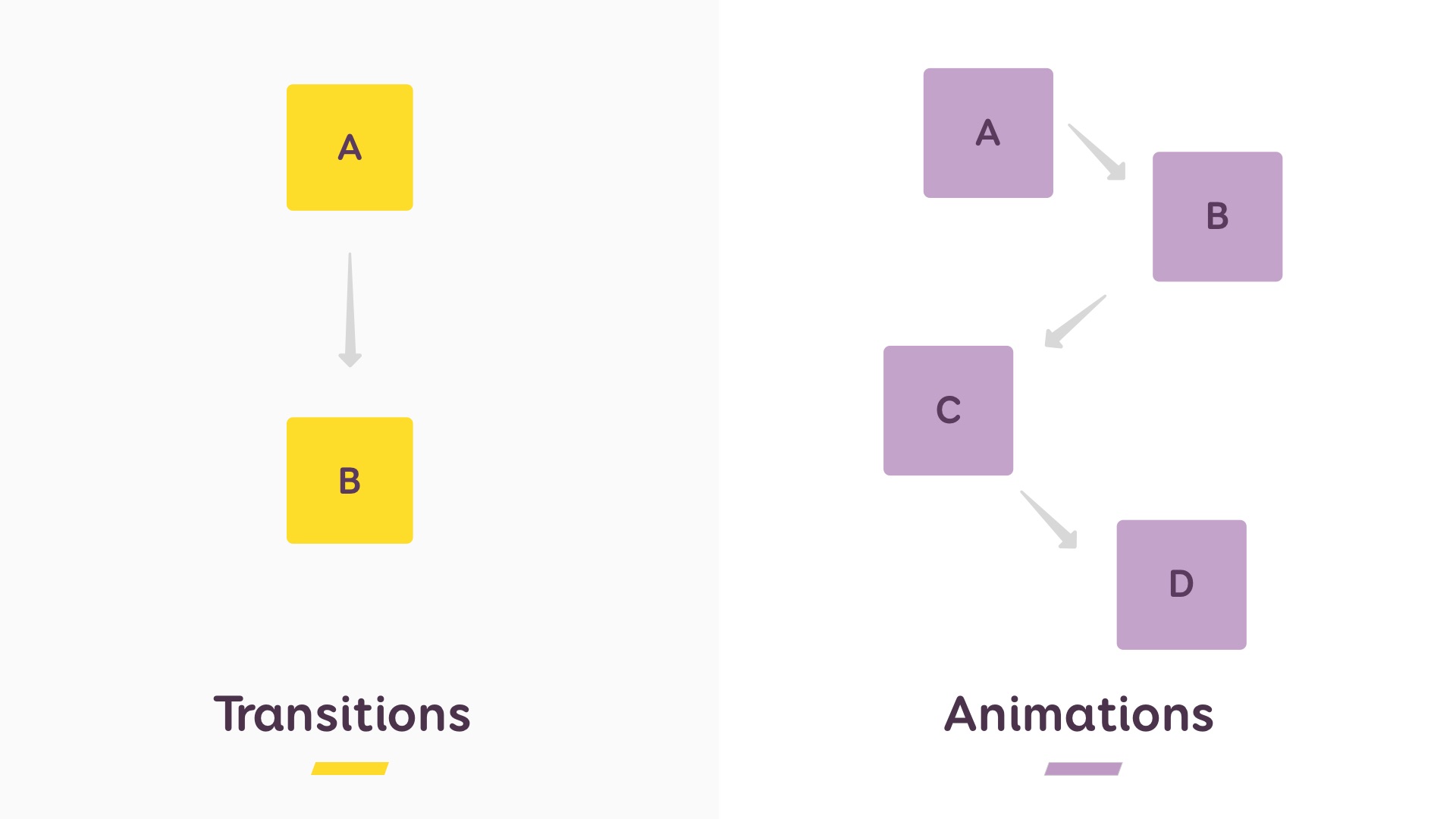
With CSS you can build 2 things: Transitions and Animations.
A transition lets you change one (or many) properties between 2 different states. With animations, you can change those properties between as many states as you want.
CSS Transition syntax
This codepen shows an example of CSS transition: I transition the background color from yellow to purple over 1 second on hover. So my two states are “default” to “hover”.
1
CSS transitions usually need a trigger, but you are not limited to :hover.
In this codepen, I trigger a CSS transition on :checked when the user clicks on “remember me”. I display the little checkmark and I change the background color to purple.
1
The syntax looks like that:
transition-property: to set the propertie(s) you want to change- transition-duration: to set how long the transition will last
transition-timing-function: to set the speed curve of an animation (more on that in next part)transition-delay: to define how long the browser waits before triggering the transitiontransition: transform 2s ease 1.5s;if you want the shorthand property
Transitions are connected to triggers (hover, tap, etc.) and mostly used for UI feedback and to help users understand UI changes A to B (menu opening, etc.)
CSS Animation syntax
This codepen shows an example of an animation. The syntax is close to “traditional” animation . You write a set of keyframes, one per state, to define what you change over time (yellow, pink, purple). You then attach this animation to an element. Here it’s attached to a link with no trigger so it will play on page load.
1
The really cool thing is that you can mix CSS animations with JavaScript. Build the animations in CSS. Then attach it to a .class in CSS. Trigger it by adding the class to JavaScript events on click, focus, blur, form submit, etc.
I used my form codepen to show you the checkbox animation, but have you tried submitting the form with no data? That’s right, the form shakes! I created a “shakeMe” animation with 3 keyframes that move the form from left to right. Then there’s a JavaScript that checks on the form submit event if I have errors in the form. If so, I attach the .error class to the form, and voila, shake it shake it!
1
So to sum it up, to build animations you need to set up some keyframes to create the different steps of your changes. Then you attach this animation to a CSS element, with or without a trigger.
The syntax is the following:
animation-name: is the name of the animation to be able to attach it lateranimation-duration: how long will it playanimation-timing: the timing curve, we’ll come back to that lateranimation-iteration count: how many times does it playanimation-direction: (normal,reverse,alternate, alternate-reverse): how the animation will play during each cycle. Check the MDN documentation for more information.animation-play-state: is it running or paused. Check the MDN documentation for more information.animation-delay: how long before it startsanimation-fill-mode: (none, forward, backwards, both) is to set what style is applied once the animation is finished. Check the MDN documentation for more information.
If you want to understand a little bit better how keyframes work, keyframes.app is a cool tool to play around with animations. You see the timeline and the concept of keyframes at the bottom.
Animations are mostly used for more complex UI motion involving different stages, looping motion and “illustrative” animations
Resources:
Opacity & Transform = ❤
Animating certain properties can become costly on the paint in the browser. The two things the browser can “cheaply” animate are transforms and opacity. So to build performant animations, I would advise to use those (and avoid animating absolute positions for example). Color and Background color are a little bit more performance costly but still okay to animation and transition.
In the talk I quickly show the 4 main transform possibilities:
- Translations —
transform: translate(): to build X,Y and Z axis translations - Scale —
transform: scale(): to make things bigger, smaller and hide them on X,Y and Z axis. Note that the default value is scale(none) (also equal to scale(1) and if you write scale(0) you will hide the element - Rotate —
transform: rotate(): to turn elements on X,Y and Z axis using degree unit, turn units, rads and more - Skew —
transform: skew(): to skew things and make those strange polygon effects I have under my titles on my blog ^^
I don’t enter into all the details of the 3d transforms with matrix3() and perspective but feel free to read the spec about those it you enjoy 3D cubes and other 3D animations in the browser.
Resources
- CSS Transforms
- transform on CSS tricks
- csstriggers.com, on online resource that shows you which properties trigger layout, paint and composite
Finding the Perfect Animation Duration and Timing
Now that we’ve seen how to build those in CSS, let’s go back to the “timing function” I talked to you about. Finding the perfect timing is key to build user friendly animations.
Here are a few best practices:
- Use almost instant durations (<100ms) for fades and color animations
- Use shorter durations (100ms – 300ms) for simpler effects and relatively small-sized animations. Also use those for user initiated action that need feedback (touch, click, swipe, etc.)
- Use longer durations (> 300ms) for more complex effects and larger scale animations (such as page transitions or moving objects on and offscreen);
- Keep slow animations (> 500ms) for large movements and background elements that bring mood
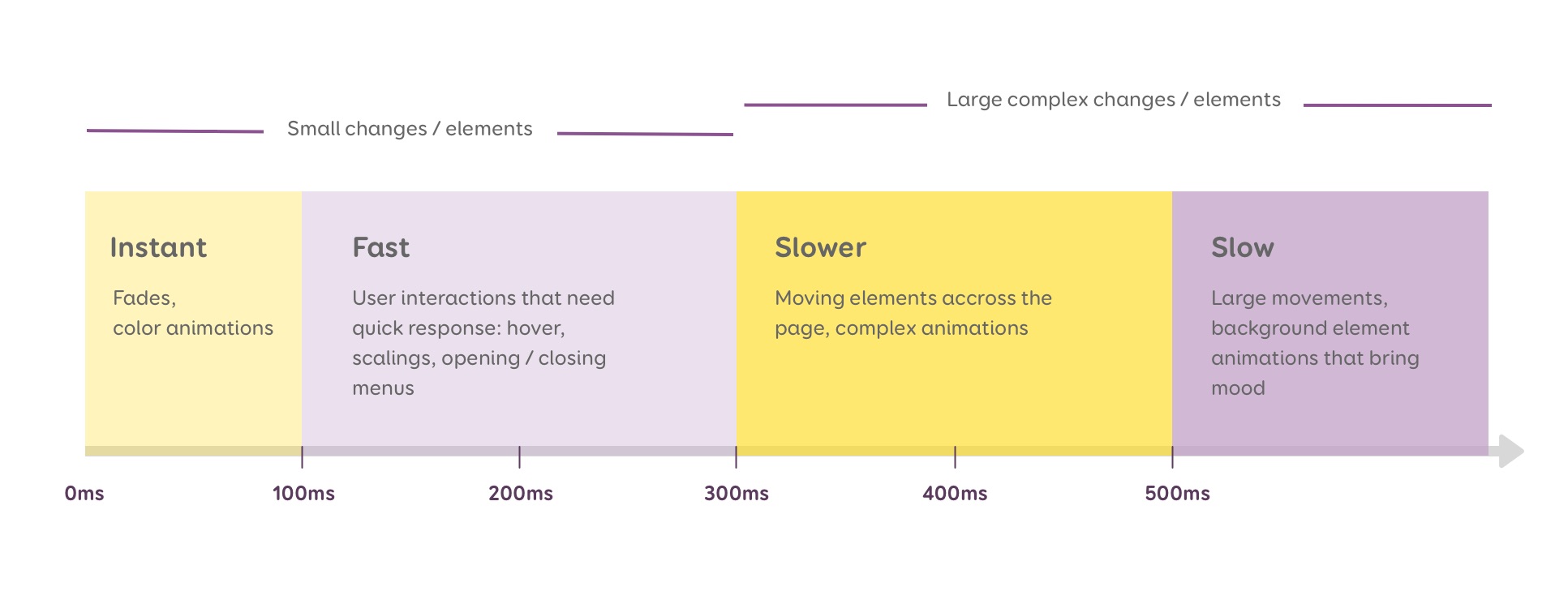
This graph is based on Val Head’s amazing article on UI animations timing and Rachel Nabors’s book Animation At Work.
Also note that the optimal timing can change based on viewport size. For example: on wearables like smart watches, the screen is quite small. So the distance for an element to go from one side of the screen to another is smaller. Which means that your “moving elements” animations should be faster for those devices, otherwise users will have to wait. Make your wearable animation durations something like 30% shorter.
Whatever you do, the key is to test that duration: with different types of users, different devices, network conditions, etc. It’s okay to fine tune animations in the browser.
Another crucial part of having those animations “feel right” is the timing function I talked to you about before. Transition-timing-function and animation-timing-function specifies how a CSS animation progress over the duration of each cycle.
The default value is ease: the animation starts slowly, accelerates in the middle, and slows down at the end. This works when in doubt, but we can do better than that.
The step() timing function can be used if you need to build some step by step animations. Like a clock, or a CSS counter.
See this codepen to understand the different timing functions visually:
1
Linear timing function
The object travels the same distance at the same time. This brings a quite unnatural feeling to the animation, almost mechanical. But it’s actually what you are going for? An example would be this train animation on codepen . You actually want the train speed to feel mechanical here to give this illusion of train passing by. It can also be used for elements and objects that are not affected by physical forces, for color and opacity animations and transitions.
Ease-in timing function
The animation starts out slow and gets faster until the end of the cycle (like a car). This gives the impression of something that accelerates. It works well with elements and objects flying out of the user screen that leave the screen forever. For example: when user dismisses a notification.
Ease-out timing function
The animation starts out fast and gets slower until the end of the timing. This works well for elements that emerge or arrive on a screen, like notifications that appear from example (you know those Material UI toasts?). It works for anything like cards that appear from outside of the screen and slide into the viewport. It also works well for page transitions.
Ease-in-out timing function
The animation starts out slow and gets faster until the midpoint of the timing; then it gets slower again. This kind of timing is usually used for objects that move from one part of the screen to another. It’s also used when the element disappears but the user can bring it back to the previous place (menus, etc.). Last but not least is works well with buttons and things that require instant reaction.
Creating your own custom timing-functions with cubic-bezier
Those where the default CSS keywords you can use for the animation/transition-timing-function. But the REALLY cool part is that you can build your own custom curves using cubic-bezier curves.
They are some online tools to build this visually:
- cubic-bezier.com: play with the toggle to build the perfect curve. You can go beyond the edge to create some bouncing effects, if bouncing effects work with your identity.
- easings.net is a gallery of pre-built custom cubic-bezier curves you can use for your projects.
SVG + CSS animations / transitions = ❤
So to illustrate the different between CSS transitions and CSS animations for this talk, I decided to a little “Day and Night” demo. Feel free to refer to this if you want to explain the difference to students for example.
1
The left part is only built with CSS transitions (I will detail some parts later and might write a whole article with some videos about the process later).
I change the colors of the elements and the position of some of those on hover. The right part is a CSS animation. It doesn’t need any trigger and is set to loop infinitely. The pulsing of the sun for example is an animation of the opacity and of the size over 3 different values.
I will detail here a few interesting things that I discovered while playing with SVG and CSS animations.
CSS custom properties can make your SVG animations easier
CSS custom properties is the fancy name of the CSS “native” variables. MDN explains the following:
Custom properties are scoped to the element(s) they are declared on, and participate in the cascade: the value of such a custom property is that from the declaration decided by the cascading algorithm
And we are going to use that scoping to make our lives easier when playing with SVG and CSS animations.
The day/night color change
For the day/night color shift I did the following:
- I defined the colors of the day background, the cactuses and the hills as CSS variables
- Then I assigned those variables as SVG
fillproperty to color my whole day artwork.
The really cool thing with CSS custom properties is that you can “redefine” them later in your CSS and assign other values if you need. So, on hover, I am re-defining my variables with a new “night” colorset.
Here is what the code looks like. You can see in the console on the right that my “day” color set get overridden by the night one when I hover the element.
Geoffrey Crofte gave a nice talk on CSS custom properties and talks about using a similar technique to create a dark theme.
The sun ripple effect
Another place I am using those custom properties is in my Sun ripple effect. You can put as many properties as you want and as many keyframes as you want. For example here I am animating both the transform and the opacity of the sun rays to create this ripple effect. I again used CSS custom properties instead of static values here for more flexibility in the transform property. This lets me redefine the scale factor of the second sun ray in its own scope. While the small ray starts at 1, scales to 1.05 and goes back to 1, the second ray (the one outside) does the opposite. It starts big at 1.1, then and then scales down to 1.01 and back to 1.1.
This change is what gives it the nice ripple effect. This way I avoid having to duplicate the animation declaration with a second scale factor. Here’s what it looks like:
The SVG transform-origin in SVG coordinate system
One thing you need to be aware of if you start playing with SVG animations in CSS is the coordinate system. Here I am not talking about animating an SVG you would use as an image in an img tag. I am talking about inline SVG in your HTML DOM and animations of paths inside that SVG.
The tricky part about SVG transforms is the origin. For HTML elements, the origin of transformations is the CSS transform origin: 50%, 50%, 0. So in the center on the 0 Z axis.
For SVG, the default value of transform-origin is 0,0 for all SVG elements except for root <svg> elements and <svg> elements that are a direct child of a foreignObject.
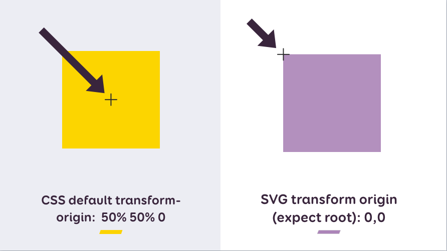
You usually want your SVG transforms to work like your HTML transforms: to have the origin in the center of the path/element. To achieve that you can use the transform-origin property. This lets you manually set up the coordinates for the origin of that transformation.
Here is an example of the rotation of the sun inside my SVG element (with the yellow background). The rotation looks broken at the beginning because of this origin. I am fixing it by manually setting the transform-origin to 700px on both axes because I want the middle of my SVG parent as origin for my rotation. (you can also play with the codepen demo here)
You can use keywords (center, left, right, etc) but sometimes some browsers mess those up. So I prefer pixels. Also note that those pixels are relative to your SVG. If you scale it down or up it doesn’t change you can still use the pixels.
To find the exact coordinates I need I usually open the SVG in Illustrator. Then I select the element I need (here the sun) and check the coordinates of its center in the properties box.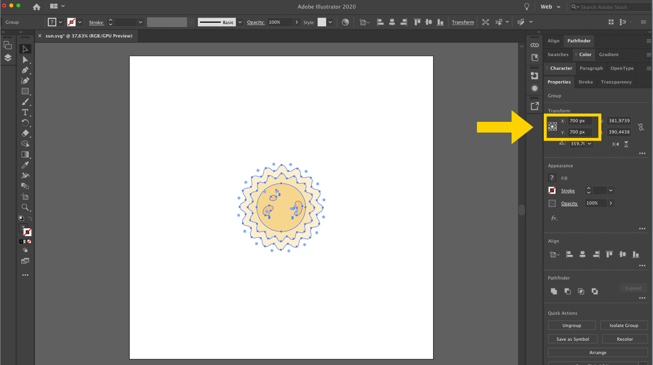
Animating following a path
One really cool trick in CSS is that you can use SVG paths to define a path for an element to follow during the animation. This is the trick I used to give the moon and sun the curvy animation. Here is the “behind the scene” of that part of the demo.
- I set a path for this transition to follow with
offset-path. Note: the path of the sun is shown in yellow in the video above, but, by default it doesn’t show. I just added some extra code for the demo to show it. - With
offset-distance, I place the sun at 32% of the beginning of this path to show the sun for the daylight default version. - On hover, I transition the
offset-distanceto 43%, hiding the sun behind the hills. - I also put a second transition on the default sun element for the “mouse leave” transition. I want this one to have a delay of 1.2s so that the transition of the moon has time to finish.
The moon works the exact same way, it’s just hidden by default the goes along the blue path when the sun hides.
Resources:
- Motion Paths – Past, Present and Future
- Get Moving (or not) with CSS Motion Path
- CSS Motion Path beyond the Big Three Properties
Building Accessible and Inclusive Animations
With great powers, come great animations. I showed you how animations can make user experience better. But you should use those tools with caution. I already talked about how you should not use animations to create deceptive design patterns. Let’s talk about accessibility now.
Some motion can make your users sick
Your animations might may some people sick. To be more precise: motion might may people with vestibular disorders sick. Some people like me suffer from vestibular disorders. It’s any disease, damage or injury that affects the internal balance. It usually happens when there is a mismatch between what my eyes see and what happen around me. A little bit like you can get sick in a can when you read a book because the road moves around you. Well this happens for me, and for some people, with websites. and with videos games. And it’s complicated to predict and detect for your users, because a lot of different criteria can trigger the motion sickness. It depends from one person to another. Some people get nausea, some people get headaches for a whole day long.
For example : I can play and love Borderlands, but I can’t play Kingdome Heart 3 (I bought that damn game…) and I could not play Spyro the dragon on PS1. Buying a game is a gamble. Sometimes I know from video gameplays that it’s not going to be a game for me. But sometimes the videos make me sick, but playing the actual game is okay. Or it can be okay for a certain amount of time. And it’s the same on the web: some motion might make some people sick and might be okay for some other people.
If you are interested in the topic (and I kind of hope you are since you read my blog and I talk a lot about accessibility here), you can read:
- Your Interactive Makes Me Sick
- Accessibility for Vestibular Disorders: How My Temporary Disability Changed My Perspective
Apple in 2017 wrote an article about the potential triggers of this motion sickness. It’s called “Responsive Design for Motion” and has a lot of visual examples.
The article includes the following triggers:
- Multi-Speed or Multi-Directional Movement (parallax)
- Scaling and Zooming
- Spinning and Vortex Effects
- Peripheral Motion,
- Etc.
In this example, my brain has a problem with the fact that elements move around on the screen while I scroll at a different speed than the scroll. It creates this mismatch that trigger the sickness.
Prefers-reduced-motion media query
So, what can we do about this? Apple introduced reduce motion to iOS settings in 2013. They did that because the animation they created to open apps made some people sick. Literally. A lot of users complained. And now this reduced motion option is also available in MacOS in the accessibility options. I think Windows 10 also offers this kind of option under the Ease and Access section. MDN has a list of where you can find those options.
Apple (then other browsers) recently introduced the “prefers-reduced-motion” media query. It is is used to detect if the user has requested that the system minimize the amount of non-essential motion it uses. Current support is Safari, Chrome and Chrome Android and Firefox).
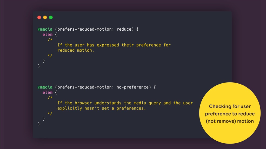
Default value is “no-preference”. This is a little bit the tricky part. no-preference can either mean that the user is okay with motion or has no prefer, but it can also mean that the user is not aware of this option. The other value us “reduce”. The means the user explicitly checked the box to tell the operating system to reduce the motion.
So you can use the media query to query for that parameter: if the prefers-reduce motion comes as true, you can ADAPT your motion. I insist on adapt, it doesn’t mean you need to remove all animations.
The idea is not to remove all animations, but more like to fine tune and reduce those animations that might trigger motion sickness (see the Apple article linked above). For example, in my CSS Transition CSS animation demo, the sun and moon moving around, on top of those shooting stars in the background and the timing of the solar system might be issues for some people. I implemented the following on prefers-reduced-motion: reduce
- I removed the shooting stars
- I remove the moving transition for the sun, cloud and moon and replace them by a color transition instead
- I slowed down the animation on the right (you can bearly see it).
- I also changed the speed of the earth rotation and removed the ripple effects on the sun
Resources to dig further into accessibility and motion:
- An Introduction to the Reduced Motion Media Query
- Revisiting prefers-reduced-motion, the reduced motion media query
- prefers-reduced-motion: Sometimes less movement is more
- “Making Motion Inclusive” by Val Head—An Event Apart video
Communicating & documenting motion
Animation is not “just” some sugar you add when the cake if backed. It needs to be part of the whole design process. So it also means that at some point, we need to communicate those animations with the development team.
Static documentation
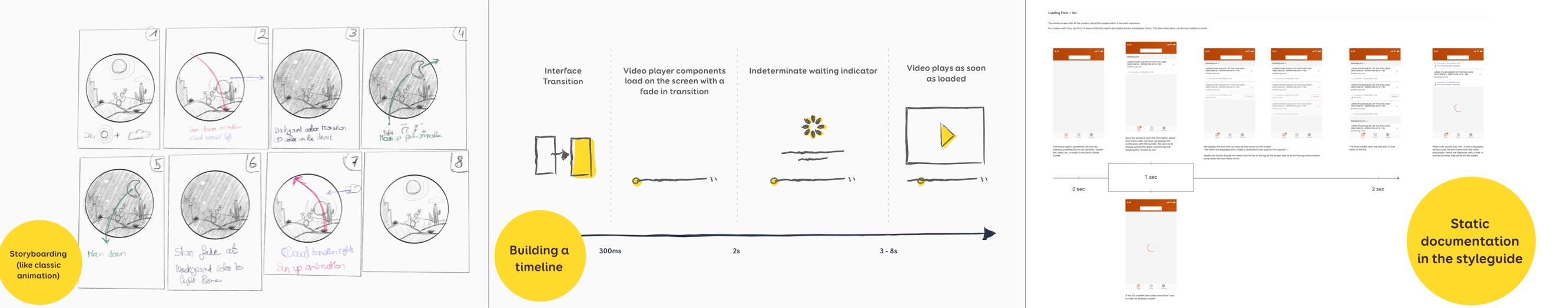
My first idea was to use more classic movies, animes and video games tricks and to document the animations with storyboard. I still do this today for complex SVG animations like the Day/Night.
Another way to document animations can be to build a kind of “animation” timeline. The example in the middle in the image bellow shows the animations that we built for loading the video on a mobile app. It starts with a 0 to 300ms transition of the 2 mobile views. Then a fade-in transition while the video loads, etc.
I sometimes also add some actual screens to the timeline to make if more visual for developers. So it is kind of a “storyboard” but with real screens at different “steps” of the UI transition. We have like delays “the first 10 items load in maximum 2 seconds”
Then Indications about the fade animation, the opacity going from 0 to 1
And indications about the loader.
This by the way is documentation I make available to the dev team in the tools they use (currently with have such documentation in the Jira stories for example).
But static documentation quickly has its limits…
Interaction animated prototypes
So, when I have the time, I usually prefer to build some kind of UI prototypes with the different animations and transitions. I am currently using Axure to do that because it has a lot of features that are close to what you can do in CSS transitions and animations. Here is an example of what it looks like in Axure + the prototype demo on the right.
Those prototypes have 3 goals:
- I can test the actual motion ideas I had in my mind by building them, playing around with easing and timings to make sure it’s efficient, not too slow, not too fast, etc.
- I can also do usability testing on those animations to make sure it works with my users
- I again use them to show to the developers exactly what is expected from the UI transition. I attach those into the Jira tickets (with all the static documentation) for documentation.
I am currently using Sketch + Axure for that, but there’s a LOT of tools that can help you prototype some animations today. You could build those with Figma, or Flinto, and Framer. It you are creating more “illustrative” animations in After Effect, you can also export them with the LottieFiles plugin. It lets you export AE animations to iOS, Android and web compatible format.
A last way I communicate animations and motion is by showing my dev teams examples of things I like and explain to them how I could like this to be implemented. For example:
- Codepen has some collections you can explore by topic
- Codrops has some “ui animation” inspiration category
Design in tools, Decide in the browser!
Whatever tool you are using, I think that the most important part is to test those animations in the browser as soon as possible. This is why I am a big fan of designing in tools, but deciding in browser. This means that even with thorough specifications, I always end up fine tuning the animations directly in the browser in a designer/dev peer reviewing session. Because this is mostly the only way to “feel” if those animations work or not.
Motion as part of the design systems
Animations are now parts of design systems. In her free eBook “Animation in Design System” Val Head gives a list of great examples of brands that included motion as part of their design system documentation. Take a look at Audi, or at the Google Material UI motion principles.
Animations tend to become some “design tokens“, just like colors, or icons. You need to document them if you want to build brand and UI consistency. A few things that often get documented when it comes to animations and design systems:
- Purpose (when and why animate)
- Types of animations (what to animate)
- Timing and speed
- Easing (custom curves)
For some interesting examples you can take a look at Microsoft’s motion documentation or at the documentation of animations in the Design system of Foyer (an insurance company in Luxembourg).
5 final basic rules to build great animations
Keep it Simple
- Does it distract my users from accomplishing their tasks?
- If there’s a risk of distraction, maybe adding a kill switch would help?
Keep it Short
- Does it annoy my user?
- Does it respond well?
- Is it too long
- Don’t make user wait for your animation to end be able to accomplish their tasks
Keep it Meaningful
- Does it provide useful information and adds value to the interface ?
- Does the animation serve a purpose or is it just annoying eye candy?
- Make the animation fit the whole message : playful animations are cool on games, but not on sleek sophisticated serious sites
Give user control
- Can my user turn off/ pause animations?
- Even better: can they chose to turn them on?
Test it
- with different devices
- with different browser conditions,
- on different network conditions
- with different users
- with different users who have different types of disabilities
Get the slides
I hosted the HTML export from keynote here. To go from one slide to another you can either click on the slide, or use the mouse arrows. There’s also a previous of the slide summary if you hover the left part of the deck. It might be quite slow though since the whole HTML export is 13Mb.
You can also enjoy the PDF version from Speakerdeck.
Watch the replay of the talk
This is the 30 minutes version of this talk (the video for the 45 minutes is coming later)
Moaaaar resources
If you want to continue your journey towards building amazing web animations that will delight and enhance your user experience, I recommend the following books:
- The CSS Animations Pocket Guide By Val Head
- Animations at Work by Rachel Nabors
- SVG Animations: From Common UX Implementations to Complex Responsive Animation by Sarah Drasner
- Animation in Design System E-Book by Val Head
And here are a few cool articles that helped me build this talk