


Roman Kamushken
Heya! Roman's here.
<span class="blog_big-paragraph">I am a UI designer, maker, and seller. It's been already 3+ years passed since I started to make templates for Figma and founded Setproduct to help startups and individuals save on design and release their apps faster.</span>
Handling 20+ years in graphic design, last years I've been browsing thousands of apps, screens, components, and layouts almost DAILY to assemble the most complete handbook of how to design components, templates, and entire apps.
But this guide is not there yet. I've faced a challenge trying to pull out everything I've learned, and I hope you'll help me to get a handbook started. I truly need to take off of my brain lay it down on paper…
Here is my exploration and research for the variants to design Avatars also known as Userpics. You will be guided through the States, Sizes, Styles, Usage, and Templates containing avatars in order to have all the keys for your design mission.
Prepare for the tiny UI details, you won't notice till you get too close.
{{spacer-64}}
What is Avatar?
Avatar (aka Userpic) — is a component used to represent a user's profile picture.
Implement Avatars with an action leading to the app section where the user is able to modify preferences, options, or edit self details.
{{spacer-64}}
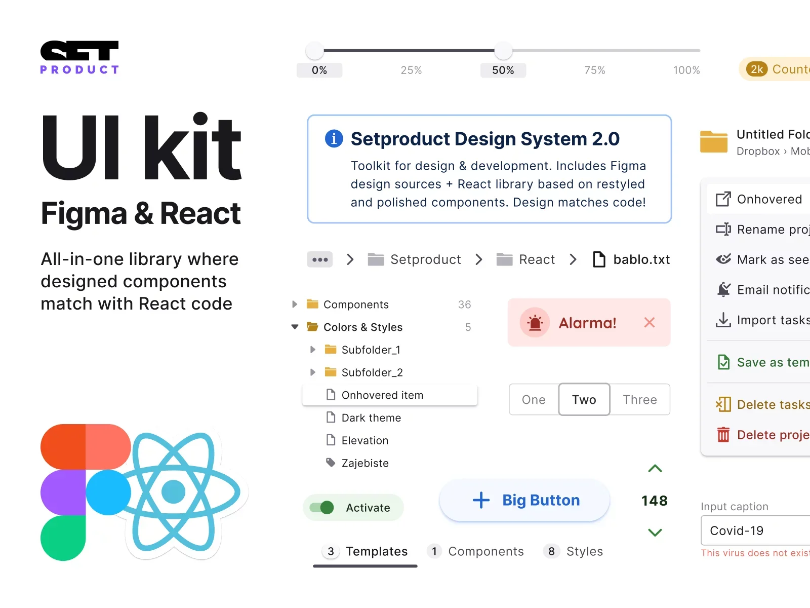
{{setproduct-gpt}}
{{spacer-64}}
Anatomy
States
The default states for Avatar are:
- empty
- initials
- user's picture
{{spacer-24}}
Size & Color
The size and color of the Avatar may vary, depending on a use case:
- 24–40dp width is mostly used for App bars, Headers, etc.
- 40–48dp for Avatars used in lists, or content blocks
- 56+ when used in templates: Profile, Settings, etc.
- Colors may vary for a better recognition
{{spacer-24}}
Actions
Additional elements for Avatar may be nested to indicate, notify, or call to action.
- You may indicate whether a user is online, or not
- You may notify and provide visual feedback with a numbered badge
- You may show up an additional icon to encourage into action
{{spacer-24}}
User status
The common pattern of displaying the user's status is to nest a round indicator at the bottom right.
- Use green for online, gray for offline status
- Use filled shape when online, empty when offline (alt. variant)
{{spacer-24}}
Notification badges
Avatar's badges could be stylized according to a priority to catch the user's attention.
- Use solid and bright colors for high priority to notify
- Use smooth or light background for other cases
{{spacer-24}}
Call to action
Use side-nested icons / rounded buttons to clarify upcoming action when Avatar is clicked.
- Swap the icon according to a result the user is about to expect
- Apply the colors wisely to intense the meaning of the action
{{spacer-64}}
Text & Captions
Avatar with sided text
In order to provide additional details, Avatar may be used with supportive titles. Mostly used in lists, application bars, tables, etc.
- The larger caption to specify the persona's name
- The subtitle is optional for additional info (e.g. status, last visit, role, followers amount, etc.)
{{spacer-24}}
Avatar with bottom text
In templates, you may apply a larger Avatar with bottom-placed text. Mostly used in-app sections, like Profile, Settings, Social.
{{spacer-64}}
UX & Usability
Events
You may additionally indicate new user's events by adding a slightly distanced outline border around Avatar. The combination with badged counter is a strong engaging solution.
{{spacer-24}}
Progress
There is an extra case for applying the stroke as a progress bar to represent Avatar's achievements ergonomically.
{{spacer-24}}
Selection
The combination of stroke with confirming icon is solid user feedback of the selected state.
{{spacer-16}}
The classic variant of selected state performed:
{{spacer-64}}
Avatar group
Nested Button
When Avatars are stacked into a group, the call to action button could be used in case of user's action is required.
e.g. "Plus" button leads to the flow related to interaction with a group of Avatars — Adding, Sorting, Editing, etc.
{{spacer-24}}
Nested Badge
Use a numeric badge to represent how many users are left behind the stack.
{{spacer-24}}
Onhovered Badge
The frequent pattern for a badge when onhovered is to expand users' details.
{{spacer-24}}
Onhovered Avatar
In a stack, you can show up the a full name using tooltip, when each userpic is onhovered.
{{spacer-24}}
Templates
The most common use cases for Avatar is nesting into the Application Bar, or use a larger version in the Profile / Settings section, in order to be able to utilize edits for the user's picture.
{{spacer-24}}
{{stars-conclusion}}
{{spacer-24}}
This is all you need to know to design better Avatars.
Hope my research will help you to improve your in-app UX. The next chapter is for the Accordions, probably. Stay tuned!
.webp)

%20(1).webp)
.webp)
.webp)
.webp)
.webp)
.webp)
.webp)

.webp)
.webp)
.webp)
.webp)


%20(1).webp)

%20(1).webp)
.webp)
.webp)


