
The field of data visualization has become a tussle between accuracy and beauty. In one corner, designers say that data is fungible as long as the presentation is eye-catching. In the other corner, statisticians argue that clarity should rarely be sacrificed in the name of novelty or entertainment.
The latest AIGA Design Census is a vivid illustration of this skirmish. Published by the oldest and largest professional design organization in the US, the report—based on an industry survey—contains some valuable insights about the country’s creative sector, but some argue that the findings are obscured by the report’s “very bad” data visualization.
Consider this chart from the report denoting the years of experience of 9,000 respondents.
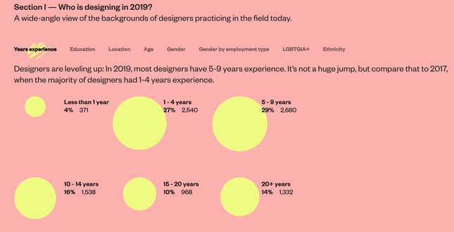
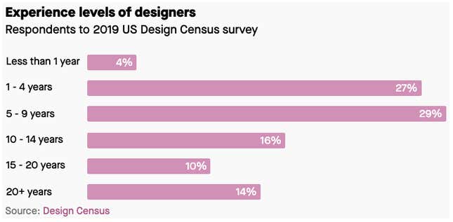
The rows of bright yellow bubbles may be more interesting to look at—they really pop against the salmon-colored background—but it makes it difficult for readers to make comparisons between shapes. A simple bar graph, like we made below, better conveys the information.
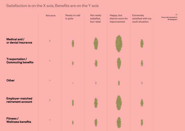
In a table showing work satisfaction versus type of benefit received, respondents are represented via clusters of dots that vaguely resemble bacteria in a petri dish. These organic forms are pretty but, again, statisticians would argue that simple bar graph would have been the most efficient visual.
“The emphasis is not on how to communicate data as clearly as possible but on a kind of visual cuteness,” observes Stephen Few, a data visualization expert and author of the book Show Me the Numbers: Designing Tables and Graphs to Enlighten, after reviewing the report. “Many charts in this publication that ought to be the same kind of graph are displayed in different ways for the sake of variety.”
Antony Unwin, professor of computational statistics and data analysis at the University of Augsburg says, “it’s very disappointing. I would expect something better from such an august body.” Asked how he might fix some of the more perplexing graphics, Unwin decries, “there’s nothing I can ask them because we’re on different planets.”
Accurat, the design firm that developed the graphs for the AIGA Design Census, says that its concern is winning the audience’s attention—even to the point of initially puzzling them. “I feel there’s a value in creating a dynamic presentation of data because capturing the attention of the audience is as important as communicating the data properly,” explains Gabriele Rossi, Accurat’s co-founder.
With offices in Milan and New York, Accurat takes the stylistic component of information design to point that one of its cofounder’s work has been featured in a fashion line.
Though Accurat also produces fairly straightforward graphics for clients such as IBM, Deloitte, and the Bill & Melinda Gates Foundation, Rossi characterizes the AIGA industry report as more of a marketing document aimed at designers. There’s an underlying assumption about this approach: it suggests that designers need to be entertained in order to be informed.
Two takes on data visualization
The fundamental disagreement between designers and statisticians isn’t rare, nor is it new. In 2012, Unwin and fellow statistician Andrew Gelman wrote a paper that defined the issue:
Outside of statistics, infographics is huge, but their purveyors and enthusiasts appear largely to be uninterested in statistical principles… We worry that designers of non-statistical data graphics are not so focused on conveying information and that the very beauty of many professionally-produced images may, paradoxically, stand in the way of better understanding of data in many situations.
Rossi of Accurat tells Quartz the difference in approach is a result of having different communication goals. If statisticians see data visualization as the pursuit of the clearest and most correct translation of numerical data into graphical form, designers understand that a chart can at times be a tool in a bigger marketing or branding scheme. It’s essentially the difference between a court transcription and an interpretative dance.
“We needed to get traction on social media,” explains Ross. “Will you really share 10 images on Instagram if they all look the same? If you do, it’s probably not going to be a very savvy social media strategy.”
Like other forms of graphic design, experimenting with fonts, shapes, and grids is a way of avoiding visual fatigue, Rossi says. “For theater posters for instance, of course black and Helvetica [font] on white background will always be readable but would you notice it on a subway? In the same way, would you notice a plain and proper bar chart with very grid lines in place, as academics recommend it?”
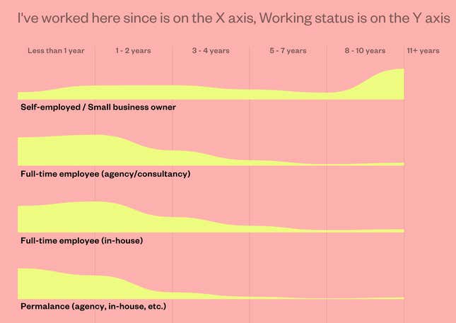
Not all untraditional charts are ineffective. One such example in the AIGA Design Census is a chart showing the distribution of time at respondents’ current job for different types of employment. Data viz researchers might scoff at the chart’s missing y-axis and would prescribe bars over curved shapes. Still, it is beautiful and clearly shows that self-employed workers tend to stay in their position longer than those who work for a company.
Statisticians believe that data visualization is about communicating information efficiently. If done right, readers can quickly perceive patterns and relationships in graphical format that would be more difficult to explain through text. In reality, it’s often more complicated than that—especially in today’s attention economy. To keep a reader’s interest, visualizers not only have to think of conveying information succinctly, they have to conjure a way to make it visually appealing and exciting. Bar charts and line charts, though effective, are boring to some people.
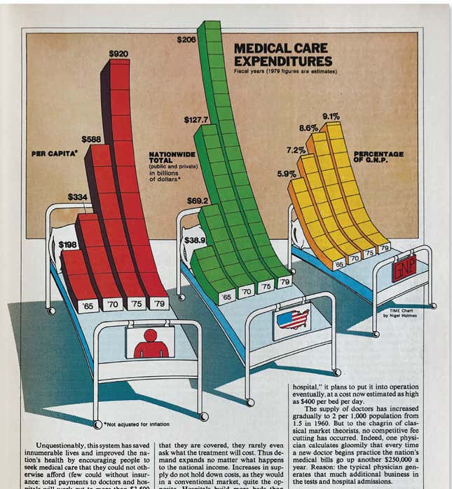
Influential information designer Nigel Holmes grappled with this tension when he introduced a new approach to graphics for TIME magazine in the 1970s. Working under art director Walter Bernard, he created bar graphs on horseback, droopy charts on hospital beds, and many other goofy graphs that purists like Yale University information design pioneer Edward Tufte, might call “chartjunk.”
In the new book Mag Men: Fifty Years of Making Magazines (Columbia University Press), Holmes describes toeing the line:
From time to time I overstepped the mark and illustration got in the way of the numbers. All I wanted to do was help people become interested in the subject of the articles. I spent a lot of time talking to the writers, who helpfully fed me metaphors that I could work into the charts. If I could get readers to smile, I was at least halfway to helping them understand.
After a few years, I felt that perhaps some of the charts had gone too far, so I calmed the illustration down a bit. That led to another round of critical mail: ‘So now we are back to boring charts again?’ A funny thing: after many years of changes in style, I still get requests for the lighter touch I’d used at Time (I’m happy to oblige). The point is the same as it always was—to engage readers.
Terrible charts in the wild
Accurat’s sometimes befuddling graphs for the AIGA Design Census are a minor event compared to the “bad charts” that have become a mainstay of business communication.
A classic example of an inefficient, but well-loved, graphic is the world cloud. A world cloud is a cluster of words associated with a key concept, with the most frequently used words rendered in a larger font size and displayed close to the center of the graphic. Data experts agree that this is a horrible way to convey frequency.

Yet data visualizers are often asked to make word clouds to summarize a politician’s speech or a company’s report. Why do otherwise brilliant writers and editors want such an ineffective chart? Because they think it looks cool, and it’s different. And if a word cloud gets someone to read a report or article they wouldn’t have otherwise, can we really call it ineffective?
Another example is the pie chart. Reviled by serious data experts, a 1984 study outlined how people tend to underestimate the size of acute angles (<90°) and overestimate the size of obtuse ones (>90°). But pie charts persist because people like circles more than rectangles.
There is a large body of scientific research literature on the most effective types of charts vis-a-vis the information. This research suggests that people are better able to compare differences in length than differences in area, and can more accurately assess the area of a square better than the area of a circle. Nearly every statistician would recommend a bar chart over a pie chart. But even experts who know this basic rule, like Accurat, will often ignore it—and it can be a good choice.
An interactive visualization of Barack Obama’s 2013 budget proposal in the New York Times, for instance, is informative and playful. There are aspects of this visualization that don’t follow the rules, particularly the use of circles rather than distance to convey differences in spending amounts.
These examples demonstrate the fundamental conflict in data visualization: Finding a balance between ingenuity and comprehension; visual acrobatics and accuracy.
Sticking points
The irony that a design organization like AIGA would publish a report with methodologically “poor” data visualization isn’t lost on critics. After all, graphic designers are often tasked with creating graphics for reports, publications, and presentations.
Few, the author of Show Me the Numbers, argues that there’s something greater at stake when such lapses go unchecked. “This is a publication from an organization that ought to understand this stuff, right? You would expect them to be leaders in this field to some degree,” he says. “This kind of publication just gives designers permission to continue doing it poorly.” Few suggests that we might see an overall improvement in charts if graphic designers involved in making charts studied some basic statistics and statisticians, in turn, learned design principles for better-looking graphs.
Accurat’s Rossi, for his part, underscores the different pressures that plague professional designers compared with academics. He admits that his firm could’ve done a different job with AIGA’s graphs had they been given more resources. “It’s just that you also have to imagine that this is a non-profit project than we did in our spare time, with a fourth of the budget,” he says. Rossi also mentions that he had to work with creative parameters from Google Design, which co-sponsored the project with AIGA. “As professionals, we need to do in two days what an academic researcher might do in two years,” he says.
For Few, among the the most egregious aspects of the AIGA Design Census visualization strategy is that readers are compelled to figure out how to read every chart. Variety, in this case, becomes a stumbling block. “If you use various types of graphs to show exactly the same thing, you are forcing people to have to relearn how to read the graph every time they come to a new one,” Few points out. “There’s no reason to put people through that learning curve when they’re reading a report.”
But Rossi says this, in fact, is by design. “We stimulate curiosity by asking the reader to figure out how the chart works,” he says.
In many ways, the fundamental disagreement between statisticians and designers reflects a shift in thinking about what constitutes good design. There was a time when the universal goal was to create seamless flow. Designers were charged with eliminating all obstacles, anticipating the mindset of users along the way. In the popular design reader, The Design of Everyday Things, design guru Don Norman writes that “when the point of contact between the product and the people becomes a point of friction, then the industrial designer has failed.”
In recent years, user-experience experts have begun to change their tune. They realized that a seamless flow of information and tasks results in passive, unmindful customers. Accurat’s intentionally imperfect chart-making underscores the importance of friction to invite participation, curiosity, and engagement—for better or worse.