
The 3 secrets to Font Pairing

The elusive art of pairing fonts always always always comes up in conversation when I’m talking with folks about what they find difficult in typography, and for good reason—it’s hard!
On our last episode of the Adobe Fonts livestream we dug into the topic and shared some examples + why they work. If you want to watch the stream the video is embedded at the bottom of this post, but I thought it would also be good to distill the information to the key points for you.
There are multiple different types of pairings and reasons to want to pair fonts. It can get pretty intimidating taking all the context into account when you are just trying to make your designs feel right and look good. With this 3 step framework you can be pairing like a pro in no time, it just takes a little practice. I’ll note there are many ways to do this, but this is how I like to think about it.
So here we go, my 3 secrets to pairing fonts:
1. Work with an Anchor font
Ok wow big first secret here—start with one font. To pair fonts you need to have made a starting decision and use that to guide the rest of your quest. Now ok, you could stumble across some inspiration and find a ready made pair you love and just use those. In that case you’re done and can stop reading! But, in most cases you’ll likely have chosen one font to start with.
You can think of this as your ‘anchor’ to tie the rest of your decisions to. This might be the font you want to use for the body text, or the heading, or even something else—that’s all ok to start with if it helps you. The typesetting of the anchor will impact the pairing though. This is because the relationships between our two pieces of text is what is most important.
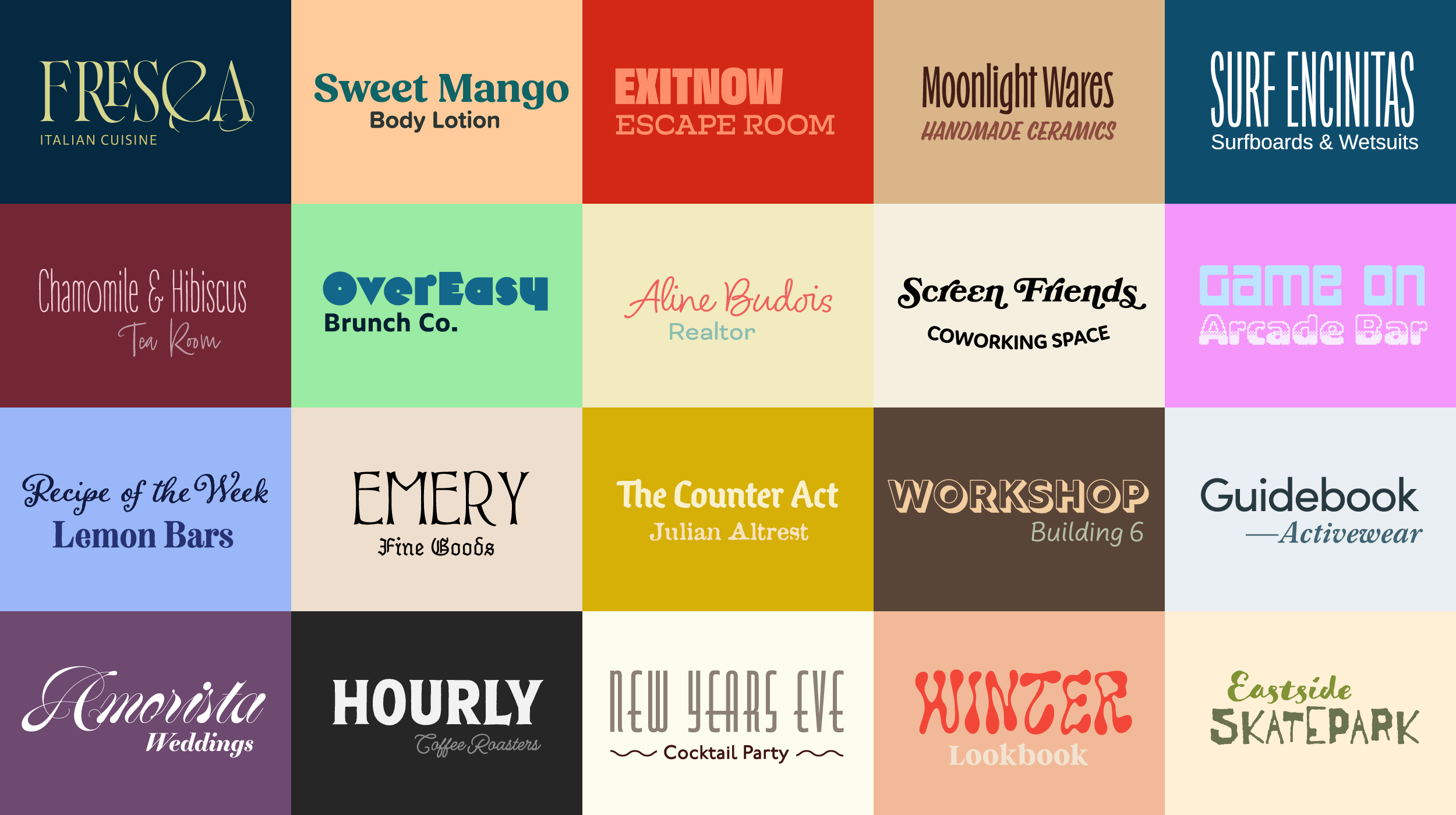
The most common reasons you are looking to pair fonts are a heading with some body text (or vice versa), or more of a 1:1 sort of pairing like the visual above where they both are kind of headings. The latter might be for some branding, or a type lock-up for a marketing graphic. For both you’ll want to take into account the relationship between the two. My favorite way to approach typography, and design as a whole, is to focus on the relationships over the individual elements. Things like the sizing, spacing, and arrangement on the macro level, and shape of the letterforms, overall texture, and flow of the strokes etc at the micro level.
Once we have our starting choice, and with those attributes in mind we can go on to secret 2 and 3.
2. Balance Contrast vs Similarity
On to the exciting stuff now! I’d say this one is the real key to font pairing too. As with many things, the trick is all about balance. You want to find a match for your anchor font which is in the sweet-spot of similarity and contrast. You want it to be a bit similar, but not too much, and have some clear degree of contrast too. Now this can sound all a bit abstract, so lets make it a bit more tangible.
Similarity
What you are looking for here is a hook which links the choices together. When fonts are totally unrelated, it can leave things feeling a bit disjointed—so aim to have at least one similar attribute across the pair to tie them together. This could be anything from the stroke weight, the same angles or curves, x-height, or even the same mood. No strict rules here, but I’ll bet you’ll find some similarities in the details of all the pairs you like the look of.
What you don’t want to do, however is use something too similar. First of all, what’s the point!? You’re better off using the same font or another variation from that same family. Secondly when you put together two very similar fonts you end up with the ‘uncanny valley’ effect where it can just look like a mistake.
This can be a helpful starting point for the quest, and over time you’ll find it easier to recognize or build up a set of go-to attributes of your own. You can even try an exercise where you look at some font pairings you think work well and try to dissect which features tie them together.
Contrast
You might be saying to yourself, “wait isn’t this just the opposite of similarity?” And, well yes you would be right there. BUT what’s key to focus on here is contrast of different attributes than the ones which bring the fonts together. Contrast is what can start to bring in some visual interest in the paring—like the old saying opposites attract. My absolute favorite example of this is using width for contrast, put together a super wide and a super condensed font (as long as they share a similarity, like weight for example) and boom you’ve got yourself a nice pairing just like that.
Another classic example of contrast is pairing a serif with a sans serif. Going across classifications is a typical way to find something different enough. Another top tip here is to look for a Superfamily, which is a typeface which has styles in multiple classifications. These are ready-made pairings for you! They already have similarities built in, as they share the same skeleton, and you can find that contrast from using two different styles.
3. Consider Emotion vs Job
Last and by no means least our third secret. Now this shouldn’t be thought of as a final step, but more as another aspect to be balancing along the way. If we only work with secrets 1 and 2, things could end up a little lackluster. We need to bring in this last piece to make sure the reasoning for the pairing is solid, and to add in the right dose of personality.
Job
Fonts are tools, and they are put to work in typography to do a job. That job is sometimes to be nice and easy to read. Other times it’s to stand out and draw people in. When pairing fonts you have to have a reason to do so. Maybe you’ve got one which is perfect for one part, but just isnt hitting home with another. This is again why it’s important to have that anchor. If you have the perfect body copy typeset but the heading aren’t intriguing enough you have to find a font to solve that job.
You might not always even know the full extent of the role this other font will play, and that’s ok! Design systems grow over time so it can often be helpful to keep that in mind and plan ahead for various roles you could need later on.
Emotion
Secret 3 combines ‘job’ and ‘emotion’ in what might feel like an odd way, but bear with me. If we only ever focus on the job of our fonts, we’re missing the bigger picture. We’d find the perfect legible font for long text, a good font which stands out for headings and call it quits there. Everything would look the same.
The emotion and relationship between the fonts is what brings the essence of the typography to life. It can elevate your design to something which feels unique, like it has soul. Creative communication is wonderfully important and homogeneous design is never a good answer, if you ask me.
So keep in mind throughout this how the pairing makes you feel, and MOST importantly trust your gut. If a pairing is feeling good to you, then it most likely is a good choice.
tl;dr recap:
- Start with one font, then anchor the rest of your decisions around it
- Look for similarities in at least one attribute to ground the pairing together
- Bring in some contrast in a different attribute to spice things up
- Find the balance of those two aspects to keep the harmony but make it more visually appealing
- Throughout keep in mind the roles these fonts will play
- Make sure you are evoking the right emotion in the relationship between the fonts
There you have it, give this framework a try and see if these unlock font pairing for you! If you have a bit more time, stick around and watch through our discussion from the livestream and we’ll be doing another volume in the future too. Let me know if I missed anything you find helpful in your process too!