Sports Apps: How To Tackle Interface Design for Athletics


Whether it’s for on-field strategy, fan experience, companion experiences (like fantasy), or training, sports are a big deal in the world of technology — to the tune of $12.17 billion in 2021. And, at least for now, there are no signs that the upward trend will stop.
Does software with a sports lean call for a considerably different interface? No, but like any other industry, there are places for priority and polish that can help set your product apart.
Let’s take a look at the overlapping techniques, key differences, and run through tips ‘n’ tricks for taking on athletic applications.
Where Do Sports and Traditional Interfaces Overlap?
Designing for sports apps looks a lot like traditional product design:
Organizing and Presenting Data
Like business dashboards everywhere, athletic interfaces are data driven. Lots and lots of data. That means tables, charts, visualizations — the whole nine yards. User experience is big here, since you’ll need to pick between raw information, stats to highlight, and derived insights.
Power Users and Information Density
Consider the gap between someone checking a score for watercooler talk versus someone prepping their fantasy roster. Both have a vested interest in your app, but the latter — power users — have a wider set of needs. As with process software in the enterprise realm, balancing information density for both user types is a core design need.
Jobs to be Done
Maybe you’re running errands and want to check on the game. Or you’re out with friends and need to settle a debate with an obscure 90s stat.
Users come in with a specific task to resolve: checking on a game’s start time, updated rosters, live stats, current standings, etc. Building goodwill with customers comes down to whether or not they’re successful.
What Differs When Designing a Sports App?
Having a good handle on product design puts you on the field, but getting the win comes from keeping these core differences in mind:
Prioritizing Real-Time Feedback
There are ten seconds left in The Big Game. The neighbors are shouting something fierce, but your phone is a few minutes behind. Bit of an anti-climax.
With events happening in real time, the design needs to support prompt, correct information. For fans that put their favorite teams on a religion-esque pedestal, delays are a compelling reason to never use your product again.
Access to live data can also drive engaging fan experiences. The US Open Sessions are a great example, translating match data into music and animations.
A Bold Ecosystem
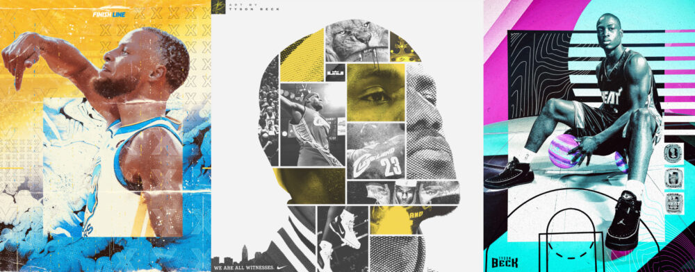
From the Premier League to the NBA and the Olympics, sports design has a penchant for being creatively bold. And, with sports apps and gamification going hand-in-hand, there’s room for designers to express ideas that’d be dubbed “too wild” elsewhere. Teams and leagues all have distinct branding, logos, and palettes, so there’s plenty of space to play with concepts that live markedly apart.
The Volume of Creative Needs
On the flip side, you can also build an interface where all of those team and league styles live in harmony — but it’s a delicate operation. Designing something that’s both neutral and unique takes just as long as something bold.
Something else to watch out for: the sheer number of assets involved. Let’s run some numbers, shall we? There are approximately 130 football teams in the NCAA and each team can have as many as 125 players on their roster. If we planned on adding everyone’s photo, we’re already on the hook for 16,000 items. When dealing with these kinds of quantities, a sustainable strategy is integral for the creation, organization, and maintenance of assets.
Unpredictable Outcomes and States
Weather delays, injuries, postponements, and cancellations — designing for sports means preparing for the worst. The completed design needs lots of states and lots of testing to make sure uncertainty is covered.
Competitors Everywhere
It’s logical that the competitive context (and the value of the market) would make for a competitive ecosystem. If a user can get live data from a Google search results page, what’s your value add?
More Than Entertainment
Sure, it’s technically possible to classify sports as entertainment, but it’s important to avoid classifying these sorts of applications as toys. Livelihoods and identities are tied to the info within (and, again, a really valuable market). They deserve to be taken seriously.
Tips for Designing a Solid Sports Interface
Similarities, check. Differences, check. Now, let’s talk about tips for taking one of these experiences on:
Prioritize Data Legibility and Functionality
Nail the layout and presentation of data first. It stands to reason that the design for a data-driven app should be driven by the data. Flashy charts and punchy animations are useless if the data can’t be clearly understood by viewers.
A solid foundation starts by choosing the right chart styles. Beyond that, it’s all about effective typography, clear labels, and appropriate contrast. Google’s Material Design Guidelines offer a great rundown of core tenets behind effective data visualization design.
How Bold Will You Go?
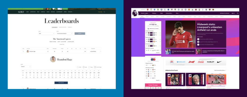
Tone is a funny thing in sports. Are you trying to cater to all ages, or a certain bracket? Should it feel refined? Edgy? Patriotic? Golf.com and the Premier League are both polished, professional, and effective, despite being polar opposites. Whichever path lines up for you, make sure you commit.
Cross-Platform Design
Modern tech has given fans and industry professionals access like never before. We’re up-to-date at home, the office, on-the-go, and even at 30,000 feet, and there’s a good chance that a significant proportion of your traffic is from mobile devices. As such, a cross-platform design approach must be a top priority to meet users where they are.
To avoid inconsistencies, take inventory of important features and make sure they aren’t overlooked in the cross-platform design shuffle. Remember: Reduced screen real estate shouldn’t equate to a reduced feature set, and limiting features on certain devices is a frustrating experience. Iteration will be required — especially for tricky features like mobile charts and tables — but you’ll eventually be able to score the perfect solution.
Caution When Redesigning or Updating Features
Whether it’s a refresh or a redesign, retreading design decisions offers a chance to reinvigorate stale experiences, address issues, and explore new feature additions. Removing features, though, is a dangerous game.
When Nike+ Running redesigned its app in 2016, it was met with pretty serious backlash. Users weren’t pleased when a few favorite features around performance tracking and achievements went missing. For these users, the app was much more than charts and numbers on a screen. It served as an extension of themselves and years of hard work. Losing metrics became a personal blow.
The moral of the story: Make sure you have a thorough understanding of how your app is being used before beginning tackling a redesign. Lean on analytics, then communicate, communicate, communicate. Let users know what to expect, and avoid surprises.
Balancing Information Density
As we touched on earlier, dialing in an appropriate level of information density is vital. Too much information on a screen can easily overwhelm new or casual users. Too little may slow down your frequent fliers. How does one satisfy both?
One approach is offering customization. This could include things like smart filtering, configurable layouts, and extra widgets. With these options, power users gain the freedom to quickly adapt their personal interface as needed.
Progressive onboarding is possible, too. Start simple, then add more complexity as a user logs time in the platform. It’s a technique popular in education and gaming, distilling a difficult method into digestible steps.
Handling Assets
There’s a good chance you’ll be missing usage rights for assets like player photos and team logos. While gaining access is possible, professionally licensed work will generally cost you a pretty penny. And, even with purchased assets, consistent quality isn’t a guarantee. You may need to get creative.
Fully customizing everything is an option, of course. You’ll have full control, a consistent look, and an assurance of quality. It’s also time-consuming, and will add a big wall to climb for future redesign efforts.
Another solution is leveraging assets already available like using players’ social profile avatars. In a pinch, team colors can programmatically generate assets to stand in for logos. A bit of creativity goes a long way towards hitting deadlines and budgets here.
Designing a Victory Lap
The future for sports and technology shines bright, and with it comes a world of opportunity. Athletic apps carry many of the usual software design challenges, but have a few quirks of their own to overcome. We hope the tips ‘n’ tricks in here help your next interface cross the line.
How Founders Tackle SaaS Differently the Second Time Around

There are plenty of hard lessons SaaS founders learn from their first experience with a dev team. Learn how to make your next engagement more successful.