


The insanely talented Jeroen van Eerden joins us to share a behind-the-scenes look at his logo design process. Learn more about the grid-system Jeroen swears by and the most important factors to consider when designing a logo.

How did you get started in logo design?
Hi, I’m Jeroen and I’m a logo designer based in Groningen, the Netherlands. My passion for design started when I was a teenager. I always felt peace in creating digital creations and I often sat on my computer creating digital posters and abstract marks.
During my studies in Human-Technology, I got an opportunity to intern at a design agency — a small studio where only two people worked. I worked on all sorts of creative projects and also got introduced to the beautiful art of logo design. I was just about 18 years old and very new to working with real clients. During this internship, I learned a lot about how to work with clients and how I could (and needed) to adjust my creative ideas to fit within a project brief.
At this point, I felt like I needed to make a move towards art school to really follow my passion and ambitions to become a professional designer. I started my new studies in Communications & Multimedia Design at the NHL (Noordelijke Hogeschool Leeuwarden) and quickly figured out what I wanted to focus on in the next few years. I felt like the art of logo design was something special and I had a talent for coming up with creative solutions. During my studies, I started my own business as a freelance designer and I’ve worked as a freelance logo designer ever since.


What is your process for coming up with concepts for a logo?
I’ve always been fascinated with storytelling through design. I usually feel the need to include specific elements within my designs to help them stand out more and give further meaning to a simple shape. Although I prefer my logos to be simple, I also aim to include hidden elements within them to further demonstrate the concept. I’ve always been a fan of using geometric shapes and finding the right balance between “too realistic” and “too abstract”.
In a recent Netflix show called Abstract, Illustrator Christoph Niemann shared a visual called “The Abstract-O-Meter”. It indicated the absolute sweet-spot of a design which is easy to recognize by most. I got really interested in this idea and shortly after discovered a great book by Ellen Lupton called “Design is Storytelling” — the cover says it all to me. So, I try to use simple and understandable shapes while use the idea of the Abstract-O-Meter as my visual formula to come up with simplified concepts for my logos.

When researching concepts at the beginning of a logo design project, I often browse through icon sites like Noun Project . I love the idea of finding recognizable symbols from our shared visual language and mix these up in unexpected ways within my designs. When it comes to logos, less is always more. It’s important for the execution to look natural and not overly complex in order to avoid confusion and ensure the design stays memorable.
At the very beginning of a logo project, I like to sketch out really rough ideas to quickly move through potential concept directions. The main goal of this phase is to discover unique concept combinations that stay true to the values of the company and speak fluently to its target audience. I use sketchbooks but the truth is that 80% of the time I start working directly in Adobe Illustrator. That’s just because I can work quickly within the software and I usually prefer to work with some of their main grid tools.

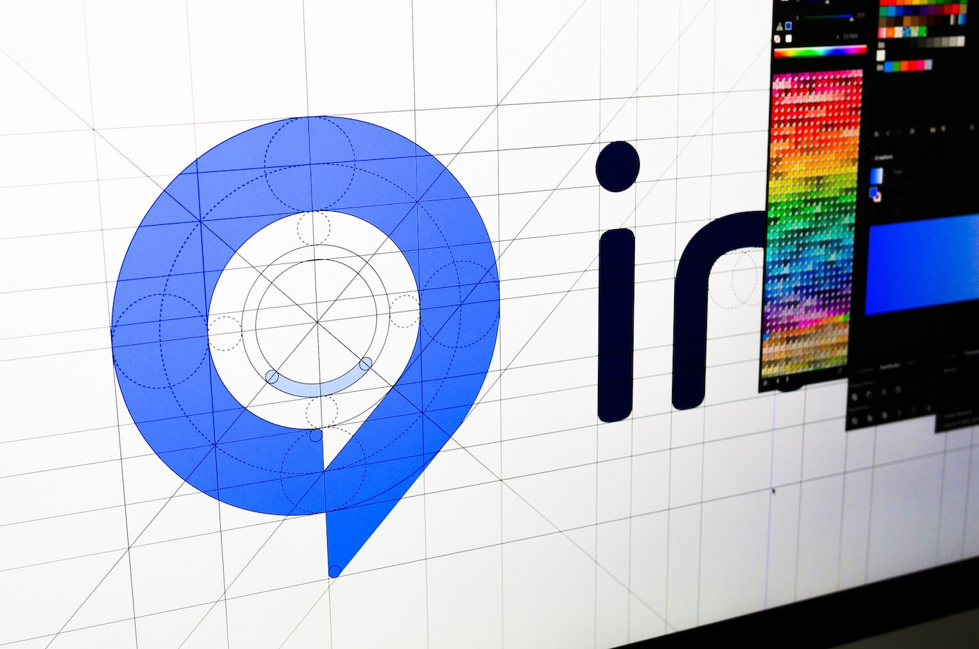
Tell us about the grid-system you use. Why does it work?
Ever since the very start of my career as a logo designer, I’ve always aimed to create symmetrical and naturally balanced designs. I love the idea of discovering a symbol that communicates the appropriate message without feeling overly complex.
Grid systems help me find ways to balance my designs in a more systematic way. Although I work a lot with grid systems, optically balancing out the final design is also very important. I try to avoid relying too much on the technicalities of the software.
I wouldn’t say that grid systems are important for every designer to use, but they do help create a technical base and framework for your design — this can be very useful when starting your design process. I use grids especially because I appreciate the fact that my logos will look pixel perfect. The fact that today’s designs need to be responsive plays a part in this too. Using grids as a baseline will help to simplify, organize, and structure a design more effectively. Especially when adapting your work to very small sizes.
Tip: Use grids as a creative starting point for your work, but keep in mind that sometimes, you’ll need to step outside of the grid to explore alternative directions and not limit your designs.
In your opinion, what makes a great logo design?
There are many factors that go into designing a great logo. It depends mostly on what the problem is you’re trying to solve for your client and their business. What I think is most important is keeping the logo simple, relevant, and to the point. A logo shouldn’t be overly complex and may need a maximum of 2-3 considered elements to include. It should feel natural but also custom (professional without a generic feel to it).
In many of my logos, I’ve included these 2-3 elements which is probably a defining factor of my work. I combine business services, letterforms, and recognizable symbols from our shared visual language. I’m always looking for new combinations to keep my work meaningful and timeless.
Presentation is key: How do you best present your designs to clients and the rest of the world?
Lately, I’ve been rethinking the way I present my work on Dribbble a lot. I’ve had the urge to include as much as possible in one Shot, without making it look chaotic and keeping the focus on the main details that I want to highlight. By presenting my work in this way, I feel like I’m able to share a lot more about my process, thinking, and why specific elements are the way they are.
Personally, I see this as a form of ‘storytelling’, where I guide my audience through my creative decisions and adapt these visuals in this micro brand style guide.
Want to keep up with Jeroen? Find him on Dribbble, Instagram, and Twitter.
Find more Interviews stories on our blog Courtside. Have a suggestion? Contact stories@dribbble.com.


