

By Peter Ramsey
29 Sep 21
Can Apple beat Peloton?
Most people find running on a treadmill boring—after all, how long can you really stare at your garage wall before losing motivation?
In an attempt to leverage some of the social psychology behind a group exercise class, Peloton released a premium spin bike for your home, with a giant screen mounted on the front. This lets you join live video classes, and cycle along with others in a pretty seamless experience.
But there's a catch: the equipment isn't cheap. The cheapest bike and treadmill being £1,390 and £2,295, plus a £39 monthly subscription for the live classes.
What if you could get the benefits of a that group psychology, without having to spend thousands of pounds?
Instead of buying a Peloton treadmill with an integrated screen for £2,295, couldn't you just use your iPhone, and a £400 treadmill that you picked up from Amazon?
That's more or less what Apple Fitness+ is—a subscription for home-workouts, that aims to utilise Apple hardware with standard fitness equipment.
But is the user experience any good? That's what this case study is about.
Summary:
🪂
Beware of the 'jump in' fallacy
🚧
Why Apple intentionally adds friction
🧙♀️
Some UX wizardry by YouTube
😰
Why to not constantly push for upgrades
😍
How Apple strikes a perfect balance
5 key takeaways
1. The 'jump in' fallacy
It's wrong to assume that showing 'options' quickly is always good UX—this is often under the pretence that it's allowing the user to 'jump right in'.
There's a nuance that's seldom considered: can the user actually engage with all of this content, or not?
i.e., if they wanted to, could they actually use all of these options (or results)?
For example, on YouTube, you can watch any video you like—sure, you may not want to, but you can.
But on Apple Fitness, you can't. You may not have the right equipment, or the physical space to do the workout. The value of a cycling class to you is null, unless you have a bike.
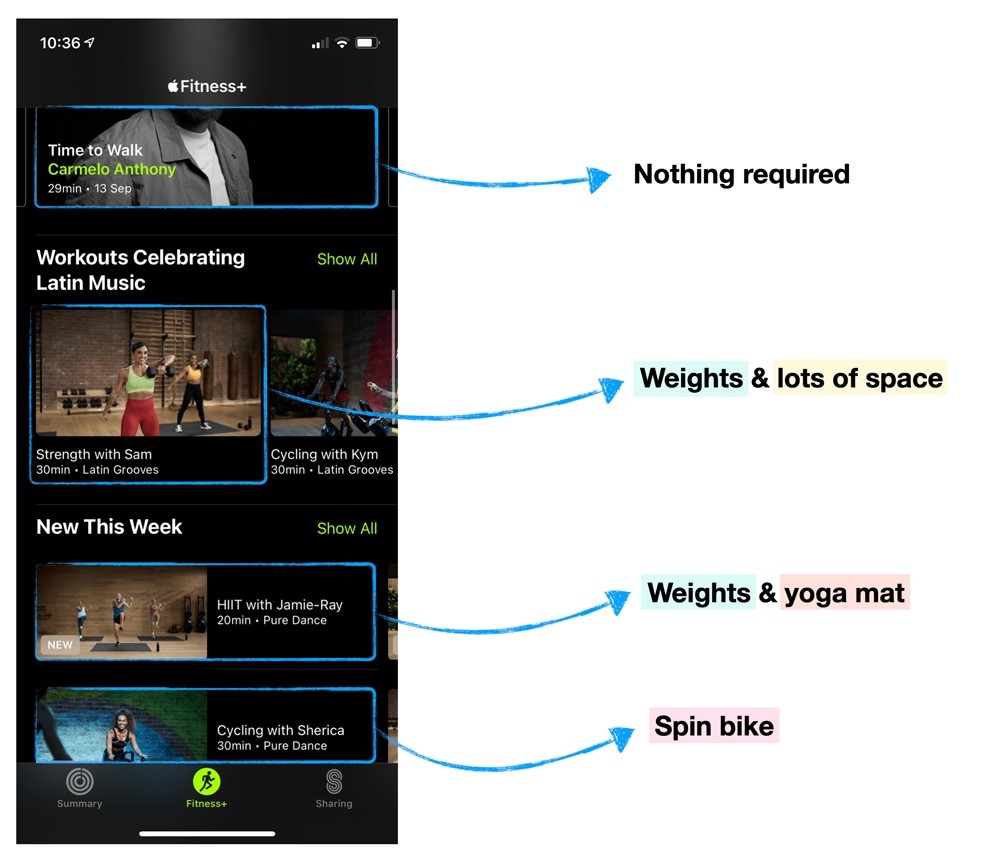
This means that whilst you technically can 'jump right in', and click on any workout, you'll find that an ineffective means of browsing content.
Instead, you'll need to—probably sub-consciously—go through a process of working out which options are appropriate for you. This is made more difficult because the options on Apple Fitness aren't labelled in any meaningful way.
i.e., do I need weights for a 'hiit' workout? What about a 'Core with Kyle' workout?
Remember: if the user cannot get value from every option shown, help them to quickly work out which ones they should invest time in.
2. Intentional friction
Making a purchase is typically a moment of high intensity. The anticipation for using the product is growing by the second, and you're excited about the new benefits you're about to have.
You know what is guaranteed to kill that momentum? Asking for access to your data.
1. Select package
2. Pay

3. Give us data
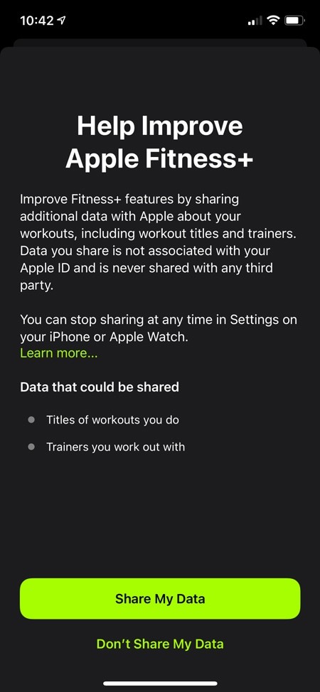
Providing access to your data is a selfless act—the direct benefit is to the company, not you. So why would Apple do this immediately after sign-up? Are they unaware that it damages every user's experience?
The answer is probably that they are aware, but have made a calculated trade-off: the data about your first-time usage is more important than the negative impact on the user experience.
This is intentional friction.
This begs the question: when is it okay to add 🍯 Intentional Friction?
A good rule of thumb that I follow is to only add friction, if there is a trackable and provable long-term benefit.
As an example, 'collecting data' is only valuable if you actually do something with it. So the question is, what do you do with it? How does it impact the long-term user experience?
And ultimately, can you prove that benefit (if not, how will you ever know if it was a successful trade-off)?
3. YouTube mastery
We've all been in this position: you've clicked on a video, the first 10 seconds are boring, so you skip forward a bit to try and bypass the introduction.
Except, it didn't work. Now you don't know what's going on, so you rewind a bit—but still, you lack the context to efficiently listen-in to the conversation.
This is how many people, myself included, used to watch YouTube videos.
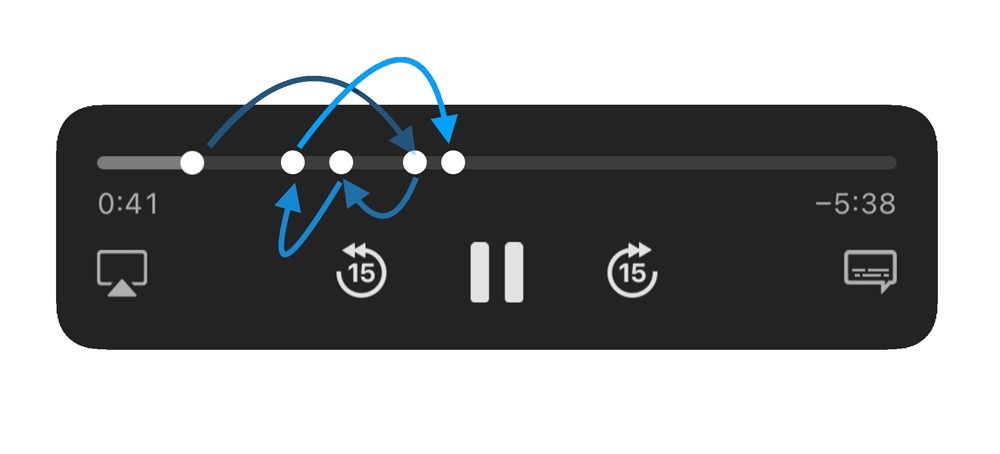
YouTube have solved this issue with a feature called 'Chapters'—which works like chapters in a book, or in a film.
You may have noticed them: they're rectangular bars in the footer of the player, which have been labelled by the uploader. This is an important innovation for YouTube, because their retention rates are based on creators uploading engaging content, which is out of their control.
And, as more YouTubers fill the first 60 seconds of their videos with ads, the ability to efficiently skip portions of the video becomes more important.

Note: even DVDs had menus and chapters for this reason—without them, you'd need to scrub the entire film to rewatch a specific scene. New technology = new UX problems.
It's likely that this is reducing churn, and at a conceptual level, is something that Apple should be looking to introduce to the videos inside Fitness+.
As an example, I was 45 seconds into of the workout introduction videos, and all I'd learned is that you shouldn't stand on a moving treadmill.
So whilst the production value is high, they're long, slow and boring. Most people won't have the patience to watch them.
4. Pressure to upgrade
Every time you start a workout it automatically tries to connect to an Apple Watch, and makes you take an action to not use one.
That's key, because it's making you do something every time.
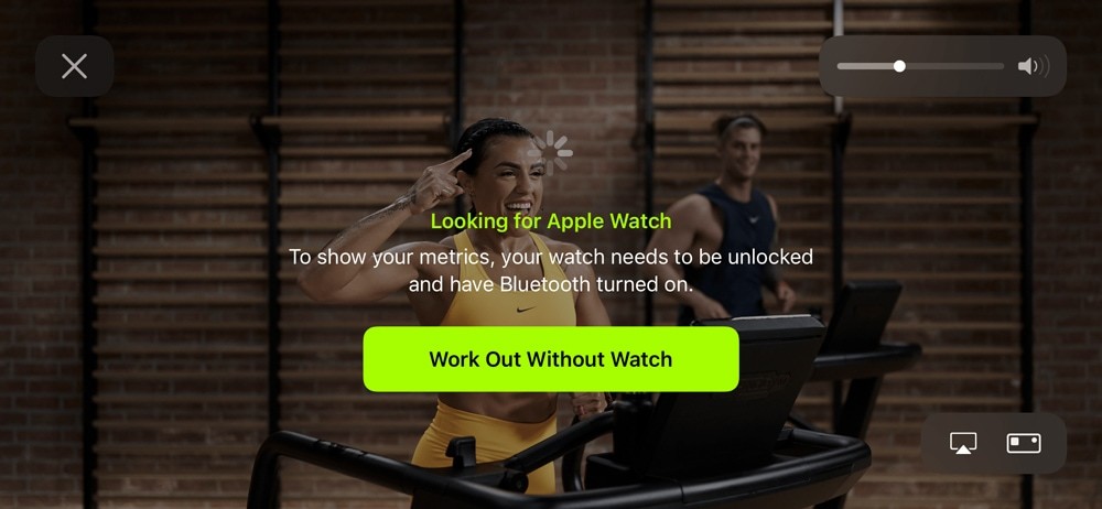
This is likely to have two psychological effects:
👆
Increased motivation to purchase an Apple Watch
i.e., to maximise the value from the Fitness+ subscription.
👇
Lower perception of value
i.e., a constant reminder that you're not getting the most value from the subscription.
This trade-off is really common, especially with SaaS products. How do you promote an upgrade, without making the user feel like what they have now is insufficient
It's essentially the fear of missing out—which as you probably know, isn't a solely positive emotion.
It's also another example of Intentional Friction: a finely tuned A/B test of how much pressure they can put on you to upgrade, without you getting annoyed enough that you stop using the app.
When building products, you can't keep amping up the pressure to upgrade, without eventually risking a net negative effect.
5. The perfect balance
Unlike Peloton, classes on Apple Fitness aren't actually live—they're pre-recorded. This makes it inherently less interesting, as it's literally a video of someone else jogging, without any scope for interactivity.
So, when designing the experience of actually doing a workout, Apple had a fairly nuanced challenge; how to make the UI engaging, without being distracting.
This is even more difficult when you consider that the primary goal of the video isn't to capture your full attention—like a YouTube video would be—but to guide you through a workout.
i.e., if the video sought your full attention, you'd not be able to focus on the running (e.g., breathing, pacing, stride length).
In my opinion, Apple have found an impressive balance, and the core experience is fantastic.

But it's unlikely that you're also building a live fitness app, so what can you learn from Apple's execution?
Well, it's a masterclass in timing. The UI changes frequently enough that it stays interesting, without ever being overwhelming. Elements collapse when they're not needed, and expand when they are.
Everything on screen has a purpose, at all times.
And that mantra can be applied to almost every dashboard, SaaS product or onboarding flow—how can you effectively show the user what they need, when they need it, and then hide it when they don't?
Premium content
You shouldn't be seeing this. Whoops. Abort abort.