
By Peter Ramsey
23 May 23
Ticketmaster: the UX of a true monopoly
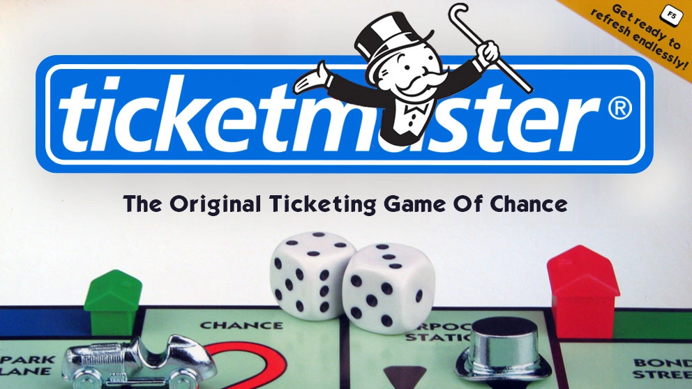
Ticketmaster, who merged with Live Nation in 2010, control more than 70% of the ticketing market. In short; they’re a monopoly.
And they’re often accused of abusing their power with high fees, being slow to react to bots and scalpers, and providing a service that routinely crashes during popular releases.
But let's ignore all of that, and go one level deeper.
Ticketmaster, as it stands today, is an experience where:
- The onboarding is optimised for data collection
🤖
- The checkout punishes cautious consumers
👊
- The core product is ripe with errors
🐞
And yet, their analytics likely hide all of this, behind (presumably) strong attempted-conversion rates and low churn.
Get ready to pass GO!
Case study
Key UX takeaways
1. Front-loading permissions
When you stop and think about it, it's weird that even the most popular apps in the world front-load their experiences with multiple requests for your data.
This is true, despite the universal understanding that consumers tend to hate it.
It's a form of 😮💨 Cognitive Dissonance that has become so common, we've stopped noticing it.
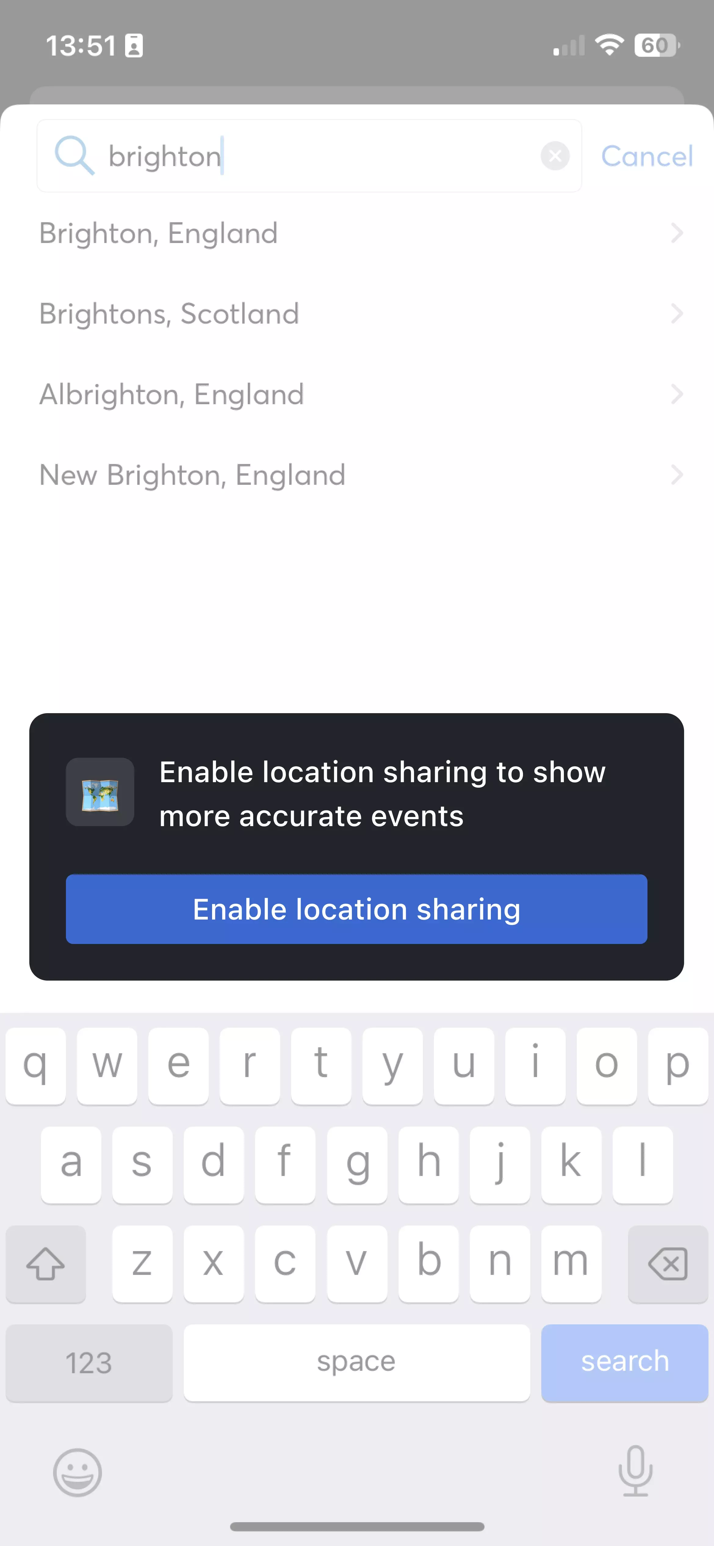
For example, before you can even browse any events on the Ticketmaster App, you need to navigate through all of the following requests:
- Sharing data across other companies and apps
- Accepting Ticketmaster's privacy notice
- Onboarding welcome screens
- Notification permissions
- Location tracking permissions
Often when I challenge companies on this, they'll claim that "it allows us to deliver the best experience to the user, once they're using the app", before conceding.
There are exceptions, where permissions can meaningfully impact the value proposition (i.e., an app to track you cycling outdoors would be severely hindered without location data), but these are exceptions to the rule.
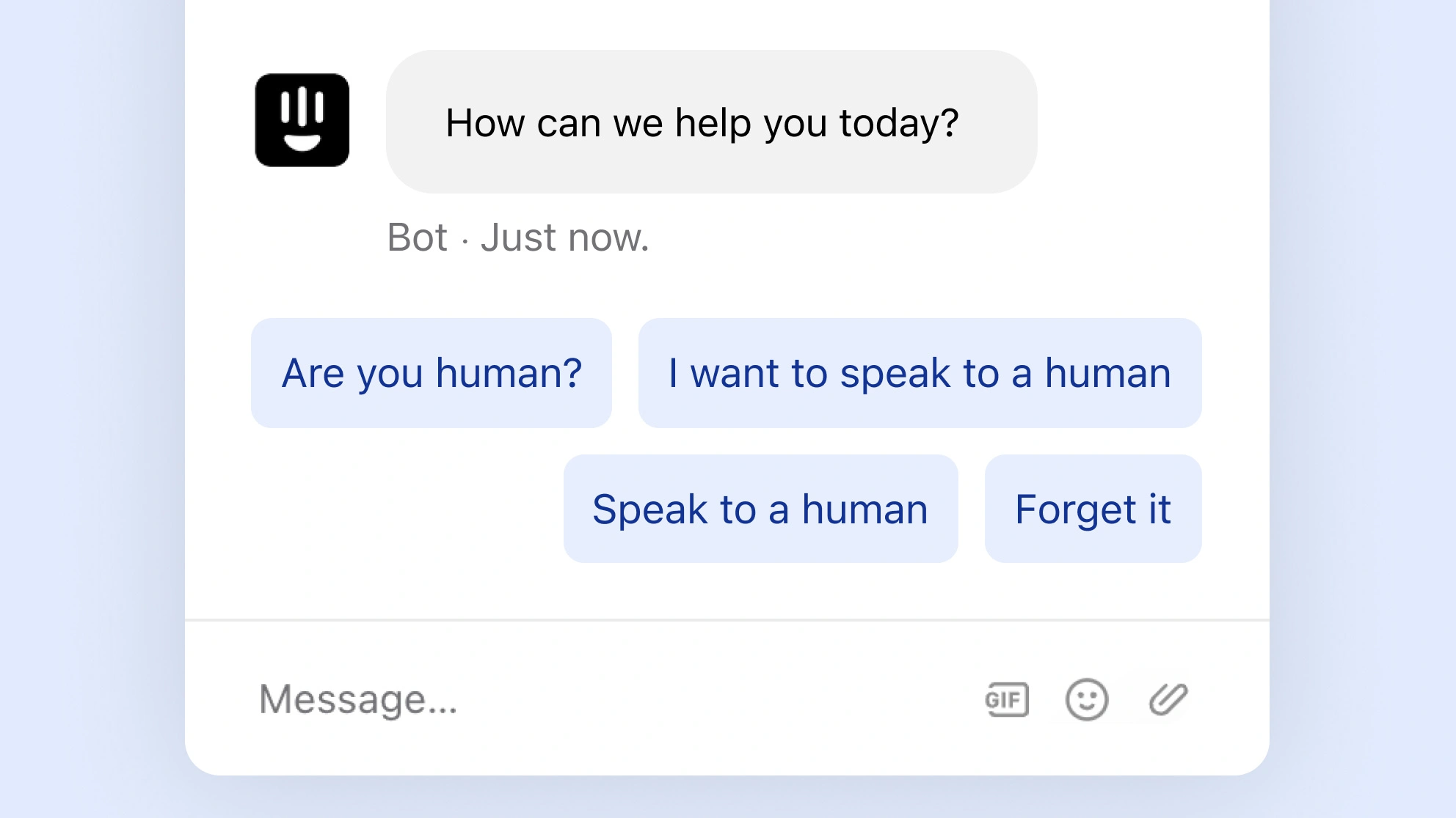
It feels like an under-utilised UX hack: the better experience is to ask for permission in context of a clear benefit.
Instead of asking the user for everything right away, wait until you can demonstrate a clear value for that 'thing'. Wait for the 'why?' to be obvious.
⚡️
Notifications
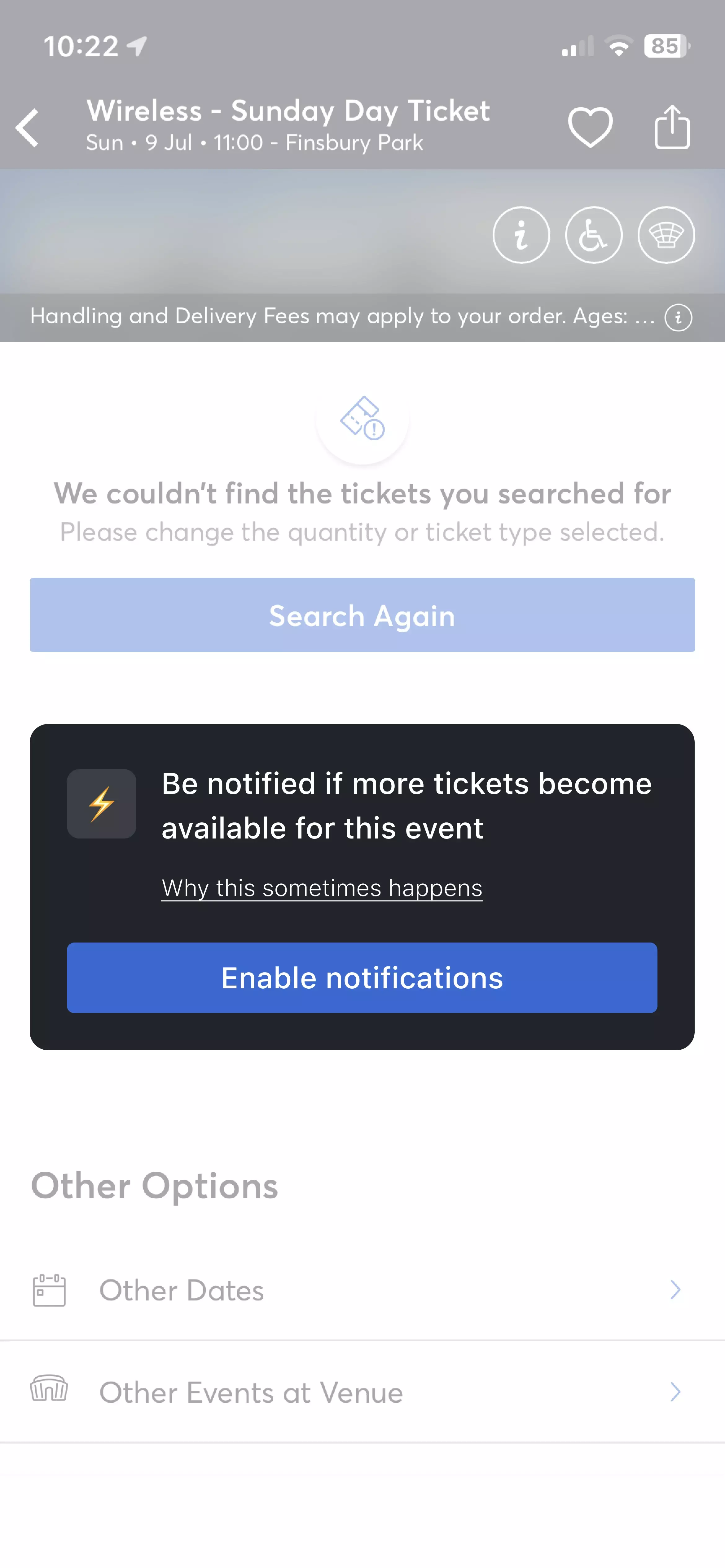
If the user lands on a sold out event, offer to notify them if any tickets become available.
🗺
Location sharing
If the user searches for a new location, offer to always and automatically show nearby events.
As a super rough demonstration, something like this could work:
Notifications
Location sharing
To be clear, it's not necessarily about improving the number of people who opt-in, but rather giving people an informed choice, where they don't feel pestered.
It can feel like a hack, because it quickly reduces friction in the onboarding.
2. Second-order effects
Product builders; please don't copy Ticketmaster—there's a real possibility that even they don't know how bad this experience is.
Or rather; they could be looking at the data, and concluding that everything is great.
This is because Ticketmaster has an unusual dynamic: popular tickets are released with plenty of promotion, far more demand than will ever be satisfied, and people are desperate.
In other words; they will put up with just about anything.
For example, imagine that you're scrambling to secure tickets to this theatre show, do you even stop to register how awkward it is to tap the seats that you want?
Or are you operating on pure autonomy and panic?
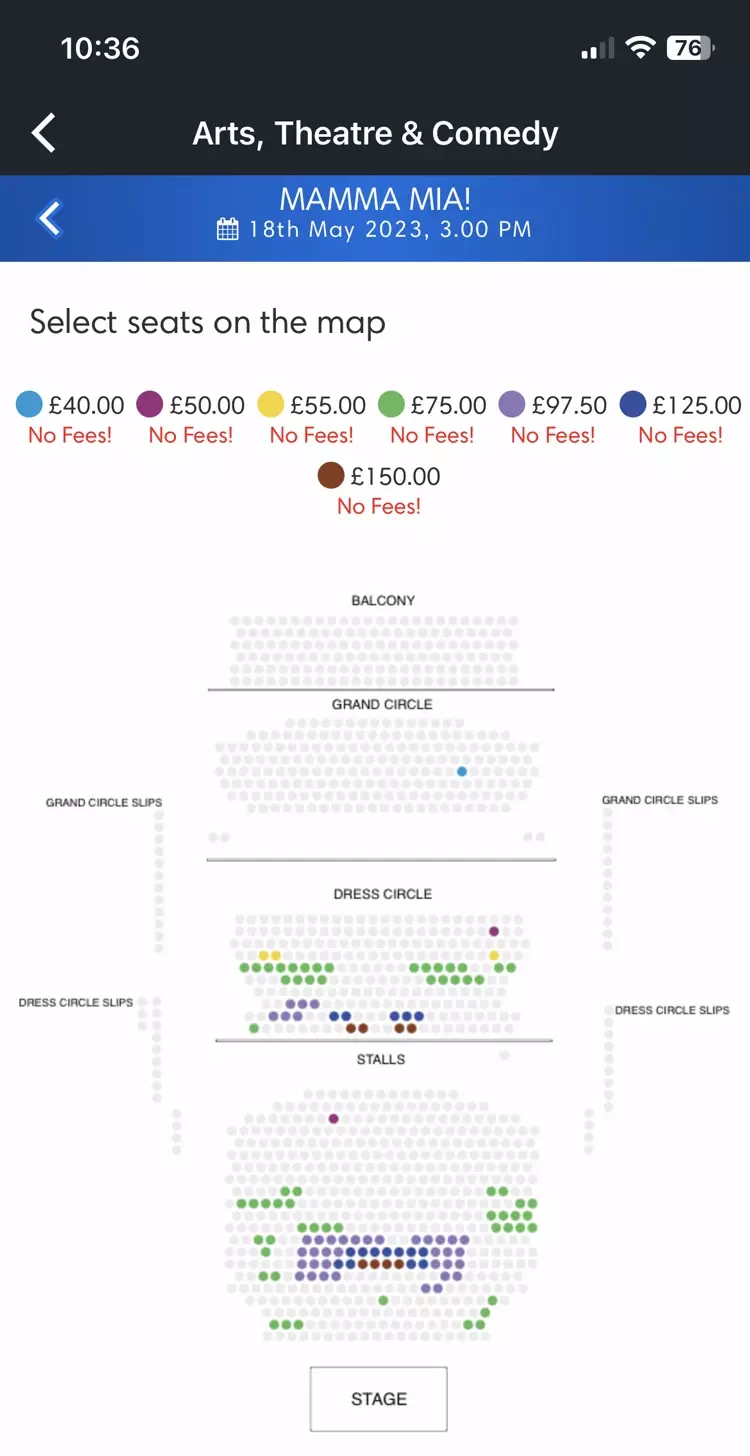
This one factor alone warps a typical user's behaviour, and will skew almost all of the checkout analytics that they collect.
If companies insist on operating solely on data-driven decisions, they'll miss even the most obvious annoyances.
And as a second-order effect, if you assume that Ticketmaster's success is in part due to their design, (or at least not hindered by it), then you'll be missing the point too.
3. Fail with grace
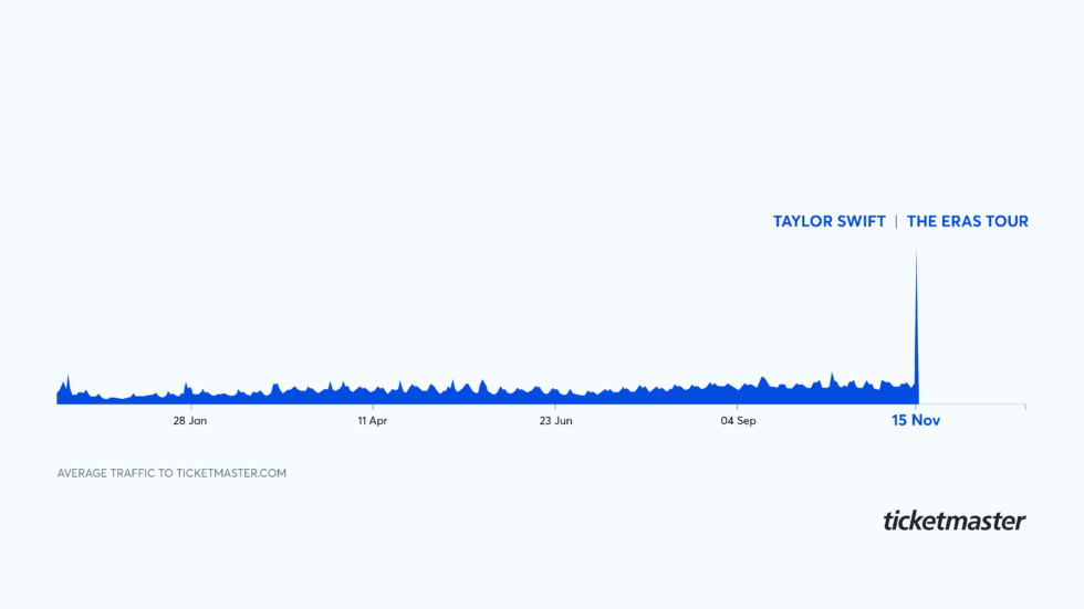
14 million people (including bots) tried to purchase Taylor Swift tickets on their release. The catch; there were only 2.4 million for sale.
In a post-mortem of the crash, Ticketmaster claimed that they’ve received 3.5 billion system requests, and published the following graphic.
I expect that the problem was exacerbated by people panic-refreshing multiple devices.
Individual services (both internal and external APIs) start to slow, and then stop.
For example, their postcode lookup service died, stopping people from validating their addresses, which therefore lost them their tickets.
But if we ignore these intense 'unprecedented demand' moments (where bugs are supersized), I still quickly found repeatable steps that crashed more or less every time.
For example; finding a ticket, cancelling the order, and going back in the browser.
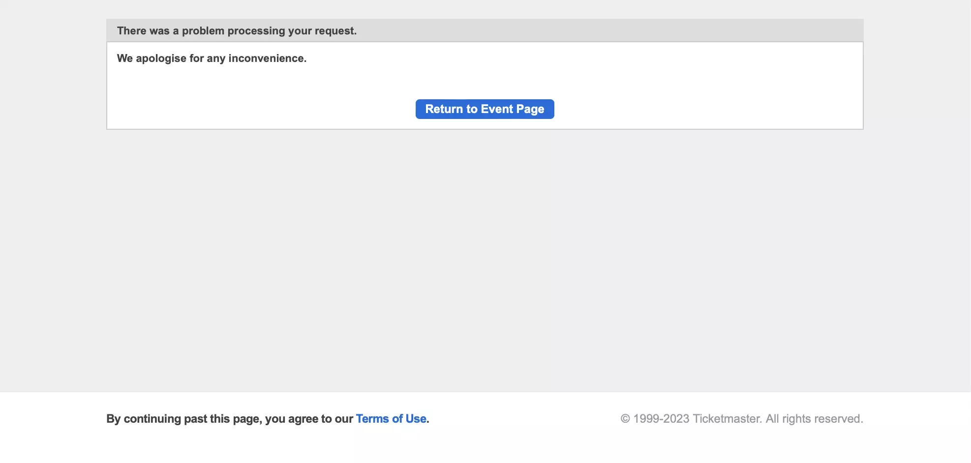
I can be even more reductive, by using one of the most common errors: the 404.
My non-technical summary is that a 404 error refers to a missing piece of content. For example, an old case study that you still have the link for, but has since been removed.
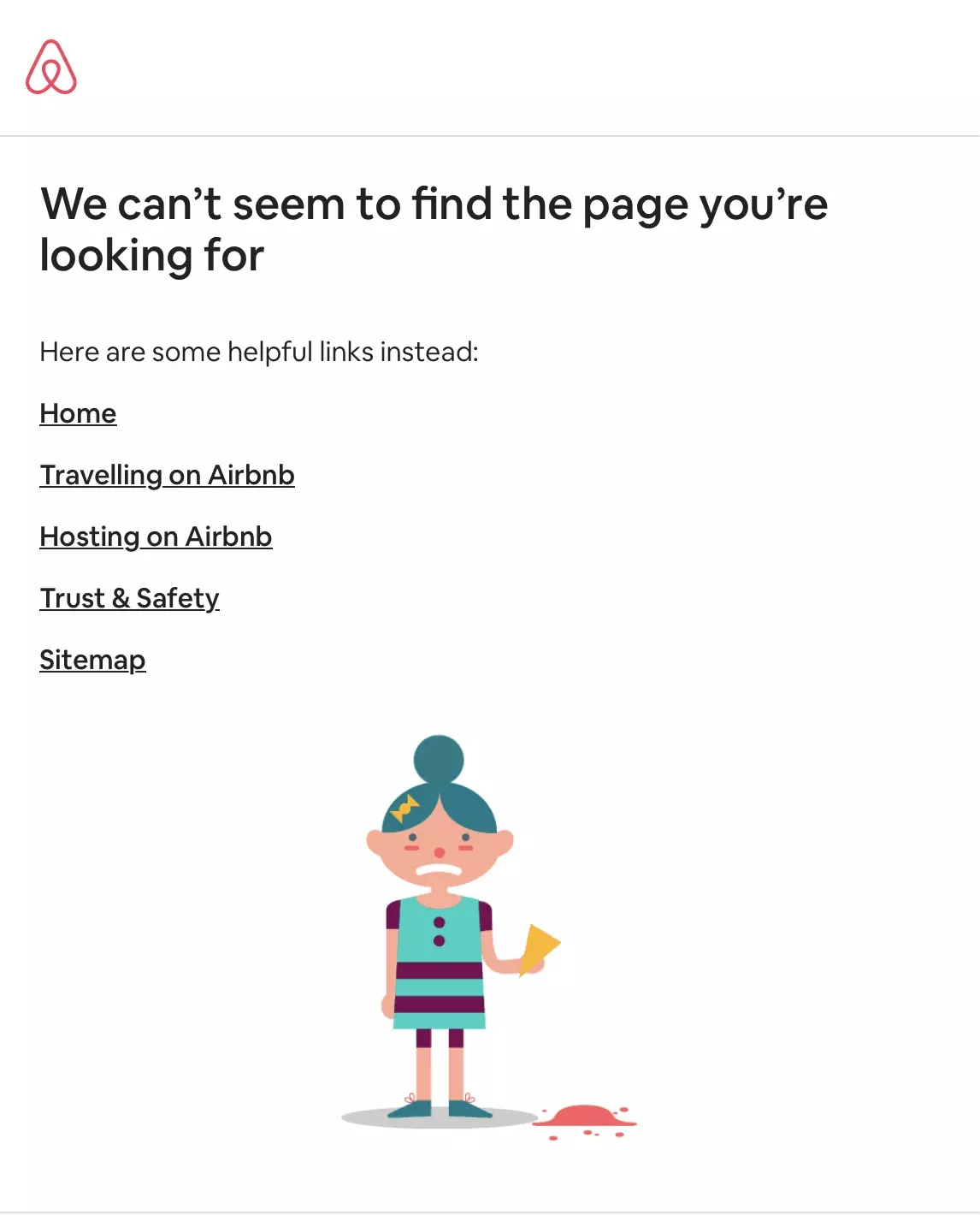
Internet companies have learned that a well-designed 404 error is a 'catch-all' for missing content, and the small amount of effort required to create a helpful one, demonstrates empathy and attention to detail.
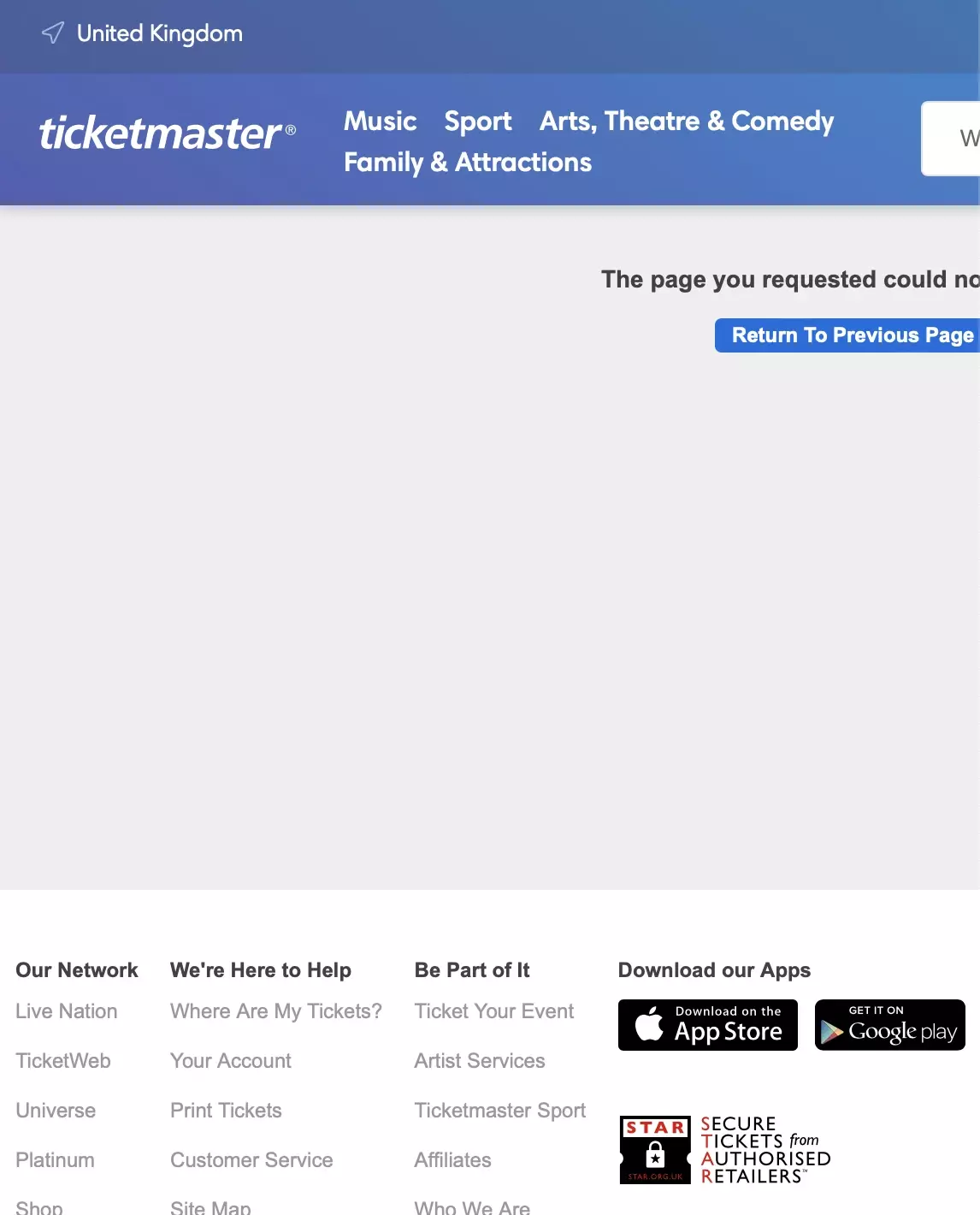
Compare Ticketmaster's to Airbnb's below:
Ticketmaster
Airbnb
Ticketmaster's 404, which you can hit by going here, is a non-responsive page that was probably never signed-off by a designer. Functionally it's flawed too, as the 'return to previous page' CTA won't even work for new sessions (because there's no previous page to return to).
It's not the worst part of their user experience, but it is an indication that the 20 billion dollar company has their eye off the ball.
Cheatsheet
💬
Conversations to have
1. Are we front-loading requests?
If you're asking for any data permissions upfront (e.g., contacts, notifications or location tracking) challenge the assumption that you're providing real value for that request.
If you're not, how can you ask in-context of a benefit?
✌️
Things to do
1. Design a 404 page
It doesn't need to be perfect, but ensure you have a personable, interesting, funny or helpful 404 error page.
👀