
Reflecting on Figma’s First Year


When we set out to make a web-based design platform in the browser, we knew it wouldn’t be easy.
When we set out to make a web-based design platform in the browser, we knew it wouldn’t be easy. We faced not only the technical hurdle of rendering complex graphics while maintaining performance, but also the cultural challenge of convincing designers they could trust us. There are a lot of reasons no one successfully built a product like this before now.
In our early days, many labeled Figma a toy instead of a real tool. We had to prove our commitment to collaborative design, and we’ve worked hard to do so over the past year, talking to designers, engineers and product managers to understand the needs of scaling teams.
We shipped countless new features and updates, both big and small, to simplify workflows and make the tool feel more polished. In recent months, we made performance a major priority, investing significant engineering resources to speed up file loading and rendering. We’re constantly honing our Sketch import tool, which allows users to bring in their existing Sketch designs so they’re not starting from scratch.
We’ve been shipping so quickly users have told us it’s hard to keep track of all the developments. So, to celebrate our anniversary we gathered them here in one place for anyone who wants to see how Figma has evolved since launch. This is only the beginning…we have many exciting things in store for our users in the second year (keep an eye on our Twitter next week for starters 😉).
Collaborative design
Multiplayer editing, Sept. 28, 2016
When we launched Figma to the public, we generated major debate among designers. Before us, no design tool ever offered multiplayer functionality. While some people were thrilled and promptly threw multiplayer design parties, others loathed the idea of working on a design at the same time as another person (the so-called “pair design” process).
One year in, we’ve seen people pair design in Figma to ship products on insane deadlines, mentor aspiring designers from around the world and run far more efficient design critiques.
But like its name, multiplayer has multiple benefits and the biggest one has nothing to do with collaborative design. Instead, its super power is that it gives teams a single source of truth. With Figma, designs can be shared with whomever needs them via a simple URL; as designs are updated or changed, the URL stays the same, abolishing the complex workflow previously required for syncing design assets and ensuring everyone on a product team is working with the latest file.
Copywriters can play with different messaging directly in the design, developers can grab attributes to convert designs to code and product managers can track project statuses without sending a single Slack message. No one accidentally saves over the design or works off an outdated version.

Building design systems
Components, Dec. 8, 2016
As design becomes more and more important in the product process, companies require ways to systematize their design process at scale. In particular, they need to be able to synchronize components of their product — like status bars or navigation menus — across files and between team members. That way, designers don’t have to waste time manually updating all their designs whenever an icon is tweaked or a font is changed.
Design systems are a priority at Figma, and just a few months after launching to the public we released a feature to let designers synchronize components in individual files. We were excited to introduce component overrides, which allow designers to change any property of an individual instance, like the color or text font, without breaking the instance entirely.
Component overrides allow designers to change any property of an individual instance, like the color or text font.
This gave designers more flexibility, while still offering them the benefit of the broader design system.
Team Library beta, Feb. 15, 2017
But sharing components locally didn’t go far enough, so in February we launched a first of its kind feature in beta called Team Library. This allowed designers to use synchronized components across files and share them with colleagues.
If a company updated its icon or tweaked its menu bar interface, the designer could make the change in one place and rest easy knowing it would immediately be mirrored in all the rest of the designs through the rest of their design system.
Team Library 1.0, Sept. 19, 2017
We paid close attention to how people used Team Library beta so we could perfect it. We learned a lot over the last 8 months and we unveiled Team Library 1.0 with far more options for browsing and organizing components, publishing them, and documenting their functionality. A lot went out in this release, and in my personal opinion it’s one of the most exciting areas of Figma, so be sure to read up on how to create a design system for your team!
Working with non-designers
We initially launched Figma with the individual designer in mind, but we always knew we would evolve into a broader platform. Design is inherently collaborative, and teams need far more efficient ways to communicate and work together.
Since we’re the only design application that runs on the web, we’re able to consolidate entire toolchains. With Figma, companies don’t have to glue different products together to meet their needs. The design application is also the prototyping application, file sharing application and developer handoff application. All of this comes together for the price of one.

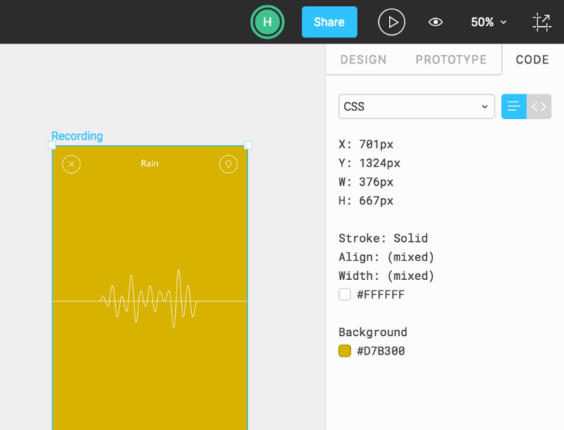
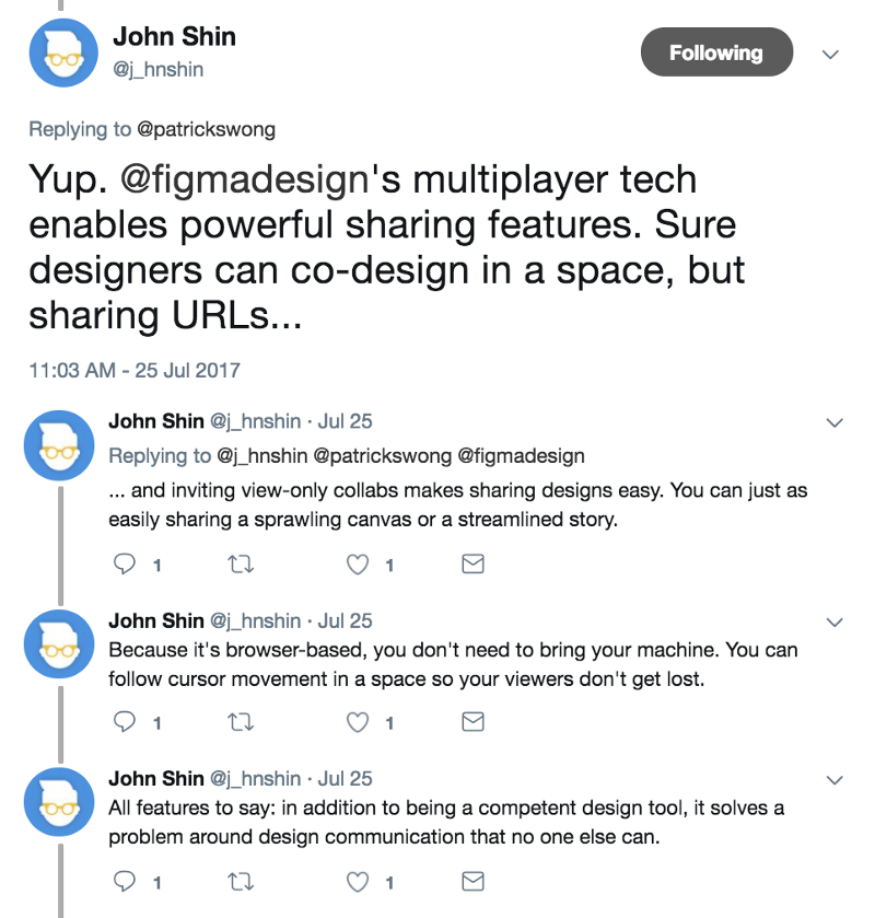
Developer handoff, July 25, 2017
With our code mode, developers can see the attributes they need to start coding a design. They can access code mode even if they only have view-only permission, so teams don’t have to pay for extra editor seats. Most importantly: Developers always know their implementation is based on the source of truth. The days where developers accidentally build an outdated design are gone.
Prototyping, July 25, 2017
Figma may have started out as a design solution, but we expanded our repertoire with our prototyping feature. Before we launched it, our users were trapped in a hellish cycle — exporting designs whenever they made tweaks, using crazy naming conventions to keep frames in order, and syncing to multiple services to keep prototypes current.
We knew we could stop the madness with our web functionality. Figma prototypes let people design and prototype in one place — no need to hack together a bunch of third party tools. Just like with our code mode, our prototypes are always up to date, no syncing necessary.
Embed integration with JIRA, Trello and Dropbox Paper
In the first phase of Figma, we focused on enabling people to design better products together. For our next act, we’re helping teams integrate design through their entire product workflow. We took the first step in this process by teaming up with Dropbox Paper, JIRA and Trello. Our Live Embed feature allowed teams to insert live, always up to date designs and prototypes in these project management tools.
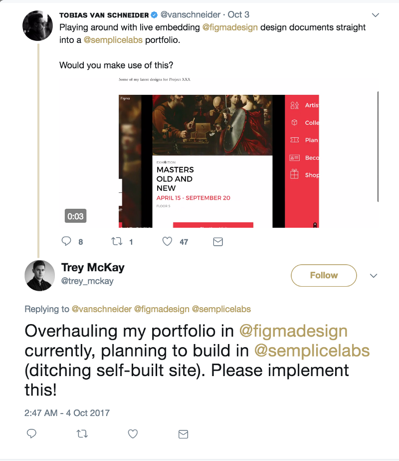
Live Embed Kit, Sept. 28, 2017
Live, always up to date designs have the potential to be useful in many places. Following on the heels of our first integrations, we created a simple Figma iframe that could be used by anyone to embed Figma designs and prototypes in any website or tool.

Design functionality
Guides, June 26, 2017
Guides made it easier for people to align designs visually, without having to set up a grid. They were a big crowd pleaser.
Photo filters, July 20, 2017
Little known fact — we originally conceived Figma as a photo editing tool. We returned to these roots in a small way with our image filter toolbar. It lets designers make quick adjustments in exposure, contrast, saturation, temperature, tint, highlights and shadows.
Image scaling, Feb 8, 2017
We introduced an array of options for designers scaling images — Fit, Fill, Stretch/Crop, and Tile.
Emojis, Aug. 10, 2017
Emojis. Serious business folks. Our customers asked us for emoji integration for ages. These little faces are the language of emotion on the web, so we enabled them to appear both inside Figma designs and in comments.
OpenType, May 25, 2017
We added a bunch of OpenType features — discretionary and historical ligatures, fractions, small caps, subscript and superscript.
Figma Mirror for Android, May 9, 2017
This feature stirred more excitement than we’d expected. Designers were thrilled to be able to test their Android design appearance in actual Android hardware. As far as we know, we’re the only design tool to offer this.
Design refresh
Logo and website
Figma has matured a lot from its earliest stealth iterations. With a new era, we needed a fresh look and our design team embarked on a major communications and branding redesign. We jazzed up our website and introduced a new identity based on three principles: celebrating the fundamentals of design, encouraging play and design as a system.
Looking forward
It’s been a busy year for us at Figma, but we’re only just getting started. We have a lot of exciting things in store for the next year that will make it easier for you to design and collaborate with your team. Keep watching to see what’s next!
Dylan Field is the co-founder and CEO of Figma. Dylan studied computer science and mathematics at Brown University where he and his co-founder, Evan Wallace, first started experimenting with design tools built on (and for) the web. With funding from a Thiel fellowship, they began Figma. Prior to Figma, Dylan interned at O'Reilly Media, LinkedIn, and Flipboard.