
Material Design + Figma Styles = 🔥


Often when we think of design systems, we think of a tightly controlled collection of components, patterns and guidelines in order to ensure consistency across a product.
Often when we think of design systems, we think of a tightly controlled collection of components, patterns and guidelines in order to ensure consistency across a product. In the context of a single product or brand, this makes a lot of sense, but what about a design system for a platform that will be adopted by many different brands/products?
Google’s Material system has been faced with this challenge since its inception. Its adoption has ensured far more consistent experiences across both Google and non-Google native Android applications. That said, although those experiences excel in usability, they’re less successful at becoming memorable extensions of the brand. There’s drawbacks when everyone leverages the same set of components.
Enter the next evolution of Material—a system that builds on everything that was great about its first iteration, but adds the ability for brands to theme their system in ways that will allow Material apps to feel less like stock native UI experiences, and more like impactful on-brand experiences.
With an infinite number of possibilities and such a large library of components, it poses an interesting challenge for designers to easily theme and customize an entire UI kit. I decided to take on the challenge as a side project for collaborative design tool Figma, to see how we could work together to make a Material kit that could leverage Figma features…
Enter Figma Styles
Figma recently announced a modular take on Styles, allowing you to quickly define global text, fill, stroke, effect and grid styles. Making a change to a style instantly makes a globalized change across your entire document. Additionally, styles can also be pushed to your shared team library, to be used across all of your team’s projects in the same way you would share a component.

See what’s possible
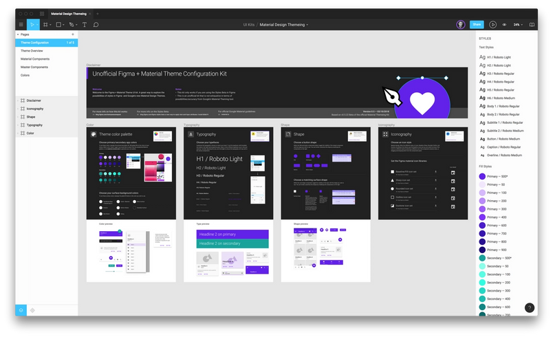
I was fortunate enough to get early access to Figma Styles, and got excited about the possibilities of using them for Material Design. So I created a Material UI kit using Styles to make building Material apps much easier. While this isn’t an official kit or partnership, I think it showcases how well these things work together.
Material Colors — I used a fill style for all of the primary and secondary app colors, all levels of emphasis for typography, and a number of swatches for surface colors. Modifying the theme to match your brand’s colors is as easy as picking new colors. I also included a page in the document to access the stock Material palette. Alternatively you can also use Google’s color tool or our color wheel as a starting point.
Material Type—I created text styles for the all of the styles specified in the Material Design spec. By default these are set to Roboto, but can be easily redefined to use your brand’s typeface. Changing a style to a different font will instantly propagate the changes across the whole system. Bear in mind, you may need to make some adjustments to type size and spacing in order to fine tune the sizing across the system. As the kit evolves, I plan to include some predefined size recommendations that work for some of the most popular Google fonts.

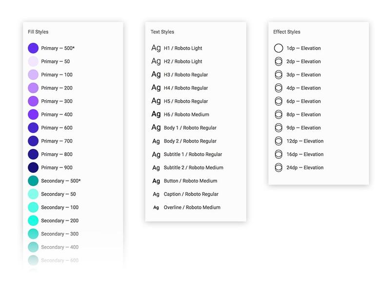
Material Elevation—I created a library of preset drop shadow styles for all elevations. Changing the elevation of an element is as easy as choosing the appropriate elevation—this greatly simplifies the process of applying Material shadows which are sometimes complex combinations of up to three different drop shadows.
Material Grid—Material is based on a 4dp baseline grid so I created a style for that too. You can apply this to any frame or component, and of course, you can add your own grids for desktop, mobile and tablet and apply them as needed.
Combining Styles with Components
Material Design encourages designers to control the shapes of UI components to better reflect the personality of the brand. They give users the option to customize surface corners, ranging from sharp rectangular corners, to 45 degree cuts, to varying levels of roundedness.
To achieve this, I created some basic shape components for buttons, floating action buttons, and cards. This gives users the ability to adjust the size of the cuts or the degree of corner radius for any chosen shape. Then I nested those components within another master component which would become the base for corresponding components in the system. If you decided you wanted to have cut-off corners, it is as simple as toggling the visibility of the correct nested component.
That change is then reflected across the entire system (note: in some cases this will take a few seconds for the change to propagate through hundreds of components). Because you can access the nested layers within every component instance, if there are specific places where you want change the style, you can make that change as an override in any instance.
Material Design also give you the option to change between 5 different icon styles. To keep the weight of the kit down, we created 5 separate sticker sheet documents for each icon style, complete with components for each icon. You can copy the desired icons from those files, or better yet, publish them as a shared library to your team and pull them into your projects.