
Introducing: Figma to React


Using Figma's API we built a Figma to React converter. Check it out!
We’re hiring! Find a full list of open positions and photos of our airy San Francisco office on Figma’s careers page.
Since the launch of the Figma API, many people have speculated about the possibility of automatically turning Figma documents into React components. Some of you have actually made working prototypes, and Pagedraw even built a whole product around it!
We’re loving the enthusiasm and thought we’d share our own attempt at a React converter, discuss some of the subtle design choices and technical solutions that went into its development, and expound on the vision that motivated its creation. If you want to follow along, we’ve open sourced the code at GitHub. (Too excited to read this blog post and want to play around with our read API right now? Check out our Developers page!)
We wanted to solve two main problems when building Figma to React. One was to have the design for components we generate to live as much in Figma as possible. How amazing would it be to update a design in Figma, and then click a button to sync those design changes to your website? This also means that we need to ensure updating your design doesn’t overwrite any custom code that we have written to make the website or app functional, and that it naturally lends itself to having Figma-generated design code and functional code live separately in neat compartments.
The second but related goal was to make it easy to attach existing functional code to new designs. For example, in the sorted list example above, it would be nice if we could design a new sorted list and easily attach the code we’d already written to it. In other words, it would be great to have our functional code be reusable across designs, just like how you might reuse React components.
From Figma to CSS
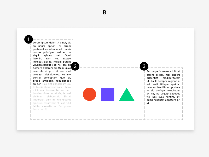
The first hurdle to Figma to React was creating React components that look like the designs they represent — otherwise, there’s not much point to any of this. Let’s use the sortable list example from above:

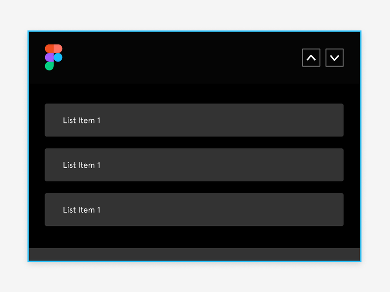
There are a lot of different ways we could go about reproducing the look of this list in HTML. For example, we could render an image of the entire frame and create a component that just draws that image. This approach is simple but very limited; for example, it’s almost impossible to do something interactive here like clicking a button to sort.
The first hurdle to Figma to React was creating React components that look like the designs they represent — otherwise, there’s not much point to any of this.
Use absolute layout to position nodes
A better approach would be to break the frame down into its constituent pieces, convert each piece into a DOM element like a <div> or an <img>, and then compose those DOM elements together. Composing these elements is a process called layout in which we specify where each element should be placed and how it should be sized relative to every other element.
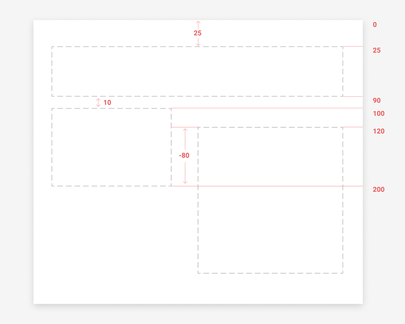
The Figma API provides a solid foundation for determining layout. Each node in a document has a property called absoluteBoundingBox. Using absoluteBoundingBox, we can figure out exactly where each node currently lives on the canvas, and how much space it occupies. From this, one idea would be to take each node, render it as an element, and then use CSS absolute positioning to place it on the page. Doing so, we might get something like this (notice that the frame is still stuck to the top left corner):

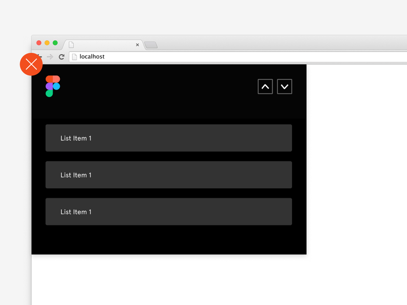
This looks pretty much the same as if we had rendered the entire frame as an image, however we’ve already made a lot of progress. We can now select the text in the list, we can potentially replace the text with something dynamic, and we can attach events to clicking on different things in the scene (like the sorting arrows). Despite that, many shortcomings remain. If we add a lot of text to this list item box, the text will spill over outside the rectangle. Looking at these absolute bounds turns out to be too constraining. We need to loosen our grip over layout and allow elements to dynamically resize as the design intended.
Use Figma constraints to resize nodes dynamically
Figma and other design tools have a concept of constraints that can be applied to a layer that make them resize according to their parent frame. These constraints are reflected in the API as the constraints property, shown here for the previous text node:
"constraints": {
  "vertical": "TOP",
  "horizontal": "LEFT_RIGHT"
}
This says that this particular text element should be positioned relative to the top of the parent, and should stretch with the parent horizontally such that the left and right margins are preserved. The parent in this case is the rectangle surrounding “List item 1”. Applying constraints out of the box to absolute positioning is a direct mapping to the left, right, top, and bottom attributes in CSS. This deals with the list container changing size and shape, but not with the list contents themselves changing. For instance, how would we adapt if we wanted to add another list element dynamically, or if the text that goes in that list element exceeds the dimensions of the original box?
Layout: top-down or bottom-up?
The problems above happen to be what HTML itself is adept at solving. If you stack two div elements one on top of the other, changing the height of the first div will automatically push the second div down. This behavior doesn’t work in our situation because everything is absolutely positioned, and so they’re locked in place!
Stacking divs one atop the other based on how much content is in each one is an approach that we’ll call bottom-up layout, meaning we start from the lowest building blocks (say, pieces of text) and build up the structure by composing those blocks together to get the shape of the higher level layers. In contrast, what we so far have done is top-down layout, in which we specify how much space the top-most layer should take up, and then place the elements that make up this higher layer within it. What if we take a combination of top-down and bottom-up approaches?
Let’s decide on how we want to react when content within one of our elements changes. In some cases, the answer is obvious:

Imagine that the dashed boxes are the elements that live inside an outer frame. If we add text to the topmost element, we should push both the image and the bottom text down by an equal amount. But there are other situations in which the correct solution may not be as clear:


What do we do in cases A and B above if we want to add text to the first box? The solution I ended up going with was pragmatic, but in many cases imperfect. The main insight is that most websites are arranged vertically, as website convention is that you scroll from top to bottom to view all available content. Given that, I decided to treat child elements of a node as if they had a linear ordering from top to bottom.
If we apply that to the first example above, the ordering might look something like this:

Now, if we want to expand the first text box, we push everything that comes after it in the ordering down to match the amount that it expanded by:

Notice that in the above example the result is strange, but borderline reasonable. In contrast, this is the result in B:

This is most likely not what we wanted: most people would expect the image and other text boxes to remain top-aligned. There are many ways in which we could solve this problem. We could introduce heuristics like “elements that are vertically aligned should remain vertically aligned” or mark the nodes in Figma in a certain way to annotate that they should hold their vertical positions. Try your own approach by modifying the Figma to React code and let us know if you have any novel ideas!
The 3-stack approach
Armed with our decision, we can now return to tackle the general layout problem. Taking a set of nodes that are TOP aligned, we can position them relative to one another by determining the distance between the bottom of the previous element and the top of the current element:

Note that this margin can be negative. We then simply set the margin-top CSS property of the current element to this difference. Now, if one element changes, the others will flow up and down the page as one would expect. The same can be done of BOTTOM aligned elements, treating them as a separate group. The result is that for any node, we can separate its children elements into three groups:
- A group of
TOPaligned elements, with bottom-up layout - A group of elements that are
CENTER,SCALE, orTOP_BOTTOMaligned, positioned with absolute (or top-down) layout - A group of
BOTTOMaligned elements, again with bottom-up layout
If we apply these ideas to the sortable list, we can now output a fully reactive component that both resizes to fit the container and adapts to changing content within itself, as shown below.
One thing to point out in this clip is that the footer stops moving at a certain point — in other words, the document stops becoming shorter at a fixed point. This is crucial to ensure that for example the footer doesn’t run into the main content of the component. However, this can’t just be implemented as minimum height on the element: as the text resizes, the minimum height has to grow to accommodate the extra text. The solution here is to add a bottom margin to the top-aligned elements (and a top-margin to the bottom-aligned elements) such that they butt against the opposite end of their parent and “prop” their parent open to a certain size.
Push out and in at the same time
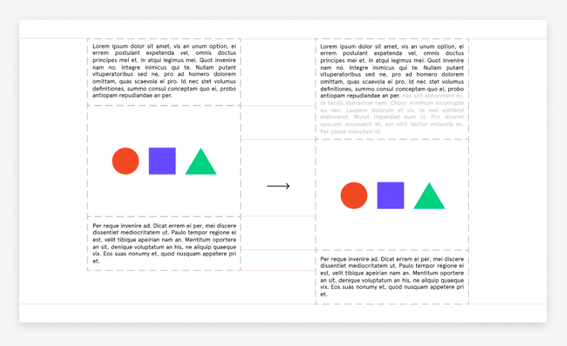
Finally, let’s look back at how the bottom-up and top-down constraints interact with one another in the case of the list above. In this next example we highlight three elements that are instrumental in making the list items resize correctly: the containing frame (outer dashed box), the text field (inner dashed box), and the round rectangular border (outlined in solid blue).

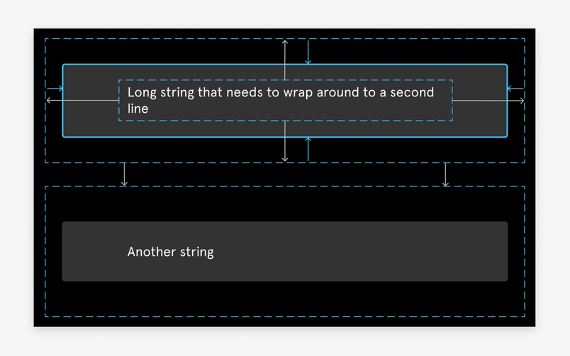
The relationship between these elements is as follows: the text element and rectangular stage are both children of the frame. The text element has LEFT_RIGHT and TOP constraints on the frame, and the rectangle has LEFT_RIGHT and TOP_BOTTOM constraints. As the frame narrows, the text has to squeeze onto a second line, increasing its height. Because its margins remain constant, this causes the containing frame also to enlarge, which causes the next frame in the list to be pushed down. At the same time, because the rectangle (again, in blue) has a TOP_BOTTOM constraint to that frame, it too has to resize and become bigger to satisfy that constraint. So we have a bottom-up constraint where the inner text makes the outer frame larger, and then a top-down constraint where the outer frame makes the inner rectangle larger. I really feel like this is one of those interactions where the result is entirely unremarkable (this is exactly the behavior you would expect) but the journey to get there is fairly creative.
Make the list act like a list
Now that we’ve got ourselves something that looks like a list, how do we make this list do list-y things? How can we make it load arbitrary data, for example? Or sort that data?
Our React converter will have to spit out some files with React components in them. Every time we change the design, we’ll have to at least change some of the contents of some of these files to represent the changes in the design. In order to make the components do things we probably want to write some code somewhere that can interact with the generated components. Lastly, the code that we write shouldn’t ever be overwritten by the generator and ideally could be portable from one component to another.
You might’ve noticed by now that the previous section on layout doesn’t depend on React at all. You’re right — we could’ve made our converter generate pure HTML and CSS and it would’ve worked just as well so far. That’s because a pure conversion of a Figma frame results in a static component, and React proffers no significant advantages when it comes to rendering a static site besides composability of code.
But now we’ll have to lean in on React more heavily. I’ll introduce just two basic concepts that I conceived of to solve the functionality problem. Their advantage is that they are simple yet surprisingly powerful, but in no way do I imply that these concepts are the only ways to do things — maybe you can offer or implement your own solutions to this problem.
Gadgets: reusable code blobs that stick to designs
The first concept I want to introduce is that of a Gadget (called “components” in the code). A Gadget is a wrapper that goes around any node in a Figma design and adds a piece of functionality to it — any functionality at all. You can create or attach a Gadget to a Figma node by putting a hash symbol (‘#’) in front of its name.
For example, if you want to say that a frame should behave like a clock, you could name it #Clock. This won’t do anything special in the file itself, but will trigger that node to be Gadgetized in the converter — this will create a Gadget file called CClock.js that you can fill in with functionality. Perhaps the easiest way to explain this is to show an example:

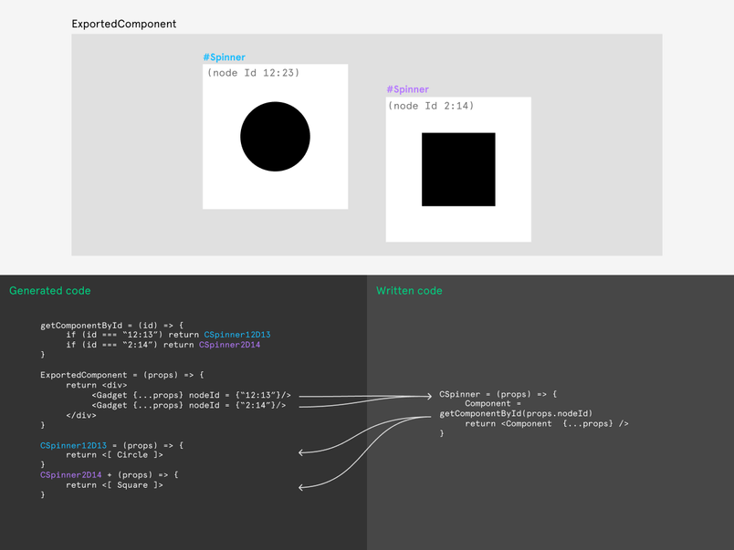
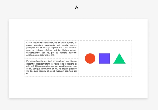
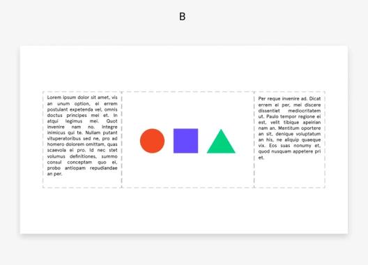
In this scene we have a container with two frames inside. One frame contains a picture of a circle and the other a picture of a square. Say we want both frames to exhibit some custom (but same) behavior, like we want to animate both spinning around. We can wrap each frame in the same Gadget (called #Spinner). This will generate a customizable code file CSpinner.js. The generated left hand side will reference this Gadget component every time a node annotated as a #Spinner appears in the node tree. The code will also pass a nodeID to the Gadget that it can use to look up its contents in each case— the power of Gadgets is that they can be applied to any node, so the contents of the node can vary from instance to instance.
A Gadget is a wrapper that goes around any node in a Figma design and adds a piece of functionality to it — any functionality at all.
That means that if we code CSpinner.js to make the contents animate and spin around, we can make any node spin around by naming it #Spinner and thus attaching the Gadget code to it. If we apply the animation code to CSpinner, we get this:
Notice that in its render function the CSpinner component simply references Component which is obtained from getComponentById. CSpinner is unaware of what it is wrapping — a complete disentanglement of function from design. Note also that once CSpinner.js is generated we will never overwrite it: any changes made to it are persisted no matter how many times you regenerate the designs.
Variables: swap out placeholder text with dynamic values
Variables are the second concept that we introduce. A variable is simply a text node whose name starts with $. Such a node will by default show the text in the design, but can be overridden by React props to show arbitrary text. The property that overrides the text is the same as the name of the node minus the $. So as an example, if I have a node called $chicken and props coming into that element looks like {chicken: "poptarts"}, then the text of that node will be replaced with the string "poptarts". You can send these properties down by wrapping nodes with variables in a Gadget.
Let’s put this all together: for our sorted list, we want something that can take a data source and populate a list entry for each item in the data source. Given that we want to take one list item and duplicate it many times, it makes sense to put a Gadget around the node corresponding to the list item. Such a Gadget may look like this:
class CListItems extends React.PureComponent {
  render() {
    const Component = getComponentFromId(this.props.nodeId);
    if (this.props.listItems) {
      return this.props.listItems.map((item) =>
        <div style={{position: "relative"}} key={item}>
          <Component {...this.props} item={item} />
        </div>)
    } else {
      return <Component {...this.props} />
    }
  }
}
We can make several observations about this code snippet:
- We don’t read from the data source directly here. Rather we expect to be passed a list of items that has already been processed. The reason why will become apparent later.
- The Gadget name starts with a C, which is true of all Gadget templates generated with the converter. This is to ensure that we can always start with a capital letter which is React convention for component names (another way would be to just capitalize the first letter).
- We default to showing what’s in the Figma document if no listItems are provided. This is recommended so that the page can function without having to provide any data sources.
- We can use Component, which is the node the Gadget is wrapping, multiple times in the render function! This is how we can duplicate the list item.
- We have to wrap each Component in a div. This is to apply the
position: relativestyle, which is necessary in the case of our file. The details of why this is aren’t important, but it’s nice that we can do this. Note that you could just as easily attach a class here and style this in CSS. React in fact discourages inline styles in its style guide. You can imagine implementing a converter that outputs a CSS file without too much additional difficulty.
So why can’t we just load the data source directly in this component? The reason is because we want to create a sortable list, and the controls for sorting are outside of this component. Because the ListItems component and the buttons to sort ascending and descending are on completely different subtrees, they can only communicate between one another through a common parent. They have to talk through this parent, so we might as well have the parent be responsible for being the canonical source of truth for the list elements.
There are a number of ways around this. You could easily attach Redux to each component and communicate through actions and the global store. This would also have the advantage of being more maintainable. But for the sake of code simplicity, I’ll show how to achieve the same end result with React only.
Load custom data into the list
Next let’s set up the common parent component:
export class CSortableList extends React.PureComponent {
  state = {};

  constructor(props) {
    super(props);
    if (!props.listSource) return;
    const req = new XMLHttpRequest();
    req.addEventListener("load", () => {
      const listItems = JSON.parse(req.responseText);
      this.setState({listItems});
    });
    req.open("GET", props.listSource);
    req.send();
  }

  sortAscending = () => {
    if (this.state.listItems)
      this.setState({listItems: this.state.listItems.slice().sort()});
  }
  sortDescending = ...

  render() {
    const Component = getComponentFromId(this.props.nodeId);
    return <Component {...this.props} {...this.state}
      sortAscending={this.sortAscending}
      sortDescending={this.sortDescending}
    />;
  }
}
If we pass a listSource to this Gadget, it will attempt to load the URL stored in listSource and store the resulting parsed JSON object in listItems. We also define two sorting functions and pass them down as properties on Component. Now any node that is a descendent of CSortableList can call these sort functions, and if we put a CListItems Gadget downstream of this, it will be able to render the list from the data source!
Finally we’ll briefly show the Gadget that triggers the sorting:
export class CSortAscending extends React.PureComponent {
  sort = () => {
    this.props.sortAscending && this.props.sortAscending();
  }

  render() {
    const Component = getComponentFromId(this.props.nodeId);
    return <a onClick={this.sort}><Component {...this.props} /></a>;
  }
}
This Gadget is wrapped around the button that triggers sorting the list in ascending order. Because one of its ancestors is a CSortableList, we’re able to call into the props.sortAscending() function which will cause the state in CSortableList to change, triggering a rerender of the CListItems Gadget and rearranging the list items therein. Let’s attach all these Gadgets to our original design, create a CSortableList component with listSource set to /shapes.json, and see what happens:
Reuse of code
This particular example is now functional! Even more exciting though is that now that we have this code, it’s easy to attach it to anything that we want to make into a sortable list by naming the nodes in Figma to what we called our Gadgets. We’ve managed to encapsulate functionality into these Gadget files that can be arbitrarily plunked onto any Figma node. Is this the way that interfaces should be built? Probably not exactly. Are there lessons to be learned here and insights that can be gleaned toward advancing how we think about the interaction of design and code? We hope so.
Future work: prototyping, CSS Grid, Layout Grids
A few ideas for extending Figma to React:
- Respect prototyping links so that clicking on an element transitions the app to a different state
- Implement hover states
- Generate a stylesheet that uses CSS grid to layout the elements
- Respect layout columns and rows in Figma
- Implement support for rotated nodes (right now any node with rotation or skew won’t be correctly rendered)
Go West
Here we have presented what we hope to be a diamond in the rough. We laid out our strategy for mapping constraints to HTML and for attaching reusable code to designs. If you missed the link in the intro, we’ve open-sourced the code for Figma To React over at Github.
Interface design can benefit by embracing code, instead of having design and code live in two separate worlds imitating each other. By fusing them together into a shared library, designers and developers can cut down on menial work and spend time on what matters: solving bigger challenges.
Excited to build something of your own with our API? Head to our Developers page for inspiration, and the Show & Tell channel on Spectrum for a community of fellow tinkerers. The future is yours to forge.
Related articles