
How one designer motivates others to build more ethical products


Cat Noone is the founder and/or CEO of three (yes, three!) apps focused on design accessibility.
Welcome to the continuation of our Side Project Series, a chance for us to spotlight those designers who work until the wee hours to finish their passion projects, sleep be damned. If you think you have the chops to be featured, reach out to content@figma.com. We’d love to hear from you.

Cat Noone is the founder and/or CEO of three (yes, three!) apps focused on design accessibility. Along the way, she’s learned some valuable lessons about building products that work well for everyone.
A report from Interactive Accessibility found that 57 million Americans are disabled, either by a physical or mental handicap, with 54% of that number active online. That’s 9.3% of the American population.
Do you really want to miss out on 10% of that prospective user base?
“Designers have this notion that accessibility means terrible constraints that will make your UI shitty,” she tells us. “But actually, how shitty is it to leave out an entire population?”
To build an app for everyone, you have to prioritize accessibility from the start. Cat’s working on three apps doing just that: Lyra, a symbol to speech app for autistic children; Iris Health, a modern day critical health service; and Stark, a design tool for color-blind simulation and color-blind contrast.
Here’s a peek into her projects along with tips on how to include as many users as possible.
Iris Health: a modern day critical health service

The idea for Iris Health came to Cat while she was driving through southwest Germany with her boyfriend (now husband) Ben. She looked at him and said, “‘Dude, if we get into a car accident, I’m SOL. We’re not married, so my health proxy is back in the US, and without that they know next to nothing about me. What am I allergic to? How has my health been recently? What’s my blood type? Am I diabetic?’”
The idea took hold. She decided to build an app to help save the life of anyone too incapacitated to speak for themselves, a service that’s just as useful for the chronically ill as it is for expats. Two years later and Iris Health is now fully operational.
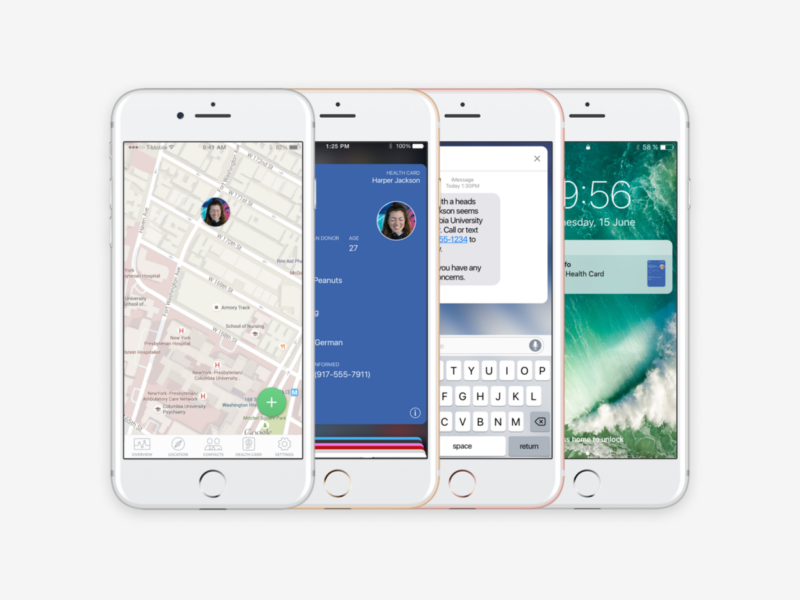
If Iris Health detects that you’re located at a hospital, then it will ask if you’re OK. If it doesn’t receive a response within ten minutes, then it will alert your emergency contacts via text message. In addition to that, your personal health card will appear on your iPhone lock screen the way a boarding pass does — with a swipe, medical professionals can view important information such as name, medication, allergies and donor status (morbid, but useful.)
Lesson learned
Think about the user base from every angle. Spend a solid amount of time considering the different populations who might use your product and how you can adapt the UI to their needs.
Stark: a design tool for checking color-blind contrast

As she attempted to build an app for the healthcare space, Cat realized there weren’t enough design tools supporting accessibility. It became apparent that the tech industry’s blind spot is anyone who doesn’t fit the mold of a “typical user,” whatever that means.
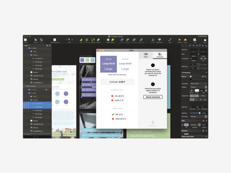
That’s how she came up with the concept for Stark, a color-blind simulator and contrast checker. The tool allows designers to simulate various forms of color blindness and check contrast by quickly selecting layers within Sketch (with more integrations soon to come :]). Then a designer can either select which form of color-blindness to simulate or view the contrast ratios for the typography against a background color.
Already Stark has racked up usage from teams at some heavyweight companies: Twitter, ESPN, Palantir, Dropbox and Microsoft.
Lesson learned
Embed tools into your workflow by default. Use accessibility tools like Stark, Contrast, the W3C checklist to ensure you’re meeting the standards necessary. These services will analyze your design and tell you what’s missing from an accessibility standpoint. Typefaces like Braille Neue are a cool way to address the visual and tactile needs of those with sight as well as those without.
Lyra: the symbol to speech app for autistic children

What if you could help autistic children communicate more effectively? That’s the question Cat asked herself after working with autistic children while in college. Back then she wanted to be a pediatric neurologist and worked with children with all different types of special needs — from autism to cerebral palsy, to a variety of behavioral challenges. These experiences serve as the backbone for why she cares so much about accessibility, and the reason for why she built Lyra, a symbol-to-speech communication app for non-verbal autistic children.
The Delaware Autism program created a non-digital communication method for autistic children, involving laminated tabs on velcro straps, back in 1985. Over three decades later, that style now seems archaic and analogue; it inhibits them from living in the digital world like the rest of us. Cat and her team wants to modernize this communication style with Lyra.
Cat and her team plan on releasing the beta version of Lyra within the next few months.
Lesson learned
Educate yourself. Learn what makes for accessible design, so you know what pitfalls to watch out for. A great place to start is with Microsoft’s Accessibility guide. Not only is it beyond informative, it’s also beautiful designed.