
How Kiwi.com handles project structure, versioning, and components in Figma


The mobile design team at travel booking site Kiwi.com is tiny, there are only two of us. But there are around twenty people contributing to our designs in some way, whether they’re commenting on our latest iterations, fixing copy, or designing cross platform features. Currently, our front end is designed in Sketch, as is Orbit, our design system. But since the mobile part of Orbit is visually different, we decided to try designing it in Figma and see how it works for us.
Editor’s note: With this story, we’re reprinting excellent work from Kiwi.com designer Denis Rojcyk, which originally appeared on his personal website.
This post covers:
- Why we built our mobile design system in Figma
- How the latest update changed the way we work
- How we’ve organized our design system (with examples)
Why Figma?
Skip ahead to the 3rd section (“Our design library component principles”) if you’re already a Figma convert and just want inspiration on organizing components, handling version history and other housekeeping.
A Sketch-oriented workflow relies on tools like Zeplin to handle handoffs, Abstract to cover version control, and Marvel to design static prototypes. But, from time to time, things get out of sync. Prototypes get stuck on the latest tested iterations, people forget to push commits to Abstract, maybe Zeplin hasn’t been updated with the latest approved visuals, or the PNGs embedded in Dropbox Paper are 3 weeks old. These tools are, by design, bound to get out of sync 🤔.
Before I joined Kiwi.com, I was playing with the idea of trying Figma, but it was hard for me to get to it. I didn’t see much much value in using it, and I didn’t need to keep all my tools in sync.
I was also put off by the browser/cloud approach to it. I liked that I could fire up Sketch whenever I wanted, and it’s a native Mac app. And then it hit me, there’s no way around it — you either have everything in the cloud and it’s in sync 100% of the time, or you have things offline in desynchronized workflows. So, I tried working with Figma, just a little bit at first, and I liked it a lot.
Then I joined Kiwi.com last November. Vojta was the only one working there on mobile at the time. He was covering all the platforms and all the devices by himself 👏. While he was doing a great job, his work lacked a consistent system behind it.
We wanted to try it, but betting on Figma without the whole team, and designing Orbit in it, seemed like a bad call. It wasn’t very clear what direction the Figma team would be heading in, and what they would focus on. Additionally, some of the features just weren’t quite ready. And yet, we decided to try it anyways, but with mobile only. Our front end and Orbit are still designed and maintained in Sketch.
Then it hit me: You either have everything in sync 100% in the cloud, or you have things offline in desynchronized workflows.
Figma 3.0
Until recently, managing components was a pain. Figma lacked the features to make the design system scalable. If you wanted to work with a DS efficiently, you were limited to a single file.
Fortunately Figma introduced a huge 3.0 update. I won’t go into much detail here (just follow the link), but basically the update:
- Made enabling, disabling, and managing updates easy
- Enabled users to share components with overrides across files
- Enabled users to share different styles for layers (which makes it more atomic than Sketch, as it enables you to combine text styles with colors and effects)
Our design library component principles
Whenever we design a new library component, or any other addition to the design system, we try to follow a couple of UX principles to ensure the library remains consistent, efficient and easy to work with.
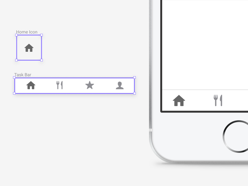
Max two level deep component nesting
Working with components and nesting them feels pretty powerful at first. By building components out at an atomic level (like icons) and assembling them into larger components (like status bars), you give yourself the flexibility to change one small piece of your system and watch it reflect in every part of your design. For those unfamiliar with the practice, here’s a blog post and a tutorial video that go into more detail.
Going two levels deep in component nesting provides the best balance of usability and possibility.
But as soon as you go more than a few layers deep — for example, let’s say you nest an icon component inside a status bar component, which itself is nested inside a home screen component — your process can get really confusing. With great power comes great responsibility, and I’ve found that going about two levels deep in component nesting provides the best balance of usability and possibility. It’s a crucial guideline that keeps our design system manageable.

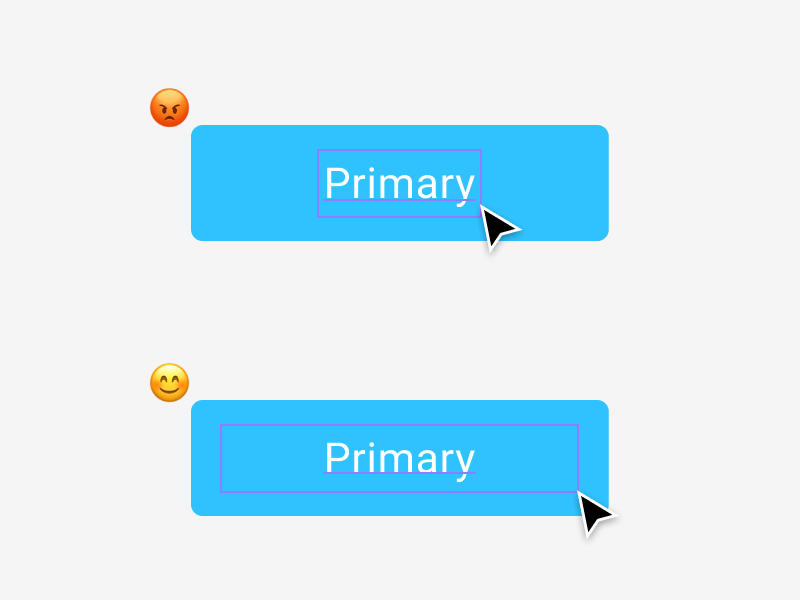
Make it easier to select layers (especially with text)
To design quickly, you need techniques for manipulating layers and components. They often have invisible bounding boxes around them that can be tricky to nail (much like the ‘hit box’ targets in FPS games). For example, let’s say you create a standard component, with only a text label in it. By default, when you create a text layer in Figma the handles (dashed lines) surrounding it are small, wrapping the text nearly 1:1.
At Kiwi.com, we’ve gotten in the habit of automatically stretching those handles to the borders of the component. Then, we can double click almost anywhere in the component to edit the label.
You have to take a slightly different tact when you have two labels in a component. If you stretch both of these labels to the edges, they will overlap (and the handy ‘stretch to click’ technique no longer works). In this case, make one of the labels a bit smaller (I usually make it half the size), and push it to the top of the layer list in the left-hand panel. Then, you have a convenient way to double click and edit both layers, either by clicking the large one on the canvas itself, or by clicking smaller one in the layers panel.

Component override logic
Component override suggestions are based on the size of the components. So, when you want to replace a component with something else, and you want to select it from the suggestions window, it needs to be the same size.
GroupIt ProTip™
We wrap all of our components in groups. This way they don’t clutter the sidebar in the file components library. This makes working with pages with lots of components far easier. It’s something I miss in Sketch quite a lot.
Optimize bitmap assets
When working with photos or any other bitmaps in our designs, we work with them as we would if they would be web assets.
- We optimize the images: with tools like ImageOptim, Optimage, tinyPNG and such. I’m not sure if Figma does any optimization, but we do it anyways.
- We optimize the file format: PNGs for simple illustrations and JPEGs for photos.
- We resize the assets: We generally don’t need a billboard sized photos in our mockups.
Following this practice improves the download time of our files and library components. It also makes reopening files less of a hassle.
Components and project structure
In addition to our guidelines on building components, we’ve also created organizational structure for projects, versions and files. I’ve recreated the following examples so you can easily use them yourself. Just copy them, and feel free to adapt them to your workflow.
Project cover

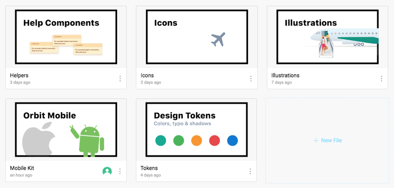
It might seem like a little thing, but navigating through Figma can be a pain when you have lots of files and projects. File titles work, but it is hard to scan them fast. That is why we use cover images.
Project file structure
We stick with one file per project or flow (we have files for things like place picker, date picker, search and similar). We chose this solution because we found that having many user flows in one file makes it slow to load.
One drawback — You cannot connect two files and create a prototype from them in Figma. So, with flows separated between files, we can’t test certain user behavior (like going from the booking flow to their profile information).
Project versioning
We use pages as different versions of the project with a standard XY naming convention. X represents huge version updates, while Y smaller iterations, with the latest iteration on top. The components page hosts component candidates which we consider moving to the main UI library.
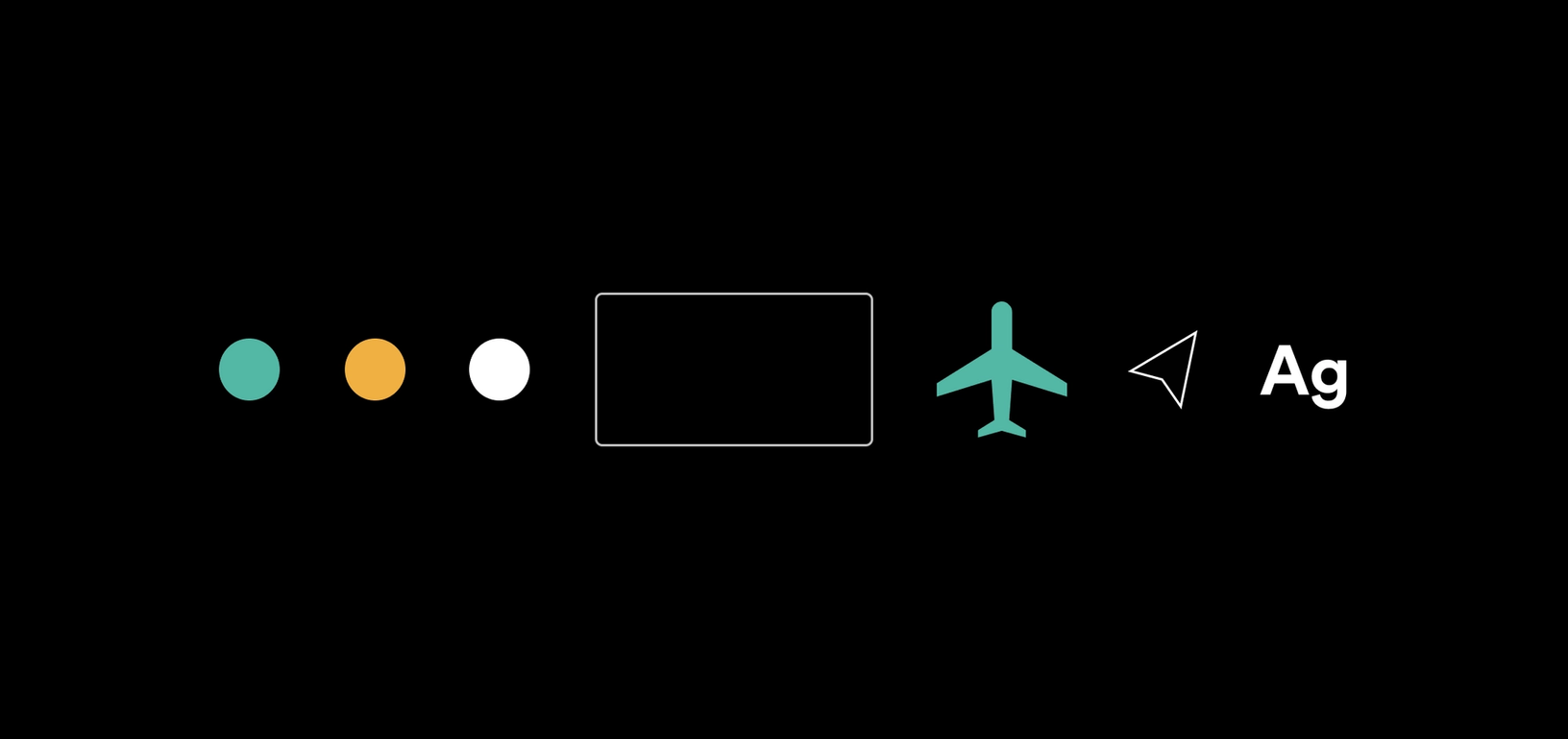
Tokens
This file is rarely touched. It contains the most atomic components of the entire design system. The file has three pages: colors, typography, and shadows. Basically everything you can define in Figma Libraries, except for components.
Typography is the same as colors. We’ve already defined everything we need in our design system (it is missing some FE font style definitions), and thus is rarely touched. The typography defined above seems rather simple, but when combined with other shared styles, it’s everything we need on mobile.
Shadows are something we’re still experimenting with, but so far we’ve defined 4 elevation levels, and this seems to work well for us.
Icons
Icons have their own page, they are all split into different sections, and are placed in 24x24 frames. Almost all the icons are standard Material Design Icons.
Illustrations
Illustrations are very similar to icons. It’s just a huge canvas full of our product illustrations. They all share the same size. But due to some import limitations of SVG to Figma, we have to work with bitmaps for now.
Orbit Mobile
Initially we had two different mobile libraries for iOS and Android. But since they overlap a lot, we’ve decided to combine them. It’s easier for us to maintain it this way. But differences in the presentation of some of the UI elements remain, for example switches and such. This is still a work in progress, and we need to catch up with Android a little bit 🙂.
The naysayer eats his words
Figma lacked in features before the 3.0 release, but now they’ve added most of my must-haves, and it’s become a serious competitor to other tools. Building a design system with it proved to be relatively easy. Actually, I feel like managing it in Figma is far easier than it other tools. It is by no means perfect, but it fits my taste the most.
The way we structure our files and split the design system logic is constantly evolving with every update, but the things mentioned in this post have stuck with us the longest and proven effective.
In future posts I would like to cover how to actually build a design system in Figma, some of the gotchas behind working with nested components, and some other tips. If this is something right up your alley, the safest way to know about it once it’s out is to follow me on Twitter 🐧.
Related articles