Figma Styles beta: A new way to apply text and layer attributes


Today, we’re excited to announce a private beta for Figma Styles.
Edit: The Styles beta group is now closed. Thanks to everyone who indicated interest! We’ll be following up soon.
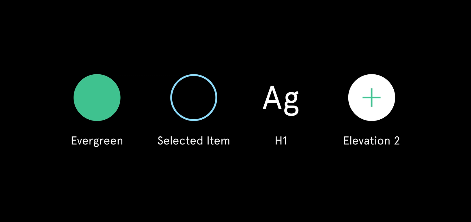
Today, we’re excited to announce a private beta for Figma Styles. Styles will simplify your workflow and keep text and layer attributes consistent across all your documents. We took a modular approach, allowing you to apply text, fill, layout grid, effect and stroke styles separately.
These styles will be accessible in your team library, to allow everyone to stay in sync with the most up-to-date versions. You can enable your team’s Styles, and you’ll receive notifications when there are changes.
After joining Figma, I worked together with Rasmus, one of our designers, to finalize the interaction model for Styles. Through previous user studies, he and the team surfaced key pain points with using styles in other tools. They honed in on the exact issues I struggled with, and I was excited by their solutions.
When we release Figma Styles publicly, we’ll do a deep dive into our approach’s benefits. In the meantime, here’s a glimpse at two of the major pain points it solves:
Pain point 1: Setting up text Styles
If you’re looking to create a unique color palette for your project, try our color wheel tool.
Traditionally, text styles tie form, color and alignment together. If your brand uses a font like Helvetica, you’d need to create Helvetica styles for headers (h1), subheads (h2) and paragraph text (p). If you add a few colors to the mix — for example, to highlight link text — things become exponentially complicated. In most design tools, you can’t separate text and color style, so you must create 9 styles — 3 colors for each of the 3 text formats (and that doesn’t even include text alignment).
If your brand changes — let’s say you realized your ‘light grey’ link color doesn’t pass accessibility tests — you have to manually update all of the styles impacted by that change.
We fixed this problem by breaking apart form, color and alignment. All three attributes can be set up (and then used) individually. If your link color changes, simply update the original fill style and it will propagate through your design in all the places where it was used.
Pain point 2: Using Styles in text fields
Override any part of your text field with a specific style
In most design tools, text fields can only hold one style. That means if you want to format part of a sentence as a link, include a section header, or make any other adjustments, you’ll distort the connection between the text field and the originally applied style.
In Figma, text fields work a little differently. Users can select and apply various text and fill styles inside one text field by highlighting a portion of the text. This will make it easier to add subheads or define sections of the text as links (among other things). They will keep their connection and update when you change the related style.
Sign up now
This is a new way of working with styles, and while it might be an adjustment, we believe the rewards will be worth it. It will ease daily pain points for individual designers, and give teams flexibility to customize their design systems at scale.
If you’re interested in checking it out, drop us a line here.
Note: With the beta, we will be migrating smaller teams before larger teams, and it’s a one way migration.


