Can the Rule-Breaking Font Designers of Three Decades Ago Still Break Rules?
Emigre Fonts have become elder statesmen in a now-crowded field.
Emigre Fonts, the cutting-edge type creators of the Macintosh revolution, have become elder statesmen in a now-crowded field.
George Orwell's prophecies aside, 1984 wasn't such a bad year. It was when Apple released—with the help of an Orwellian TV commercial—the Macintosh computer, and also the year when Emigre Graphics, destined to become Emigre Fonts, launched. The Macintosh would come to rule designers' lives, and Emigre, through its pioneering digital typefaces and iconoclastic magazine Émigré, would come to rule the conversation those designers would have about the future of the medium.
"Most designers were telling us the Macintosh was a fad without any use for serious graphic design," co-founder Rudy Vanderlans says. "So at the time we felt very isolated within the design community. We weren't taken seriously at all. We enjoyed the challenge and opportunities this tool offered, but we had no idea how big it would become and that it would solidify our place within it."
Twenty-eight years later, Vanderlans and Zuzana Licko, the husband and wife team that started Emigre and designed or promoted many of the emblematic digital fonts used on computers and in print then and now, continue refining old faces and conceiving new ones. But they have more competition than ever, and it's not always easy for a once-pathbreaking design firm to remain pathbreaking after nearly three decades.
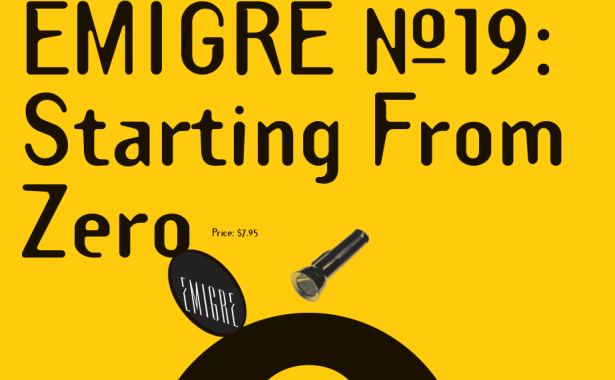
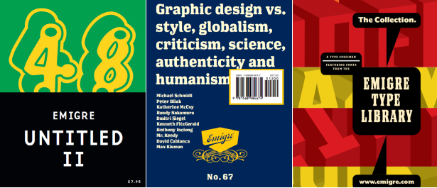
Emigre magazine, each issue of which looked radically different from the last, introduced a fanatical new generation of designers to alternative ways of making typography using the Mac—which drove the older, rational-modernist generation nuts. But in 2005 the magazine ceased publishing, in large part because of the tremendous expense: It had been financed by type sales, which were heavily dependent on the state of the economy at any given time. But Vanderlans says there were other reasons to discontinue Emigre: "The world of graphic design was changing, the focus became the Internet and blogs, and I felt disconnected from much of it. It was too geeky for me."
Although some of the articles and many of the letters to Emigre would later influence certain design blogs, Vanderlans felt "the design conversations online were all very instant and short, like snapshots. I like long, drawn-out essays. I like to think about things. I need time to reflect. So I lost my appetite for design discourse and started focusing entirely on our typefaces and the design of our type specimens."
Emigre Fonts once specialized in part in eccentric, novelty display types, but at a certain point in the mid-2000s, that changed. "When everybody seemed to have caught the type design bug, there was such a glut of novelty fonts being released, we realized we had to focus elsewhere," Vanderlans says. "It was also a part of growing up. We wanted to continue to challenge ourselves in our work. Designing text fonts [as opposed to headline or title fonts] requires a different set of skills. It also required a different type of specimen booklets to be designed, far more systematic and rational, and far less expressive."
The most popular Emigre font is Mrs Eaves (and Mr Eaves), a continually expanding family of faces, now including the recent release of Mr Eaves XL Sans and Modern Narrow. The marketplace seems to demand new faces, yet Vanderlans says the firm tries to resist being overly motivated by financial concerns. "We always like to think we're independent from the marketplace, it's the artist in us," he says. "But when our customers drop hints about what they would like to see, we listen. Mrs Eaves became very popular, and people started to ask for additional weights and variations. Zuzana was always interested in exploring the idea of creating a sans serif based on the structure of Mrs Eaves serif. So she spent the past three years drawing variations on Mrs Eaves resulting in a family of 96 related fonts, including 16 serif styles and 80 sans styles."
The reason for so many variations is that the original Mrs Eaves is not a typical reading face. (For the type nerd reading this, here's Vanderlans rationale: "It's spaced a little too loosely for lengthy texts and the x-height is too small. And although I've seen it used in books, it works best in shorter texts when there is room to set it bigger with ample line spacing. It also works really well in poetry. And we've seen it adorn hundreds of book covers. It's the additions, Mrs Eaves XL, where we increased the x-height and tightened the spacing, and the companion Mr Eaves XL Sans fonts, that can easily compete with some of the best text fonts out there.")
Although Vanderlans steers clear social media, he and Licko have adapted many of their designs for web use. Their brand-new face currently in development is called Program, and it's what Vanderlan's calls "a type designer's typeface."
"It's very much about typeface design and the challenges that type designers encounter when they design type," he says. (Again, for the font aficionado: "It features both rounded edges evoking the effects of reproduction, and ink traps, the technique used to counteract the effects of reproduction. It also mixes different stem endings, structures, and weight distributions in a way not usually done in a family of fonts. The idea is to create a series of fonts with strong individualistic features, almost busting the constraints of a central theme that is usually imposed on a family of fonts, while still relating to each other in terms of overall look and feel.")
When Emigre started there were only a handful of digital foundries. Now, with the Internet, there are literally hundreds of websites selling hundreds of thousands of fonts. It's become extremely competitive. "One way we hope to set ourselves apart is with our promotional material," Vanderlans says, referring to the aforementioned specimen sheets. "We're one of the few type foundries left that still publishes printed type specimens... because it is a big expense. But since most typefaces are still designed primarily for use in print, it only makes sense to send people printed samples of the typefaces."
Yet Vanderlans admits he is still very impressed—"jealous even"—by all the incredible typefaces that are being produced by young designers these days. "When I look at the work that comes out of the colleges KABK in The Hague and Reading in the UK I'm just amazed," he says. "These young design students spent only a single school year studying type design and they finish with fully formed, professional-looking type designs. But I am also struck by how conservative most of the work is. You're young only once, and that's a great opportunity to experiment, to do something out of the ordinary. It's the one time in life that you can claim innocence and get away with anything and in the process perhaps create something emblematic."
He and Licko played a role in the so-called design-culture wars of the '90s over legibility and illegibility, classical versus experimental. But times have changed. "I don't see any kind of larger conversation going on at the moment," he says. "There's no hoopla. [Type designer] Jeffery Keedy once mentioned that that period during the '90s was an aberration in graphic design. That it will likely not happen again. And the way that influences our work today is that we're feeling much more isolated again. Our type designs often responded to the larger conversations that were circulating around design in general. Now our work is far more inward looking."