
In addition to conveying brand personality through color and style, icons must first and foremost communicate meaning in a graphical user interface. Icons are, by definition, a visual representation of an object, action, or idea. If that object, action, or idea is not immediately clear to users, the icon is reduced to mere eye candy — confusing, frustrating, eye candy — and to visual noise that hinders people from completing a task.
The benefits of icons in a graphical user interface (GUI) include:
- Icons make good targets: they are typically sized large enough to be easily touched in a finger-operated UI, but also work well with a mouse cursor (in contrast to words, which can suffer from read–tap asymmetry on touch screens).
- Yet they save space: icons can be compact enough to allow toolbars, palettes, and so on to display many icons in a relatively small space.
- Icons are fast to recognize at a glance (if well designed) — particularly true for standard icons that people have seen and used before.
- There is no need to translate icons for international users, provided that the icons are mindful of cultural differences (for example, mailboxes look very different in various countries whereas envelopes look the same, therefore an envelope is a more international icon for an email program than a mailbox).
- Icons can be visually pleasing and enhance the aesthetic appeal of a design.
- They support the notion of a product family or suite when the same icons and style are used in several places.
Despite these potential advantages, icons often cause usability problems when they are designed without consideration for their many potential downsides.
“Universal” Icons Are Rare
There are a few icons that enjoy mostly universal recognition from users. The icons for home, print, and the magnifying glass for search are such instances. Outside of these examples, most icons continue to be ambiguous to users due to their association with different meanings across various interfaces. This absence of a standard hurts the adoption of an icon over time, as users cannot rely on it having the same functionality every time it is encountered.
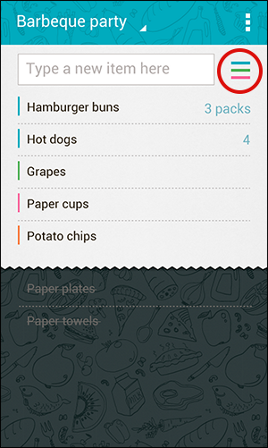
The 3-line hamburger icon is an excellent example of an icon that is striving to become universally known. While the majority of interfaces use this icon to represent the main navigation menu, some use the same (or a very similar icon) to stand for a list. For example, the list-management app Buy Me a Pie uses the 3-line icon as the way to access a list of frequently added items. To further the confusion, the icon is placed to the right of a text field, a location usually associated with a submit button. (The text field and the list icon have separate functionalities: if you thought that entering text into the input field and then selecting the menu icon would provide a narrowed-down list of matching items, you’d be wrong.)
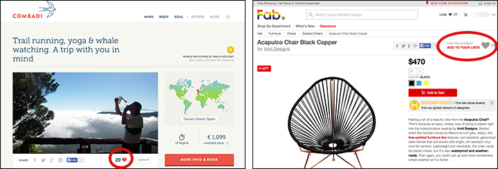
Other icons frequently misunderstood by users include the heart and the star. These icons are often used to represent favorites, bookmarks, featured items, and ratings from other users. Not only does the precise functionality associated to these icons vary from site to site, but these two icons compete with each other. As a result, these icons and their exact meanings are hard to memorize and interpret precisely. For example, the heart icon on the vacations listing site Combadi allows users to mark that they “love” a trip, but does not save that trip to a short list to ease future referencing. (Users in our recent usability study disliked that anyone can “love” a trip, as opposed to only people who had actually purchased it.) In contrast, the interior-design shopping site Fab uses the heart icon as a way for a user to save that item in order to find it easily later.
Even a slight difference in meaning and functionality hinders the ability for a user to understand and rely on an icon when it is encountered in future experiences.
Just last week, we reported our usability study of a website that employs a clock icon in its main navigation bar. While the graphic itself was easily recognizable as a clock, the meaning of the icon was completely obscure because it was a non-standard use of the concept of a clock or watch: the clock icon is used to symbolize navigation history and opens a drawer with the most recent pages that the user had visited. Not a single test participant clicked this icon. Obscure icon = wasted feature.
Icons Need a Text Label
To help overcome the ambiguity that almost all icons face, a text label must be present alongside an icon to clarify its meaning in that particular context. (And even if you’re using a standard icon, it’s often safer to include a label, especially if you slightly altered the icon to match your aesthetic preferences or constraints.)
Icon labels should be visible at all times, without any interaction from the user. For navigation icons, labels are particularly critical. Don’t rely on hover to reveal text labels: not only does it increase the interaction cost, but it also fails to translate well on touch devices.
The website Usability.gov uses navigation icons for Methods, Templates and Documents, and Guidelines on every page within the site. If I asked each person reading this article to send me an icon that represented Methods, I am sure I would receive a wide variety of designs. As we stated as part of our design guidelines for homepage usability years ago, “if you find you need to ponder to come up with an icon for navigation, chances are it’s not going to be easily recognizable or intuitive for users.” While the mobile version of the site recognizes that text labels need to accompany the icons to impart some meaning, the desktop version hides these labels until the curious user decides to hover over them. Fixing these navigational items to the left side of the page in order to remain available to users when they scroll indicates that the organization believes them to be important and useful. However, stripping these icons of text labels renders them completely meaningless and is counterproductive to the goal of providing easy access to content.

Relative Size Aids Noticeability
In general, icons tend to be more salient on mobile phones compared to desktop websites and applications. It is easy to assume that because an icon (for example, the hamburger) works on a mobile design, it will translate well to desktop. Alas, this is not the case! On mobile screens, there are fewer elements that compete for users’ attention (simply because the screen is smaller and can fit less information). In contrast, desktop screens are bigger and usually contain a lot of content; users may easily miss some of it depending on what part of the screen attracts their attention. If the only elements currently in view on a phone consist of a logo, a headline, a single image, and a menu icon, that menu icon stands a much greater chance of being noticed by a user than the same icon presented in the upper corner of a desktop site full of attractive content.
Also consider the relative size of an icon compared to other visual elements presented on the screen. In a typical header for a mobile website, the hamburger menu icon consumes roughly 20–25% of the available screen width. When that design is scaled up on a larger device, the size of the icon generally remains about the same. As a result, on desktops (and larger tablets, especially in landscape orientation) the icon will be smaller and less salient compared to other elements on the screen. This issue can be avoided on larger screens (where there is usually plenty of space) by simply making the navigation visible rather than collapsing it under an icon. By doing so, not only will the menu options be more discoverable, but you can also avoid the many usability problems that arise from hiding the global navigation.

Tips for Designing with Icons
If you decide to include icons in your interface, do your research first! Familiarize yourself with icons used by your competitors and with icons commonly used on the platforms that you target, as those will be most recognizable to your users.
If you must design new icons, strive to make them easy to recognize and memorize by following these guidelines:
- Keep the design simple and schematic. Reduce the amount of graphic details by focusing on the basic characteristics of the object rather than creating a highly realistic image in order to speed up recognition. (Intricate details are difficult to distinguish at smaller sizes.)
- Use the 5-second rule: if it takes you more than 5 seconds to think of an appropriate icon for something, it is unlikely that an icon can effectively communicate that meaning.
- Test the icons for recognizability: ask people what they expect the icons to stand for.
- Test the icons for memorability: ask a repeat set of users if they can remember the icon’s meaning after being told what it represented a couple weeks earlier.
And always include a visible text label. As Bruce Tognazzini once said, “a word is worth a thousand pictures.”