


Overview
The BBC has its own typeface 'BBC Reith' which must be used on everything that we do. For more about BBC Reith see Introducing Reith - the new face of the BBC.

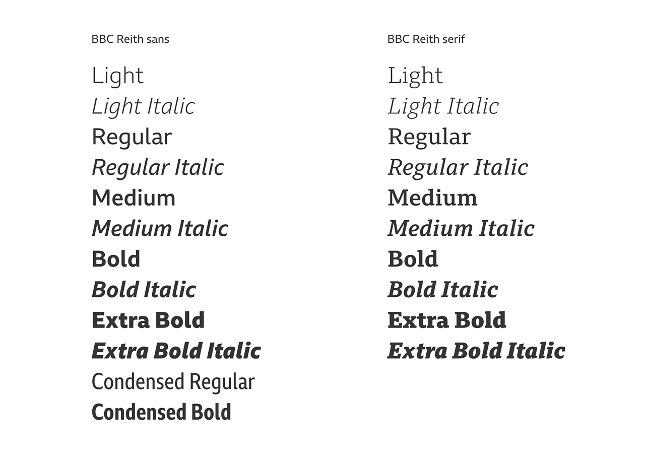
The BBC Reith font family consists of a serif, sans serif and condensed sans serif and there are currently four weights available*:
- Light
- Regular
- Medium
- Bold
- Extra bold
* Condensed sans serif only available in regular and bold.
BBC Reith offers both Latin (for example English and French) and Cyrillic (for example Russian) alphabets. The condensed sans serif only contains Latin characters.

Font stack
There are two CSS font stacks to use on the web depending on if you are using serif or sans serif:
**Sans serif: **BBC-Reith-sans, Helvetica, Arial, sans-serif
**Serif: **BBC-Reith-serif, Helvetica, Arial, sans-serif
We default to sans serif fonts in place of the serif because these better match the character, style and size of BBC Reith Serif.
Note
For products that have not yet adopted BBC Reith, Helvetica Regular and Bold can be used instead (supported by Georgia italic for short quotes from BBC blogs and third party websites).
On devices that don't include Helvetica or Georgia as system fonts, we use the best sans-serif and serif alternatives available e.g. Arial for Windows and Roboto for Android.
Type sizes
We've developed our type sizes to be suitable for average screen densities and reading comfort under typical conditions.
We size our type across the following four breakpoint groups to suit a range of devices and input methods:
- Group A: Default sizing 0 - 319 pixels (typically feature phones)
- Group B: 320 - 599 pixels (typically smart phones)
- Group C: 600 pixels and above (typically tablet devices)
- Group D: 600 pixels and above when touch is not available (typically desktop or laptop screens)
To make the type styles reusable across different page-types and contexts, we've set up a naming convention that comes from traditional type measuring techniques.
The sizes shown below correspond to size and line-height (size/line-height) and are in pixels, based on a baseline of 72 pixels per inch (ppi). We recommend you set font sizes using relative units to allow for the changing nature of the user's browser. This creates uniformity across different screen sizes and capabilities.
| Example Usage | Group A | Group B | Group C | Group D | |
|---|---|---|---|---|---|
| Canon | Hero or blog post title | 28/32 | 32/36 | 52/56 | 44/48 |
| Trafalgar | Article title or section header | 20/24 | 24/28 | 36/40 | 32/36 |
| Paragon | Primary headline on indexes | 20/24 | 22/26 | 28/32 | 28/32 |
| Double Pica | Sub header | 20/24 | 20/24 | 26/30 | 24/28 |
| Great Primer | Headline title or subtitle | 18/22 | 18/22 | 21/24 | 20/24 |
| Body Copy | Article body copy only | 15/20 | 16/22 | 18/24 | 16/22 |
| Pica | Index links, titles & headlines | 15/20 | 16/20 | 18/22 | 16/20 |
| Long Primer | Index body copy & image captions | 15/18 | 15/18 | 15/20 | 14/18 |
| Brevier | Time stamps and bylines | 14/16 | 14/18 | 14/18 | 13/16 |
| Minion | Small header capitals | 12/16 | 12/16 | 13/16 | 12/16 |
We have created a working demo of our typographic scale.
Note
For products that haven't adopted BBC Reith and are still using Georgia Italic for 3rd party content across all devices, we recommend using the type groups mentioned above. Here's how Georgia is sized across the groups:
Applied as a short quote or paragraph:
Group A 15/18 | Group B 16/20 | Group C 16/22 |** Group D** 14/18
—
Applied as a blockquote:
Group A 18/24 | Group B 22/28 | Group C 24/32 | Group D 20/24
Some background to our naming convention
As mentioned above, our naming convention comes from traditional type measuring techniques, going back as far as 1582.
Some of the names came from the type of book produced in that size. For example, Primer was used for religious books ordered by Henry VIII.
This helps us easily communicate type choices in the development process, bridging the gap between designers and developers.
Weight, style and tracking
Weight and style
Deciding whether to use the serif or sans serif and in which weight is entirely dependent on what best suits your product and audience. You can mix and match the various options to help create hierarchy and emphasis on key text.
Heavier weights should mainly be used for headlines, titles and links - basically anything interactive or that needs to shout.
Tracking
BBC Reith has been designed with legibility and readability at its core. Because of this it is important to not adjust the tracking (also known as letter spacing).
Note
For products that haven't adopted BBC Reith and are still using Helvetica we recommend applying a negative change to letter spacing, proportional to -3% for all bold text above 18 pixels.
To apply the tracking adjustment in Adobe software, change your character tracking to -30.
In CSS, letter spacing for bold type above 18px should be set to -0.03em or alternatively -1px.
Considerations
As shown in our type sizes section above, we use a limited number of sizes and styles on our typographic scale. This helps with consistency across different contexts and page types.
When using the scale, it's also important to think carefully about line length and colour contrast.
Here are a few hard and fast rules that will help in this area.
Line length
For body copy, try not to have more than 60 characters per line. Make use of the grid to optimise your layout to suit.
Colour contrast
All text and background colour combinations must be WCAG 2.0 AA compliant, as specified in the BBC mobile accessibility guideline on colour contrast.
Normal text (18px and below) should achieve a minimum contrast ratio of 4.5:1 - Level AA.
Large text should achieve a minimum contrast ratio of 3:1 - Level AA.
Large text is defined as 14 point (typically 18.66px) and bold or larger, or 18 point (typically 24px) or larger.
Type in action
Our typographic scale can be used across all page types, catering for a wide range of content across the BBC.


Additional type sizes for larger contexts
Alongside our main set of type sizes, we have created a range of additional display type sizes.
This display type can give greater impact where neccessary, especially at large screen sizes. It should only be used for immersive storytelling and infographic experiences.
The sizes use the same set of breakpoint groups as the standard type sizes (groups A - D) and follow the same weight, line height and tracking rules.
| Group A | Group B | Group C | Group D | |
|---|---|---|---|---|
| Atlas | 78/84 | 96/104 | 192/208 | 140/148 |
| Elephant | 60/64 | 78/84 | 156/170 | 116/124 |
| Imperial | 50/54 | 64/72 | 124/136 | 96/104 |
| Royal | 40/44 | 52/60 | 94/104 | 76/84 |
| Foolscap | 32/36 | 40/44 | 72/80 | 56/60 |