iTunes Connect is like the other side of a mirror to the App Store. While users download the apps from the Store, Developers submit their creations into this platform. iTunes Connect is a platform for Developers to upload, analyze and monitor all things related to apps available in App Stores.
The web version of iTunes Connect has a rich functionality, that allows professionals to perform various advanced tasks related to their app analytics. However, the iOS version of the app is not so convenient. It does not even have some important features.
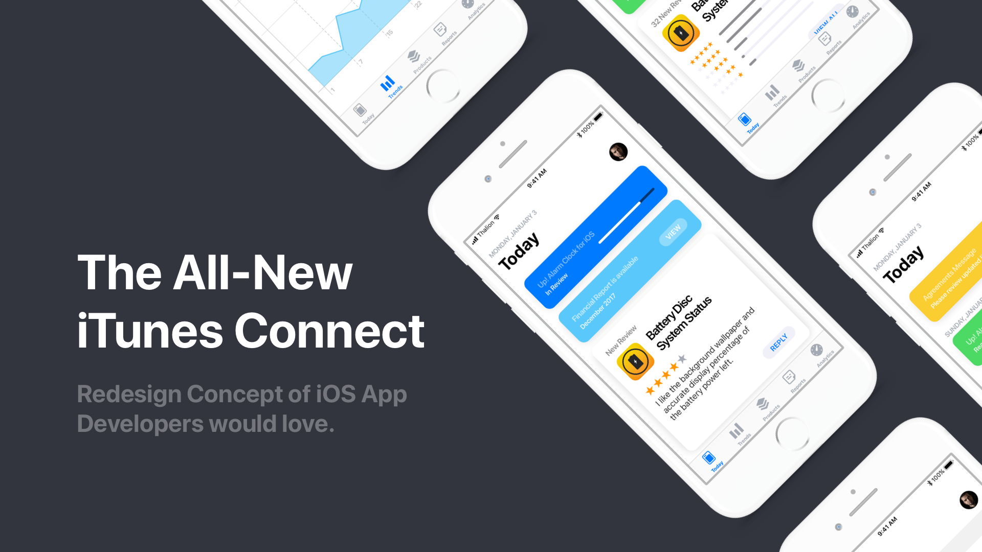
With iOS 11 App Store introduced a completely new design. If the world of digital app distribution should remain consistent – developers deserve for the iTunes Connect iOS app with a new design and better UX.
Why did Apple not update iTunes Connect App for iOS?
I do not know when Apple will decide to refresh their solution. This is why I would like to introduce a design of the iTunes Connect iOS app that would solve some issues and serve developers better.
The Design Process
Google Sprint inspired by well-known Design Thinking methodology is really good at rapid solution creation. This is why I have chosen this technique for the project.
The Main Goal
Design iTunes Connect iOS app that is really Mobile First. I have released a few apps to the App Store and I remember how frustrating it was to use the mobile app. I could not make all needed things from the iPhone. I had to turn on my Mac and log in to the web page. This is why the main goal of this project is to build app concept where everything may be done from iPhone.
How design was made
Let’s reveal how I have come up with the new design of iTunes Connect App. Because I decided to use Google Sprints methodology whole process was divided into 5 stages. Originally it should take 5 days of work, but this was the after-hours project, so it took a couple of weeks.
1. Understand Phase
Before I would dive into the creative process I had to do some research and truly understand who are the users of iTunes Connect. What are their needs and goals? In what context they use the solutions. Finally, are there any competitive or similar products they use.
iTunes Connect Platform is used by the developers and managers engaged in the development of a solution for Apple devices.
Quick research showed that managers prefer to use the web version of the platform because they can upload the binaries, change name, description or keywords. They also focus on download or purchase analysis in particular regions.
On the other hand, there are lots of individual developers that also use the mobile app. Their main activity is to check stats, monitor, if their product passed the review, or read new ratings.
Because of this, I will focus on creating the best possible design mainly for individual developers. It does not mean I will forget about the rest. I think designers should focus on the main group of users but remember the minority as well.
I have interviewed a few iOS developers, to know their opinion regarding the app. They shared with me some pain points of the present solution.
Pain points
After login, a user is able to see some stats regarding the apps. It is nice to have some predefined periods of time like, week or month to browse status. However,it is not possible to set custom period of time, or even to choose particular app stats (if some have more than one product).
It is also hard to identify what is going on with the app right now. To read reviews user has to click through many screens. The path is so complicated that no one could tell me how to go into that option from the memory. There is no option to respond to reviews either.
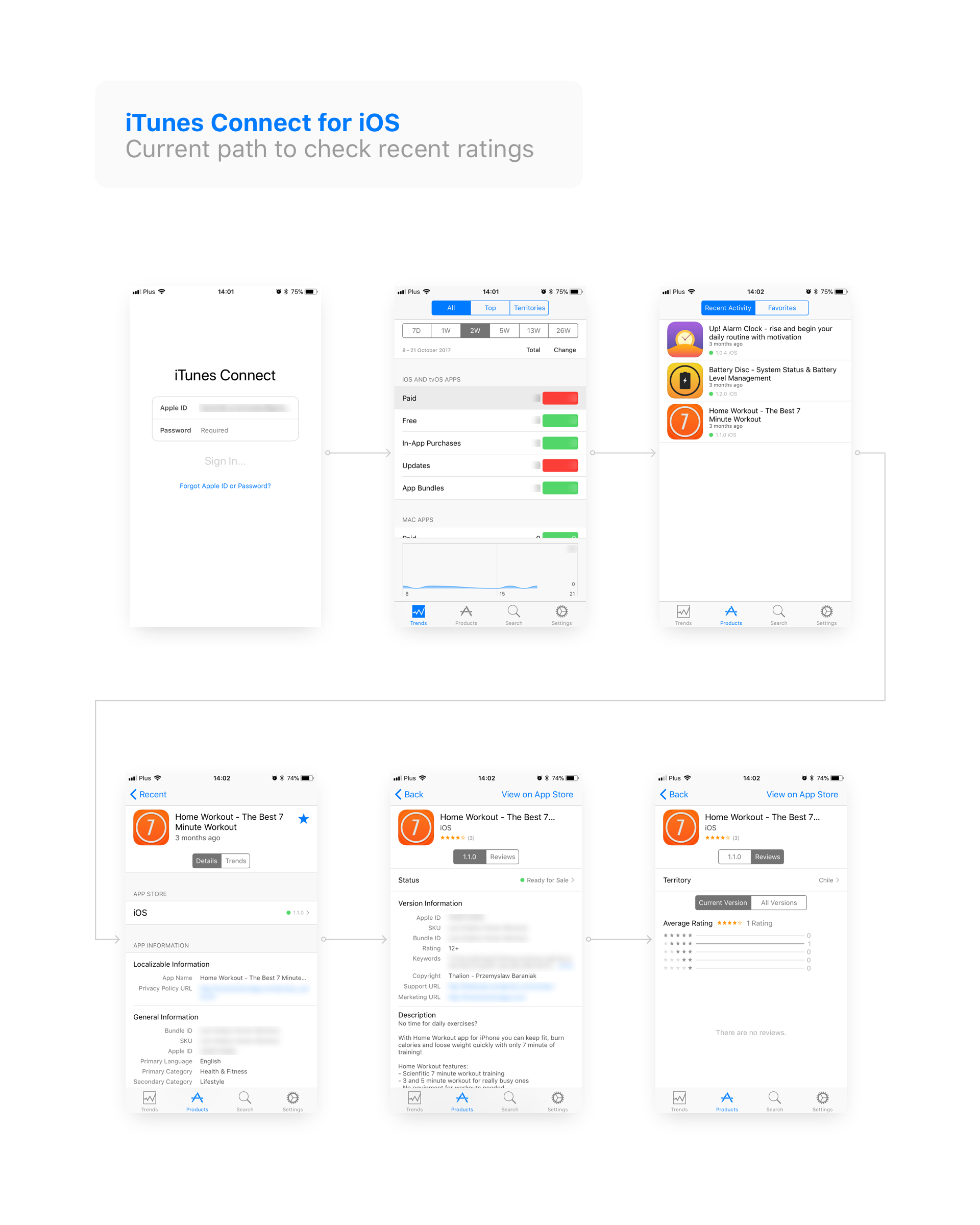
Finally, at the beginning of the month, developers get emails with notification about the availability of financial reports from last month. It is impossible to check them inside the app, they have to login into the web to see reports.
Some users would also like to change some information like description of the app or to change the price of the product. All of these options are currently unavailable in iTunes Connect for iPhone.
Competitive Solutions
There are no direct competitors of Apple’s Platform. However, we may think of Google Play Store Developer Console as of the indirect competitor. It is not an app, but RWD website. It may not have highest level aesthetics, but it adopted Google’s latest visual language – Material Design. What is crucial – Developer Console has the same functionality on all devices – phones, tablets, and desktops.
In terms of monitoring product’s statistics, the most popular solution is Google Analytics. Their mobile app has rich functionality with a dashboard that by default provides useful information from chosen time. Like Google Play Store Developer Console is also done in Material Design. Thanks to this we have a very consistent experience using their solutions.
These indirect competitors show two things. There is a need to update the design of iTunes Connect to match latest UI patterns of iOS. Next, the functionality of Apple’s mobile app should be extended to match needs of more advanced users.
To conclude Understand Phase:
There are 5 major use cases of individual developers. Some of these tasks users are able to accomplish in present app, some not. If you are on of individual developers you probably would like to:
- Monitor the review and publication process of the recently uploaded app.
- Check out information regarding the particular app. It may be a review, rating or number of downloads
- Answer the user reviews
- Monitor the statistics of downloads and purchases
- Browse financial report of the particular month
There are also some minor things developers would like to do in the mobile app for example:
- Review agreements updated by Apple
- Update information about the app
- Change price of the app inside iTunes Connect for Apple
There are no direct competitors to iTunes Connect app. However, we may consider some features and design consistency that appears in Google Play Store Developer Console or Google Analytics mobile app.
2. Diverge
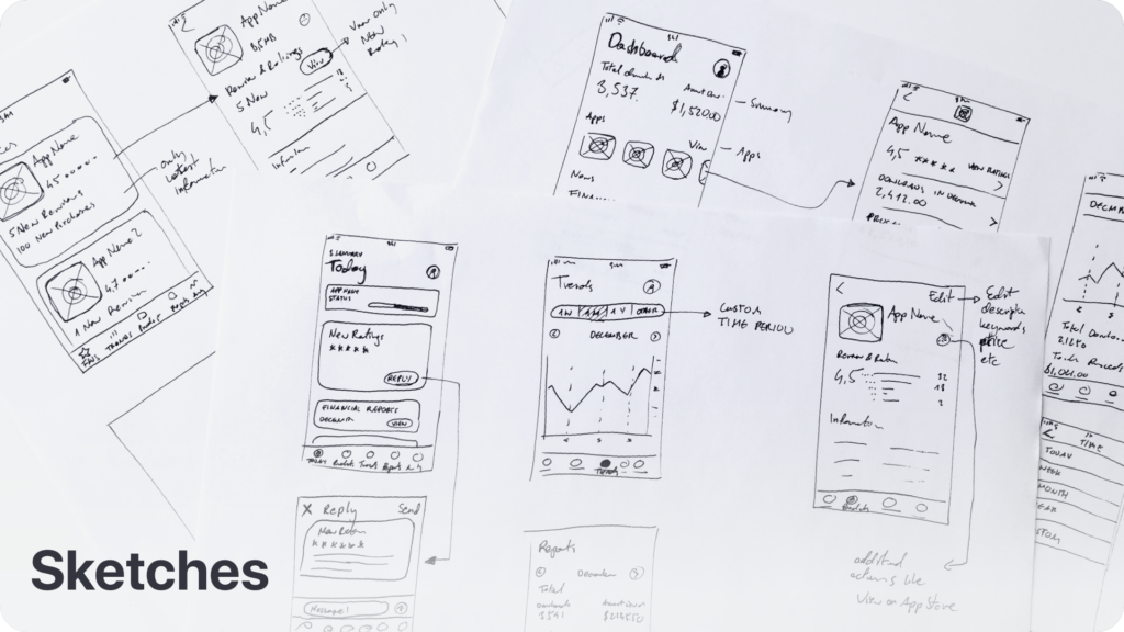
Time to ideate & sketch. I prefer to make paper or whiteboard sketching on while brainstorming. Wireframes done in software tools limit our minds and are not the most efficient way to communicate initial ideas. I have mentioned this in Wireframes – The Fifth Wheel of UX Design Process. How to design without them? article.
Below you may find some sample initial sketches of ideas I created. It is important to have in mind requirements and assumptions that appeared in Understand Phase.
3. Decide
When I work alone it is hard to choose the best idea. However, there are some techniques that help freelancers to decide what concept is possibly a good one. I group ideas into the collections of similar ones and I use Six Thinking Hats methodology to look from different perspectives at each concept. This technique was designed for teamwork, but it may be also successfully used by a freelancer.
Finally, I decided to choose the one inspired by new App Store app. The concept should cover most of users needs quickly and will have the familiar look for the iOS user.
Now it was time to plan more detailed workflow of the app. It is important to have clear user flows and storyboards before you would go to the next stage.
4. Prototype
Google Sprints creators suggest that Prototypes should be quick, rather low fidelity ones to focus on usability. This time I broke a bit this guideline. Modern UI design tools let us create high fidelity mockups and prototypes quickly. I used Sketch and some UI resources from Apple that made my work really efficient.
For prototyping, I have used InVision. I prepared a simple one – a set of connected screens. The InVision’s tool has got a possibility to implement simple transition animation, but the motion was not important in that phase. What is important I was able to share the prototype for testing and reviews.
5. Validate
I am one of the users, but I am not the users. All designers who try to improve solutions they use should remember this sentence. Even if you use a product you create there are lots of people that use it in a different way.
Thanks to identified earlier pain points and goals. I was able to prepare some test scenarios and ask some iOS developers to interact with a prototype.
The results of the test were quite good. iOS Developers are familiar with curation-like “Today” stream inspired by the new App Store app and reacted positively to the main new feature. Finally, they do not have to click through many options to get information about what is going on with their apps.
Next noticeable positive thing was the ability to set custom period of time inside the app stats. Developers know that it is quite frustrating to get meaningful data in the present version of the app.
There was also some issues. Thanks to this I have an opportunity to make next iteration of the concept.
[ctt template=”1″ link=”SX6zE” via=”no” ]I am one of the users, but I am not the users.[/ctt]
Iterations
After validation step, there are always some conclusions that lead to ideas improving the solution. This time I have done additional iteration.
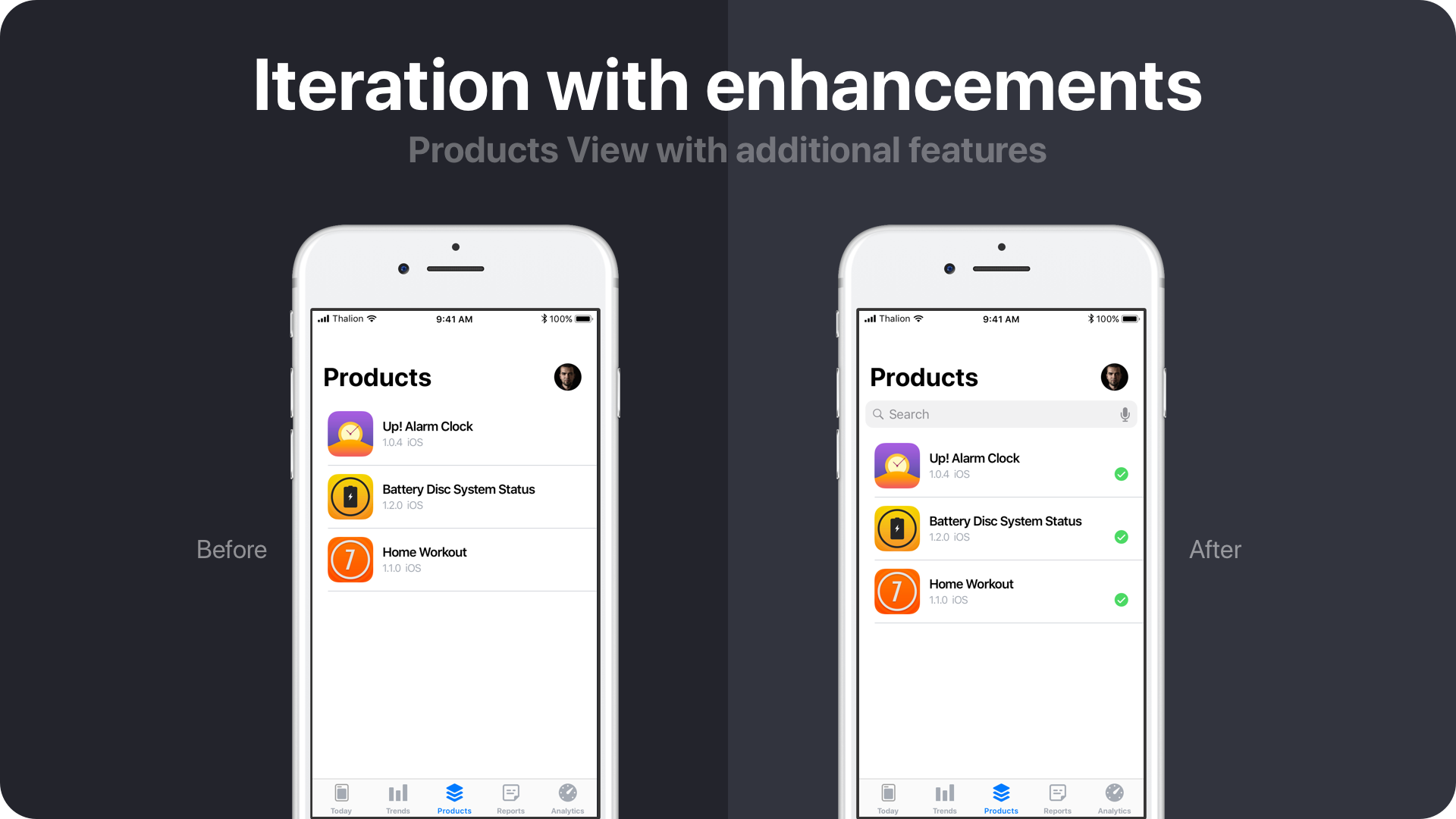
I detected that developers with multiple apps will need a search feature which I removed completely in the first concept. Search feature should not be one of the top features of the app (like in the present one), but it may be needed in Products section to find the one quickly if a user has got more apps.
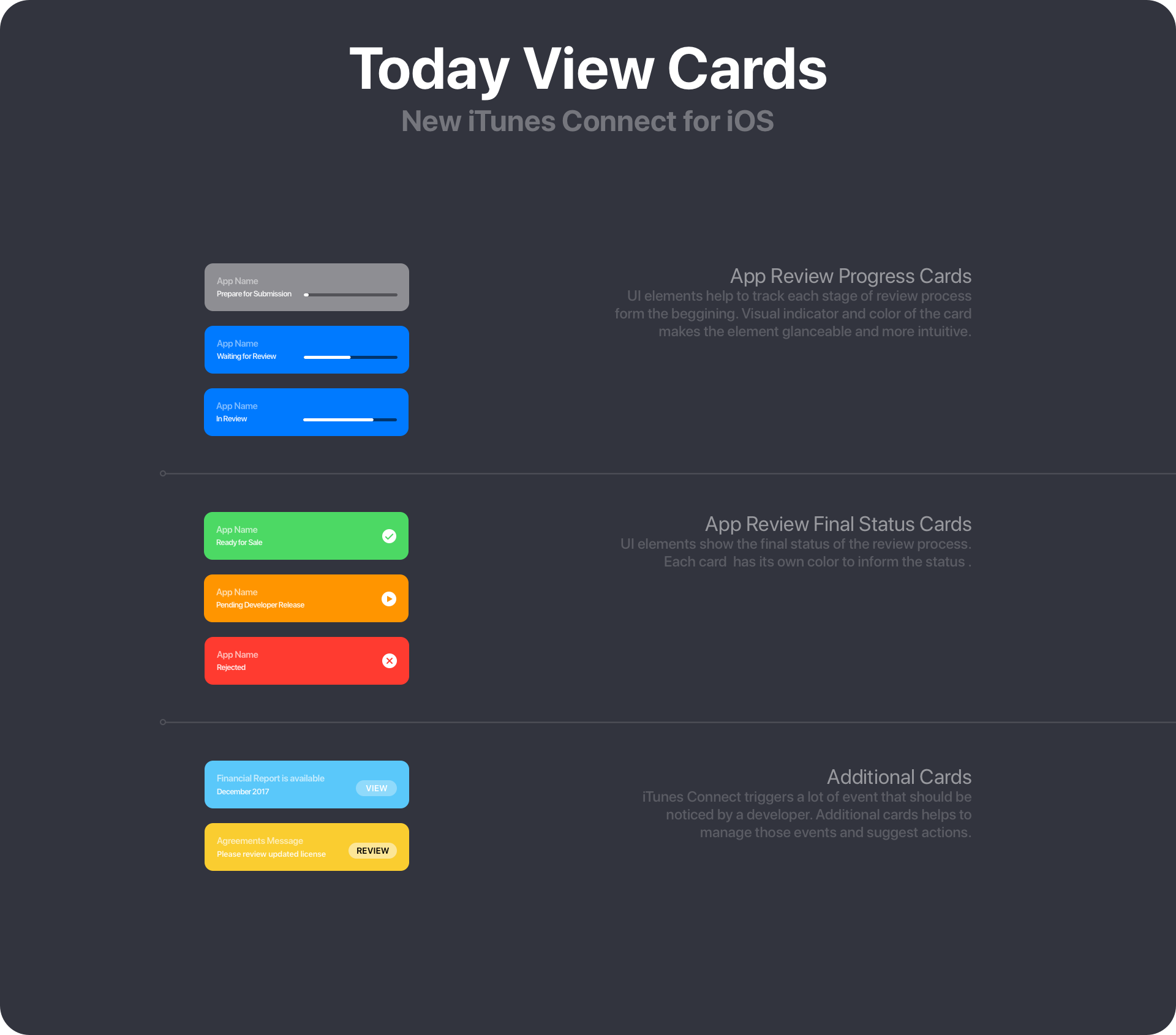
Some developers also noticed that there is no indicator that shows the current status of the solution in App Store (for example “Ready to Sale”). A small thing, but matters.
These are sample tasks to do during the prototype validation with the developers:
- What is the current status of your app submitted for review?
- What was the number of downloads of your app in September?
- Check if there is a new review or rating for your product
- What was your income from the app last year?
- Change your keywords of your app.
All of the tasks to be done during the test were accomplished successfully. However, the last one “changing keywords” was not so obvious and may be the subject of improvement in the future.
The Final Design
I have gathered below the final mockups and flows or iTunes Connect app concept for iPhone.
Today View
It was obviously borrowed from the App Store. As I mentioned, in the beginning, these are two sides of the mirror. It would be great if we could bring some consistency to the solutions.
Developers would not need to browse through the app to find newest and the most important information about the apps or the account.
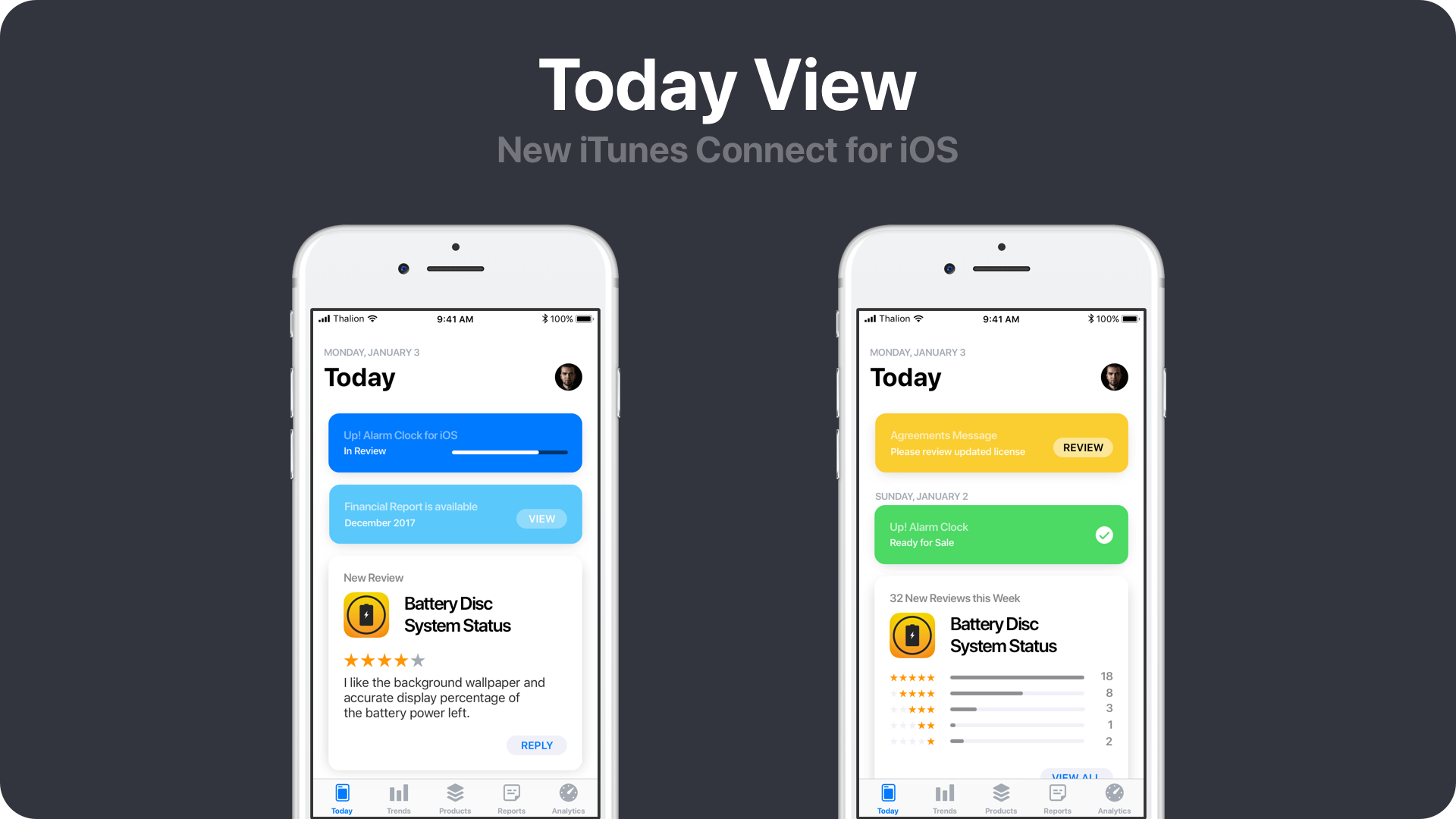

Cards
The app review process is a really “special” time for all developers. This is why I came up with the idea of cards with different colors and progress bar to communicate all stages clearly. There are also some other events in iTunes Connect Platform that should be noticed by a developer. Cards help to view them.
Ratings
Ratings are also important, so “Today” would also include newest ratings. If the app would become very popular and there would be many ratings a day – then the card with summary would appear. Of course, there is also a more traditional path to see all reviews.
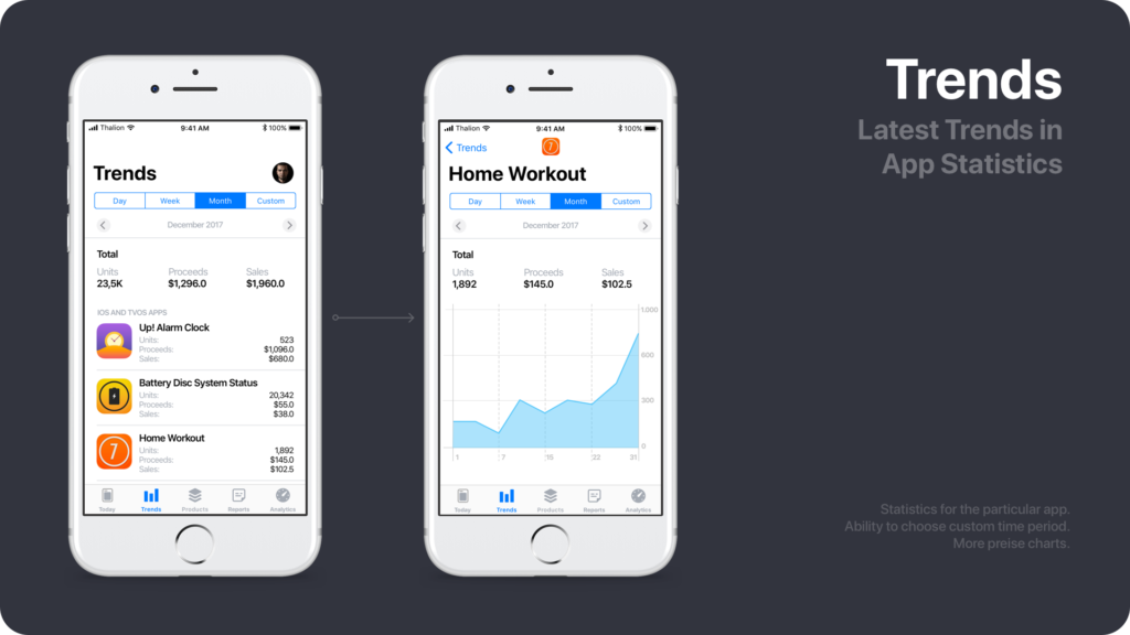
Trends
Finally, developers have got an opportunity to browse the stats of particular app. What’s more, they would be able to set custom period of time.
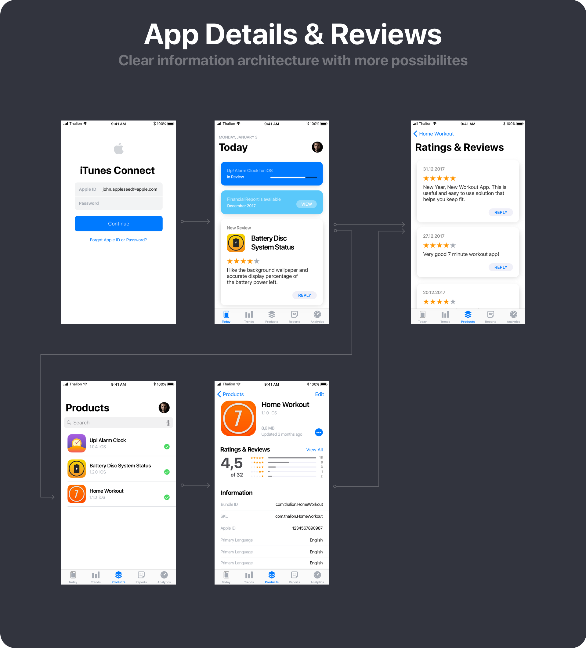
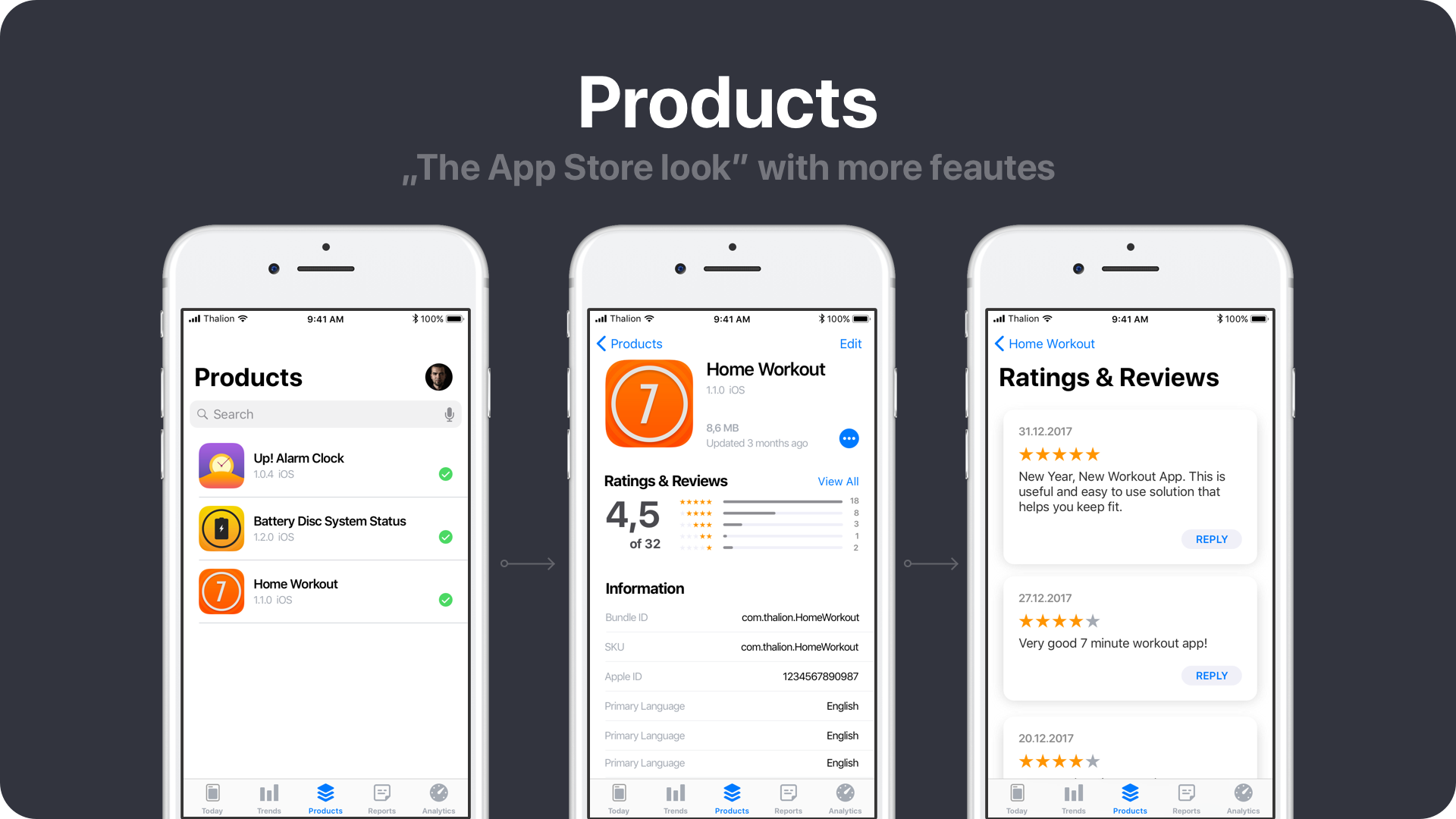
Products
Apps are the reason iTunes Connect exists. The convenient list of products. Redesigned app details with ratings and reviews that may be replied. Developers would even change app description and keywords.
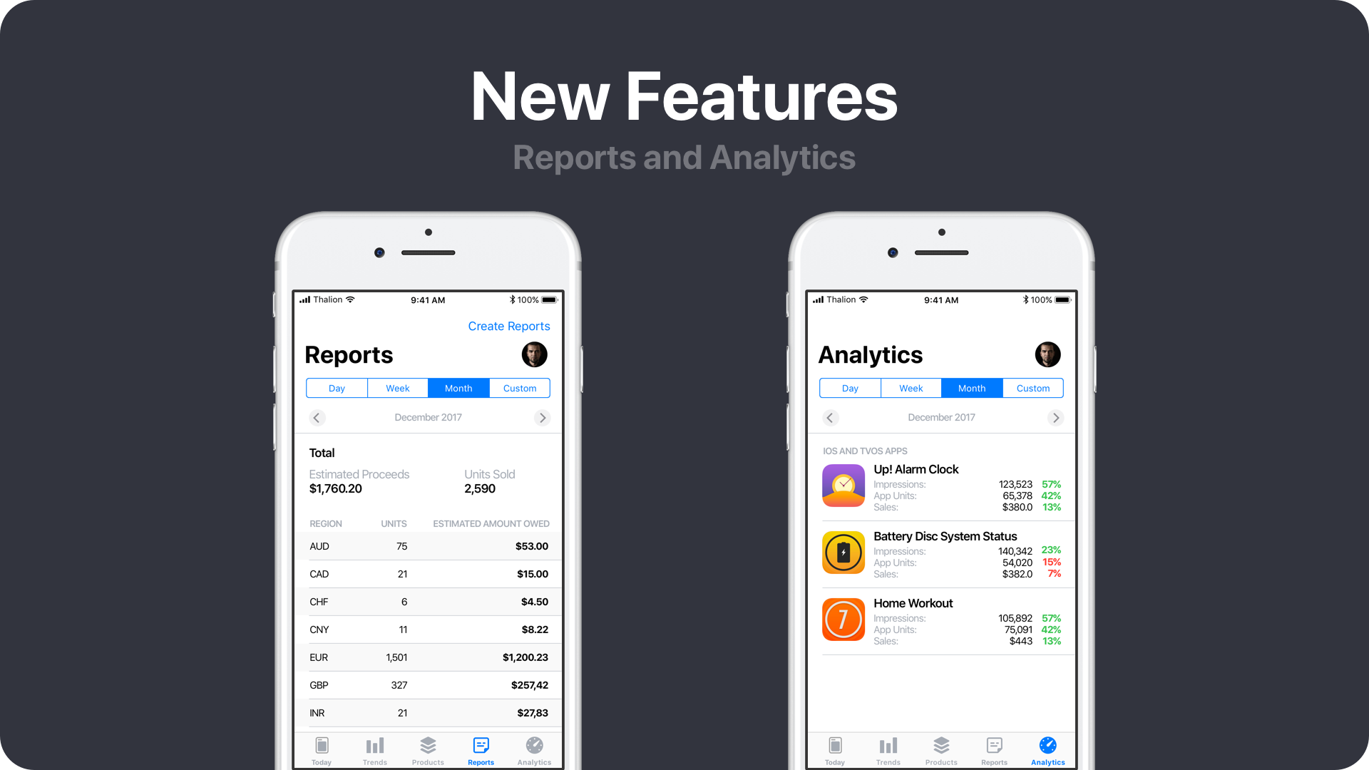
New Pages
Reports and Analytics are the features that are not present in mobile app yet. It would be great to have an opportunity of more advanced analysis on mobile.
Summing up
The New App Store introduced in iOS 11 inspired me to design the new concept of iTunes Connect for iOS. In my opinion, it is important to create a fresh solution, but it also should be familiar from the beginning.
Apple App Store and iTunes Connect are both creating an outstanding platform that connects creative professionals with their users around the world. Both solutions deserve for the best possible design and I hope iTunes Connect app for iOS will amaze developers soon with a big update!
Feel free to leave comments below. I am really curious what do you think of this concept.
Note: I am not UX/UI designer at Apple. I have done the work on my own. I wanted to create the app design developers would love. If somehow this article would be noticed by someone at Apple I would be really happy if it would inspire them to refresh the app.
Similar articles:
- iPhone X – FREE Mockups & Handy List of UI Guidelines Changes
- iPhone X – Discover The New UX Design Opportunities
- Wireframes – The Fifth Wheel of UX Design Process. How to design without them?


