Once in a great while, a typeface shows up that occupies a realm of its own. Fit, David Jonathan Ross’ wildly imaginative all-caps constructivist juggernaut, operates in a fascinating twilight zone between type and image.
By Type Network Staff
With his new typeface Fit, David Jonathan Ross set himself a challenge: to make every letter occupy the maximum surface area possible within its boundaries. To achieve this, he drew the dense capitals using almost exclusively perpendicular straight lines, with alternating sharp and circular corners, and certain characters that fold into themselves, eliminating as much empty space as possible.
Fit’s main objective is deceptively simple: to fit just about any text into just about any space. To accomplish this task, the typeface had to acquire a spectrum of widths during the course of its development. Ross whittled these down to ten punchy styles, ranging from the slender Skyline to the massive Ultra Extended.
Fit’s dramatic increase in width and weight, from Skyline to Ultra Extended, happens solely in the stroke widths; its inner shapes remain constant.
The increase in width from narrow to wider styles appears solely in the forms’ strokes. The spaces within the letters—which are identical to the spaces between the letters—are reduced to fine lines that remain consistent throughout the family. This invites users to combine and play with the different widths. White shapes in the black of the letters create typographic mazes where readers will enjoy losing themselves.
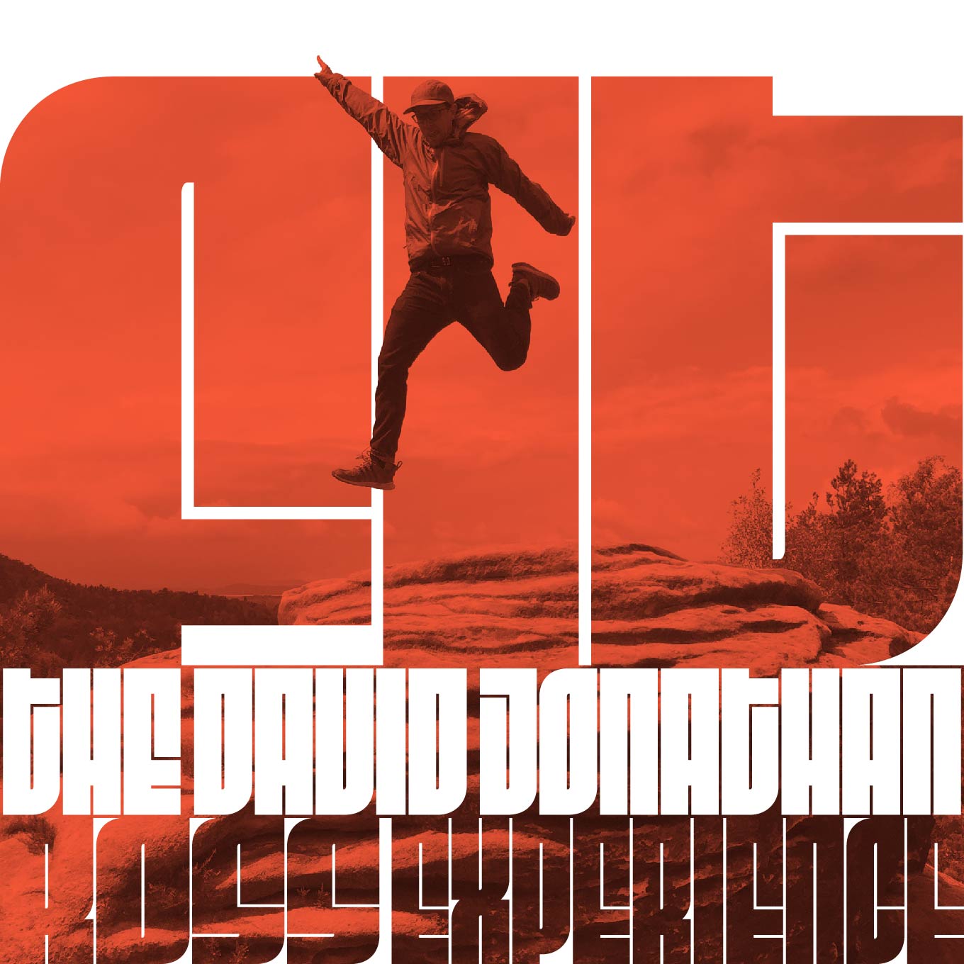
Fit’s massive character shapes are ideal for creating typographic mazes and image frames.
You’ve never seen a typeface like Fit, yet its letterforms subtly reference popular art and design movements, like Russian constructivism and ’60s jazz record sleeves. Imagine what the legendary Reid Miles could have done if he had had access to Fit when designing his seminal album covers for Blue Note Records. Sure, Fit’s bold, graphic letters may be hard to decipher at times, but they invite the eye to linger for an extra second and engage with the text. The incredibly compact character shapes blur the boundaries between type and image. Text set in Fit becomes a decorative artifact, and can also be used as readable frames for images.
Fit has impressive language support, including Cyrillic, Greek, and Vietnamese. Nested accents allow for super-tight stacking, while conventional positioning of accents aids legibility.
Fit is a fully featured OpenType family with an expansive character set. The typeface supports the Greek and Cyrillic alphabets, and offers all of the glyphs and accents necessary for Extended Latin and even Vietnamese. The user can choose between nested and extending accents, and non-descending Cyrillic letters for extra-compact stacked settings. Alternates for certain characters, like a cap-style form of T, a dotted I, a curved F, and a curly tilde improve legibility. But Fit was not exactly designed to set books. As Ross says, Fit may be difficult to read, but it’s impossible to miss.
Stylistic alternates for key characters improve Fit’s legibility.
Like all DJR fonts, Fit is available for print, web, app, and ePub licensing. Webfonts may be tested free for thirty days. To stay current on all things DJR, subscribe to Type Network News, our occasional email newsletter featuring font releases, foundry happenings, type and design events, and more.