How I Animated the bitsofcode Logo with CSS
I’m pretty new to CSS animations. For the most part, I had only used them in limited cases and mostly using libraries created by others, such as the excellent Animate.css created by Daniel Eden.
As I mentioned in Redesigning bitsofcode, the graphic designer I worked with for the new bitsofcode logo created this animation to go with it.
I knew I had to use it somewhere, so I decided to attempt recreating a section of it as a pure CSS animation.
Introduction to CSS Animations #
Before getting into how I created the logo animation, it'll be helpful to give a bit of an introduction to how CSS animations work. CSS animations make it possible for us to apply custom, complex animations to elements without needing to use additional tools or languages like JavaScript. They have a lot of benefits, such as being simpler to use and having better performance than other methods.
Creating an Animation #
To create a CSS animation, we use the @keyframes rule, with which we can name our animation and specify the CSS styles to be applied to the animating element at each step of the animation. Take, for example, the following animation, named grow, which will scale an element to twice it’s size:
@keyframes grow {
    0% {
        transform: none;
    }
    100% {
        transform: scale(2);
    }
}
When creating a custom animation, the animation name is defined after the @keyframes keyword and the animation steps are defined within the block. The steps in an animation can be thought of as a timeline, from 0, marking the start of the animation, to 100, marking the end of the animation.

Besides those two points on the timeline, we can have as many steps in between as we like. For example, let’s adapt the grow animation from above to a pulse. Instead of simply enlarging the element, we also return it back to its original size.
@keyframes pulse {
    0% {
        transform: none;
    }
    50% {
        transform: scale(2);
    }
    100% {
        transform: none;
    }
}
We also don’t have to stick to one CSS style for each point on the timeline. We can apply as many styles as we want, like we apply styles to a selector.
@keyframes pulseAndChangeColour {
    0% {
        transform: none;
        background-color: red;
    }
    25% {
        background-color: blue;
    }
    50% {
        transform: scale(2);
        background-color: green;
    }
    75% {
        background-color: pink;
    }
    100% {
        transform: none;
        background-color: orange;
    }
}
Using an Animation #
Once we have created the animation, we can then apply it to any element using the animation properties. There are nine properties related to applying CSS animations.
| Property | Description |
|---|---|
animation-name |
Specifies the name of the @keyframes rule to apply |
animation-delay |
Specifies a delay before the animation begins |
animation-duration |
Specifies the amount of time it should take for one cycle |
animation-iteration-count |
Specifies how many times to run a cycle of the animation |
animation-direction |
Specifies in which direction to run through the animation timeline |
animation-play-state |
Determines if the animation is playing or paused |
animation-timing-function |
Specifies how the animation transitions between steps |
animation-fill-mode |
Specifies the values applied to the element and the start and end of the animation |
animation |
Shorthand for all other properties |
For example, we can apply our pulseAndChangeColour animation for 3 seconds, on an infinite loop, alternating directions, after a delay of 2 seconds, with these declarations -
.animated-element {
animation-name: pulseAndChangeColour;
animation-duration: 3s;
animation-iteration-count: infinite;
animation-direction: alternate;
animation-delay: 2s;
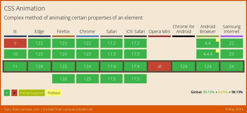
}Support #
Animating the bitsofcode Logo #
In my CSS animation, I decided to recreate just a section of the full animation that was created. Here's my recreation of that section -
Prepping the SVG Element #
The logo, as you would imagine, is an SVG element. Each letter (or, in the case of the letter "o", half of a letter), is its own <path>. This allowed me to target each letter individually or target specific groups of letters together.
Based on the animation, there are three discernible groups of letters, which I grouped together using three classes:
.logo-section—left: The letters "bitso" (with the opening o).logo-section—middle: The letters "ofco" (with the closing o and opening o).logo-section—right: The letters "ode" (with the closing o)
A separate @keyframes rule was created for each of those sections, as the animation is slightly different for each of them.
Creating a Timeline #
As I mentioned, each CSS animation has a timeline of events, from 0% to 100%. Since this was a bit more complex an animation than the pulse examples, I found it helpful to specifically write out the timeline before writing any CSS.
Let’s take the animation for the left section of the logo. These were the basic steps -
- Move left
- Return to middle
- Stay in middle (while waiting for the right section to move right)
- Move left
- Rotate
- Slowly increase rotation
- Return to unrotated position
- Return to middle
Next, I had to takes these steps and map them onto a timeline, from 0 to 100%, where each step should be.

This could then be translated into an actual CSS animation timeline.
@keyframes logoSectionLeft {
  0% {
    /* Initial Position */
  }

  12.5% {
    /* 1. Move Left */
  }

  25% {
    /* 2. Return to middle */
  }

  50% {
    /* 3. Stay in middle (while waiting for the right section to move right) */
  }

  62.5% {
    /* 4. Move left */
  }

  67%,
  72% {
    /* 5. Rotate */
  }

  82% {
    /* 6. Slowly increase rotation */
  }

  87.5% {
    /* 7. Return to unrotated position */
  }

  100% {
    /* 8. Return to middle */
  }
}
Styling each Step #
Once the timeline had been mapped out, I could then add the CSS styles for each step. For this animation, the only property I used was the transform property with translate() and rotate() functions.
Here’s the complete animation keyframes for the left section -
@keyframes logoSectionLeft {
  0% {
    /* Initial Position */
    transform: none;
  }

  12.5% {
    /* 1. Move Left */
    transform: translateX(-15px);
  }

  25%,
  50% {
    /* 2. Return to middle */
    /* 3. Stay in middle (while waiting for the right section to move right) */
    transform: none;
  }

  62.5% {
    /* 4. Move left */
    transform: translateX(-15px);
  }

  67%,
  72% {
    /* 5. Rotate */
    transform: translateX(-15px) rotate(-10deg);
  }

  82% {
    /* 6. Slowly increase rotation */
    transform: translateX(-15px) rotate(-15deg);
  }

  87.5% {
    /* 7. Return to unrotated position */
    transform: translateX(-15px);
  }

  100% {
    /* 7. Return to middle */
    transform: none;
  }
}
Applying the Animation #
Finally, I wanted to apply the animation only when the anchor element surrounding the logo was in focus or hovered above. I wanted a cycle of the animation to take 3 seconds, and for it to repeat indefinitely.
.site__title a:hover .logo-section-left,
.site__title a:focus .logo-section-left {
    animation-name: logoSectionLeft;
    animation-duration: 3s;
    animation-timing-function: ease-in-out;
    animation-iteration-count: infinite;
}
That’s it! I created a CodePen with the full animation if you want to take a look.
See the Pen bitsofcode by Ire Aderinokun (@ire) on CodePen.